
버튼 애니메이션 효과를 hover시 opacity나 color정도만 변경했었다. 참고자료에 있는 사이트를 보고 다양하게 적용된 애니메이션 효과를 적용해보고 싶었고 before와 after도 다시 알아보는 시간이 되었다.
버튼 애니메이션 효과 적용하기
.custom-btn 클래스로 모든 버튼에 적용되는 기본 스타일을 정의하였고 .btn-1부터 .btn-6 클래스로 각각 원하는 스타일을 적용하였다.
.btn-1 - 그라데이션 배경과 호버 시 색상 변경
.btn-2 - 그라데이션 배경과 호버 시 그림자 효과
.btn-3 - 그라데이션 배경과 호버 시 선이 그려지는 효과
.btn-4 - 그라데이션 배경과 빛이 지나가는듯한 애니메이션 효과, 호버 시 색상 변경
.btn-5 - 파란색 배경과 빛이 지나가는듯한 애니메이션 효과
.btn-6 - 테두리와 호버 시 그림자와 애니메이션 효과
html
<section class="wrap">
  <button class="custom-btn btn-1">Button</button>
  <button class="custom-btn btn-2">Button</button>
  <button class="custom-btn btn-3">
    <span>Button</span>
  </button>
  <button class="custom-btn btn-4">
    Button
    <div class="dot"></div>
  </button>
  <button class="custom-btn btn-5">
    Button
    <div class="dot"></div>
  </button>
  <button class="custom-btn btn-6">Button</button>
  {/* <div class="nav">text</div> */}
</section>
CSS
.wrap {
  position: relative;
  overflow: hidden;
  color: white;
}

.custom-btn {
  margin: 20px;
  width: 130px;
  height: 40px;
  color: #fff;
  border-radius: 5px;
  padding: 10px 25px;
  font-weight: 500;
  background-color: transparent;
  cursor: pointer;
  transition: all 0.3s ease;
  position: relative;
  display: inline-block;
  box-shadow: inset 1px 1px 3px 0px rgba(255, 255, 255, 0.5);
  outline: none;
}

/* 1 */
.btn-1 {
  background: rgb(6, 14, 131);
  background: linear-gradient(
    0deg,
    rgba(6, 14, 131, 1) 0%,
    rgba(12, 25, 180, 1) 100%
  );
  border: none;
}
.btn-1:hover {
  background: rgb(0, 3, 255);
  background: linear-gradient(
    0deg,
    rgba(0, 3, 255, 1) 0%,
    rgba(2, 126, 251, 1) 100%
  );
}

/* 2 */
.btn-2 {
  background: rgb(96, 9, 240);
  background: linear-gradient(
    0deg,
    rgba(96, 9, 240, 1) 0%,
    rgba(129, 5, 240, 1) 100%
  );
  border: none;
}

.btn-2::before {
  height: 0%;
  width: 2px;
}

.btn-2:hover {
  box-shadow: 3px 3px 4px 0 rgba(255, 255, 255, 0.836),
    -3px -3px 4px 0 rgba(30, 0, 36, 0.829),
    inset -3px -3px 4px 0 rgba(255, 255, 255, 0.034),
    inset 3px 3px 4px 0 rgba(42, 0, 61, 0.815);
}

/* 3 */
.btn-3 {
  background: rgb(0, 172, 238);
  background: linear-gradient(
    0deg,
    rgba(0, 172, 238, 1) 0%,
    rgba(2, 126, 251, 1) 100%
  );
  width: 130px;
  height: 40px;
  line-height: 42px;
  padding: 0;
  border: none;
}

.btn-3 span {
  position: relative;
  display: block;
  width: 100%;
  height: 100%;
}

.btn-3:before,
.btn-3:after {
  position: absolute;
  content: "";
  right: 0;
  top: 0;
  background: rgba(2, 126, 251, 1);
  transition: all 0.3s ease;
}

.btn-3:before {
  height: 0%;
  width: 2px;
}

.btn-3:after {
  width: 0%;
  height: 2px;
}

.btn-3:hover {
  background: transparent;
  box-shadow: none;
}

.btn-3:hover:before {
  height: 100%;
}

.btn-3:hover:after {
  width: 100%;
}

.btn-3 span:hover {
  color: rgba(2, 126, 251, 1);
}

.btn-3 span:before,
.btn-3 span:after {
  position: absolute;
  content: "";
  left: 0;
  bottom: 0;
  background: rgba(2, 126, 251, 1);
  transition: all 0.3s ease;
}

.btn-3 span:before {
  width: 2px;
  height: 0%;
}

.btn-3 span:after {
  width: 0%;
  height: 2px;
}
.btn-3 span:hover:before {
  height: 100%;
}

.btn-3 span:hover:after {
  width: 100%;
}

.btn-4 {
  border: none;
  background: rgb(251, 33, 117);
  background: linear-gradient(
    0deg,
    rgba(251, 33, 117, 1) 0%,
    rgba(234, 76, 137, 1) 100%
  );
  overflow: hidden;
}

.btn-4:before {
  position: absolute;
  content: "";
  display: inline-block;
  top: -180px;
  left: 0;
  width: 30px;
  height: 100%;
  background-color: #fff;
  animation: shiny-btn1 3s ease-in-out infinite;
}

.btn-4:hover {
  opacity: 0.7;
}
.btn-4:active {
  box-shadow: 4px 4px 6px 0 rgba(255, 255, 255, 0.3),
    -4px -4px 6px 0 rgba(116, 125, 136, 0.2),
    inset -4px -4px 6px 0 rgba(255, 255, 255, 0.2),
    inset 4px 4px 6px 0 rgba(0, 0, 0, 0.2);
}

@keyframes shiny-btn1 {
  0% {
    -webkit-transform: scale(0) rotate(45deg);
    opacity: 0;
  }
  80% {
    -webkit-transform: scale(0) rotate(45deg);
    opacity: 0.5;
  }
  81% {
    -webkit-transform: scale(4) rotate(45deg);
    opacity: 1;
  }
  100% {
    -webkit-transform: scale(50) rotate(45deg);
    opacity: 0;
  }
}

.btn-5 {
  border: none;
  overflow: hidden;
  background-color: blue;
}

.btn-5::before {
  content: "";
  position: absolute;
  display: inline-block;
  height: 100%;
  width: 30px;
  background-color: #fff;
  top: -180px;
  left: 0;
  animation: shiny-btn1 3s ease-in-out infinite;
}

.btn-6 {
  border: 0.5px solid rgba(255, 255, 255, 0.062);
}

.btn-6:after {
  position: absolute;
  content: "";
  width: 0%;
  height: 100%;
  top: 0;
  right: 0;
  border-radius: 5px;
  box-shadow: -3px -3px 10px 0px #0001, 3px 3px 10px 0px rgb(255, 255, 255);
  transition: all 0.3s ease;
}

.btn-6:hover::after {
  left: 0;
  right: auto;
  width: 100%;
}
::before와 ::after
::before와 ::after는 CSS의 가상 요소이며, 문서 트리에 존재하지 않는 새로운 요소를 생성하여 선택자에 스타일을 적용할 수 있다. 특정 요소의 앞(::before)과 뒤(::after)에 콘텐츠를 추가할 때 사용되며, content 속성을 사용하여 가상 요소에 텍스트 또는 이미지 등을 추가할 수 있다.
::after로 호버시 선 그리기
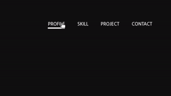
텍스트 아래에 호버시 선을 그리는 효과를 주기 위해서 after의 content는 비우고, hover전에는 높이는 주고 너비는 0%로 설정하여 선이 없는것처럼 설정하였다. 호버시 너비가 생기면서 선이 그려지는 효과처럼 보여진다.
html
<div className="nav">text</div>CSS
.nav {
  position: relative;
  display: inline-block;
  padding: 3px;
}

.nav::after {
  content: "";
  position: absolute;
  bottom: 0;
  left: 0;
  width: 0%;
  height: 3px;
  background: rgb(255, 255, 255);
  transition: all 0.3s ease-in-out;
}

.nav:hover::after {
  width: 100%;
}
참고자료

Leejungmin
3번째 버튼 적용했을때 호버 할때 top부분 선에 마우스를 대면 top,right부분만 그대로 남아있고 bottom,left부분이 사라지는데 왜 그런현상이 일어나는 것인가요 반대로 bottom부분 선에 마우스를 대면 정상적으로 모든선이 다 보입니다.