CLIP 프로젝트의 핵심 시스템인 '카드 스와이프' 기능을 사용하기 위해 react native deck swiper 서드파티 패키지를 사용하려고 한다. 해당 라이브러리의 공식 문서가 잘 정리되어 있어 번역하며 공부하는 목적으로 정리해본다.
공식 문서: https://www.npmjs.com/package/react-native-deck-swiper
1. 패키지 설치
NPM 또는 yarn으로 패키지를 설치해준다.
npm install react-native-deck-swiper --saveor
yarn add react-native-deck-swiper2. 컴포넌트 적용
공식 문서에 나와 있는 예시 코드를 App.js에서 사용해보자.
패키지를 사용하려면 import Swiper from "react-native-deck-swiper"를 추가하여 Swiper 패키지를 불러온 후, Swiper 컴포넌트로 감싸서 사용하면 된다.
import React from "react";
import { View, StyleSheet, Text, Button } from "react-native";
import Swiper from "react-native-deck-swiper";

export default function App() {
  return(
    <View style={styles.container}>
        <Swiper
            cards={['DO', 'MORE', 'OF', 'WHAT', 'MAKES', 'YOU', 'HAPPY']}
            renderCard={(card) => {
                return (
                    <View style={styles.card}>
                        <Text style={styles.text}>{card}</Text>
                    </View>
                )
            }}
            onSwiped={(cardIndex) => {console.log(cardIndex)}}
            onSwipedAll={() => {console.log('onSwipedAll')}}
            cardIndex={0}
            backgroundColor={'#4FD0E9'}
            stackSize= {3}>
            <Button
                onPress={() => {console.log('oulala')}}
                title="Press me">
                You can press me
            </Button>
        </Swiper>
    </View>
  );
}

const styles = StyleSheet.create({
  container: {
    flex: 1,
    backgroundColor: "pink",
  },
  card: {
    flex: 1,
    borderRadius: 20,
    borderWidth: 2,
    borderColor: "#E8E8E8",
    justifyContent: "center",
    backgroundColor: "cyan",
  },
  text: {
    textAlign: "center",
    fontSize: 50,
    backgroundColor: "pink",
  },
);
Swiper 컴포넌트로 감싼 Button 컴포넌트가 있는데 화면 상에는 렌더링이 안 되는 것 같다.
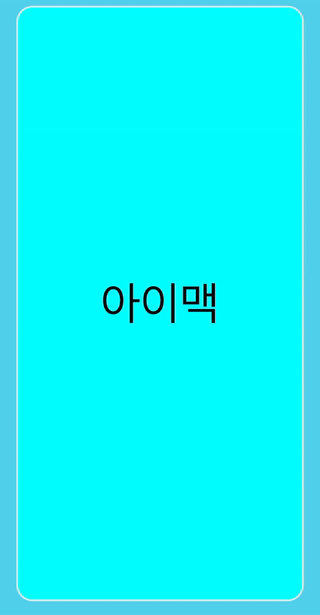
코드 적용 후 렌더링 하면 다음과 같이 작동된다. (출처: 공식 문서)
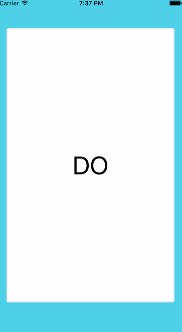
cards라는 array 배열에 렌더링 할 카드의 데이터를 넣고, 데이터를 기반으로 renderCard 함수로 데이터들을 카드 형식으로 렌더링 하는 것이다. 필수 props는 이 두 가지이며, 나머지 props는 필요에 따라 추가하면 된다.
3. Props
컴포넌트를 사용하는 데에 필요한 모든 속성들이 다양하게 지원된다.
1) Card Props
| 속성 | 타입 | 설명 | 필수 | 기본값 |
|---|---|---|---|---|
| cards | array | 렌더링할 카드 데이터의 배열 | 필수 | - |
| renderCard | func | 데이터를 기반으로 카드를 렌더링하는 함수 | 필수 | - |
| keyExtractor | func | 카드의 React 키를 얻기 위한 함수 | 아니오 | null |
| cardIndex | number | 시작할 카드 인덱스 | 아니오 | 0 |
| infinite | bool | 계속해서 스와이핑 유지 | 아니오 | false |
| horizontalSwipe | bool | 가로 스와이핑 활성화/비활성화 | 아니오 | true |
| verticalSwipe | bool | 세로 스와이핑 활성화/비활성화 | 아니오 | true |
| showSecondCard | bool | 스와이핑 중 두 번째 카드 활성화/비활성화 | 아니오 | true |
| stackSize | number | 표시할 하단 카드 수 (showSecondCard가 활성화되어야 함) | 아니오 | 1 |
2) 이벤트 콜백
| props | 타입 | 설명 | 기본값 |
|---|---|---|---|
| onSwipedAll | func | 모든 카드가 스와이프된 경우 호출되는 함수 | - |
| onSwiped | func | 카드가 스와이프된 경우 호출되는 함수. 스와이프한 카드의 인덱스를 전달받음 | - |
| onSwipedAborted | func | 임계값에 도달하기 전에 카드가 놓아진 경우 호출되는 함수 | - |
| onSwipedLeft | func | 카드가 왼쪽으로 스와이프된 경우 호출되는 함수. 스와이프한 카드의 인덱스를 전달받음 | - |
| onSwipedRight | func | 카드가 오른쪽으로 스와이프된 경우 호출되는 함수. 스와이프한 카드의 인덱스를 전달받음 | - |
| onSwipedTop | func | 카드가 위로 스와이프된 경우 호출되는 함수. 스와이프한 카드의 인덱스를 전달받음 | - |
| onSwipedBottom | func | 카드가 아래로 스와이프된 경우 호출되는 함수. 스와이프한 카드의 인덱스를 전달받음 | - |
| onSwiping | func | 카드가 이동 중일 때 호출되는 함수. X 및 Y 위치를 전달받음 | - |
| dragStart | func | 드래그가 시작될 때 호출되는 함수 | - |
| dragEnd | func | 드래그가 종료될 때 호출되는 함수 | - |
| onTapCard | func | 카드를 탭했을 때 호출되는 함수. 탭한 카드의 인덱스를 전달받음 | - |
| onTapCardDeadZone | number | 탭으로 인식되지 않는 최대 이동량. 탭으로 인식되기 전까지의 이동량 | 5 |
3) 스와이프 애니메이션 props
| props | 타입 | 설명 | 기본값 |
|---|---|---|---|
| verticalThreshold | number | 세로 스와이프 임계값 | height / 5 |
| horizontalThreshold | number | 가로 스와이프 임계값 | width / 4 |
| swipeAnimationDuration | number | 스와이프 애니메이션의 지속 시간 | 350 |
| disableBottomSwipe | bool | 하단 스와이프 비활성화 여부 | false |
| disableLeftSwipe | bool | 왼쪽 스와이프 비활성화 여부 | false |
| disableRightSwipe | bool | 오른쪽 스와이프 비활성화 여부 | false |
| disableTopSwipe | bool | 상단 스와이프 비활성화 여부 | false |
4) 스택 props
| props | 타입 | 설명 | 기본값 |
|---|---|---|---|
| stackSeparation | number | 하단 카드 사이의 세로 간격 | 10 |
| stackScale | number | 각 하단 카드 크기를 줄이는 비율 | 3 |
| stackAnimationFriction | number | 스프링 애니메이션 마찰 (바운스) | 7 |
| stackAnimationTension | number | 스프링 애니메이션 텐션 (속도) | 40 |
5) Rotation(카드 회전) 애니메이션 props
| props | 타입 | 설명 | 기본값 |
|---|---|---|---|
| inputRotationRange | array | 회전 결과에 대한 x 값 범위 | [-width / 2, 0, width / 2] |
| outputRotationRange | array | inputRotationRange 내 x 값에 대한 회전 값 | ["-10deg", "0deg", "10deg"] |
6) 투명도 애니메이션 props
| props | 타입 | 설명 | 기본값 |
|---|---|---|---|
| animateCardOpacity | bool | 카드 투명도 애니메이션 활성화 여부 | false |
| inputCardOpacityRangeX | array | 팬 x에 대한 카드 투명도 입력 범위 | [-width / 2, -width / 3, 0, width / 3, width / 2] |
| outputCardOpacityRangeX | array | inputCardOpacityRangeX 내 값에 대한 투명도 값 | [0.8, 1, 1, 1, 0.8] |
| inputCardOpacityRangeY | array | 팬 y에 대한 카드 투명도 입력 범위 | [-height / 2, -height / 3, 0, height / 3, height / 2] |
| outputCardOpacityRangeY | array | inputCardOpacityRangeY 내 값에 대한 투명도 값 | [0.8, 1, 1, 1, 0.8] |
| animateOverlayLabelsOpacity | bool | 카드 오버레이 레이블 투명도 애니메이션 활성화 여부 | false |
| inputOverlayLabelsOpacityRangeX | array | 팬 x에 대한 오버레이 레이블 투명도 입력 범위 | [-width / 3, -width / 4, 0, width / 4, width / 3] |
| outputOverlayLabelsOpacityRangeX | array | inputOverlayLabelsOpacityRangeX 내 값에 대한 투명도 값 | [1, 0, 0, 0, 1] |
| inputOverlayLabelsOpacityRangeY | array | 팬 y에 대한 오버레이 레이블 투명도 입력 범위 | [-height / 4, -height / 5, 0, height / 5, height / 4] |
| outputOverlayLabelsOpacityRangeY | array | inputOverlayLabelsOpacityRangeY 내 값에 대한 투명도 값 | [1, 0, 0, 0, 1] |
| overlayOpacityVerticalThreshold | number | 오버레이 레이블에 대한 세로 임계값 | height / 5 |
| overlayOpacityHorizontalThreshold | number | 오버레이 레이블에 대한 가로 임계값 | width / 4 |
inputOverlayLabelsOpacityRangeX 및 inputOverlayLabelsOpacityRangeY의 2단계는 horizontalThreshold 및 verticalThreshold와 일치해야 합니다.
7) 스와이프 오버레이 레이블
| props | 타입 | 설명 | 기본값 |
|---|---|---|---|
| overlayLabels | object | 스와이프 레이블의 제목 및 스타일을 포함한 객체 | null |
| overlayLabelStyle | object | 스와이프 레이블의 스타일을 지정한 객체 | null |
| overlayLabelWrapperStyle | object | 오버레이 레이블 래퍼 스타일을 지정한 객체 | 아래의 기본값 참조 |
overlayLabelWrapperStyle 기본값
{
  position: 'absolute',
  backgroundColor: 'transparent',
  zIndex: 2,
  flex: 1,
  width: '100%',
  height: '100%'
}
overlayLabelWrapperStyle 기본값:
{
  position: 'absolute',
  backgroundColor: 'transparent',
  zIndex: 2,
  flex: 1,
  width: '100%',
  height: '100%'
}
overlayLabels 기본값:
{
  bottom: {
	element: <Text>BLEAH</Text> /* Optional */
	title: 'BLEAH',
    style: {
      label: {
        backgroundColor: 'black',
        borderColor: 'black',
        color: 'white',
        borderWidth: 1
      },
      wrapper: {
        flexDirection: 'column',
        alignItems: 'center',
        justifyContent: 'center'
      }
    }
  },
  left: {
	element: <Text>NOPE</Text> /* Optional */
	title: 'NOPE',
    style: {
      label: {
        backgroundColor: 'black',
        borderColor: 'black',
        color: 'white',
        borderWidth: 1
      },
      wrapper: {
        flexDirection: 'column',
        alignItems: 'flex-end',
        justifyContent: 'flex-start',
        marginTop: 30,
        marginLeft: -30
      }
    }
  },
  right: {
	element: <Text>LIKE</Text> /* Optional */
	title: 'LIKE',
    style: {
      label: {
        backgroundColor: 'black',
        borderColor: 'black',
        color: 'white',
        borderWidth: 1
      },
      wrapper: {
        flexDirection: 'column',
        alignItems: 'flex-start',
        justifyContent: 'flex-start',
        marginTop: 30,
        marginLeft: 30
      }
    }
  },
  top: {
	element: <Text>SUPER</Text> /* Optional */
	title: 'SUPER LIKE',
    style: {
      label: {
        backgroundColor: 'black',
        borderColor: 'black',
        color: 'white',
        borderWidth: 1
      },
      wrapper: {
        flexDirection: 'column',
        alignItems: 'center',
        justifyContent: 'center'
      }
    }
  }
}
8) 이전 카드 스와이프 백(swipe-back) props
스무스하고 올바른 전환을 위해 showSecondCard={false}로 설정하라고 한다.
| props | 타입 | 설명 | 기본값 |
|---|---|---|---|
| goBackToPreviousCardOnSwipeLeft | bool | 왼쪽 스와이프 시 이전 카드를 렌더링 여부 | false |
| goBackToPreviousCardOnSwipeRight | bool | 오른쪽 스와이프 시 이전 카드를 렌더링 여부 | false |
| goBackToPreviousCardOnSwipeTop | bool | 상단 스와이프 시 이전 카드를 렌더링 여부 | false |
| goBackToPreviousCardOnSwipeBottom | bool | 하단 스와이프 시 이전 카드를 렌더링 여부 | false |
9) 스타일 props
특이하게 따로 style을 지정해주는 것이 아닌 자체 style props를 지원한다.
| props | 타입 | 설명 | 기본값 |
|---|---|---|---|
| backgroundColor | string | 카드를 포함하는 뷰의 배경색 | '#4FD0E9' |
| marginTop | number | 스와이퍼 컨테이너의 상단 여백 | 0 |
| marginBottom | number | 스와이퍼 컨테이너의 하단 여백 | 0 |
| cardVerticalMargin | number | 카드의 세로 여백 | 60 |
| cardHorizontalMargin | number | 카드의 가로 여백 | 20 |
| childrenOnTop | bool | 자식 요소를 위로 렌더링할지 여부 | false |
| cardStyle | node | 스와이프 가능한 카드의 스타일을 재정의하는 노드 | {} |
| containerStyle | node | 컨테이닝 스타일을 재정의하는 노드 | {} |
| pointerEvents | string | 컨테이닝에 대한 pointerEvents 프롭 | 'auto' |
| useViewOverflow | bool | 스와이퍼 컴포넌트에 View 대신 ViewOverflow 사용 여부 | true |
10) 스와이프 백 메서드
| 메서드 | 타입 | 설명 |
|---|---|---|
| swipeBack | callback | 마지막으로 스와이프한 카드로 다시 스와이프. 스택 사이즈는 2 이상이어야 함. |
11) 스와이프 백 props
| props | 타입 | 설명 | 기본값 |
|---|---|---|---|
| previousCardDefaultPositionX | number | 카드가 덱으로 스와이프될 때 애니메이션 시작 위치의 x 좌표 | -width |
| previousCardDefaultPositionY | number | 카드가 덱으로 스와이프될 때 애니메이션 시작 위치의 y 좌표 | -height |
| stackAnimationFriction | number | 스프링 애니메이션 마찰 (바운스) | 7 |
| stackAnimationTension | number | 스프링 애니메이션 텐션 (속도) | 40 |
| swipeBackCard | bool | 스와이프 백 카드를 렌더링하여 애니메이션화할지 여부 | false |
12) methods
Imperative 애니메이션을 트리거하려면 Swiper 컴포넌트에 대한 참조를 사용할 수 있다.
| 이름 | 인자 | 설명 |
|---|---|---|
| swipeLeft | mustDecrementCardIndex = false | 다음 카드로 왼쪽 스와이프 |
| swipeRight | mustDecrementCardIndex = false | 다음 카드로 오른쪽 스와이프 |
| swipeTop | mustDecrementCardIndex = false | 다음 카드로 위로 스와이프 |
| swipeBottom | mustDecrementCardIndex = false | 다음 카드로 아래로 스와이프 |
| jumpToCardIndex | cardIndex | 현재 카드 인덱스 설정 |
4. 카드 콘텐츠 속성 업데이트 (동적 카드 콘텐츠)
카드의 속성은 변경될 수 있으며 이미 스와이프된 카드에도 영향을 미칠 수 있다. 이는 사용자에게 카드가 더 이상 표시되지 않게 되어 아무런 효과가 없게 될 수 있다. 이 상황에 대한 해결책은 덱이 다시 렌더링되어야 할 때 부모 컴포넌트에서 cardIndex를 설정하는 것이다.
import React, { useRef, useEffect } from 'react';
import Swiper from 'react-native-deck-swiper';

export default const App = ({ cardIndex, customSwiperProps }) => {
  const swiperRef = useRef(null);

  useEffect(() => {
    if (swiperRef.current) {
      swiperRef.current.jumpToCardIndex(cardIndex);
    }
  }, [cardIndex]);

  return (
    <Swiper
      ref={swiperRef}
      {...customSwiperProps}
      cardIndex={cardIndex}
    />
  );
};
함수 컴포넌트에서 useEffect를 사용하여 cardIndex가 변경될 때마다 swiper의 jumpToCardIndex 메서드를 호출하여 덱을 다시 렌더링할 수 있다. 이를 통해 swiper가 수행하는 변경과 외부에서의 변경이 일치하도록 확인할 수 있다.
공식 문서에서는 class component 방식으로 기술되어 있어 function component에 맡게 바꿨다.
5. 구현
1) 필요 사양 분석
먼저 CLIP 메인 인터페이스를 살펴보자.

디자인을 바탕으로 추상화 한 필요 사양은 다음과 같다.
- 카드 앞면에 렌더링 될 데이터는
상품사진,상품명,상품가격,상품상태,거래희망위치,상품추가사진버튼,사용자레벨이다. - 카드 뒷면에 렌더링 될 데이터는
상품명,상품가격,상품상태,사용자레벨,판매자명,상품구매시기,상품사용빈도,상품설명,거래희망위치지도이다. - 카드를 클릭하면 앞면과 뒷면으로 각각 180도 플립되어야 한다.
- 좌우로만 스와이프 기능을 지원한다.
- 왼쪽으로 넘기면 카드 중앙에 'X', 오른쪽으로 넘기면 카드 중앙에 'O'가 뜬다.
- 카드를 스와이프 하고 나면 다음 카드가 바로 보인 후, 즉시 스와이프 액션을 실행할 수 있어야 한다.
- 사용자가 의사 표현한 상품 카드는 데이터에 각각의 형식으로 남아야 한다.
사용자 데이터에는 dislike 상품이 안 남으며, like 상품만 남는다.
dislike 상품은 상대방에게 보이면 안 되며, yes한 상품은 상대방에게 우선 노출되어야 한다.
2) 구현
먼저 카드에 상품 정보가 렌더링되는 것부터 구현하고 추가 기능을 구현해보겠다.
상품 데이터는 파이어베이스로부터 받아와야 하므로 파이어베이스에 가상의 데이터를 몇 개 생성한다.
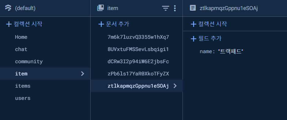
item이라는 컬렉션에 item 고유의 id를 가진 문서가 있고, 문서 안에 name이라는 필드를 추가하여 item의 이름을 추가했다. 우선 데이터가 잘 불러와지는지부터 확인해봤다.
import React, { useEffect, useState } from "react";
import { collection, getDocs } from "firebase/firestore";
import { db } from "./firebaseConfig";


export default function App() {
  const [items, setItems] = useState([]);
  const my = [1, 2, 3, 4, 5];

  useEffect(() => {
    const fetchData = async () => {
      const itemsCollection = collection(db, "item");
      const itemsSnapshot = await getDocs(itemsCollection);
      const itemsData = [];

      itemsSnapshot.forEach((doc) => {
        const data = doc.data();
        itemsData.push({
          id: doc.id,
          name: data.name,
        });
        console.log("id:", doc.id, ", item:", data);
      });
      setItems(itemsData);
      console.log("items:", items);
      console.log("_____________________________________________");
    };
    fetchData();
  }, []);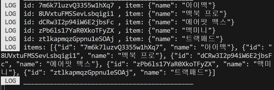
오. 잘 불러와진다. 이제 이것을 cards, renderCard props에 넣어서 렌더링 해보자.
Swiper의 cards prop은 배열을 지정해줘야 한다. 그냥 보통의 배열이면 배열의 이름이나 배열 자체를 전달해줘도 되지만 배열의 값을 객체로 가진 지금 같은 상황의 경우는 map 함수를 사용하여 각 인자를 반환해줘야 한다.
import React, { useEffect, useState } from "react";
import { View, StyleSheet, Text, Button } from "react-native";
import Swiper from "react-native-deck-swiper";
import { collection, getDoc, getDocs } from "firebase/firestore";
import { db } from "./firebaseConfig";

export default function App() {
  (...)

  return (
    <View style={styles.container}>
      <Swiper
        cards={items.map((item) => item.name)}
        renderCard={(card) => {
          return (
            <View style={styles.card}>
              <Text style={styles.text}>{card}</Text>
            </View>
          );
        }}
        infinite={true}
        onSwiped={(cardIndex) => {
          console.log(cardIndex, "번째 카드");
        }}
        onSwipedAll={() => {
          console.log("onSwipedAll");
        }}
        cardIndex={0}
        backgroundColor={"#4FD0E9"}
        stackSize={3}
      >
      </Swiper>
    </View>
  );
}

(...)
이제 데이터를 불러오고 매핑하는 것은 성공했으니, 여러 데이터를 매핑하고 레이아웃을 맞춰보자.
가짜 더미 데이터를 생성하는 함수를 작성하고 실행한 후 firestore에 데이터를 저장해주었다.
import { collection, addDoc } from "firebase/firestore";
import { db } from "./firebaseConfig";

const itemsCollection = collection(db, "item");

// 랜덤 아이템 생성
const generateRandomItem = () => {
  const randomItemData = {
    itemName: generateRandomName(),
    itemPrice: generateRandomPrice(),
    itemPics: generateRandomPics(),
    itemUploader: generateRandomUploader(),
  };

  return randomItemData;
};

// 물건 이름 생성
const generateRandomName = () => {
  return "Item " + Math.floor(Math.random() * 1000);
};

// 물건 가격 생성
const generateRandomPrice = () => {
  const randomPrice = Math.random() * 10000 + 20000;
  const priceInWon = Math.round(randomPrice / 10) * 10;
  return priceInWon;
};

// 사진 이름 생성
const generateRandomPics = () => {
  const picCount = Math.floor(Math.random() * 3) + 1;
  return Array.from({ length: picCount }, (_, index) => `pic${index + 1}.png`);
};

// 업로더 이름 생성
const generateRandomUploader = () => {
  const uploaders = ["John Doe", "Jane Smith", "Bob Johnson"];
  const randomIndex = Math.floor(Math.random() * uploaders.length);
  return uploaders[randomIndex];
};

// 더미 데이터 한 번에 생성
const generateDummyData = async (numItems) => {
  for (let i = 0; i < numItems; i++) {
    const randomItemData = generateRandomItem();
    await addDoc(itemsCollection, randomItemData);
  }
};

export default function App() {
  // 원하는 개수만큼 더미 데이터를 생성
  generateDummyData(20);
  return;
}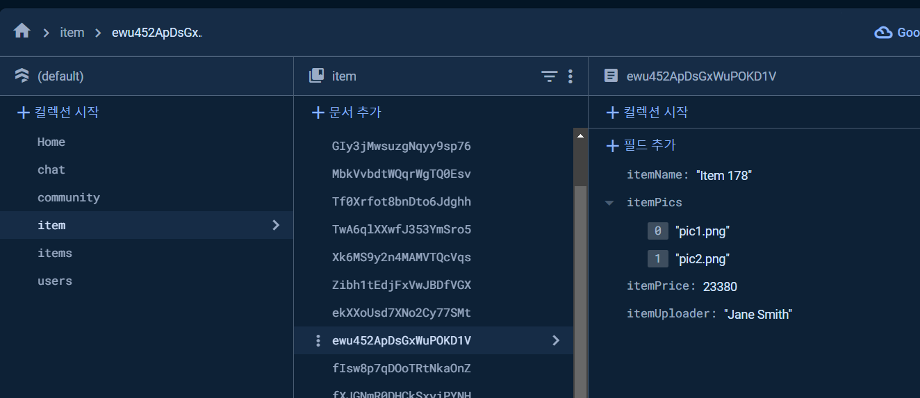
20개의 데이터가 잘 생성되어 저장되었다.
내일 추가로 더 하기!