
🔎 서울시 CCTV 분석
📌 1. 서울시 CCTV 현황 데이터 확보
📌 2. 인구 데이터 확보
📌 3. CCTV데이터와 인구 현황 데이터 합치기
📌 4. 데이터를 정리하고 정렬하기
📌 5. 그래프로 시각화
📌 6. 전체적인 경향 파악
📌 7. 경향에 벗어난 데이터 강조
1. 데이터 가져오기
import pandas as pd
import numpy as np
import matplotlib.pyplot as plt
import matplotlib as mpl
CCTV_Seoul 데이터 불러오기
path = '../data/Seoul_CCTV.csv'
cctv_seoul=pd.read_csv(path,encoding='utf-8')  # 한글을 사용하려면 인코딩 설정 필수
데이터 확인
cctv_seoul.head()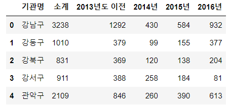
컬럼명 변경
rename()
Signature:
cctv_seoul.rename(
    mapper: 'Renamer | None' = None,
    *,
    index: 'Renamer | None' = None,
    columns: 'Renamer | None' = None,
    axis: 'Axis | None' = None,
    copy: 'bool | None' = None,
    inplace: 'bool' = False,
    level: 'Level' = None,
    errors: 'IgnoreRaise' = 'ignore',
) -> 'DataFrame | None'
cctv_seoul.rename(
    columns={cctv_seoul.columns[0]:'자치구'}
    ,inplace=True)

cctv_seoul.head()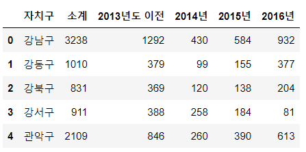
서울시 인구 데이터 불러오기
import openpyxl
pop_seoul=pd.read_excel("../data/Seoul_Population.xlsx")
데이터 확인
pop_seoul.head() 
원하는 데이터만 가져오기
pop_seoul=pd.read_excel("../data/Seoul_Population.xlsx",
                        header=2,
                        usecols='B,D,E,F,H')

pop_seoul.head()
컬럼명 변경
pop_seoul.rename(
    columns={
        pop_seoul.columns[0]:'자치구',
        pop_seoul.columns[1]:'인구수',
        pop_seoul.columns[2]:'한국인 ',
        pop_seoul.columns[3]:'외국인',
        pop_seoul.columns[4]:'고령자',

    },
    inplace=True
)

pop_seoul.head()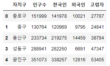
2. 데이터 살펴보기
서울시 cctv 데이터
cctv_seoul.head()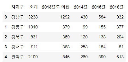
cctv_seoul.sort_values(by='소계',ascending=False).head(8)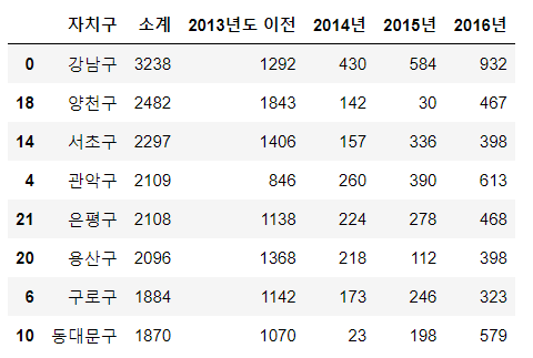
컬럼 생성하기
- 존재하는 컬럼이면 수정 없으면 추가
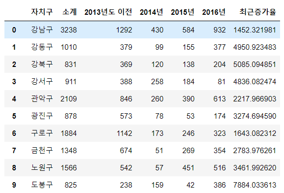
cctv_seoul['최근증가율']=np.sum([cctv_seoul['2014년'],cctv_seoul['2015년'],cctv_seoul['2016년']])/cctv_seoul['2013년도 이전']*100
cctv_seoul
서울시 인구 데이터
pop_seoul.head()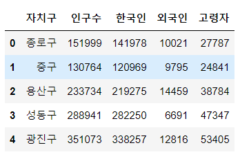
외국인비율, 고령자비율 추가
pop_seoul['외국인비율']=pop_seoul['외국인']/pop_seoul['인구수']*100
pop_seoul['고령자비율']=pop_seoul['고령자']/pop_seoul['인구수']*100
pop_seoul.head()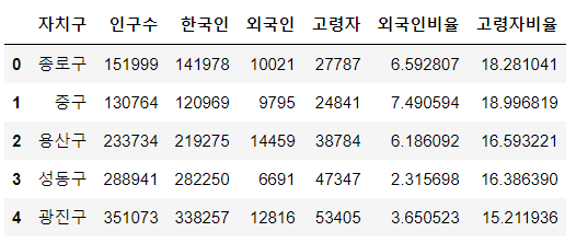
3. 데이터 정리
Pandas에서 데이터 프레임을 병합하는 방법
- pd.concat()
- pd.merge()
- pd.join()
pd.merge()
- 두 데이터 프레임에서 컬럼이나 인덱스를 기준으로 잡고 병합하는 방법
- 기준이 되는 컬럼이나 인덱스를 키값이라고 합니다
- 기준이 되는 키값은 두 데이터 프레임에 모두 포함되어 있어야 한다
seoul_data=pd.merge(cctv_seoul,pop_seoul,on='자치구')
seoul_data.head()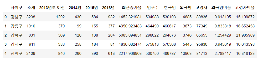
년도별 데이터 컬럼 삭제
- del
- drop
del seoul_data['2013년도 이전']
del seoul_data['2014년']
seoul_data.drop(['2015년','2016년'],axis=1,inplace=True)
seoul_data.head()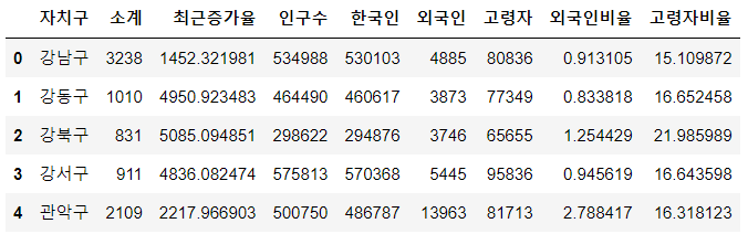
인덱스 변경
- set_index()
- 선택한 컬럼을 데이터 프레임의 인덱스로 지정
seoul_data.set_index('자치구',inplace=True)
seoul_data.head()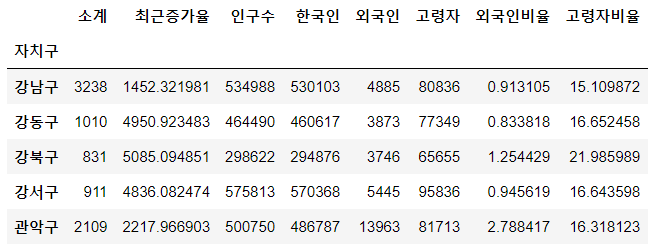
4. 그래프 기초
matplotlib 기본 형태
- plt.figure(figuresize=(w,h))
- plt.plot(x,y)
- plt.show()
import matplotlib.pyplot as plt
import matplotlib as mpl
# 한글 사용 모듈
!pip install koreanize-matplotlib
import koreanize_matplotlib
삼각함수 그리기
- np.arange(a,b,s):a부터 b까지 s의 간격
- np.sin(value)
x=np.arange(0,12,0.01)
y1=np.sin(x)
y2=np.cos(x)
plt.figure(figsize=(10,6))
plt.plot(x,y1)
plt.plot(x,y2)
plt.show()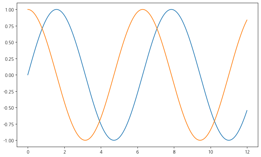
- 격자 무늬 추가
- 그래프 제목 추가
- x축, y축 제목 추가
- 주황색, 파란색 선 데이터 의미 구분
plt.figure(figsize=(10,6))
plt.plot(x,y1)
plt.plot(x,y2)
plt.grid() # 격자무늬 추가
plt.title('Example of sinewave') # 제목 추가
plt.xlabel='time' # x축
plt.ylabel='Amplitude' # y축
plt.legend(['sin','cos'],loc=7) # 범례 설정, loc : 범례위치
'''
  ==================   =============
        Location String      Location Code
        ==================   =============
        'best' (Axes only)   0
        'upper right'        1
        'upper left'         2
        'lower left'         3
        'lower right'        4
        'right'              5
        'center left'        6
        'center right'       7
        'lower center'       8
        'upper center'       9
        'center'             10
        ==================   =============
'''
plt.show()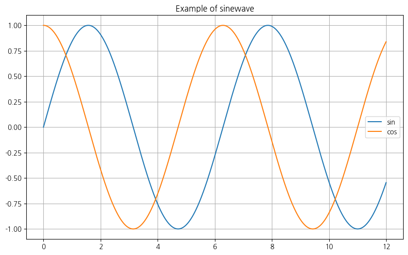
그래프 커스텀
속성 살펴보기
----------------
    scalex, scaley : bool, default: True
        These parameters determine if the view limits are adapted to the
        data limits. The values are passed on to
        `~.axes.Axes.autoscale_view`.

    **kwargs : `.Line2D` properties, optional
        *kwargs* are used to specify properties like a line label (for
        auto legends), linewidth, antialiasing, marker face color.
        Example::

        >>> plot([1, 2, 3], [1, 2, 3], 'go-', label='line 1', linewidth=2)
        >>> plot([1, 2, 3], [1, 4, 9], 'rs', label='line 2')

        If you specify multiple lines with one plot call, the kwargs apply
        to all those lines. In case the label object is iterable, each
        element is used as labels for each set of data.

        Here is a list of available `.Line2D` properties:

        Properties:
        agg_filter: a filter function, which takes a (m, n, 3) float array and a dpi value, and returns a (m, n, 3) array and two offsets from the bottom left corner of the image
        alpha: scalar or None
        animated: bool
        antialiased or aa: bool
        clip_box: `.Bbox`
        clip_on: bool
        clip_path: Patch or (Path, Transform) or None
        color or c: color
        dash_capstyle: `.CapStyle` or {'butt', 'projecting', 'round'}
        dash_joinstyle: `.JoinStyle` or {'miter', 'round', 'bevel'}
        dashes: sequence of floats (on/off ink in points) or (None, None)
        data: (2, N) array or two 1D arrays
        drawstyle or ds: {'default', 'steps', 'steps-pre', 'steps-mid', 'steps-post'}, default: 'default'
        figure: `.Figure`
        fillstyle: {'full', 'left', 'right', 'bottom', 'top', 'none'}
        gapcolor: color or None
        gid: str
        in_layout: bool
        label: object
        linestyle or ls: {'-', '--', '-.', ':', '', (offset, on-off-seq), ...}
        linewidth or lw: float
        marker: marker style string, `~.path.Path` or `~.markers.MarkerStyle`
        markeredgecolor or mec: color
        markeredgewidth or mew: float
        markerfacecolor or mfc: color
        markerfacecoloralt or mfcalt: color
        markersize or ms: float
        markevery: None or int or (int, int) or slice or list[int] or float or (float, float) or list[bool]
        mouseover: bool
        path_effects: `.AbstractPathEffect`
        picker: float or callable[[Artist, Event], tuple[bool, dict]]
        pickradius: unknown
        rasterized: bool
        sketch_params: (scale: float, length: float, randomness: float)
        snap: bool or None
        solid_capstyle: `.CapStyle` or {'butt', 'projecting', 'round'}
        solid_joinstyle: `.JoinStyle` or {'miter', 'round', 'bevel'}
        transform: unknown
        url: str
        visible: bool
        xdata: 1D array
        ydata: 1D array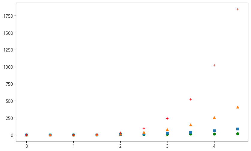
zorder: floatvalue=np.arange(0,5,0.5)
valuearray([0. , 0.5, 1. , 1.5, 2. , 2.5, 3. , 3.5, 4. , 4.5])plt.figure(figsize=(10,6))
#plot(x, y, 'bo') # plot x and y using green circle markers
plt.plot(value,value**2,'go')
plt.plot(value,value**3,'s')
plt.plot(value,value**4,'^')
# plot(y, 'r+') # ditto, but with red plusses
plt.plot(value,value**5,'r+')
plt.figure(figsize=(10,6))
plt.plot(value, value*2, 'bo-', linewidth=2, markersize=6)
plt.plot(value, value*3, 'go--', linewidth=2, markersize=5)
#  'go--' :  color='green',  marker='o', linestyle='dashed',
plt.plot(value,
         value*4,
         color='green',
         marker='o',
         linestyle='dashed',
         linewidth=2, markersize=5)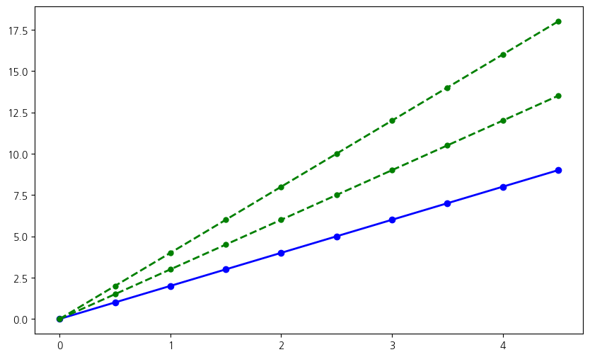
plt.figure(figsize=(10,6))
plt.plot(value, value*2, 'b^', value, value*3, 'b-')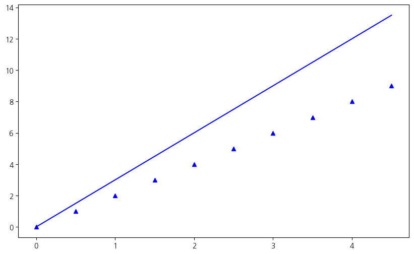
plt.figure(figsize=(10,6))
plt.plot([1, 2, 3], [1, 2, 3], 'go-', label='line 1', linewidth=2)
plt.plot([1, 2, 3], [1, 4, 9], 'rs', label='line 2')
plt.legend()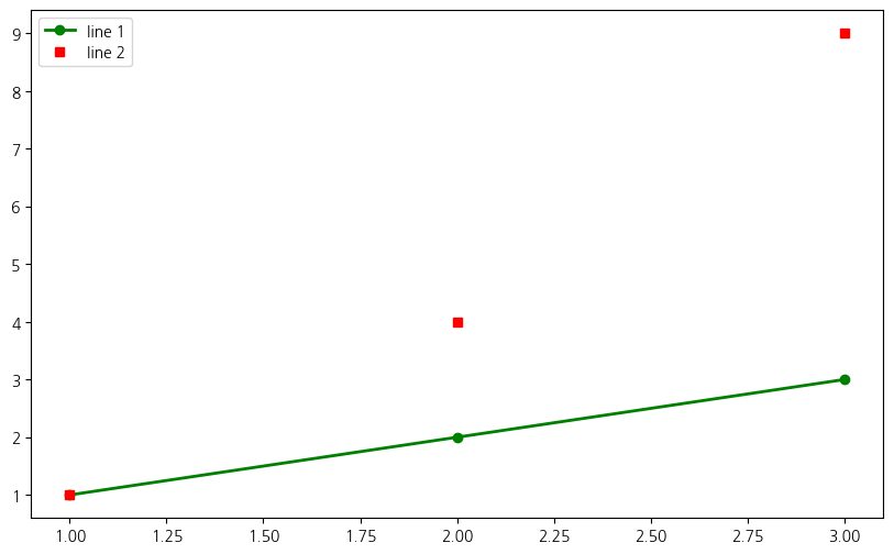
scatter plot
x=np.array(range(0,10))
y=np.array([9,8,7,9,8,3,2,4,3,4])
plt.figure(figsize=(10,6))
plt.scatter(x,y,c='g',marker='^')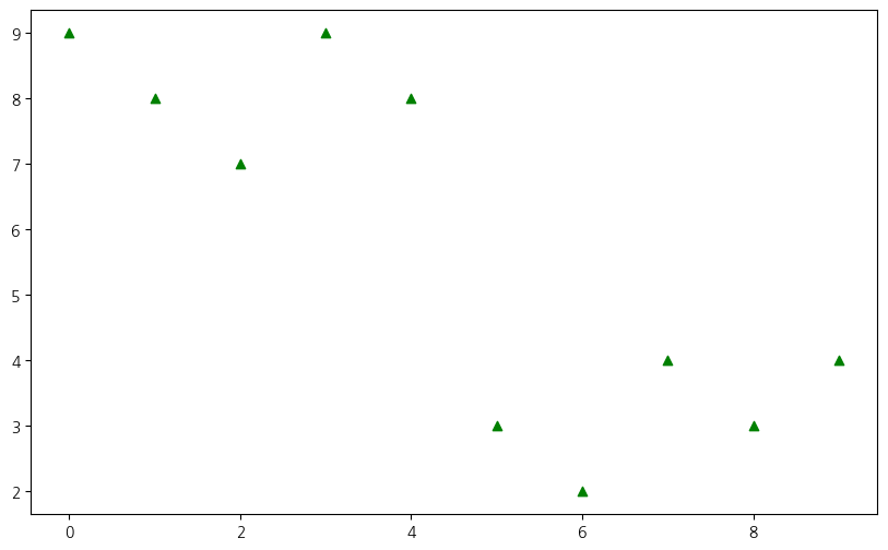
colormap=x
def drawScatter():
    plt.figure(figsize=(10,6))
    plt.scatter(x,y,s=50,c=colormap,marker='o')
    plt.colorbar()
    plt.show()

drawScatter()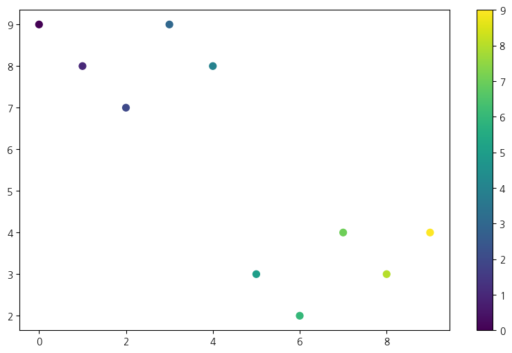
5. 데이터 시각화 하기
seoul_data['인구수'].plot(kind='bar',color='skyblue',figsize=(10,10))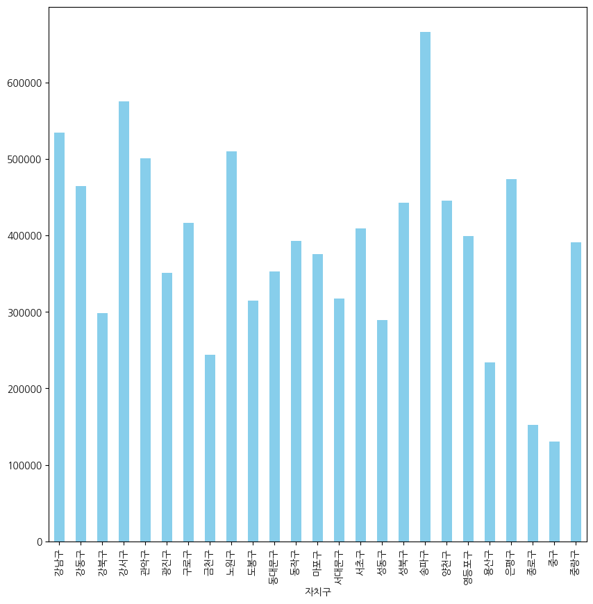
seoul_data['인구수'].plot(kind='barh',
                       figsize=(10,10),
                      title='자치구별 CCTV 수',
                      grid=True)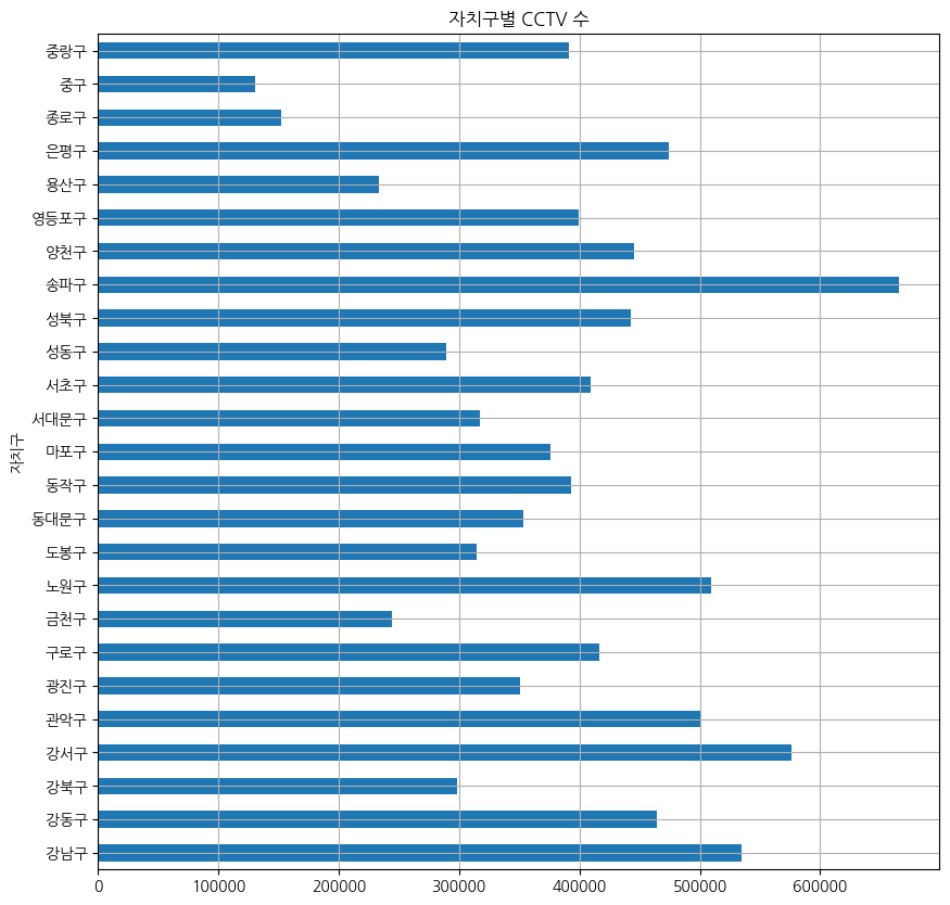
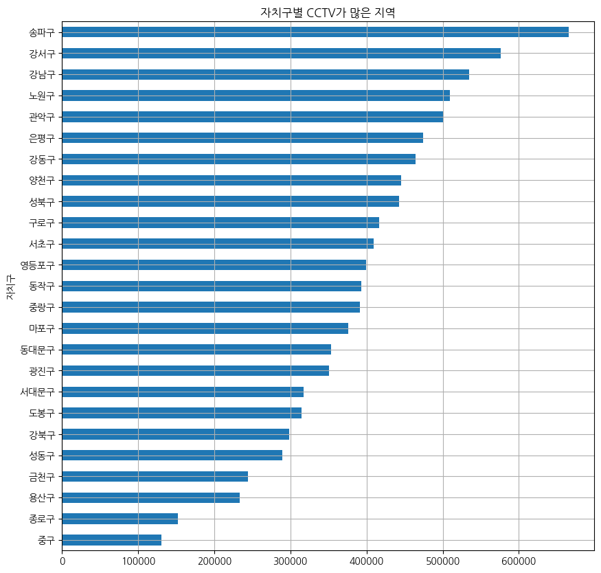
seoul_data['인구수'].sort_values().plot(kind='barh',
                       figsize=(10,10),
                       title='자치구별 CCTV가 많은 지역',
                       grid=True
                      )
6. 데이터 경향 표시
인구수와 소계 컬럼으로 scatter plot 그리기
from importlib import reload
plt=reload(plt) #xlabel() 오류로 인해 재실행

def drawScatterPlot():
    plt.figure(figsize=(14,10))
    plt.scatter(seoul_data['인구수'],seoul_data['소계'] ,s=50)
    plt.xlabel('인구수')
    plt.ylabel("CCTV")
    plt.grid()
    plt.show()

drawScatterPlot()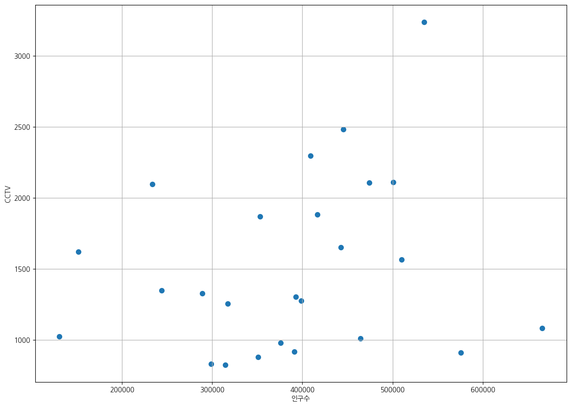
numpy를 이용한 1차 직선 만들기
- np.polyfit(): 직선을 구성하기 위한 계수를 계산
- np.poly1d(): polyfot으로 찾은 계수로 파이썬에서 사용할 수 있는 함수로 만들어주는 기능
t = np.arange(0, 10, 0.01)
y = 3*t + 5 # 기울기 3, y 절편 5

plt.figure(figsize=(12,8))
plt.plot(t, y)
plt.show()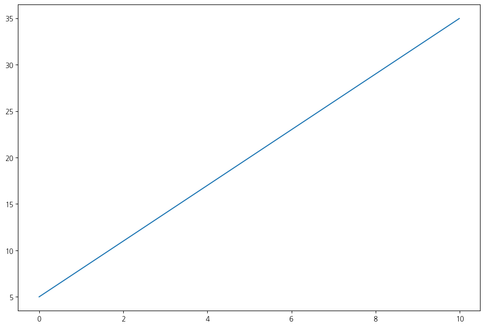
y_noise = y + np.random.randn(len(y))

plt.figure(figsize=(12,8))
plt.plot(t, y_noise)
plt.show()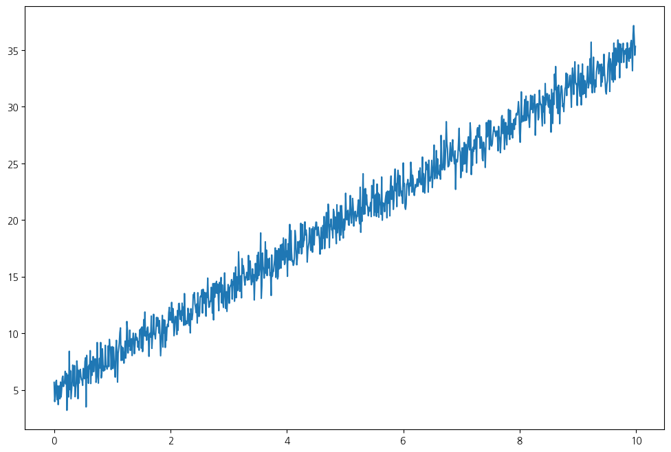
#y_noise 에서 직선을 찾을려면 직선의 기울기와 절편을 알아야함
#polyfit 명령으로 쉽게 찾을 수 있다.
#polyfit에서 세번쨰 인자는 찾고자 하는 함수의 차수
fp1 = np.polyfit(t, y_noise, 1)
# y = 3*t + 5 # 기울기 3, y 절편 5 와 유사한 결과가 나옴
fp1array([2.99859825, 4.99442716])
# poly1d : 다항식 생성 함수
#poly1d 함수를 사용해서 polynomial class를 만들어 준다
f1 = np.poly1d(fp1)
f1
poly1d([2.99859825, 4.99442716])
plt.figure(figsize=(12,8))
plt.plot(t, y_noise, label='noise', color='g')
plt.plot(t, y, ls='dashed', lw=3, color='b', label='original')
plt.plot(t, f1(t), lw=2, color='r', label='polyfit')
plt.grid()
plt.legend()
plt.show()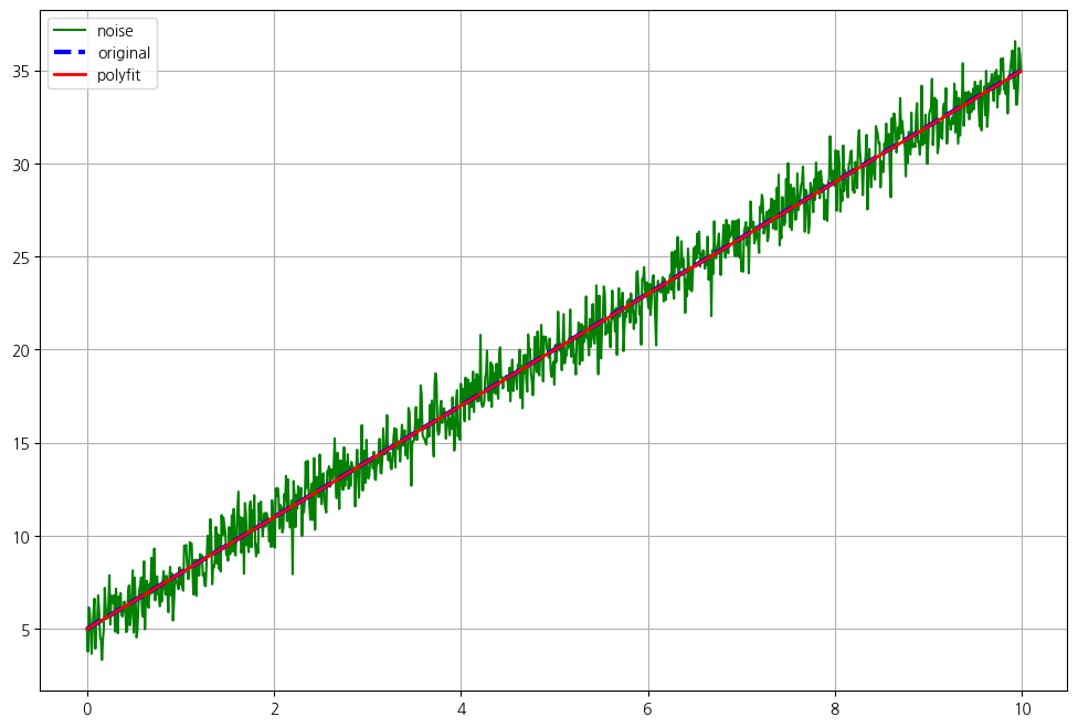
인구수와 소계의 1차 직선 구하기
t=seoul_data['인구수']
y=seoul_data['소계']
fp1=np.polyfit(t, y, 1)
fp1
array([1.03174958e-03, 1.11573882e+03])
f1=np.poly1d(fp1) # f1은 기울기가 1.03174958e-03 이고  절편이 1.11573882e+03인 함수
f1
poly1d([1.03174958e-03, 1.11573882e+03])
- 경향선을 그리기 위한 x 데이터 생성
- np.linspace(a,b,n) : a부터 b까지 n개의 등간격 데이터 생성
fx=np.linspace(100000,700000,100)
def drawScatterPlot():
    plt.figure(figsize=(14,10))
    plt.scatter(seoul_data['인구수'],seoul_data['소계'],s=50)
    plt.plot(fx,f1(fx),ls='dashed',lw=3,color='g')
    plt.xlabel('인구수')
    plt.ylabel('CCTV')
    plt.grid()
    plt.show()

drawScatterPlot()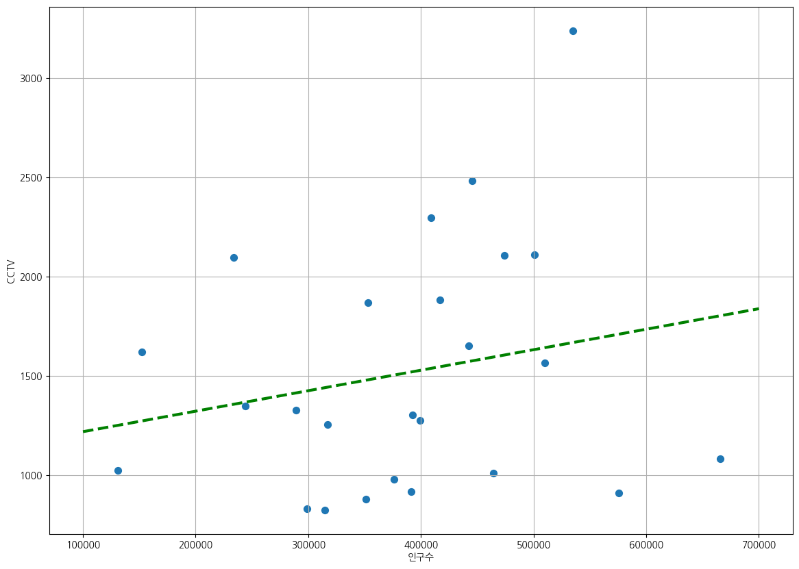
7. 강조하고 싶은 데이터 시각화
경향과의 오차 만들기
fp1=np.polyfit(seoul_data['인구수'],seoul_data['소계'],1)
f1=np.poly1d(fp1)
fx=np.linspace(100000,700000,100)
seoul_data['오차']=seoul_data['소계']-f1(seoul_data['인구수']) # 오차 : 소계 - f1(인구수)
seoul_data.head()
# 경향과 비교해서 데이터의 오차가 큰 데이터를 계산
df_sort_f=seoul_data.sort_values(by='오차',ascending=False) #내림차순
df_sort_t=seoul_data.sort_values(by='오차')#오름차순
#경향 대비 CCTV 많은 구
df_sort_f.head()
#경향 대비 CCTV 적은 구
df_sort_t.head()
from matplotlib.colors import ListedColormap

#colormap 을 사용자 정의로 세팅
color_step=['#00FA9A','#7FFFD4','#00BFFF','#87CEFA','#F0E68C','#FFFF00']
my_cmap=ListedColormap(color_step)

def drawScatterPlot():
    plt.figure(figsize=(14,10))
    plt.scatter(seoul_data['인구수'],seoul_data['소계'],s=50, c=seoul_data['오차'],cmap=my_cmap)
    plt.plot(fx,f1(fx),ls='dashed',lw=3,color='g')

    for n in range(5):
        # 상위 5개
        plt.text(df_sort_f['인구수'][n]*1.02, # x좌표
                 df_sort_f['소계'][n]*0.979, #y 좌표
                 df_sort_f.index[n], #title
                 fontsize=10)
        #하위 5개
        plt.text(df_sort_t['인구수'][n]*1.02, # x좌표
                 df_sort_t['소계'][n]*0.98, #y 좌표
                 df_sort_t.index[n], #title
                 fontsize=10)

    plt.xlabel('인구수')
    plt.ylabel('CCTV')
    plt.grid()
    plt.colorbar()
    plt.show()

drawScatterPlot()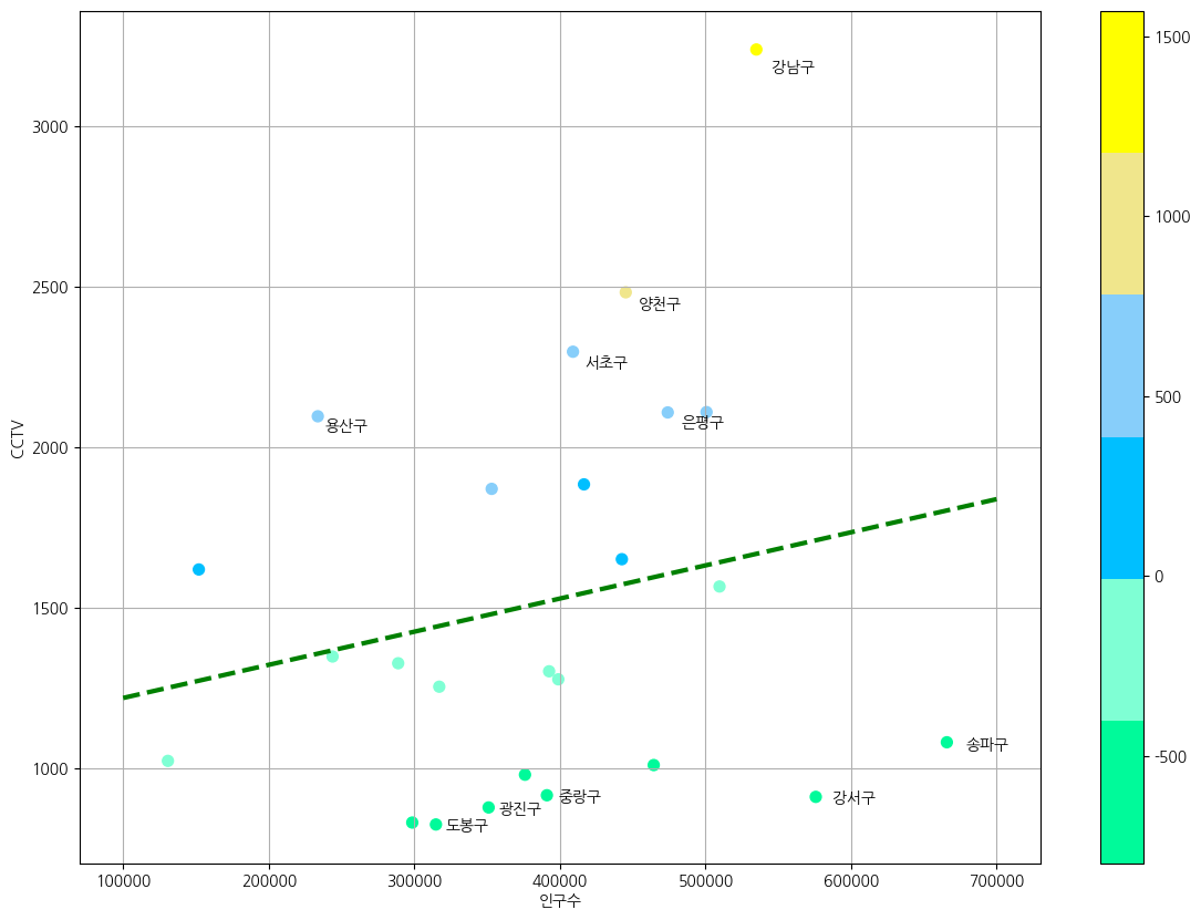
8. 데이터 내보내기
seoul_data.to_csv('../data/01_Seoul_CCTV_Data.csv',sep=',',encoding="utf-8")
개발하고싶은사람