1. Data 시각화
import  matplotlib.pyplot as plt
import seaborn as sns
ㅡㅡㅡㅡㅡㅡㅡㅡㅡㅡㅡㅡㅡㅡㅡㅡㅡㅡㅡㅡㅡㅡㅡㅡㅡㅡㅡㅡㅡㅡㅡㅡㅡ
1) bar
 sns.barplot(data=df, x값, y값)
 plt.figure(figsize=(6,6)) -> 그래프 사이즈 맞추는 거!
 plt.title('그래프 제목')
 plt.xlabel('x축 이름')
 plt.ylabel('y축 이름')
 plt.xticks(rotation = 0) -> 0이면 정자체, 45는 기울임 형태!
 plt.show()
2) heatmap
- 변수간의 상관관계를 알아보는 것
- 1에 가까울수록 양의 상관관계, -1에 가까울수록 음의 상관관계
- 양의 상관관계 : X값 ↑ Y값도 ↑
음의 상관관계 : X값 ↓ Y값 ↑ , 그 반대도 해당!
문자 형태는 사용 불가!
- 양의 상관관계 : X값 ↑ Y값도 ↑
 col_df = df.select_dtypes(include = 'int').corr()
 sns.heatmap(cor_df.corr(),
 			annot=True <- 수치값 나타낼지 말지
            )
3) FacetGrid
- 드릴다운해서 나눠서 볼 수 있음!
facet = sns.facetGrid(df, col='', row = '', height = ) -> Grid 전체 구성
facet.map_dataframe(sns.barplot, x = '', y='') -> 사용할 데이터
facet = facet.figsuplot(wspace= , vspace= ) -> subplot 간격조절
4) Regplot
- plot 두개를 연관지어서 볼 수 있음

5) Histplot
- 원하는 Col의 갯수를 세어서 그래프로 보여줌
sns.histplot(x=df['col'])6) Jointplot
- 함수 두 개를 한눈에 볼 수 있음!
sns.jointplot(data= , x='col' , y='col' , kind='그래프 종류')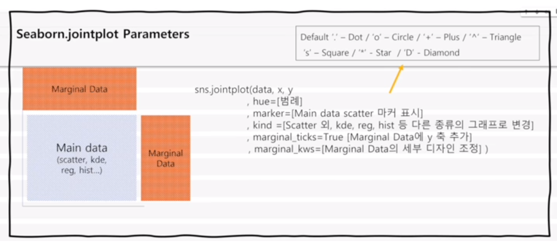

성장하는 주니어 데이터 분석가입니다!
안녕하세요. 좋은 글 잘 읽고 있습니다.
scattered 점들을 가지고 추세선을 어떻게 긋는건가요?