CSS 관련
-
글자 크기가 12px 밑으로 내려가면 폰트가 깨질 수 있음
-
display: flex속성
justify-content: center속성 설정 시, 가로 가운데align-items: center속성 설정 시, 세로 가운데
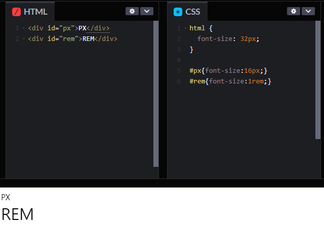
상대 단위
-
em: 부모 태그에 적용된font-size단위에 따라 크기가 결정됨 (기본 크기는 16px) -
rem: html 태그에 적용된font-size단위에 따라 크기가 결정됨 (가장 많이 사용됨)
-
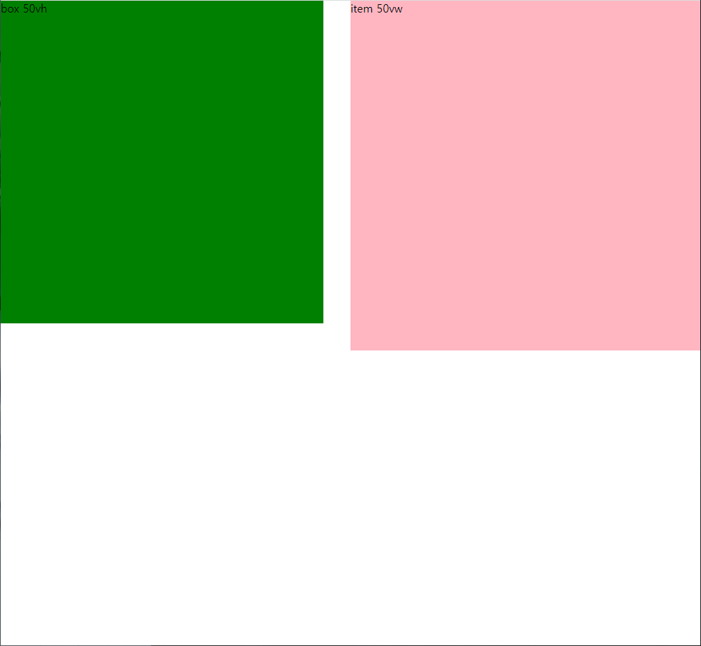
vh: 화면 크기(Viewport height)의 1%에 대한 비율 -
vw: 화면 크기(Viewport width)의 1%에 대한 비율
-
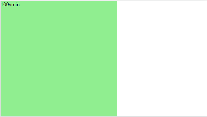
vmin: 화면의 가로 혹은 세로 크기 중 작은 것(Viewport smaller dimension의 1%에 대한 비율) -
vmax: 화면의 가로 혹은 세로 크기 중 큰 것(Viewport larger dimension의 1%에 대한 비율)
- 매번 상대적 크기를 적용하지는 않음, 고정 크기를 사용하는 경우가 더 많음
media query
-
다양한 장치에서 html 문서가 적절한 형태를 갖추게 만들어 주는 규칙
-
link방식,@import방식,@media방식 (권장) -
다음과 같은 형식,
screen혹은all속성인데 프린트까지 포함하려면 후자
@media screen and ( min-width: 751px ) and ( max-width: 992px ) {
  body { background: darkorange; }
  #wrap:before {
    content: 'orange';
    font-size: 2em;
    color: white;
  }
}

@media screen and ( min-width: 501px ) and ( max-width: 750px ) {
  body { background: gold; }
  #wrap:before {
    content: 'yellow';
    font-size: 1.75em;
    color: white;
  }
}
and ( orientation: landscape )속성 설정 시, 가로 화면일 때의 속성,
and ( orientation: portrait )속성 설정 시, 세로 화면일 때의 속성
transition
: 속성 변화 시간에 대한 설정 (애니메이션 속성은 따로 정해줘야 함)
-
transition-property:transition을 적용시킬 속성 -
transition-duration:transition의 총 시간 -
transition-delay:transition의 시작될 때까지의 최소 유지 시간 -
transition-timing-function:transition의 진행 속도
(속성 참고 사이트 : https://developer.mozilla.org/en-US/docs/Web/CSS/easing-function) -
transition: (property), (duration), (delay), (timing-function)순서
transform
: 요소의 위치 이동, 크기 조절, 회전 등의 속성을 설정
translate(x,y): x축, y축 만큼 이동scale(x,y): X축, Y축 만큼 확대,축소skew(x,y): X축, Y축 만큼 축 왜곡rotate(각도): 각도 만큼 회전
Do it! 웹 표준의 정석 356p ~ 376p, 389p ~ 408p