- Seaborn 라이브러리는 matplotlib을 확장한 파이썬 시각화 도구의 고급 버전이다.
- seaborn 라이브러리를 임포트할때는 'sns'라는 약칭을 주로 사용한다.
**
0. 데이터셋 가져오기
- Seaborn 라이브러리에서 제공하는 'titanic' 데이터셋을 사용한다.
Seaborn의 load_dataset() 함수를 이용하여 데이터프레임으로 가져온다.
import seaborn as sns

# titanic 데이터셋 가져오기

titanic = sns.load_dataset('titanic')

# titanic 데이터셋 살펴보기

print(titanic.head())
print('\n')
print(titanic.info())
->
survived pclass sex age sibsp parch fare embarked class who adult_male deck embark_town alive alone
0 0 3 male 22.0 1 0 7.2500 S Third man True NaN Southampton no False
1 1 1 female 38.0 1 0 71.2833 C First woman False C Cherbourg yes False
2 1 3 female 26.0 0 0 7.9250 S Third woman False NaN Southampton yes True
3 1 1 female 35.0 1 0 53.1000 S First woman False C Southampton yes False
4 0 3 male 35.0 0 0 8.0500 S Third man True NaN Southampton no True
<class 'pandas.core.frame.DataFrame'>
RangeIndex: 891 entries, 0 to 890
Data columns (total 15 columns):
# Column Non-Null Count Dtype
--- ------ -------------- -----
0 survived 891 non-null int64
1 pclass 891 non-null int64
2 sex 891 non-null object
3 age 714 non-null float64
4 sibsp 891 non-null int64
5 parch 891 non-null int64
6 fare 891 non-null float64
7 embarked 889 non-null object
8 class 891 non-null category
9 who 891 non-null object
10 adult_male 891 non-null bool
11 deck 203 non-null category
12 embark_town 889 non-null object
13 alive 891 non-null object
14 alone 891 non-null bool
dtypes: bool(2), category(2), float64(2), int64(4), object(5)
memory usage: 80.7+ KB
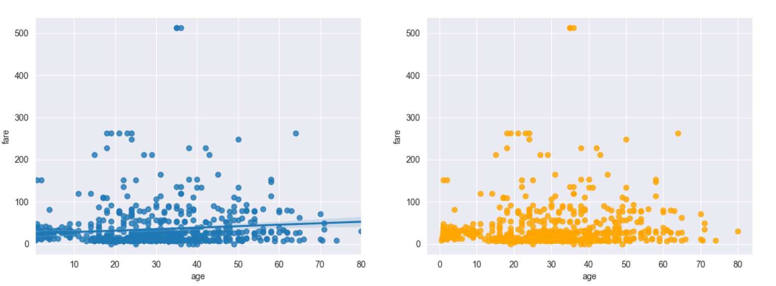
None1. 회귀선이 있는 산점도
- seaborn 라이브러리의 regplot() 함수는 서로다른 2개의 연속 변수 사이의 산점도를 그리고 선형회귀분석에 의한 회귀선을 함께 나타낸다.
- fit_reg=False 옵션을 설정하면 회귀선을 안보이게 할 수 있다.
ex)
import matplotlib.pyplot as plt
import seaborn as sns

titanic = sns.load_dataset('titanic')


# 스타일 테마 설정( 5가지 : darkgrid, whitegrid, dark, white, ticks)
sns.set_style('darkgrid')


fig = plt.figure(figsize=(15,5))

ax1= fig.add_subplot(1,2,1)
ax2= fig.add_subplot(1,2,2)


# 그래프 그리기 - 선형 회귀선 표시 (fig_reg=True)

sns.regplot(x='age', # x축 변수
            y='fare', # y축 변수
            data=titanic, # 데이터
            ax=ax1) # axe 객체 - 1번째그래프

sns.regplot(x='age',
            y='fare',
            data=titanic,
            ax=ax2,
            color='orange',
            fit_reg=False)


plt.show()
실행결과

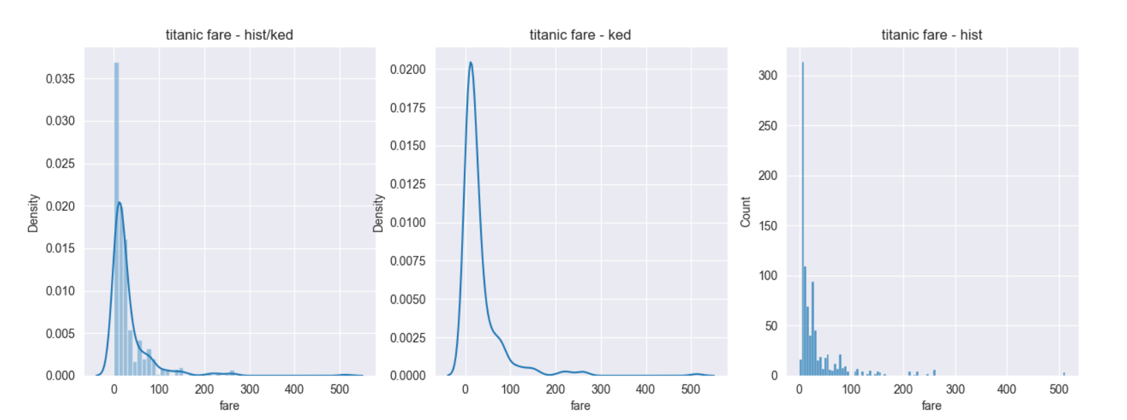
2. 히스토그램/ 커널 밀도그래프
-
단변수(하나의 변수) 데이터의 분포를 확인할 때 seaborn라이브러리의 distplot()함수를 이용한다. 기본값으로 히스토그램과 커널 밀도 함수를 그래프로 출력한다..
: 커널 밀도함는 그래프와 x축 사이의 면적이 1이 되도록 하는 밀도 분포 함수이다. -
커널 밀도 그래프를 표시하지않으려면 distplot()함수에 옵션으로 kde=False를 사용하면 된다.
-
커널 밀도 그래프만 그리려면 seaborn라이브러리의 kdeplot()함수를 이용한다.
-
히스토그램은 seaborn 라이브러리의 histplot()함수를 이용한다.
-
distplot()함수는 hisplot() + kdeplot() 형태이다.
import pandas as pd
import seaborn as sns
import matplotlib.pyplot as plt

titanic = sns.load_dataset('titanic')
sns.set_style('darkgrid')


fig = plt.figure(figsize=(15,5))

ax1 = fig.add_subplot(1,3,1)
ax2 = fig.add_subplot(1,3,2)
ax3 = fig.add_subplot(1,3,3)

# 밀도그래프
sns.distplot(titanic['fare'], ax=ax1)

sns.kdeplot(x='fare',data=titanic, ax=ax2)


# 히스토그램
sns.histplot(x='fare',data=titanic, ax=ax3)


ax1.set_title('titanic fare - hist/ked')

ax2.set_title('titanic fare - ked')

ax3.set_title('titanic fare - hist')


print(titanic.head())


plt.show()
실행결과
3. 히트맵
-
seaborn 라이브러리는 히트맵을 그리는 heatmap()메소드를 제공한다.
-
2개의 범주형 변수를 각각 x,y축에 놓고 데이터를 매트릭스 형태로 분류
ex)
import seaborn as sns
import matplotlib.pyplot as plt

titanic = sns.load_dataset('titanic')

sns.set_style('darkgrid')

# 피벗테이블로 범주형 변수를 각각 행, 열로 재구분하여 정리
## aggfunc='size'옵션은 데이터 값의 크기를 기준으로 집계한다는 뜻이다.
### 피벗테이블에 관하여 자세한건 나중에..

table = titanic.pivot_table(index=['sex'],columns=['class'],aggfunc='size')
히트맵 그리기
print(titanic.head())
print('\n)
print(table)

sns.heatmap(table, #데이터프레임
            annot=True,fmt='d', # 데이터 값 표시 여부, 정수형 포맷
            cmap='YlGnBu', # 컬러맵
            lw=5, # 구분 선
            cbar=True) # 컬러 바 표시 여부

plt.show()
실행결과
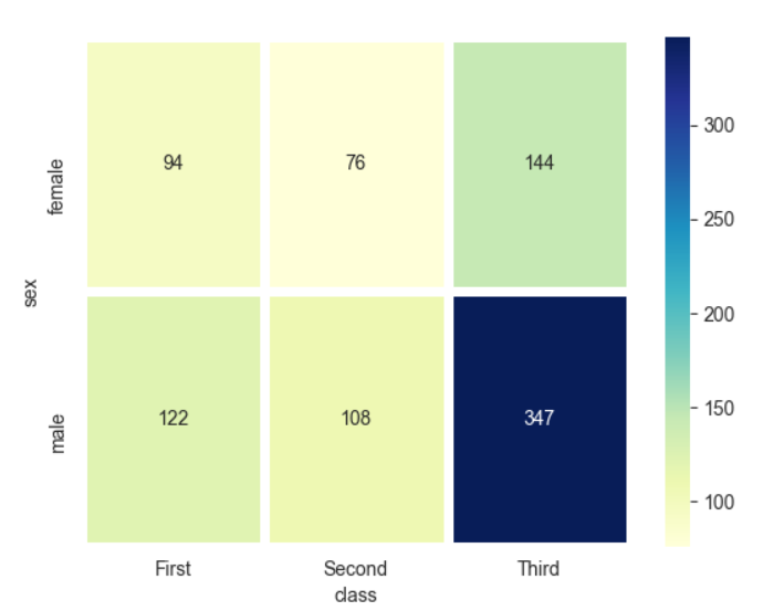
     survived  pclass     sex   age  sibsp  parch     fare embarked  class    who  adult_male deck  embark_town alive  alone
  0         0       3    male  22.0      1      0   7.2500        S  Third    man        True  NaN  Southampton    no  False
  1         1       1  female  38.0      1      0  71.2833        C  First  woman       False    C    Cherbourg   yes  False
  2         1       3  female  26.0      0      0   7.9250        S  Third  woman       False  NaN  Southampton   yes   True
  3         1       1  female  35.0      1      0  53.1000        S  First  woman       False    C  Southampton   yes  False
  4         0       3    male  35.0      0      0   8.0500        S  Third    man        True  NaN  Southampton    no   True

class   First  Second  Third
sex
female     94      76    144
male      122     108    347
-> 히트맵을 그려보면 타이타닉호에 여자승객보다 남자승객이 상대적으로 많은 편이다. 특히 3등석 남자 승객의 수가 압도적으로 많은걸 확인할 수 있다.
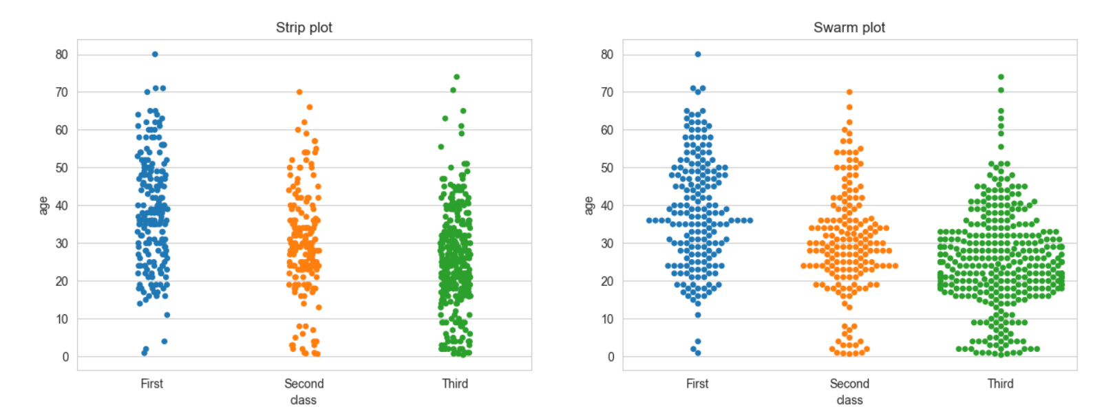
3. 범주형 데이터의 산점도
-
범주형 변수에 들어있는 각 범주별 데이터의 분포를 확인하는 방법이다.
-
seaborn 라이브러리의 stripplot()함수와 swarmplot() 함수를 사용할 수 있다.
-
swarmplot() 함수는 데이터의 분산까지 고려하여, 데이터 포인트가 서로 중복되지 않도록 그린다.
-> 즉, 데이터가 퍼져있는 정도를 입체적으로 볼수 있다. -
hue='열이름' 옵션을 사용하면 해당 열의 데이터값을 색깔로 구분하여 범례와함께 표시한다.
import matplotlib.pyplot as plt
import seaborn as sns

titanic = sns.load_dataset('titanic')

sns.set_style('whitegrid')

fig = plt.figure(figsize=(15,5))

ax1 = fig.add_subplot(1,2,1)
ax2 = fig.add_subplot(1,2,2)

sns.stripplot(x="class",
            y="age",
            data=titanic,
            ax=ax1)


sns.swarmplot(x="class",
            y="age",
            data=titanic,
            ax=ax2)


ax1.set_title('Strip plot')
ax2.set_title('Swarm plot')

plt.show()
실행결과
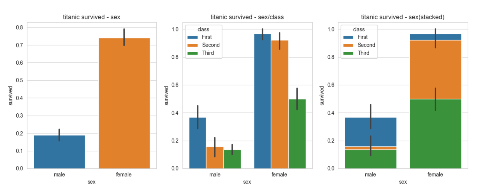
4. 막대형 그래프
-
seaborn 라이브러리의 barplot()함수 이용
-
dodge=False 옵션을 이용하면 누적그래프로 그릴수 있다.
# -*- coding: utf-8 -*-

# 라이브러리 불러오기
import matplotlib.pyplot as plt
import seaborn as sns

# Seaborn 제공 데이터셋 가져오기
titanic = sns.load_dataset('titanic')

# 스타일 테마 설정 (5가지: darkgrid, whitegrid, dark, white, ticks)
sns.set_style('whitegrid')

fig = plt.figure(figsize=(15,5))

ax1 = fig.add_subplot(1,3,1)
ax2 = fig.add_subplot(1,3,2)
ax3 = fig.add_subplot(1,3,3)

sns.barplot(x='sex',y='survived',data=titanic,ax=ax1)
sns.barplot(x='sex',y='survived',data=titanic,hue='class',ax=ax2)
sns.barplot(x='sex',y='survived',data=titanic,hue='class',dodge=False,ax=ax3)

ax1.set_title('titanic survived - sex')
ax2.set_title('titanic survived - sex/class')
ax3.set_title('titanic survived - sex(stacked)')

plt.show()
실행결과
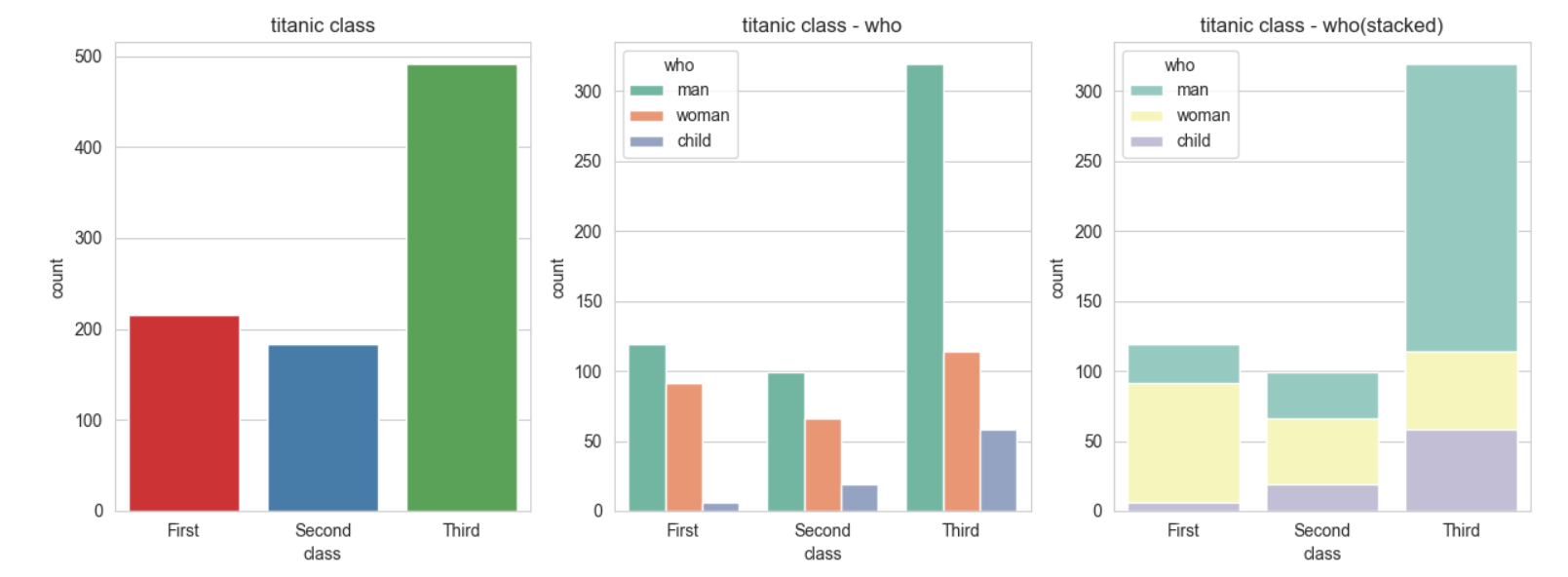
5. 빈도 그래프
- seaborn라이브러리의 countplot()함수를 이용한다.
- dodge=False 옵션을 이용하면 누적그래프로 그릴수 있다.
- Palette 옵션 (Set1,2,3 ... )을 이용하여 색구성을 다르게 할 수 있다.
# -*- coding: utf-8 -*-

# 라이브러리 불러오기
import matplotlib.pyplot as plt
import seaborn as sns

# Seaborn 제공 데이터셋 가져오기
titanic = sns.load_dataset('titanic')

# 스타일 테마 설정 (5가지: darkgrid, whitegrid, dark, white, ticks)
sns.set_style('whitegrid')

# 그래프 객체 생성 (figure에 3개의 서브 플롯을 생성)
fig = plt.figure(figsize=(15, 5))
ax1 = fig.add_subplot(1, 3, 1)
ax2 = fig.add_subplot(1, 3, 2)
ax3 = fig.add_subplot(1, 3, 3)

sns.countplot(data=titanic,x='class',palette='Set1',ax=ax1)

sns.countplot(data=titanic,x='class',palette='Set2',hue='who',ax=ax2)

sns.countplot(data=titanic,x='class',palette='Set3',hue='who',dodge=False,ax=ax3)

ax1.set_title('titanic class')
ax2.set_title('titanic class - who')
ax3.set_title('titanic class - who(stacked)')

plt.show()
실행결과
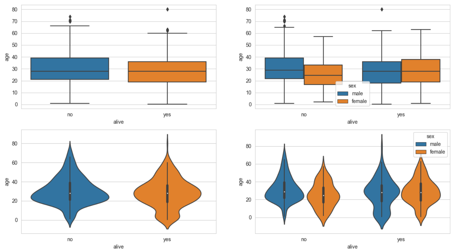
6. 박스플롯/ 바이올린 그래프
- 박스플롯은 숫자형 데이터 분포와 주요 통계 지표를 함께 제공한다.
- 하지만 분산의 정도는 정확히 알기 어렵기 때문에 커널 밀도 함수 그래프를 y축 방향에 추가하여 바이올린 그래프를 그리는 경우도 있다.
import seaborn as sns
import matplotlib.pyplot as plt

titanic = sns.load_dataset('titanic')

sns.set_style('whitegrid')

fig = plt.figure(figsize=(15,10))

ax1 = fig.add_subplot(2,2,1)
ax2 = fig.add_subplot(2,2,2)
ax3 = fig.add_subplot(2,2,3)
ax4 = fig.add_subplot(2,2,4)

sns.boxplot(data=titanic,x='alive',y='age',ax=ax1)
sns.boxplot(data=titanic,x='alive',y='age',hue='sex',ax=ax2)


sns.violinplot(data=titanic,x='alive',y='age',ax=ax3)
sns.violinplot(data=titanic,x='alive',y='age',hue='sex',ax=ax4)

plt.show()
실행결과
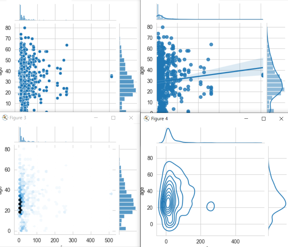
7. 조인트 그래프
- 조인트 그래프는
산점도를 기본으로 표시하고, x-y축에 각 변수에 대한 히스토그램을 동시에 보여준다.
- 따라서 두 변수의 관계와, 데이터가 분산되어 있는 정도를 한눈에 파악하기 좋다.
ex)
import seaborn as sns
import matplotlib.pyplot as plt

titanic = sns.load_dataset('titanic')

sns.set_style('whitegrid')


j1 = sns.jointplot(data=titanic,x='fare',y='age')

# kind='reg' -> 회귀선추가
j2 = sns.jointplot(data=titanic,x='fare',y='age',kind='reg')


# kind='hex' -> 육각산점도
j3 = sns.jointplot(data=titanic,x='fare',y='age',kind='hex')


# kind='kde' -> 커널밀도
j4 = sns.jointplot(data=titanic,x='fare',y='age',kind='kde')


plt.show()
실행결과
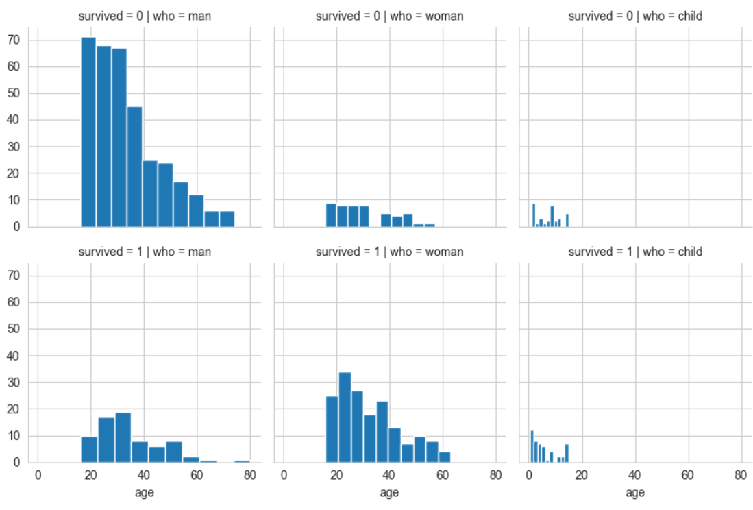
8. 조건을 적용하여 화면을 그리드로 분할하기
- Seaborn 라이브러리의 FacetGride()함수는 행, 열 방향으로 서로 다른 조건을 적용하여 여러개의 서브플롯을 만든다.
ex)
import seaborn as sns
import matplotlib.pyplot as plt

titanic = sns.load_dataset('titanic')

sns.set_style('whitegrid')

# 조건에 따라 그리드 나누기
# 행 = who, 열 = survived
g = sns.FacetGrid(data=titanic,col='who',row='survived')

# 그래프적용하기

g = g.map(plt.hist,'age')

plt.show()
실행결과
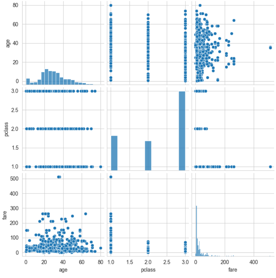
- 이변수 데이터의 분포
- pairplot() 함수는 인자로 전달되는 데이터프레임의 열을 두개씩 짝을 지을 수 있는 모든 조합에 대해 표현한다.
같은 변수끼리 짝을 이루는 대각선 방향으로는 히스토그램을 그리고
다른 변수 간에는 산점도를 그린다.
# -*- coding: utf-8 -*-

# 라이브러리 불러오기
import matplotlib.pyplot as plt
import seaborn as sns

# Seaborn 제공 데이터셋 가져오기
titanic = sns.load_dataset('titanic')

# 스타일 테마 설정 (5가지: darkgrid, whitegrid, dark, white, ticks)
sns.set_style('whitegrid')

# titanic 데이터셋 중에서 분석 데이터 선택하기
titanic_pair = titanic[['age','pclass', 'fare']]


# 조건에 따라 그리드 나누기
g = sns.pairplot(titanic_pair)

plt.show()
실행결과

210824