이전 포스트에서 선그래프와 그래프꾸미기(주석,범례,축라벨 등등), axe객체에 대해 알아 보았다. 그래프에는 선그래프 뿐만 아니라 여러가지 그래프들이 있는데 그 그래프에 대해 알아보자.
1. 면적 그래프
- 각 열의 데이터를 선그래프로 구현하는데, 선 그래프와 x축 사이의 공간에 색이 입혀진다.
- plot()메소드에 kind='area'옵션을 추가하면 된다.
- 그래프를 누적할지 여부를 설정할수 있는데 plot()메소드에 stacked = True 옵션을 사용하면 된다.
- 면적의 투명도를 plot()메소드에 alpha=투명도값(투명도:0~1범위)으로 설정할 수 있다.
# 라이브러리 불러오기
import pandas as pd
import matplotlib.pyplot as plt

# matplotlib 한글 폰트 오류 문제 해결
from matplotlib import font_manager, rc
font_path = r'C:\Users\kjt63\OneDrive\바탕 화면\python\data_analysis\sample\part4\malgun.ttf'   #폰트파일의 위치
font_name = font_manager.FontProperties(fname=font_path).get_name()
rc('font', family=font_name)


# Excel 데이터를 데이터프레임 변환

df = pd.read_excel(r'C:\Users\kjt63\OneDrive\바탕 화면\python\data_analysis\sample\part4\시도별 전출입 인구수.xlsx',engine='openpyxl',header=0)
df = df.fillna(method='ffill')


# 서울에서 다른 지역으로 이동한 데이터만 추출하여 정리
mask = (df['전출지별'] == '서울특별시') & (df['전입지별'] != '서울특별시')
df_seoul = df[mask]
df_seoul = df_seoul.drop(['전출지별'], axis=1)
df_seoul.rename({'전입지별':'전입지'}, axis=1, inplace=True)
df_seoul.set_index('전입지', inplace=True)

col_years = list(map(str,range(1970,2018)))


df_4 = df_seoul.loc[['충청남도','경상북도','강원도','전라남도'],col_years]
df_4= df_4.T


plt.style.use('ggplot')

# 데이터프레임의 인덱스를 정수형으로 변경

df_4.index = df_4.index.map(int)

df_4.plot(kind='area',stacked=False,alpha=0.2,figsize=(20,10))

plt.title('서울 -> 타도시 인구이동')
plt.xlabel('기간',size=10)
plt.ylabel('이동인구수',size=10)
plt.legend(loc='best',fontsize=15)

plt.show()
실행결과
    전입지    충청남도   경상북도    강원도   전라남도
      1970  15954  11868   9352  10513
      1971  18943  16459  12885  16755
      1972  23406  22073  13561  20157
      1973  27139  27531  16481  22160
      ...
      1999  26726  16604  25741  29161
      2000  23083  14576  22832  22969
      2012  22269  15191  22332  14765
      2013  21486  14420  20601  14187
      2014  21473  14456  21173  14591
      2015  22299  15113  22659  14598
      2016  21741  14236  21590  13065
      2017  21020  12464  21016  12426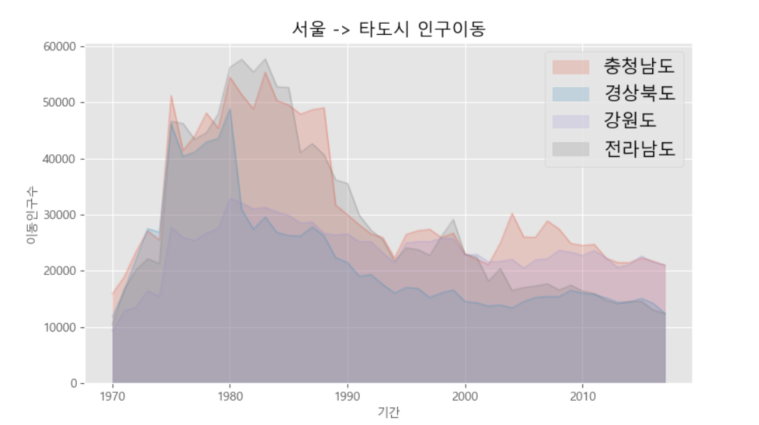
2. 막대 그래프
- 데이터 값의 크기에 비례하여 높이를 갖는 직사각형 막대로 표현
- 세로막대와 가로막대그래프가 있다.
- 세로막대는 kind='bar', 가로막대는 kind='bah'
2.1 세로막대그래프
import pandas as pd
import matplotlib.pyplot as plt

# matplotlib 한글 폰트 오류 문제 해결
from matplotlib import font_manager, rc
font_path = r'C:\Users\kjt63\OneDrive\바탕 화면\python\data_analysis\sample\part4\malgun.ttf'   #폰트파일의 위치
font_name = font_manager.FontProperties(fname=font_path).get_name()
rc('font', family=font_name)


# Excel 데이터를 데이터프레임 변환

df = pd.read_excel(r'C:\Users\kjt63\OneDrive\바탕 화면\python\data_analysis\sample\part4\시도별 전출입 인구수.xlsx',engine='openpyxl',header=0)
df = df.fillna(method='ffill')


# 서울에서 다른 지역으로 이동한 데이터만 추출하여 정리
mask = (df['전출지별'] == '서울특별시') & (df['전입지별'] != '서울특별시')
df_seoul = df[mask]
df_seoul = df_seoul.drop(['전출지별'], axis=1)
df_seoul.rename({'전입지별':'전입지'}, axis=1, inplace=True)
df_seoul.set_index('전입지', inplace=True)

col_years = list(map(str,range(2010,2018)))

df_4 = df_seoul.loc[['충청남도','경상북도','강원도','전라남도'],col_years]
df_4 = df_4.T

plt.style.use('ggplot')


df_4.index = df_4.index.map(int)

df_4.plot(kind='bar',figsize=(20,10),width=0.7,color=['orange','green','skyblue','blue'])

plt.title('서울 -> 타시도 인구이동')
plt.xlabel('연도',size=20)
plt.ylabel('이동 인구수',size=20)
plt.ylim(5000,30000)
plt.legend(loc='best',fontsize=15)

plt.show()
실행결과

2-2. 가로막대그래프
- kind='barh'옵션 사용
# 라이브러리 불러오기
import pandas as pd
import matplotlib.pyplot as plt
# matplotlib 한글 폰트 오류 문제 해결
from matplotlib import font_manager, rc
font_path = r'C:\Users\kjt63\OneDrive\바탕 화면\python\data_analysis\sample\part4\malgun.ttf' #폰트파일의 위치
font_name = font_manager.FontProperties(fname=font_path).get_name()
rc('font', family=font_name)
# Excel 데이터를 데이터프레임 변환
df = pd.read_excel(r'C:\Users\kjt63\OneDrive\바탕 화면\python\data_analysis\sample\part4\시도별 전출입 인구수.xlsx',engine='openpyxl',header=0)
df = df.fillna(method='ffill')
# 서울에서 다른 지역으로 이동한 데이터만 추출하여 정리
mask = (df['전출지별'] == '서울특별시') & (df['전입지별'] != '서울특별시')
df_seoul = df[mask]
df_seoul = df_seoul.drop(['전출지별'], axis=1)
df_seoul.rename({'전입지별':'전입지'}, axis=1, inplace=True)
df_seoul.set_index('전입지', inplace=True)
col_years = list(map(str,range(2010,2018)))
df_4 = df_seoul.loc[['충청남도','경상북도','강원도','전라남도'],col_years]
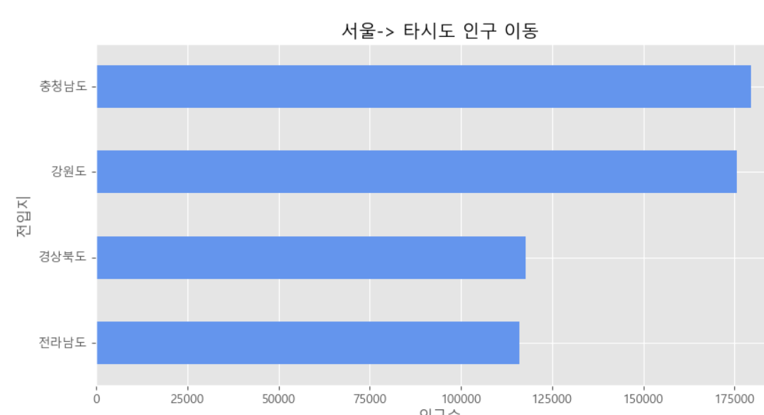
# 각각의 행들의 합을 '합계'열을 새로만들어서 추가
df_4['합계'] = df_4.sum(axis=1)
print(df_4)
# '합계'열을 오름차순 정렬후 df_total에 대입
df_total = df_4['합계'].sort_values(ascending=True)
print(df_total)
plt.style.use('ggplot')
df_total.plot(kind='barh',color='cornflowerblue',width=0.5,figsize=(10,5))
plt.title('서울-> 타시도 인구 이동')
plt.ylabel('전입지')
plt.xlabel('인구수')
plt.show()실행결과
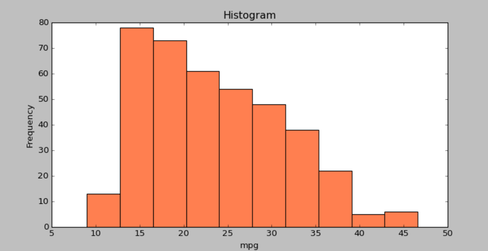
3. 히스토그램
- 히스토그램은 변수가 하나인 단변수 데이터의 빈도수를 그래프로 표현한다.
import pandas as pd
import matplotlib.pyplot as plt

plt.style.use('classic')

df = pd.read_csv(r'C:\Users\kjt63\OneDrive\바탕 화면\python\data_analysis\sample\part4\auto-mpg.csv',header=None)

df.columns = ['mpg','cylinders','displacement','horsepower','weight',
              'acceleration','model year','origin','name']


df['mpg'].plot(kind='hist',bins=10,color='coral',figsize=(10,5))

print(df['mpg'])


plt.title('Histogram')
plt.xlabel('mpg')
plt.show()
실행결과
0 18.0
1 15.0
2 18.0
3 16.0
4 17.0
...
393 27.0
394 44.0
395 32.0
396 28.0
397 31.0
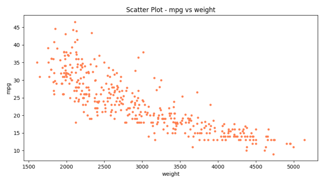
4. 산점도
- 서로 다른 두 변수사이의 관계를 나타내는 그래프
- 이때 각 변수는 연속되는 값을 갖는다. (일반적으로 정수형, 실수형)
- plot() 메소드에 'o' 옵션을 사용하면 선없이 점으로만 표현하는데 산점도라고 볼수 있다.
- plot() 메소드에 kind='scatter' 옵션을 사용하면 산점도를 그린다.
- x축과 y축 옵션을 지정해주어야한다.
ex1)
import pandas as pd
import matplotlib.pyplot as plt

plt.style.use('default')

df = pd.read_csv(r'C:\Users\kjt63\OneDrive\바탕 화면\python\data_analysis\sample\part4\auto-mpg.csv',header=None)

df.columns = ['mpg','cylinders','displacement','horsepower','weight',
              'acceleration','model year','origin','name']


# c는 color, s는 size를 나타냄
df.plot(kind='scatter',x='weight',y='mpg',c='coral',s=10,figsize=(10,5))
plt.title('Scatter Plot - mpg vs weight')
plt.show()
실행결과
- 세번째 변수를 추가하여 점의크기를 상이하게 할 수 있다.
- plt.savefig() 메소드를 사용하여 사진을 저장할 수 있다.
transparent=True 옵션을 사용하면 배경을 투명하게 할 수 있다.
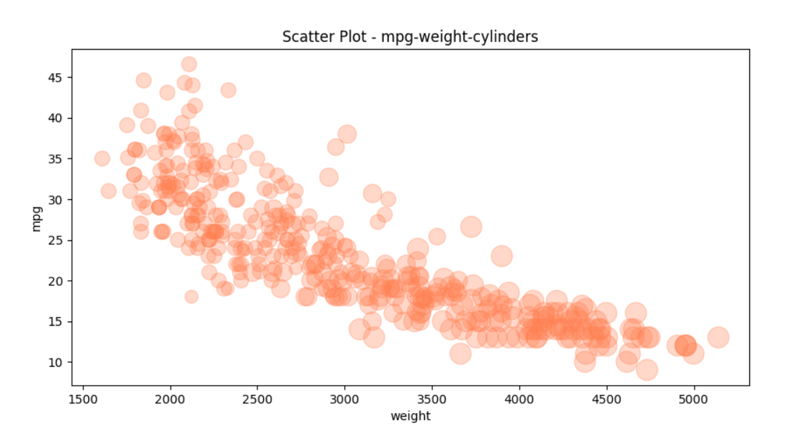
ex2)
import pandas as pd
import matplotlib.pyplot as plt

plt.style.use('default')

df = pd.read_csv(r'C:\Users\kjt63\OneDrive\바탕 화면\python\data_analysis\sample\part4\auto-mpg.csv',header=None)

df.columns = ['mpg','cylinders','displacement','horsepower','weight',
              'acceleration','model year','origin','name']

# 비율 지정
cylinders_size = df.cylinders/df.cylinders.max() * 300

print(cylinders_size)

df.plot(kind='scatter',x='weight',y='mpg',c='coral',s=cylinders_size,figsize=(10,5),alpha=0.3)
plt.title('Scatter Plot - mpg-weight-cylinders')

# 파일 저장
plt.savefig(r'C:\Users\kjt63\OneDrive\바탕 화면\python\data_analysis\part4.visualization_tool\scatter.png')
plt.savefig(r'C:\Users\kjt63\OneDrive\바탕 화면\python\data_analysis\part4.visualization_tool\scatter_transparent.png',transparent=True)

plt.show()
실행결과
cylinders_size :
0 300.0
1 300.0
2 300.0
3 300.0
4 300.0
...
393 150.0
394 150.0
395 150.0
396 150.0
397 150.0
5. 파이차트
- 파이차트는 원을 파이조각 처럼 나눠 표현한다.
- plot() 메소드에 kind='pie'를 사용한다.
import pandas as pd
import matplotlib.pyplot as plt

plt.style.use('default')

df = pd.read_csv(r'C:\Users\kjt63\OneDrive\바탕 화면\python\data_analysis\sample\part4\auto-mpg.csv',header=None)

df.columns = ['mpg','cylinders','displacement','horsepower','weight',
              'acceleration','model year','origin','name']


# 데이터 개수 카운트를 위해 값 1을가진 열추가
df['count']=1

# origin 열을 기준으로 그룹화, 합계연산
df_origin = df.groupby('origin').sum()

print(df_origin)

df_origin.index=['USA','EU','JPN']

df_origin['count'].plot(kind='pie',
                        figsize=(7,5),
                        autopct='%1.1f%%', # 퍼센트 %표시
                        startangle=10, # 파이 조각을 나누는 시작점(각도표시)
                        colors=['chocolate','bisque','cadetblue'] # 색상 리스트
                        )

plt.title('Model Origin',size=30)
plt.axis('equal') # 파이 차트의 비율을 같게(원에가깝게) 조정
plt.legend(loc='upper right') # 범례표시
plt.show()
실행결과
       mpg  cylinders  displacement    weight  acceleration  model year  count
origin
1       5000.8       1556       61229.5  837121.0        3743.4       18827    249
2       1952.4        291        7640.0  169631.0        1175.1        5307     70
3       2405.6        324        8114.0  175477.0        1277.6        6118     79
6. 박스플롯
-
박스플롯은 범주형 데이터의 분포를 파악하는데 적합하다.
-
박스플롯 구조
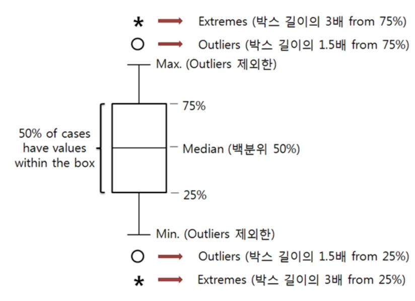
ex)
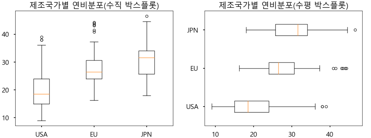
import pandas as pd
import matplotlib.pyplot as plt

# matplotlib 한글 폰트 오류 문제 해결
from matplotlib import font_manager, rc
font_path = r'C:\Users\kjt63\OneDrive\바탕 화면\python\data_analysis\sample\part4\malgun.ttf'   #폰트파일의 위치
font_name = font_manager.FontProperties(fname=font_path).get_name()
rc('font', family=font_name)

plt.style.use('seaborn-poster')

# 마이너스 부호 출력여부
plt.rcParams['axes.unicode_minus']=False

df = pd.read_csv(r'C:\Users\kjt63\OneDrive\바탕 화면\python\data_analysis\sample\part4\auto-mpg.csv',header=None)

df.columns = ['mpg','cylinders','displacement','horsepower','weight',
              'acceleration','model year','origin','name']

fig = plt.figure(figsize=(15,5))

ax1 = fig.add_subplot(1,2,1)
ax2 = fig.add_subplot(1,2,2)

ax1.boxplot(x=[
                df[df['origin']==1]['mpg'] ,
                df[df['origin']==2]['mpg'] ,
                df[df['origin']==3]['mpg']
              ],
                labels=['USA','EU','JPN'])

ax2.boxplot(x=[
                df[df['origin']==1]['mpg'] ,
                df[df['origin']==2]['mpg'] ,
                df[df['origin']==3]['mpg'] ,
              ],
                labels=['USA','EU','JPN'],
                vert=False)


ax1.set_title('제조국가별 연비분포(수직 박스플롯)')
ax2.set_title('제조국가별 연비분포(수평 박스플롯)')
plt.show()
실행결과
7. 2축 그래프 그리기
지금까지 그래프를 그릴때 y축을 하나만 사용했다. Excel 에서 차트를 그릴때처럼 보조 축을 추가하여 2개의 y축을 갖는 그래프를 그릴수 있다.
ex)

남북한 발전량 데이터셋을 사용하여 보조축을 설정하는 방법을 살펴보자.
기존 축에는 막대그래프의 값을 표시하고, 보조 축에는 선 그래프의 값을 표시한다.
막대그래프는 연도별 북한의 발전량을 나타내고, 선 그래프는 북한 발전량의 전년대비 증감률을 백분률로 나타낸다.
1.증감률을 계산하기 위해서 rename()메소드로 '합계'열의 이름을 '총발전량'으로 바꾸고,
2. shift() 메소드를 이용하여 '총발전량'열의 데이터를 1행씩 뒤로 이동시켜 '총발전량-1년'열을 새로 생성한다.
3. 그리고 두 열의 데이터를 이용해 전년도 대비 변동율을 계산한 결과를 '증감률' 열에 저장한다.
import pandas as pd
import matplotlib.pyplot as plt

# matplotlib 한글 폰트 오류 문제 해결
from matplotlib import font_manager, rc
font_path = r'C:\Users\kjt63\OneDrive\바탕 화면\python\data_analysis\sample\part4\malgun.ttf'   #폰트파일의 위치
font_name = font_manager.FontProperties(fname=font_path).get_name()
rc('font', family=font_name)

plt.style.use('ggplot')

# 마이너스 부호 출력 여부
plt.rcParams['axes.unicode_minus']=False

df = pd.read_excel(r'C:\Users\kjt63\OneDrive\바탕 화면\python\data_analysis\sample\part4\남북한발전전력량.xlsx',engine='openpyxl',
                  convert_float=True)

df = df.loc[5:9]
df.drop('전력량 (억㎾h)',axis=1,inplace=True)

df.set_index('발전 전력별',inplace=True)

print(df)

df= df.T

df = df.rename(columns={'합계':'총발전량'})

print(df)


# 증감률 계산

# 총발전량-1년 열추가 = 총발전량 열의 데이터를 1칸씩 뒤로이동
df['총발전량-1년'] = df['총발전량'].shift(1)
df['증감률'] = ((df['총발전량']/df['총발전량-1년'])-1)* 100


# 2축 그래프 그리기
ax1 = df[['수력','화력']].plot(kind='bar',figsize=(20,10),width=0.7,stacked=True)

## ax1의 쌍둥이객체 -> ax2
ax2 = ax1.twinx()

# ls(line style) = '--' 점선 으로 설정
ax2.plot(df.index,df.증감률,ls='--',marker='o',markersize=20,color='red',label='전년대비 증감률(%)')

ax1.set_ylim(0,500)
ax2.set_ylim(-50,50)

ax1.set_xlabel('연도',size=20)
ax1.set_ylabel('발전량 (억wkh)')
ax2.set_ylabel('전년대비 즘감률(%)')

plt.title('북한 전력 발전량 (1990-2016)',size=20)
ax1.legend(loc='upper left')

plt.show()
실행결과