TIL
👍🏼 감상
.gif)
📙 열품타 8hour
👍🏼 적당하게 공부
👎🏼 적당하게 공부
🚀 목표
- 노마드 코더 React 복습 (-3/27)
- Udemy에서 Javascript 강좌 수강하기 (134/682)
- 매일 커밋 연속 30일 달성하기 (6/30, 3.26 완료)
- 3.24 발견 노션으로 옮기기
- 내일배움카드 신청
- 18시간 도전해보기
- CSS 파트 완료, 위키로 복습해보기
[링크 목록]
The Web Developer Bootcamp 2021
MDN CSS Reference
Google Fonts
드림코딩 Flexbox (CSS의 꽃)
Material Design color tool
A complete guide to flexbox
플랙스박스 연습하기: Flexbox Froggy
CSS Reset
BootStrap
Semantic UI
📣 The Web Developer Bootcamp 2021: 9.97-12.120
css background
background-image: url("");
background-size: cover;
background-position: bottom;
(or)
background: coenter/40% no-repeat url(""), blue; -> background 여러개 가지는 법
google font
link -> html
font-family-> css
body { font-family: Monstserrat, sans-serif; }
main { width: 60%; margin: 0 auto; }
h1 { font-size: 3rem; margin-bottom: 0; }
h1 + h2 { margin-top: 10px; }
h1, h2, h3 { font-family: Roboto, sans-serif; font-weight: 100; }
Photo Blog CodeAlong
<span>Hello</span>
<span>World</span>
<!-- 이렇게 하면 사이에 공간 생김-->

<span>Hello</span><span>World</span>
<!-- 이렇게 하면 안 생김, jam together-->

<img src=""><img src="">
<!-- 이것도 마찬가지임-->
<img src="">
<img src="">
-> 근데 이 문제가 flexbox로 해결이 됨
⭐️ Responsive CSS, Flexbox
이번 내용은 모두 중요함
flexbox
참고 사이트: airbnb
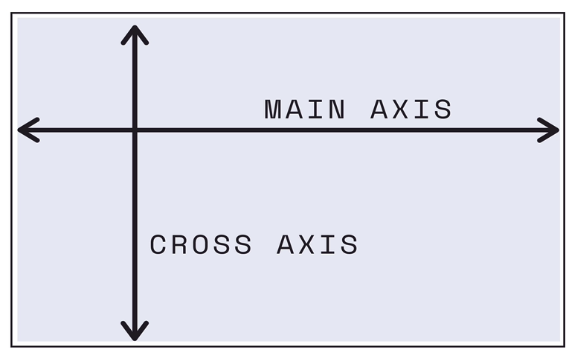
한 컨테이너 안에서 공간을 어떻게 나눌 것인가.
one-dimensional layout method for laying out items in rows or columns
recent addition to css, allows to distribute space dynamically across elements of and unknown size, hence the term "flex"
display: flex; ("야, 너네 이제 flexbox야")
flex-direction: row; (default)
flex-direction: row-reverse; (순서를 바꾸고 시작점이 왼쪽에서 오른쪽으로 이동)
flex-direction: column; (main-axis goes from top to bottom)
flex-direction: column-reverse;
justify-content: flex-start; (default)
justify-content: flex-end; (시작점이 반대로 이동, 순서는 바뀌지 않음)
justify-content: center;
justify-content: space-between; (0 1 1 1 1 0)
justify-content: space-around; (1 2 2 2 2 1)
justify-content: space-evenly; (2 2 2 2 2 2)
flex-wrap: wrap;
원래는 container가 작으면 content가 shrink되지만 wrap을 쓰면 new column이 생기며 안 그러게 됨
flex-wrap: wrap-reverse; (cross-axis가 반대로)
align-items: flex-start; (default, align along the beginning of cross axis)
align-items: flex-end; (cross-axis 반대부터 시작)
align-items: center; (center horizantly and vertically)
align-items: baseline; (text의 baseline에 맞춰 align, text 크기나 element's height 다를 때 유용할 수 있음)
aligh-content: space-between;
aligh-content: flex-start;
드림코딩 Flexbox (CSS의 🌸)
position float table 로는 안 되는 것들을 가능하게 해줌
float
원래는 텍스트와 이미지 배치에 활용
float: left; 이미지가 왼쪽 배치, 텍스트가 이미지 감싸면서 오른쪽에 배치 (right, center)
1) flexbox는 컨테이너(박스)에 적용되는 속성값이 존재, 그 안의 각각 item에 적용할 수 있는 속성값 존재
2) main axis 와 반대인 cross axis 존재
contaier에는 display, flex-direction, flex-wrap, flex-flow, justify-content, aligh-items, align-content
item에는 order, flex-grow, flex-shirink, flex, align-self
🔸 빠르게 여러 박스 만들 수 있는 방법
div.container>div.item.item{}*10 + tab
<div class="container">
  <div class="item itme1">1</div> *10
</div>
height: 100% (컨테이너의 부모의 높이(body)에 맞춤)
height: 100vh (부모에 상관없이 보이는 view point의 100퍼센트를 다 쓰겠다)
flex-row: row;
flex-wrap: nowrap; (default)
이 두 개를 합쳐서 쓸 수 있다
flex-flow: row nowrap;
justify-content : 아이템 어떻게 배치할건지? (중심축)
flex-direction: 순서 바뀜, justify-content: 순서 안 바뀜
align-items: 아이템 배치 (반대축)
align-content: (반대축)
.item1 { order:2; } 를 통해서 1번째 아이템을 두번째로 이동시킬 수 있다 -> 하지만 안 쓰임
flex-grow: 0; (default)
flex-grow: 1; (전체를 꽉 채우려고 하게 됨)
flex-shirink: 0; (default)
flex-shirink: 2; (줄어들 때 두 배로 더 작게 줄어들기)
flex-basis: auto; (dafault)
flex-basis: 60%; (항상 60퍼센트 차지)
align-self: center; 아이템 별로 정렬, 하나만 다르게 하고 싶을 때
align-self: fix-end;
flex-basis: the initial size that element should be added into our box as and it might be with it might be a height or width depending on the main axis direction.
flex-grow: controls the amount of available space an element should take up.
flex-shrink:
max-width, min-width로 더 설정할 수 있음
div: nth-of-type(5) { flex-grow: 2; }
flex shorthand
flex: 1;
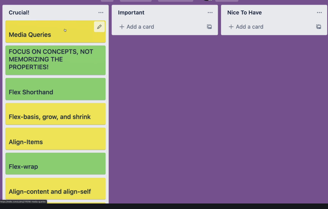
Responsive Design & Media Queries
@media (min-width: 800px) {h1 { color: purple; }}
building a responsive nav
Pricing panel project(Done)
Bootstrap
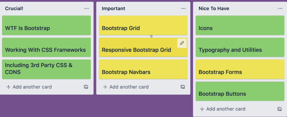
Bootstrap: Components, Grid System
bootstrap 사용예시: blackbox
bootstrap 사용예시: taskade