storybook을 쓰는 이유
다양한 커스터 마이징을 설정할 수 있다.
button만 컴포넌트 해서 만들기
- AntButton/index.js
import { Button } from 'antd'
import React from 'react'

const AntButton = ({
  text,
  type,
  size = 'default',
  className = '',
  htmlType = '',
  color,
}) => {
  const shapeStyle = {
    width: size,
    height: size,
    backgroundColor: color,
  }

  return (
    <>
      <Button
        type={type}
        style={{ ...shapeStyle }}
        className={className}
        htmlType={htmlType}
      >
        {text}
      </Button>
    </>
  )
}

export default AntButton
받아온 값들에 따라 text는 버튼의 text에 적용되고 그외에 color나 css관련은 shapeStyle에 넣어 width와 height backgroundColor가 적용되게 처리했다.
(이때 background-color가 아닌 backgroundColor로 적용시켜야한다. )
컴포넌트한 버튼과 ant-design 버튼
import AntButton from '@AntDesign/AntButton'
import { Form, Input, Button, Checkbox } from 'antd'
....

	<AntButton
            text="Log in(storybook use)"
            type="primary"
            size="large"
            htmlType="submit"
            className="login-form-button"
          />

          <Button
            type="primary"
            className="login-form-button"
            htmlType="butmit"
            style={{ width: 'large', height: 'large' }}
          >
            Log in(storybook not use)
          </Button>
AntButton 컴포넌트의 경우 위에서 만든 부분에서 가져온 내용이고
Button 컴포넌트의 경우 antd에서 import한 Button이다.

두 결과를 보면 결과 자체는 같다.
하지만 차이는 모듈화한 AntButton은 우리가 원하는 대로 storybook에서 커스터마이징이 가능하다.
storybook 사용하기
- Button.stories.js
import AntButton from '@components/AntDesign/AntButton'

export default {
  title: 'Component/AntButton',
  component: AntButton,
  argTypes: {
    text: { defaultValue: 'button!!!', control: 'text' },
    size: { defaultValue: 100, control: { type: 'range', min: 80, max: 300 } },
    className: { control: 'className' },
    color: { defaultValue: '#abd', control: 'color' },
  },
}

export const Default = (args) => {
  return <AntButton {...args}></AntButton>
}
모듈화 시킨 AntButton에 대해서 import를 하고 해당 argTypes에 따라
기본적인 defaultValue를 설정지을 수 있고
control을 통해 원하는 대로 커스터마이징 그외에 type을 통해 최소 최대 크기설정도 가능하다.
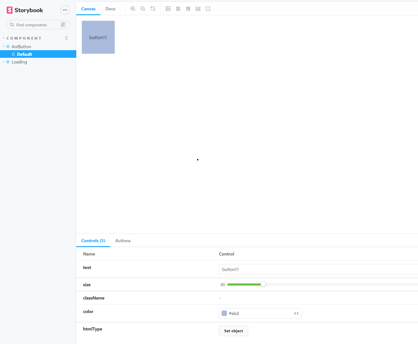
- 해당 부분은 defaultValue로
button!!!을 설정한 것과 defaultValue로 색상을#abd를 설정한 것이 적용된 것을 알 수 있고 이것을 커스터마이징이 가능하다.
정리
우리는 button을 그냥 ant-design에서 가져와 쓸 수도 있다.
하지만 해당 button을 우리의 원하는 대로 컴포넌트로 분리하여 사용하면
쉽게 해당 모듈에 대한 커스터 마이징이 가능하다.
추가내용
혹시나 안되면 pacakge.json에 해당 ant-design을 적용시킬 storybook 부분도 다운로드 해보자
  "devDependencies": {
    "@craco/craco": "^6.3.0",
    "@emotion/babel-plugin": "^11.3.0",
    "@emotion/babel-preset-css-prop": "^11.2.0",
    "@storybook/addon-actions": "^6.3.12",
    "@storybook/addon-essentials": "^6.3.12",
    "@storybook/addon-links": "^6.3.12",
    "@storybook/node-logger": "^6.3.12",
    "@storybook/preset-ant-design": "^0.0.2",
    "@storybook/preset-create-react-app": "^3.2.0",
    "@storybook/react": "^6.3.12"
  },
나의 하루를 가능한 기억하고 즐기고 후회하지말자