
Transform
: HTML 요소의 모양, 크기, 위치 등을 자유롭게 바꿀 수 있는 속성
- Translate
: 선택한 오브젝트의 위치를 변경하는 속성
.translate { transform: translate(50px, 100px); }
/*현재 위치에서 x축으로 50px, y축으로 100px만큼 이동함*/
예제
<div>의 위치를 x축으로 100px, y축으로 200px만큼 이동하려고 할 때 코드를 수정해보자.
<!DOCTYPE html>
<html>
<head>
<style>
div {
  width: 200px;
  height: 100px;
  background-color: pink;
  border: 2px solid red;
}
</style>
</head>
<body>

<h1>The translate() Method</h1>
<div>Example</div>

</body>
</html>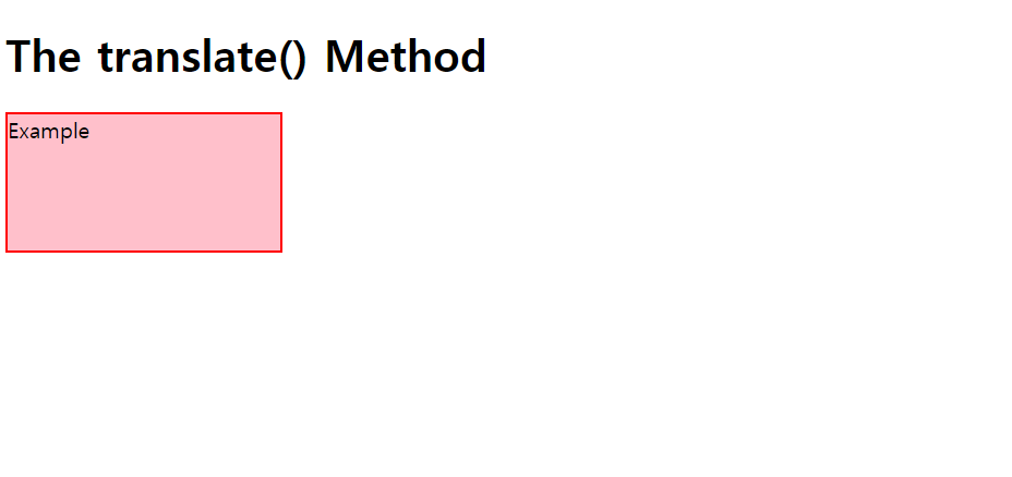
<div> 안에 traslate 속성을 추가해서 아래와 같이 변경하면,
div {
  width: 200px;
  height: 100px;
  background-color: pink;
  border: 2px solid red;
  transform: translate(100px,100px);
}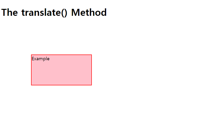
<div> 의 위치가 변경된 것을 확인할 수 있다.
- Skew
: 오브젝트를 x축과 y축을 기준으로 입력한 각도만큼 비트는 속성
.skew { transform: skew(20deg, 10deg); }
/* 오브젝트를 x축으로 20도, y축으로 10도 비틀기 */
예제
<div>를 x축으로 10도, y축으로 20도만큼 기울이려고 할 때 코드를 수정해보자.
<!DOCTYPE html>
<html>
    <head>
        <title>The skew() Method</title>
        <style>
            div {
                width : 300px;
                height : 100px;
                background-color : yellow;
                border : 2px solid orange;
            }
        </style>
    </head>
    <body>
        <h1>The skew() Method</h1>
        <div>This is an example of skew() Method.</div>
    </body>
</html>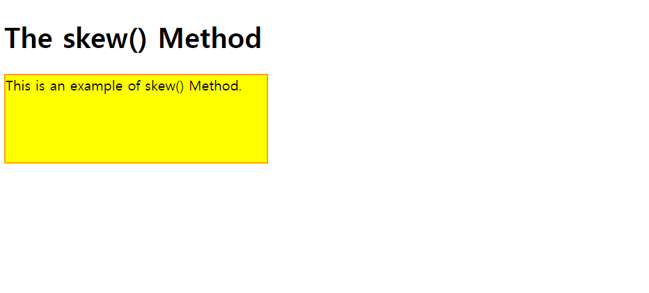
<div> 안에 skew 속성을 추가해서 아래와 같이 변경하면,
div {
	width : 300px;
	height : 100px;
	background-color : yellow;
	border : 2px solid orange;
	transform : skew(10deg, 20deg);
}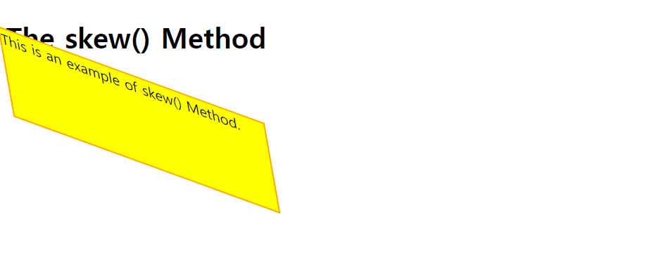
<div> 의 각도가 비틀어져서 나타난 것을 확인할 수 있다.
- Rotate
: 오브젝트를 주어진 각도만큼 시계방향/반시계방향으로 회전시키는 속성
.rotate { transform: rotate(20deg); }
/* 오브젝트를 시계방향으로 20도 회전하기 */
.rotate { transform: rotate(-40deg); }
/* 오브젝트를 반시계방향으로 20도 회전하기 */
예제
클래스
example1를 시계방향으로 15도, 클래스example2를 반시계방향으로 30도 회전시키자.
<!DOCTYPE html>
<html>
    <head>
        <title>The rotate() Method</title>
        <style>
            div {
                width : 200px;
                height : 150px;
                background-color : skyblue;
                border : 2.5px solid black;
          		margin : 50px;
            }
        </style>
    </head>
    <body>
        <h1>The rotate() Method</h1>
        <div class="example1">Example1</div>
      <br>
      	<div class="example2">Example2</div>
    </body>
</html>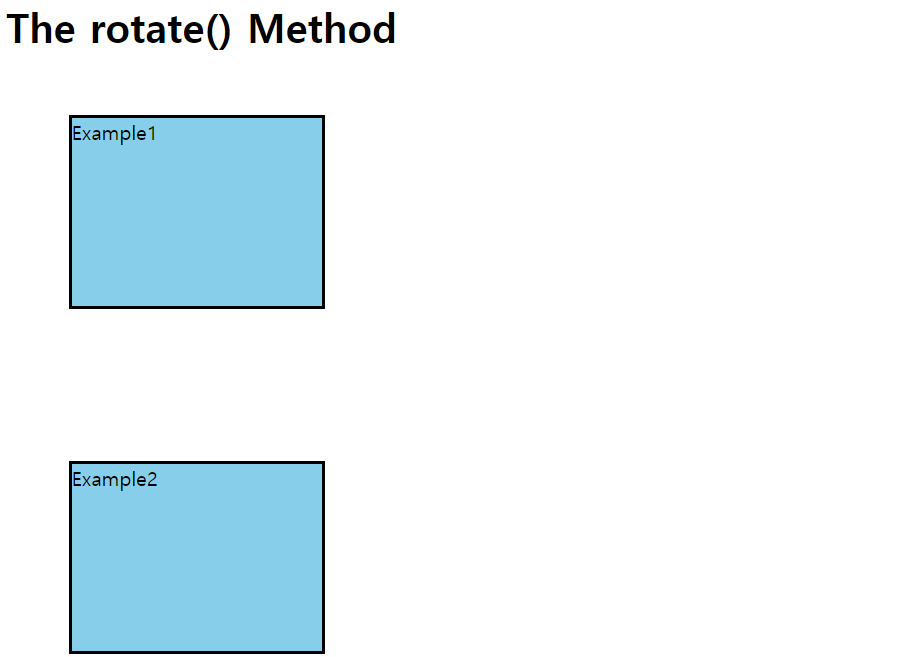
<style> 안에 rotate 속성을 추가해서 아래와 같이 변경하면,
<style>
	div {
		width : 200px;
		height : 150px;
		background-color : skyblue;
		border : 2.5px solid black;
        margin : 50px;
	}

	.example1 {
		transform : rotate(15deg);
	}
	.example2 {
		transform : rotate(-30deg);
	}
}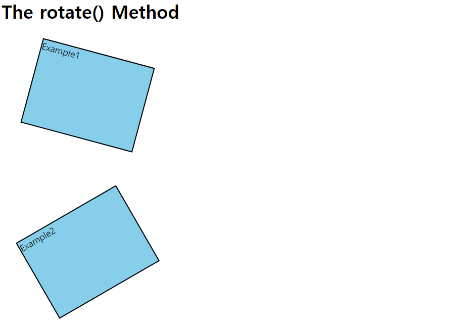
<example1> 은 우측으로 15도,<example2> 는 좌측으로 30도 기울어져 나타난 것을 확인할 수 있다.
- Scale
: 오브젝트의 크기를 변형시키는 속성
/* increase scale */
.scale { transform: scale(2, 3); }
/* width의 2배, height의 3배인 크기로 변형하기 */

/* decrease scale */
.scale { transform: scale(0.5, 0.5); }
/* width의 0.5배, height의 0.5배인 크기로 변형하기 */
예제
가로가 300px, 세로가 100px인 박스를
scale속성을 이용하여 기존 박스에서 가로가 1.5배, 세로가 2배된 박스로 변형시키자.
<!DOCTYPE html>
<html>
    <head>
        <meta charset="UTF-8">
        <html lan = "EN">
        <link rel="stylesheet" href="index.css">
        <title>The scale() Method</title>
        <style>
            div {
                width : 300px;
                height : 100px;
                background-color : pink;
                border : 3px solid red;
                margin : 100px;
            }
        </style>
    </head>
    <body>
        <h1>The scale() Method</h1>
        <div>Example</div>
    </body>
</html>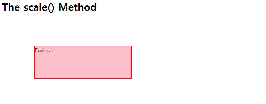
<style> 시트 안에 있는 div 내부에 transform : scale(1.5, 2); 을 추가해주면,
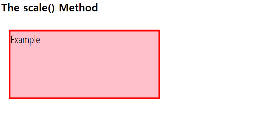
기존에 설정한 width의 1.5배, height의 2배인 크기의 <div> 박스가 나타난다.
- Matrix
: 모든 Tramsform 속성을 하나로 결합한 속성
matrix(scaleX(), skewY(), skewX(), scaleY(), translateX(), translateY()).matrix { transform: matrix(1, -0.3, 0, 1, 0, 0); }
/* 기존 오브젝트에서 scale(1, 0), skew(-0.3, 0), translate(0,0)을 전부 적용 */Ref. w3schools