
오늘은 주식이나 코인의 차트를 만드는 방법에 대해 작성해보고자 한다.
안드로이드 앱에서 차트 기능을 구현하기 위해서는 여러가지 방법이 있겠지만, 이 글에서는 MPAndroidChart 라이브러리를 사용할 예정이다.
그럼 지금부터 주식&코인 차트를 만드는 방법에 대해 알아보자!
MPAndroidChart를 사용하기 위한 설정
MPAndroidChart를 사용하기 위해서는 우선 안드로이드 스튜디오에 라이브러리를 추가해야 한다.
아래의 링크를 타고 들어가면 그 방법이 자세하게 나와있으니, 참고하면 될 것 같다.
https://github.com/PhilJay/MPAndroidChart
데이터 구조
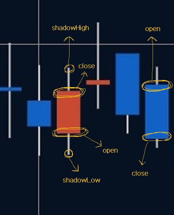
주식&코인 차트는 캔들 차트이므로, MPAndroidChart의 CandleStickChart를 사용해야 한다.
CandleStickChart를 만드는데 필요한 데이터는 다음과 같다.
createdAt: 캔들의 x좌표
open: 시가
close: 종가
shadowHigh: 장중 최고가
shadowLow: 장중 최저가
빨간색 캔들은 양봉, 파란색 캔들은 음봉이기 때문에 서로 open과 close의 위치가 반대가 된다.
내가 사용한 데이터 클래스는 아래와 같다.
data class Candle(
    val createdAt: Long,
    val open: Float,
    val close: Float,
    val shadowHigh: Float,
    val shadowLow: Float
)
createAt 은 나중에 Float 타입으로 변환하여 사용하기 때문에, 특별한 이유가 있지 않는 이상 Float 타입으로 선언해서 사용하는 것이 더 좋을 것 같다.
차트 그리기
우선 Activity 또는 Fragment에 CandleStickChart를 추가해준다.
<?xml version="1.0" encoding="utf-8"?>
<LinearLayout xmlns:android="http://schemas.android.com/apk/res/android"
    xmlns:tools="http://schemas.android.com/tools"
    android:layout_width="match_parent"
    android:layout_height="match_parent"
    android:background="@color/main_background"
    android:orientation="vertical"
    tools:context=".FragmentChart">

    <com.github.mikephil.charting.charts.CandleStickChart
        android:id="@+id/priceChart"
        android:layout_width="match_parent"
        android:layout_height="match_parent"
        android:layout_weight="2" />

</LinearLayout>
그리고 차트를 초기화 해준다.
fun initChart() {
    binding.apply {
        priceChart.description.isEnabled = false
        priceChart.setMaxVisibleValueCount(200)
        priceChart.setPinchZoom(false)
        priceChart.setDrawGridBackground(false)
        // x축 설정
        priceChart.xAxis.apply {
            textColor = Color.TRANSPARENT
            position = XAxis.XAxisPosition.BOTTOM
            // 세로선 표시 여부 설정
            this.setDrawGridLines(true)
            axisLineColor = Color.rgb(50, 59, 76)
            gridColor = Color.rgb(50, 59, 76)
        }
        // 왼쪽 y축 설정
        priceChart.axisLeft.apply {
            textColor = Color.WHITE
            isEnabled = false
        }
        // 오른쪽 y축 설정
        priceChart.axisRight.apply {
            setLabelCount(7, false)
            textColor = Color.WHITE
            // 가로선 표시 여부 설정
            setDrawGridLines(true)
            // 차트의 오른쪽 테두리 라인 설정
            setDrawAxisLine(true)
            axisLineColor = Color.rgb(50, 59, 76)
            gridColor = Color.rgb(50, 59, 76)
        }
        priceChart.legend.isEnabled = false
    }
}
차트를 초기화 한 후에, 차트에 데이터를 추가하면 된다.
fun setChartData(candles: ArrayList<Candle>) {
val priceEntries = ArrayList<CandleEntry>()
for (candle in candles) {
// 캔들 차트 entry 생성
priceEntries.add(
CandleEntry(
candle.createdAt.toFloat(),
candle.shadowHigh,
candle.shadowLow,
candle.open,
candle.close
)
)
}
val priceDataSet = CandleDataSet(priceEntries, "").apply {
axisDependency = YAxis.AxisDependency.LEFT
// 심지 부분 설정
shadowColor = Color.LTGRAY
shadowWidth = 0.7F
// 음봉 설정
decreasingColor = Color.rgb(18, 98, 197)
decreasingPaintStyle = Paint.Style.FILL
// 양봉 설정
increasingColor = Color.rgb(200, 74, 49)
increasingPaintStyle = Paint.Style.FILL
neutralColor = Color.rgb(6, 18, 34)
setDrawValues(false)
// 터치시 노란 선 제거
highLightColor = Color.TRANSPARENT
}
binding.priceChart.apply {
this.data = CandleData(priceDataSet)
invalidate()
}
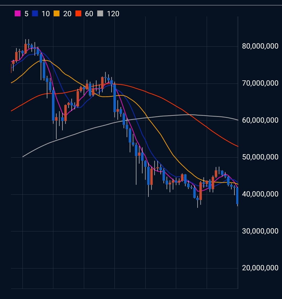
}이렇게 하면 아래와 비슷한 차트가 그려진다!
다음 포스팅에서는 CombinedChart 를 사용해서 가격을 나타내는 캔들 차트와 더불어, 이동 평균선을 나타내는 라인 차트까지 함께 그리는 방법에 대해 포스팅할 예정이다.