개요
버그를 수정하고 출시를 준비하면서 CSS를 분석하고 있었습니다. 그 과정에서 Common/Button이 여러 곳에서 사용되고 있었는데, 각기 다른 디자인으로 인해 통일성이 없어 보였습니다.
import styled from 'styled-components';
import tw from 'twin.macro';

import {
  TextColors,
  BorderColors,
  BgTheme,
  TextTheme,
  BorderTheme,
  BgColorsType,
}                                      from '@/styles/colorThemes.ts';
import { ButtonSize, ButtonSizeTheme } from '@/styles/sizeThemes.ts';

type StyleProps = {
  $bgColor?: BgColorsType;
  $border?: BorderColors;
  $hover?: boolean;
  $size: ButtonSize;
  $textColor?: TextColors;
  $width?: string;
};

const Button = styled.button<StyleProps>`
  ${tw`
      flex
      flex-row
      justify-center
      content-center
      items-center
      font-medium
      rounded-xl
      cursor-pointer
      transition
      duration-200
    `}
  ${(props) => ButtonSizeTheme[props.$size]}
    ${(props) => props.$width && `width: ${props.$width};`}
    ${(props) => (props.$bgColor ? BgTheme[props.$bgColor] : BgTheme['white'])}
    ${(props) =>
    props.$textColor ? TextTheme[props.$textColor] : TextTheme['black']}
    ${(props) => (props.$border ? tw`border` : '')}
    ${(props) => (props.$border ? BorderTheme[props.$border] : '')}
    ${(props) => (props.$hover ? tw`hover:scale-110 ` : null)}
`;

export default Button;
위 코드처럼 tailwind와 styled-components로 작성된 버튼 컴포넌트가 있었고, 여러 곳에서 이 버튼에 대한 CSS를 각각 사용하다 보니 스타일이 중구난방이었습니다.
| 이름 | 사진 | 설명 |
|---|---|---|
| 사용자 모달 창 | 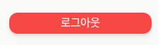 | 사용자 정보창에 있는 로그아웃 버튼입니다. |
| 달력 | 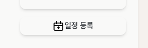 | 메인 페이지인 달력의 일정 등록 버튼입니다. |
| 일정 상세 조회 | 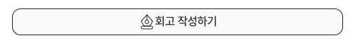 | 일정 상세 조회 버튼에 있는 회고 작성하기 버튼입니다. |
| 저장 및 취소 버튼 | 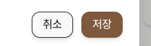 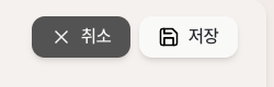 | 어디서든 사용되고 있는 저장 및 취소 버튼입니다. |
| 화살표 버튼 | 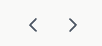 | 주로 달력 페이지에서 보이는 화살표 버튼입니다. |
위의 표처럼 다양한 버튼 디자인이 있었기에, 전체적인 통일성이 필요하다고 느껴 모든 버튼을 리팩토링하기로 결정했습니다.

내 집이 무너진다...
컴포넌트 분리
가장 먼저 진행한 작업은 기존에 Button.ts 파일로 작성되어 있던 파일을 Button.tsx로 변경하고, 기본적인 구조를 재정의하는 것이었습니다.
import React, { ComponentPropsWithoutRef, ElementType } from 'react';
import type { ButtonStyling } from '@/components/Common/Button/Button.styled.ts';
import {
getButtonStyling,
getSizeStyling,
getVariantStyling,
} from '@/components/Common/Button/Button.styled.ts';
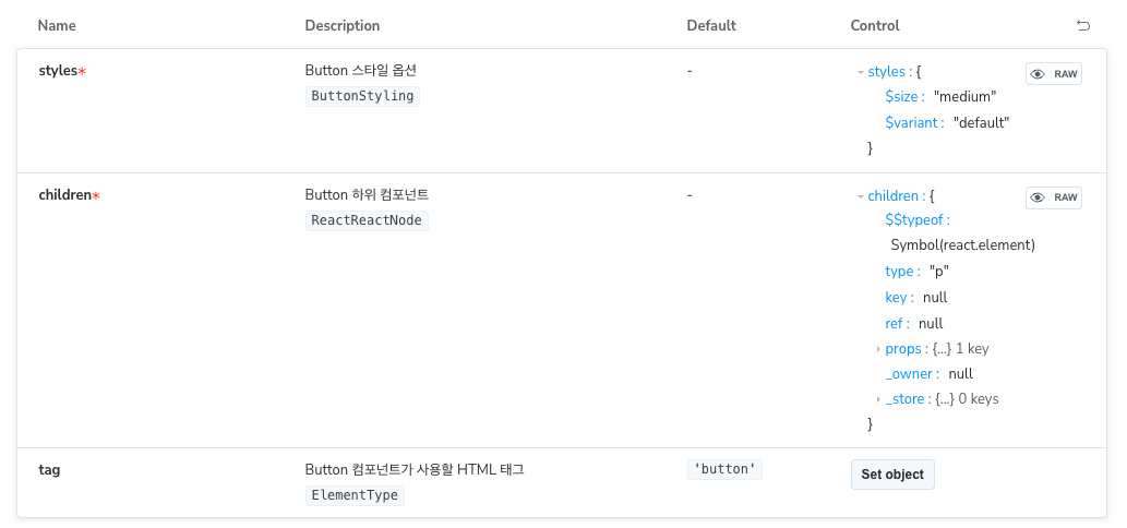
export interface ButtonProps extends ComponentPropsWithoutRef<'button'> {
/**
* Button 컴포넌트가 사용할 HTML 태그
*
* @default 'button'
*/
tag?: ElementType;
/** Button 스타일 옵션 */
styles: ButtonStyling;
/** Button 하위 컴포넌트 */
children: React.ReactNode;
}
function Button({
tag = 'button',
styles,
children,
...attributes
}: ButtonProps) {
const Tag = tag;
return (
<Tag
css={[
getButtonStyling(),
getSizeStyling(styles.$size),
getVariantStyling(styles.$variant),
]}
{...attributes}
>
{children}
</Tag>
);
}
export default Button;태그는 기본적으로 button을 사용하되, 다른 HTML 태그도 사용할 수 있도록 tag 프로퍼티를 정의했습니다. 또한 자식 컴포넌트나 태그가 반드시 필요하다고 판단하여 필수로 받도록 설정했습니다. 버튼의 크기와 종류를 선택할 수 있게 만들었습니다.
스타일 코드 작성
import { css } from '@emotion/react';

import { Theme } from '@/styles/Theme.ts';

export interface ButtonStyling {
  $size: 'small' | 'medium' | 'large' | 'circle';
  $variant: 'primary' | 'secondary' | 'danger' | 'outline' | 'default';
}

export const getVariantStyling = (
  variant: Required<ButtonStyling>['$variant'],
) => {
  const style = {
    primary: css({
      backgroundColor: Theme.color.brown600,

      color: Theme.color.white,

      '&:hover:enabled': {
        backgroundColor: Theme.color.brown700,
      },

      '&:focus': {
        boxShadow: `0 0 0 3px ${Theme.color.brown700}`,
      },
    }),
	// etc..
    default: css({
      backgroundColor: Theme.color.white,

      color: Theme.color.black900,

      '&:hover:enabled': {
        backgroundColor: Theme.color.white900,
      },

      '&:focus': {
        boxShadow: `0 0 0 3px ${Theme.color.white900}`,
      },
    }),
  };
  return style[variant];
};

export const getSizeStyling = (size: Required<ButtonStyling>['$size']) => {
  const style = {
    small: css({
      padding: '8px 12px',
    }),
	// etc..
    circle: css({
      padding: '8px 8px',
      borderRadius: 100,
    }),
  };

  return style[size];
};

export const getButtonStyling = () =>
  css({
	// etc..
  });
코드가 너무 길어서 일부분만 가져왔습니다.
기존에 사용하던 tailwind를 제거하고 emotion으로 변경했습니다. emotion을 선택한 이유는 styled-components로 마이그레이션할 때 문제가 없고, Theme를 활용할 수 있다는 장점이 있기 때문입니다.
각 버튼의 종류(variant)와 크기(size)에 따라 다른 스타일을 적용할 수 있도록 작성하였습니다.
사용
<Button
  styles={{ $size: 'medium', $variant: 'outline' }}
  children={<span>일정 등록</span>}
  onClick={handleOpenCreate}
/>
버튼을 사용할 때 styles를 통해 필요한 스타일 관련 속성을 전달받고, children으로 표시할 텍스트나 컴포넌트를 받도록 구현했습니다.
변경 후 버튼의 모습은 다음과 같습니다.
| 이름 | Before | After | 설명 |
|---|---|---|---|
| 사용자 모달 창 | | 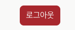 | 사용자 정보창에 있는 로그아웃 버튼입니다. |
| 달력 | | 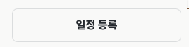 | 메인 페이지인 달력의 일정 등록 버튼입니다. |
| 일정 상세 조회 | | 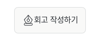 | 일정 상세 조회 버튼에 있는 회고 작성하기 버튼입니다. |
| 저장 및 취소 버튼 | | 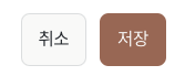 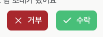 | 어디서든 사용되고 있는 저장 및 취소 버튼입니다. |
| 화살표 버튼 | | 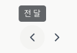 | 주로 달력 페이지에서 보이는 화살표 버튼입니다. |
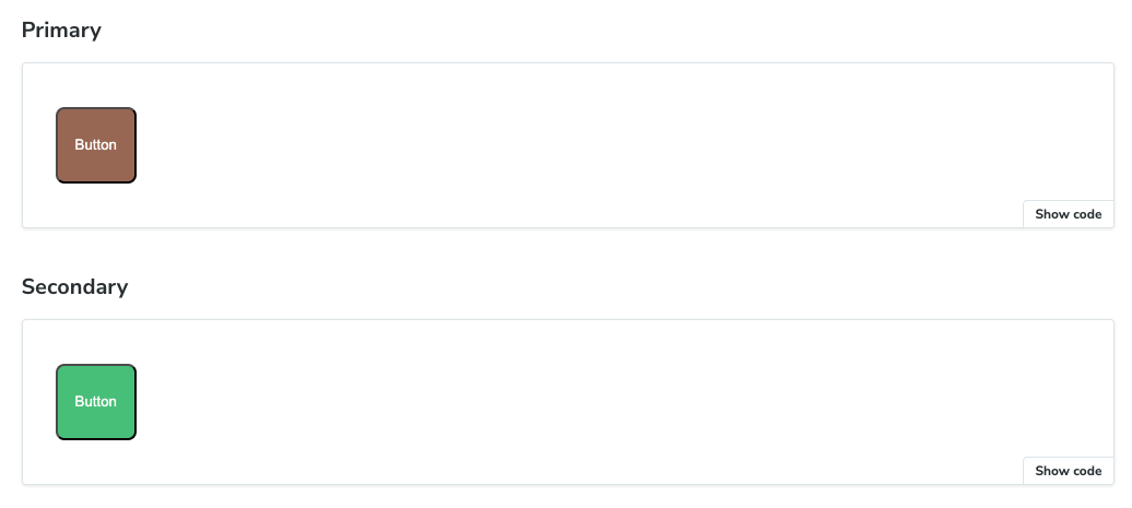
버튼 디자인이 기존보다 더 통일성을 갖추게 되었다고 생각합니다. 이러한 방식으로 다른 기본 컴포넌트들도 동일하게 리팩토링을 진행하였고, storybook에 등록하여 더욱 편리하게 컴포넌트들을 미리 보고 사용할 수 있도록 하였습니다.