1. Bootstrap
CSS 프론트엔드 프레임워크 → 모바일, 태블릿, 데스크탑 등 다양한 기기 환경에서 웹 페이지가 적절하게 표시될 수 있도록 반응형 웹 디자인을 지원하는 도구이자 기술이다.
Bootstrap 설치 및 적용 방법 (다운로드 후 로컬에서 사용하는 방식)
- https://getbootstrap.com/docs/4.4/getting-started/download/에 접속 후 파일 다운 및 압축 해체를 해준다.
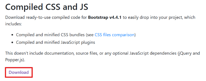
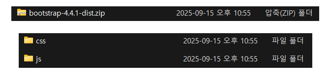
- css > bootstrap.min.css, js > bootstrap.bundle.min.js 파일을 프로젝틑 폴더 안에 복제한다.
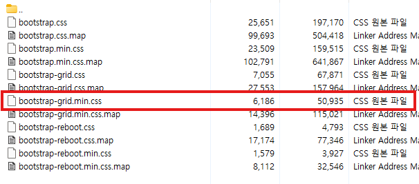
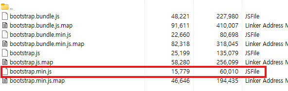
- css/와 js/ 폴더 생성 후,
bootstrap.min.css,bootstrap.bundle.min.js를 넣는다.
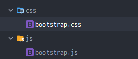
- HTML 템플릿의 와 에 Bootstrap을 불러온다.
<link rel="stylesheet" href="/css/bootstrap.min.css"> // Bootstrap CSS
<script src="/js/bootstrap.bundle.min.js"></script> // Bootstrap JS
<!DOCTYPE html>
<html lang="en">
<head>
<meta charset="UTF-8">
<meta name="viewport" content="width=device-width, initial-scale=1.0">
<title>부트스트랩 연습</title>
<link rel="stylesheet" href="/css/bootstrap.min.css">
</head>
<body>
<!-- body 내용 -->
<script src="/js/bootstrap.bundle.min.js"></script>
</body>
</html>적용 화면

Bootstrap 기본 사용 방법
Bootstrap에는 특정한 규칙이 있는 클래스 이름으로 스타일 및 레이아웃이 미리 작성이 되어있다.
Spacing 표현 방법
{property}{sides}-{size} 형식으로 작성한다.
{property}{sides}-{size}예시:
<p class="mt-5">Hello, world!</p>mt-5는 위쪽에 3rem, 약 48px의 바깥 여백을 적용한다.
Property
| 이름 | 의미 |
|---|---|
m | margin, 바깥 여백 |
p | padding, 안쪽 여백 |
Sides
| 이름 | 적용 방향 |
|---|---|
t | top |
b | bottom |
s | left |
e | right |
x | left, right |
y | top, bottom |
| 생략 | 네 방향 모두 |
Size
| 값 | rem | 약 px |
|---|---|---|
0 | 0 | 0px |
1 | 0.25rem | 4px |
2 | 0.5rem | 8px |
3 | 1rem | 16px |
4 | 1.5rem | 24px |
5 | 3rem | 48px |
auto | auto | 자동 |
<div class="m-3">모든 방향 바깥 여백</div>
<div class="px-2">좌우 안쪽 여백</div>
<div class="mb-5">아래쪽 바깥 여백</div>
2. Rest CSS
Reset CSS
브라우저마다 기본으로 적용되는 CSS 스타일을 초기화하는 코드이다.
- 브라우저는 HTML 태그에 기본 여백이나 글꼴 크기를 자동으로 적용한다.
- 예를 들어
<body>,<h1>,<p>에는 기본margin이 들어가 있다.- Bootstrap에는 브라우저 기본 스타일을 정리해 주는 Reboot 기능이 포함되어 있어서, Bootstrap을 사용하면 기본적인 Reset CSS가 함께 적용된다.
Reset CSS 적용이 되지 않을 때
<!DOCTYPE html>
<html lang="ko">
<head>
  <meta charset="UTF-8">
  <title>Reset CSS 적용 안 함</title>
</head>

<body>
  <h1>Hello, World!</h1>
  <p>Reset CSS 적용 안 함</p>
</body>
</html>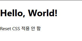
Reset CSS 적용 했을 때
<!DOCTYPE html>
<html lang="ko">
<head>
  <meta charset="UTF-8">
  <title>Reset CSS 적용함</title>

  <style>
    * {
      margin: 0;
      padding: 0;
      box-sizing: border-box;
    }
  </style>
</head>

<body>
  <h1>Hello, World!</h1>
  <p>Reset CSS 적용함</p>
</body>
</html>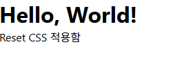
Normalize CSS
- Reset CSS 방법 중 대표적인 방법이다.
- 웹 표준 기준으로 브라우저 중 하나가 불일치 한다면 차이가 있는 브라우저를 수정하는 방법이다.
3. Bootstrap 활용
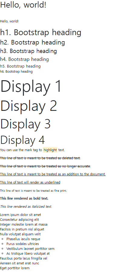
Typographt: 제목, 본문, 텍스트, 목록 등에 적용한다.Display headings: 기존 Heading보다 더 눈에 띄는 제목이 필요할 경우에 적용한다.Inile text elements: HTML Inline 요소에 대한 스타일이다.Lists: HTML list 요소에 대한 스타일이다.
부트스트랩 사이트에서 가져온 예시 코드
<body>
  <h1>Hello, world!</h1>
  <p class="mt-5">Hello, world!</p>

  <!-- Headings -->
  <p class="h1">h1. Bootstrap heading</p>
  <p class="h2">h2. Bootstrap heading</p>
  <p class="h3">h3. Bootstrap heading</p>
  <p class="h4">h4. Bootstrap heading</p>
  <p class="h5">h5. Bootstrap heading</p>
  <p class="h6">h6. Bootstrap heading</p>

  <!-- Display Heading -->
  <h1 class="display-1">Display 1</h1>
  <h1 class="display-2">Display 2</h1>
  <h1 class="display-3">Display 3</h1>
  <h1 class="display-4">Display 4</h1>

  <!-- Inline text elements -->
  <p>You can use the mark tag to <mark>highlight</mark> text.</p>
  <p><del>This line of text is meant to be treated as deleted text.</del></p>
  <p><s>This line of text is meant to be treated as no longer accurate.</s></p>
  <p><ins>This line of text is meant to be treated as an addition to the document.</ins></p>
  <p><u>This line of text will render as underlined</u></p>
  <p><small>This line of text is meant to be treated as fine print.</small></p>
  <p><strong>This line rendered as bold text.</strong></p>
  <p><em>This line rendered as italicized text.</em></p>

  <!-- Lists -->
  <ul class="list-unstyled">
    <li>Lorem ipsum dolor sit amet</li>
    <li>Consectetur adipiscing elit</li>
    <li>Integer molestie lorem at massa</li>
    <li>Facilisis in pretium nisl aliquet</li>
    <li>Nulla volutpat aliquam velit
      <ul>
        <li>Phasellus iaculis neque</li>
        <li>Purus sodales ultricies</li>
        <li>Vestibulum laoreet porttitor sem</li>
        <li>Ac tristique libero volutpat at</li>
      </ul>
    </li>
    <li>Faucibus porta lacus fringilla vel</li>
    <li>Aenean sit amet erat nunc</li>
    <li>Eget porttitor lorem</li>
  </ul>
화면 출력
Colors
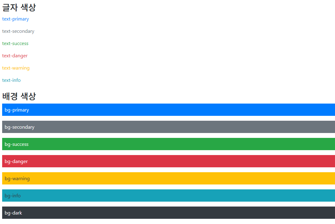
- Bootstrap이 지정하고 제공하는 색상 시스템이다.
<h3>글자 색상</h3>

  <p class="text-primary">text-primary</p>
  <p class="text-secondary">text-secondary</p>
  <p class="text-success">text-success</p>
  <p class="text-danger">text-danger</p>
  <p class="text-warning">text-warning</p>
  <p class="text-info">text-info</p>

  <h3 class="mt-4">배경 색상</h3>

  <p class="bg-primary text-white p-2">bg-primary</p>
  <p class="bg-secondary text-white p-2">bg-secondary</p>
  <p class="bg-success text-white p-2">bg-success</p>
  <p class="bg-danger text-white p-2">bg-danger</p>
  <p class="bg-warning text-dark p-2">bg-warning</p>
  <p class="bg-info text-dark p-2">bg-info</p>
  <p class="bg-dark text-white p-2">bg-dark</p>
화면 출력
4. Component
재사용 가능한 독립적인 부품으로, 더 크고 복잡한 시스템을 구축하기 위해 사용되는 소프트웨어의 기본 단위이다.
대표적인 컴포넌트
-
Alerts: 사용자에게 성공, 경고, 오류, 안내 등의 상태 메시지를 눈에 띄게 보여주는 알림이다..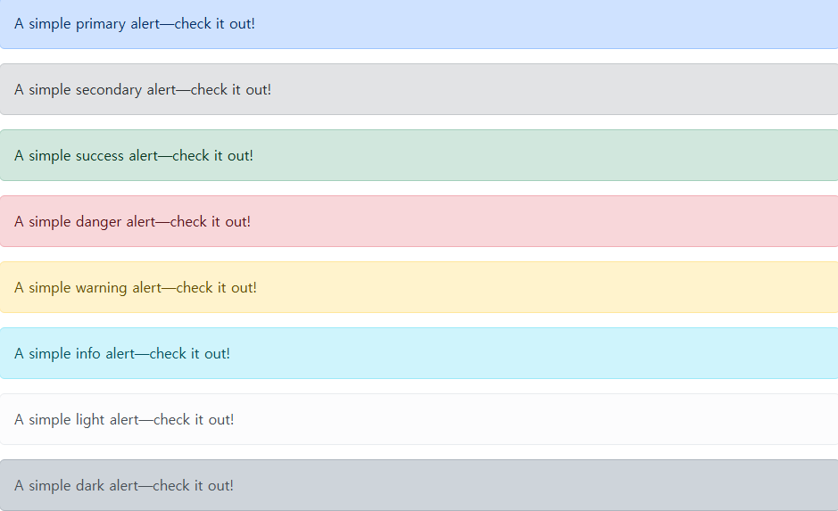
Badges: 상태, 개수, 분류 등의 짧은 정보를 작은 라벨 형태로 표시한다.

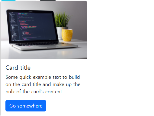
Cards: 이미지, 제목, 본문, 버튼 등의 내용을 하나의 박스 형태로 묶어서 보여준다.
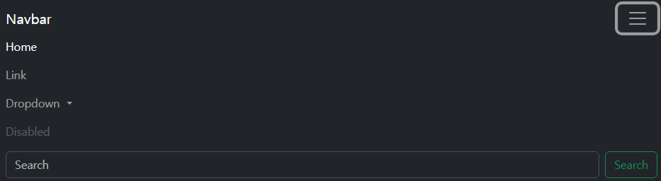
Navbar: 웹 페이지 상단 등에 배치하여 로고, 메뉴, 검색창 등의 이동 기능을 제공하는 내비게이션 컴포넌트이다.
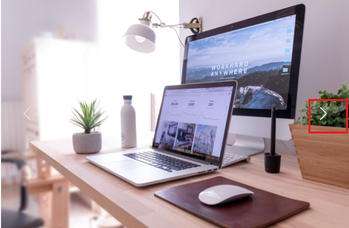
Carousel: 이미지나 텍스트 슬라이드와 같은 요소를 순환하며 보여주는 슬라이드쇼 컴포넌트이다.
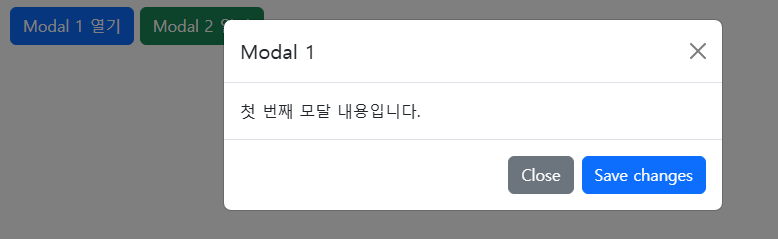
Modal: 기존 화면의 상호작용을 일시적으로 차단하고, 그 위에 레이어를 띄워, 사용자의 즉각적인 확인을 요구하는 대화상자이다.
컴포넌트의 특징 및 장점
- 사용성
- 한번 잘 만들어 둔 컴포넌트는 여러 페이지에서 반복해서 사용할 수 있다.
- 독립성
- 각 컴포넌트는 자체적으로 작동하는데 필요한 모든 코드를 가지고있다.
- 다른 컴포넌트에 미치는 영향을 최소화한다.
- 유지보수 용이성
- 특정 기능을 수정해야 할 때 전체 코드를 뒤질 필요 없이 해당 컴포넌트만 찾아 수정하면 되므로 관리가 편리하다.
5. Semantic
Semantic web
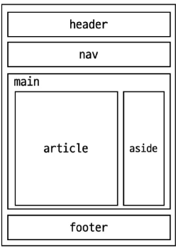
기본적인 모양과 기능 이외의 의미를 가지는 HTML 요소이다.
Semantic HTML
외형보다는 요소 자체의 의미에 집중하는 것이다.
HTML Semantic Element
기본적인 모양과 기능 이외의 의미를 가지는 HTML 요소이다.
6. 정리
- Bootstrap은 미리 만들어진 CSS 클래스와 컴포넌트를 활용해 웹 페이지를 빠르게 제작할 수 있는 프론트엔드 프레임워크이다.
- Spacing, Typography, Colors 등의 클래스를 사용해 여백과 글자, 색상을 간단하게 적용할 수 있다.
- Bootstrap에는 브라우저의 기본 스타일을 정리하는 Reboot 기능이 포함되어 있다.
- Alerts, Badges, Cards, Navbar, Carousel, Modal 등의 컴포넌트를 재사용할 수 있다.
- Semantic HTML은 태그의 의미와 역할에 맞게 문서 구조를 작성하는 방법이다.
- Bootstrap은 버전에 따라 클래스와 속성 작성법이 다르므로 사용하는 버전을 확인해야 한다.

백엔드를 학습하는 주니어 개발자입니다.