CSS Box Model
1. 박스 타입
Block 타입: 하나의 독립된 덩어리처럼 동작하는 요소이다.- 항상 새로운 행으로 나뉜다. (한 줄 전체를 차지하고 너비가 100%임)
width,height,margin,padding속성을 모두 사용할 수 있다.padding,margin,border로 인해 다른 요소를 상자로부터 밀어낸다.
<!--block 타입의 대표적인 div-->
<div class="container">
	<h1>제목</h1>
	<p>내용</p>
</div>
<div>
	<p>콘텐츠</p>
</div>
Inline 타입- 줄 바꿈이 일어나지 않는다. (콘텐츠의 크기만큼만 영역을 차지함)
width,height속성을 사용할 수 없다.- 수직 방향:
padding,margin,border가 적용되지만 다른 요소를 밀어낼 수 없다. - 수평방향:
padding,margin,border가 적용되어 다른 요소를 밀어낼 수 있다.
<!--inline 타입의 대표적인 span-->
<p>여기서 <span style="color: blue;">여기만 파랑색이 됨 </span>여기는 검은색</p>
<p>여기서 <span class="highlight-text;">여기만 강조가 됨 </span>여기는 일반 글씨</p>
<p>여기서 <span id="changeText;">여기만 클릭하면 바뀜 </span>신기방기</p>
2. Normal flow
- 일반적인 흐름 또는 레이아웃을 변경하지 않은 경우 웹 페이지 요소가 배치되는 방식이다.
<head>
  <style>
    div {
      border: 2px solid blue;
      margin: 5px;
      padding: 5px;
    }

    span {
      border: 2px solid red;
      padding: 3px;
    }
  </style>
</head>

<body>
  <h2>Block 요소</h2>

  <div>첫 번째 div</div>
  <div>두 번째 div</div>

  <h2>Inline 요소</h2>

  <p>
    문장 시작
    <span>첫 번째 span</span>
    <span>두 번째 span</span>
    문장 끝
  </p>
</body>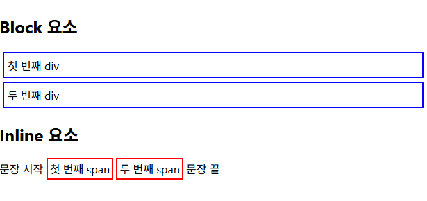
기타 display 속성들
inline-block: inline과 block의 특징을 모두 가진 특별한 display 속성 값이다.- inline, block의 특징을 합쳐 놓은 것
- width 및 height 속성 사용 가능
- padding, margin 및 border로 인해 다른 요소가 상자에서 밀려남
<head>
  <title>Inline-block 예시</title>
  <style>
    .box {
      display: inline-block;

      width: 150px;
      height: 80px;

      margin: 10px;
      padding: 10px;

      border: 2px solid green;
      background-color: lightgreen;
    }
  </style>
</head>

<body>
  <h2>Inline-block 요소</h2>

  <div class="box">첫 번째 박스</div>
  <div class="box">두 번째 박스</div>
  <div class="box">세 번째 박스</div>
</body>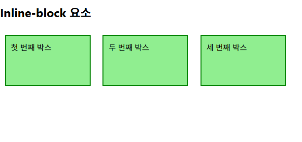
none: 요소를 화면에 표시하지 않고, 공간조차 부여되지 않는다.
<head>
  <title>Display None 예시</title>
  <style>
    .box {
      width: 150px;
      padding: 15px;
      margin: 5px;
      border: 2px solid blue;
    }

    .hidden {
      display: none;
    }
  </style>
</head>
<body>
  <h2>display: none</h2>

  <div class="box">첫 번째 박스</div>
  <div class="box hidden">숨겨진 박스</div>
  <div class="box">세 번째 박스</div>
</body>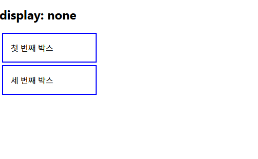
3. CSS Position
- CSS Layout
- 각 요소의 위치와 크기를 조정해 웹 페이지의 디자인을 결정하는 것이다.
- 요소들을 상하좌우 정렬을 하고, 간격을 맞추고, 전체적인 페이지의 뼈대를 구성한다.
- CSS Position
- 요소의 Normal Flow에서 제거하여 다른 위치로 배치하는 것이다.
- 다른 요소 위에 올리기, 화면의 특정 위치에 고정 시키기 등등이 있다.
static 포지션
- 요소를 Normal Flow에 따라 배치한다.
top,right,bottom,left속성이 적용되지 않는다.
relative 포지션
- 요소를 Normal Flow에 따라 배치한다.
- 자신의 원래 위치 (static)을 기준으로 이동한다.
top,right,bottom,left속성으로 위치를 조정한다.- 다른 요소의 레이아웃에 영향을 주지 않는다. (요소가 차지하는 공간은 static일 때와 같다.)
absolute 포지션
- 요소를 Normal Flow에서 제거한다.
- 가장 가까운 relative 부모 요소를 기준으로 이동한다.
- 만족하는 부모 요소가 없으면 body 태그를 기준으로 한다.
top,right,bottom,left속성으로 위치를 조정한다.- 문서에서 요소가 차지하는 공간이 없어진다.
fixed 포지션
- 요소를 Normal Flow에서 제거한다.
- 현재 화면 영역을 기준으로 이동한다.
- 스크롤해도 항상 같은 위치에 유지된다.
top,right,bottom,left속성으로 위치를 조정한다.- 문서에서 요소가 차지하는 공간이 없어진다.
sticky 포지션
- 처음에는 Normal Flow에 따라 배치다.
- 스크롤하여 지정한 위치에 도달하면 그 자리에 고정된다.
top,bottom등의 기준값을 함께 지정해야 한다.
<head>
  <title>CSS Position 예시</title>

  <style>
    body {
      margin: 0;
    }

    h2 {
      margin-left: 20px;
    }

    .box {
      width: 150px;
      padding: 15px;
      margin: 10px;
      border: 2px solid blue;
      background-color: lightblue;
    }

    /* static */
    .static {
      position: static;
      top: 20px;
      left: 50px;
    }

    /* relative */
    .relative {
      position: relative;
      top: 20px;
      left: 50px;
      background-color: lightpink;
    }

    /* absolute의 기준이 되는 부모 */
    .parent {
      position: relative;
      width: 400px;
      height: 150px;
      margin: 20px;
      border: 3px solid green;
    }

    /* absolute */
    .absolute {
      position: absolute;
      top: 20px;
      right: 20px;
      background-color: lightyellow;
    }

    /* sticky */
    .sticky {
      position: sticky;
      top: 0;
      width: auto;
      margin: 0;
      background-color: lightgreen;
      z-index: 1;
    }

    /* fixed */
    .fixed {
      position: fixed;
      right: 20px;
      bottom: 20px;
      background-color: lightcoral;
      z-index: 2;
    }

    .space {
      height: 600px;
      padding: 20px;
    }
  </style>
</head>

<body>
  <h2>static</h2>

  <div class="box">첫 번째 박스</div>
  <div class="box static">static 박스</div>

  <h2>relative</h2>

  <div class="box">첫 번째 박스</div>
  <div class="box relative">relative 박스</div>

  <h2>absolute</h2>

  <div class="parent">
    부모 요소
    <div class="box absolute">absolute 박스</div>
  </div>

  <div class="box sticky">sticky 박스</div>

  <div class="space">
    아래로 스크롤해보아.
  </div>

  <div class="box fixed">fixed 박스</div>
</body>💡fiixed 박스는 그대로 있는 것을 볼 수 있다.
비유
static: 줄에 가만히 서 있음relative: 내 자리는 남겨 두고 옆으로 이동함absolute: 줄에서 빠져나와 부모 안 원하는 위치로 감fixed: 브라우저 화면에 붙어 있음sticky: 스크롤하다가 화면 위에 닿으면 붙음
4. z-index
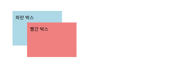
- 요소들이 겹쳤을 때 어떤 요소를 앞에 보이게 할지 정하는 속성이다.
- 화면을 위에서 내려다보는 것이 아니라, 여러 장의 종이를 겹쳐 놓았다고 생각하자.
z-index: 3  → 가장 앞
z-index: 2
z-index: 1  → 가장 뒤
.box {
position: absolute;
width: 150px;
height: 100px;
padding: 10px;
}
.blue {
top: 50px;
left: 50px;
background-color: lightblue;
z-index: 1;
}
.red {
top: 90px;
left: 100px;
background-color: lightcoral;
z-index: 2;
}<div class="box blue">파란 박스</div>
<div class="box red">빨간 박스</div>실행 결과
5. CSS Flexbox
Flexbox는 여러 요소를 한 줄 또는 여러 줄로 정렬하고 간격을 조절하는 CSS 배치 방법이다.
Flexbox 구성 요소
Flexbox는 부모 요소와 자식 요소로 구성된다.
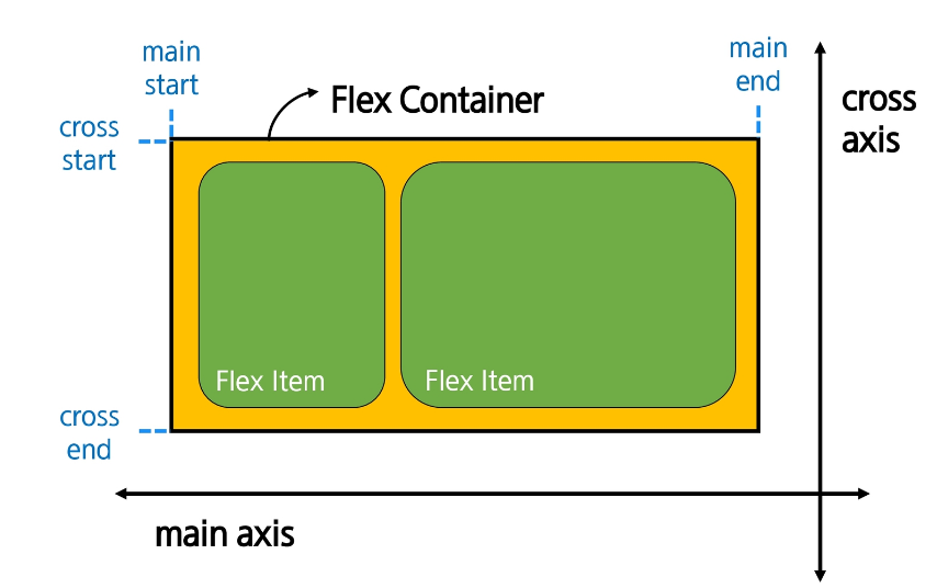
Flex Container- Flexbox가 적용된 부모 요소이다.
- 부모 요소에
display: flex또는display: inline-flex를 지정한다. - 자식 요소의 배치 방향과 정렬 방법을 결정한다.
Flex Item- Flex Container 안에 있는 자식 요소이다.
- 부모의 Flexbox 설정에 따라 가로 또는 세로로 배치된다.
<div class="container">
  <div class="item">1</div>
  <div class="item">2</div>
  <div class="item">3</div>
</div>
.container {
display:flex;
}위 코드에서는 다음과 같이 구분된다.
container → Flex Container
item      → Flex Item
Flexbox의 축
Flexbox는 주축과 교차축을 기준으로 요소를 배치한다.
Main Axis(주축)- Flex Item이 나열되는 방향이며 기본 축이다.
- 기본값은 왼쪽에서 오른쪽으로 향하는 가로 방향이다.
- main start에서 시작해서 main end 방향으로 배치한다. (기본 값)
Cross Axis(교차축)- 주축과 수직으로 교차하는 방향이다.
- 주축이 가로 방향이면 교차축은 세로 방향이다.
- cross start에서 시작해서 cross end 방향으로 배치한다. (기본 값)
Flex Container- Flexbox가 적용된 부모 요소이다.
- 부모 요소에
display: flex또는display: inline-flex를 적용하면 된다. - 내부 Flex Item의 방향, 정렬, 간격 등을 결정한다.
Flex Item- Flex Container의 직접적인 자식 요소이다.
- 부모에게 적용된 Flexbox 속성에 따라 배치된다.
- 각 Item마다 크기, 순서, 늘어나는 비율 등을 따로 설정할 수 있다.
          교차축
            ↓

주축 → [1] [2] [3]flex-direction이 바뀌면 주축과 교차축의 방향도 함께 바뀐다.
Flex Container 지정
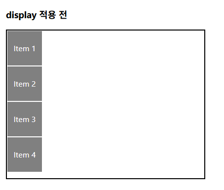
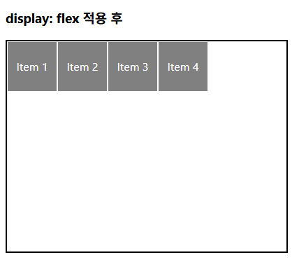
- display 속성을 flex로 설정하면, Flex Container로 지정된다.
- flex item은 기본적으로 행으로 나열한다.
- flex item은 주 축의 시작 선에서 시작한다.
- flex item은 교차 축의 크기를 채우기 위해 늘어난다.
		.container {
      width: 400px;
      height: 300px;
      border: 2px solid black;
    }

    .flex-container {
      display: flex;
    }
출력 결과
flex-direction
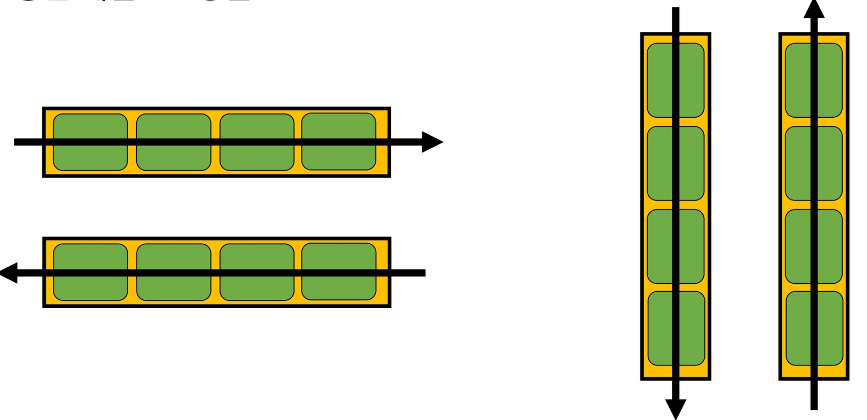
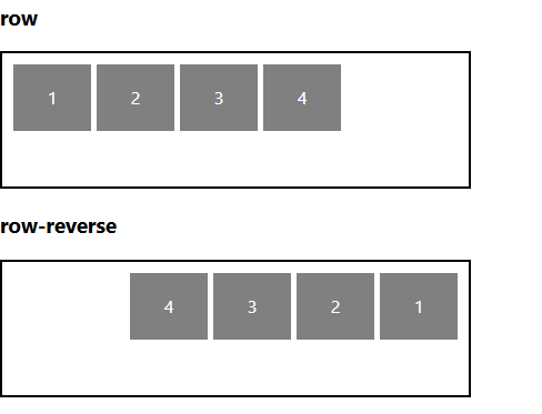
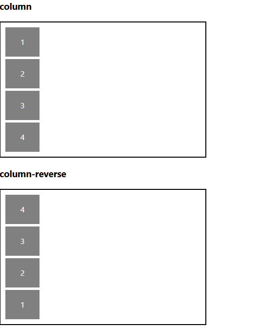
- flex item이 나열되는 방향을 지정한다.
- 속성
row: 아이템을 가로방향으로, 왼쪽에서 오른쪽으로 배치한다.column: 아이템을 세로 방향으로, 위에서 아래로 배치한다."-reverse"로 지정하면 flex item 배치의 시작 선과 끝 선이 서로 바뀐다.
		.container {
      width: 400px;
      min-height: 100px;
      margin-bottom: 20px;
      padding: 10px;
      border: 2px solid black;
      display: flex;
      gap: 5px;
    }
    .row {
      flex-direction: row;
    }

    .row-reverse {
      flex-direction: row-reverse;
    }

    .column {
      flex-direction: column;
    }

    .column-reverse {
      flex-direction: column-reverse;
출력 결과
flex-wrap
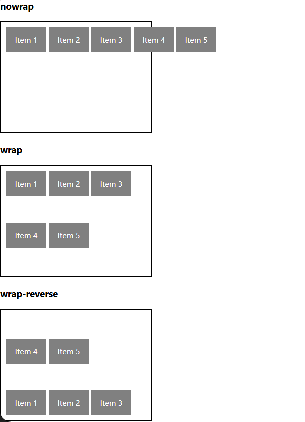
- flex item 목록이 flex container의 한 행에 들어가지 않을 경우, 다른 행에 배치할지 여부를 설정한다.
- 속성
nowrap: 줄 바꿈을 하지 않는다. (기본 값)wrap: 여러 줄에 걸쳐 배치될 수 있게 설정한다. (위에서 아래로 쌓인다.)wrap-reverse: 여러 줄에 걸쳐 배치되거나 줄이 쌓이는 방향이 반대(역순)로 설정된다.
		.container {
      display: flex;
      width: 280px;
      height: 200px;
      margin-bottom: 20px;
      padding: 10px;
      gap: 5px;
      border: 2px solid black;
    }

    .item {
      width: 80px;
      height: 50px;
      flex-shrink: 0;
      background-color: gray;
      color: white;
      text-align: center;
      line-height: 50px;
    }

    .nowrap {
      flex-wrap: nowrap;
    }

    .wrap {
      flex-wrap: wrap;
    }

    .wrap-reverse {
      flex-wrap: wrap-reverse;
    }
출력 결과
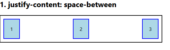
justify-content
- 주축 방향으로 전체 아이템을 정렬한다.
- 속성
flex-start: 주 축의 시작점으로 정렬한다. (기본 값)center: 주 축의 중앙으로 정렬한다.flex-end: 주 축의 끝점으로 정렬한다.
.container {
  display: flex;
  justify-content: space-between;
}
출력 결과
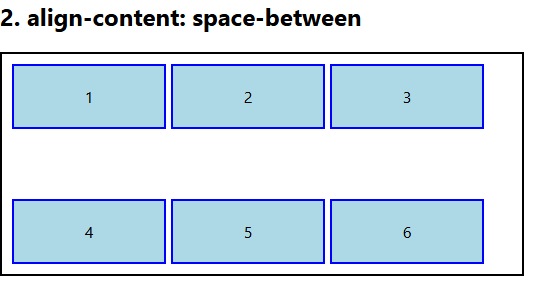
align-content
- 컨테이너에 여러 줄의 flex item이 있을 때 그 줄들 사이의 공간을 어떻게 분배할지 지정한다.
- 속성
-
stretch: 여러 줄을 교차 축에 맞게 늘려 빈 공간을 채운다. (기본 값) -
center: 여러 줄을 교차 축의 중앙에 맞춰 정렬한다. -
flex-start: 여러 줄을 교차 축의 시작점에 맞춰 정렬한다. -
flex-end: 여러 줄을 교차 축의 끝점에 맞춰 정렬한다..container { display: flex; flex-wrap: wrap; align-content: space-between; }출력 결과
-
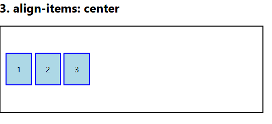
align-items
- 한 줄 안의 모든 아이템을 교차축 방향으로 정렬한다.
- 속성
stretch: 여러 줄을 교차 축에 맞게 늘려 빈 공간을 채운다. (기본 값)center: 여러 줄을 교차 축의 중앙에 맞춰 정렬한다.flex-start: 여러 줄을 교차 축의 시작점에 맞춰 정렬한다.flex-end: 여러 줄을 교차 축의 끝점에 맞춰 정렬한다.
.container {
  display: flex;
  align-items: center;
}
출력 결과
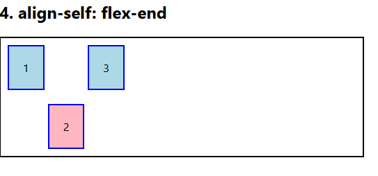
align-self
- 특정 아이템 하나만 따로 정렬한다.
- 속성
auto: 부모 컨테이너의align-item속성 값을 상속한다.stretch: 해당 아이템만 교차 축 방향으로 늘어나 컨테이너를 꽉 채우도록 정렬한다.center: 해당 아이템만 교차 축의 중앙에 정렬한다.flex-start: 해당 아이템만 교차 축의 시작점에 정렬한다.flex-end: 해당 아이템만 교차 축의 끝점에 정렬한다.
.item {
  align-self: flex-end;
}
출력 결과
💡속성 쉽게 이해하는 방법
- 배치 (flex-direction, flex-wrap)
- 공간 분배 (justify-content, align-content)
- 정렬 (align-items, align-self)
- justify → 주축
- align → 교차 축
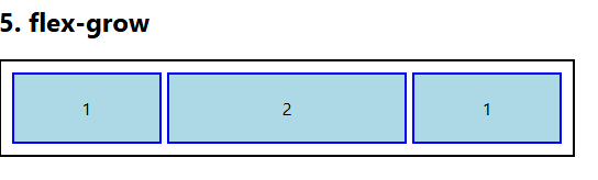
flex-grow
- 남는 행 여백을 비율에 따라 각 flex item에 분배한다.
- flex item이 컨테이너 내에서 확장하는 비율을 지정한다.
.item {
  flex-grow: 1;
}
출력 결과
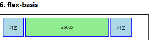
flex-basis
- flex item의 초기 크기 값을 지정한다.
- flex-basis와 width 값을 동시에 적용한 경우 flex-basis가 우선이다.
.item {
  flex-basis: 150px;
}
출력 결과
6. 반응형 레이아웃 작성해보기
<!DOCTYPE html>
<html lang="ko">
<head>
  <meta charset="UTF-8">
  <title>반응형 Flexbox 카드</title>

  <style>
    .card {
      width: 80%;
      margin: 30px auto;
      border: 1px solid black;

      display: flex;
      flex-wrap: wrap;
    }

    .thumbnail {
      width: 100%;
      flex-basis: 700px;
      flex-grow: 1;
    }

    .content {
      box-sizing: border-box;
      padding: 20px;

      flex-basis: 350px;
      flex-grow: 1;
    }
  </style>
</head>

<body>
  <div class="card">
    <img
      class="thumbnail"
      src="https://picsum.photos/900/500"
      alt="예시 이미지"
    >

    <div class="content">
      <h2>Heading</h2>
      <p>
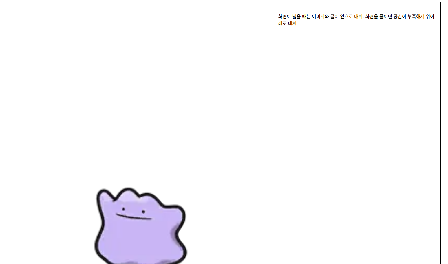
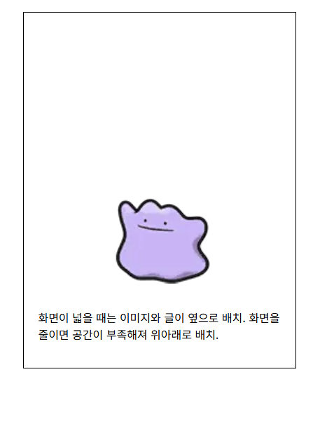
        화면이 넓을 때는 이미지와 글이 옆으로 배치됩니다.
        화면을 줄이면 공간이 부족해져 위아래로 배치됩니다.
      </p>
    </div>
  </div>
</body>
</html>
동작 원리
flex-wrap: wrap;공간이 부족하면 Flex Item이 다음 줄로 내려간다.
.thumbnail {
  flex-basis: 700px;
  flex-grow: 1;
}
이미지의 기본 너비는 700px이며, 남는 공간이 있으면 늘어난다.
.content {
  flex-basis: 350px;
  flex-grow: 1;
}
글 영역의 기본 너비는 350px이며, 남는 공간이 있으면 늘어난다.
출력 결과
7. 정리
block은 새로운 줄에서 시작하고,inline은 내용 크기만큼 같은 줄에 배치된다.position은 요소의 위치 기준을 정하며,absolute와fixed는 Normal Flow에서 벗어난다.z-index는 요소가 겹쳤을 때 앞뒤 순서를 결정한다.- Flexbox는 부모인
Flex Container와 자식인Flex Item으로 구성된다. justify-content는 주축,align-items와align-self는 교차축 정렬에 사용한다.flex-wrap,flex-grow,flex-basis를 활용하면 화면 크기에 반응하는 레이아웃을 만들 수 있다.
백엔드를 학습하는 주니어 개발자입니다.