CSS로 반응형 사이드바 만들기
1. <label> 엘리먼트
먼저 HTML의 <label> 엘리먼트의 효과를 알고 가자.
    <label for="user">아이디</label>
    <input type="text" id="user">

    <label for="user2">아이디</label>
    <input type="radio" id="user2">

    <label for="user3">아이디</label>
<input type="checkbox" id="user3"><label>의 효과로 인해 마우스 커서로 아이디라는 텍스트 영역을 눌러도 <input> 속성들이 반응함을 알 수 있다.
2. 사이드바 On/Off 스위치 만들기
A + B: 인접 형제 결합자. 첫 번째 요소의 바로 뒤에 위치하면서 같은 부모를 공유하는 두 번째 요소를 선택함.A ~ C: 일반 형제 결합자. 첫 번째 요소를 뒤따르면서 같은 부모를 공유하는 두 번째 요소를 선택함.
  [html]

  <input type="checkbox" id="icon">
    <label for="icon">
        <span></span>
        <span></span>
        <span></span>
    </label>
[css]
#icon + label {
display: inline-block;
width: 60px;
height: 40px;
}
span {
display: block;
height: 7px;
width: 100%;
background: #000;
}
#icon {
display: none;
}
<span>으로 3줄의 선을 긋고 #icon {display: none;}으로 체크박스를 가린다. (체크박스를 가려도 <labed>의 효과로 인해 선택이 가능해진 상태)
  #icon {
    width: 0px;
    height: 0px;
    overflow: hidden;
}
(↑체크박스를 가리는 다른 예시)
아래 태그를 추가한다.
[css]
#icon + label {
position: relative;
display: inline-block;
width: 60px;
height: 40px;
cursor: pointer;
background: red;
}
#icon + label > span {
position: absolute;
display: block;
border-radius: 30px;
height: 7px;
width: 100%;
background: #000;
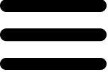
}position 속성의 효과로 인해 검은 선 3개가 하나로 겹쳐졌다.
<span>을 선택해서 세 줄 형태가 되도록 정렬하고자 하는데
<span> 각각에 id나 class를 부여하는 것도 가능하지만
이 경우에는 CSS의 선택자를 이용하는 방법을 추천한다.
:first-child: 부모안의 모든 요소 중 첫번째 요소
:last-child: 부모안의 모든 요소 중 마지막 요소
:nth-child(N): 부모안의 모든 요소 중 N번째 요소
[css]

#icon + label > span:nth-child(1) {
    top: 0px;
}


#icon + label > span:nth-child(2) {
    top: 50%;
}


#icon + label > span:nth-child(3) {
    bottom: 0px;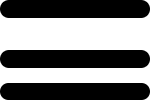
<span>이 세 줄로 구분됐지만 정렬 상태가 온전하지는 않다.
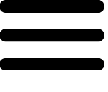
중앙선이 완전히 가운데로 오도록 구현하려면
CSS의 transform 속성을 이용해야 한다.
  #icon + label > span:nth-child(2) {
    top: 50%;
    transform: translateY(-50%);
} 
(수평으로 가운데 정렬하려면 transform: translateX(-50%) 사용)
이것으로 스위치 완성.
3. 반응성 부여하기
[html]

    <input type="checkbox" id="icon">
    <label for="icon">
        <span></span>
        <span></span>
        <span></span>
    </label>
    <div>
        <ul>
            <li>아우터</li>
            <li>상의</li>
            <li>하의</li>
            <li>악세사리</li>
        </ul>
    </div>
[css]
#icon + label + div {
position: fixed;
width: 300px;
background: red;
}스위치 아래에 사이드바 메뉴가 될 <div>영역을 추가한다.
position: fixed는 마우스 스크롤을 위아래로 움직여도
컨텐츠가 지정된 위치에 고정된 채로 띄워지도록 하기 위함.
<div> 영역 아래에 깔린 스위치를 위로 꺼내기 위해
높이와 넓이, z-index를 설정하자.
[css]

#icon + label + div {
    position: fixed;
    top: 0;
    width: 300px;
    background: red;
    z-index: 1;
}


#icon + label {
    position: relative;
    display: inline-block;
    width: 60px;
    height: 40px;
    cursor: pointer;
    z-index: 2;
}
z-index: 1은 기준점이 되므로 반드시 생략하지 말고 적어두자.
이제 사이드바 스위치에 on/off 효과를 부여해보자.
  [css]

#icon:checked + label + div {
    display: block;
}


#icon + label + div {
    display: none;
    position: fixed;
    padding: 50px;
    top: 0;
    width: 300px;
    height: 100%;
    z-index: 1;
    background: red;
}
사이드 바 메뉴에 display: none을 설정하고
스위치를 한번 눌렀을 때 블록 속성으로 떠오르도록 한다.
스위치가 on 상태일 때 X자 모양이 되도록 만들어보자.
1) 가운데 줄을 가린다.
#icon:checked + label > span:nth-child(2) {
    opacity: 0;
}
2) 위, 아래에 있던 줄을 가운데로 옮긴다.
#icon:checked + label > span:nth-child(1) {
    top: 50%;
    transform: translateY(-50%);
}

#icon:checked + label > span:nth-child(3) {
    bottom: 50%;
    transform: translateY(+50%);
}
ㄴ 바텀을 기준으로 하려면 transform: translateY(+50%) 부여.
(이동하고자 하는 방향과 반대쪽으로 당긴다)
3) X자 형태를 만든다.
#icon:checked + label > span:nth-child(1) {
    top: 50%;
    transform: translateY(-50%) rotate(45deg);
}

#icon:checked + label > span:nth-child(2) {
    opacity: 0;
}

#icon:checked + label > span:nth-child(3) {
    bottom: 50%;
    transform: translateY(+50%) rotate(-45deg);
}
4) 애니메이션 효과 부여.
transition: all 0.35s;


#icon + label > span {
    position: absolute;
    display: block;
    border-radius: 30px;
    height: 7px;
    width: 100%;
    background: #000;
    transition: all 0.35s;
}
(transition에는 속성을 설정한 시간만큼 서서히 변화시키는 효과가 있다.)
이렇게 0.35초에 걸쳐서 삼선 스위치가 X자 모양으로 바뀌는
애니메이션이 만들어졌다.
사이드바 메뉴에도 애니메이션 효과를 넣어보자.
#icon + label + div {
    position: fixed;
    padding: 50px;
    top: 0;
    left: -300px;
    width: 300px;
    height: 100%;
    z-index: 1;
    background: red;
    transition: all 0.35s;
}
기본(스위치 off) 상태에서는 left: -300px로 숨겨져 있다.
스위치가 on상태일 때 사이드바를 꺼내기 위해 아래 태그를 추가한다.
#icon:checked + label + div {left: 0px;}아래는 완성본.
[html]
    <input type="checkbox" id="icon">
  <label for="icon">
      <span></span>
      <span></span>
      <span></span>
  </label>
  <div>
      <ul>
          <li>아우터</li>
          <li>상의</li>
          <li>하의</li>
          <li>악세사리</li>
      </ul>
  </div>
[css]
ul,li {
list-style: none;
}
a {
text-decoration: none;
color: #000;
}
#icon {
display: none;
}
#icon + label {
position: relative;
display: inline-block;
width: 60px;
height: 40px;
cursor: pointer;
z-index: 2;
}
#icon + label > span {
position: absolute;
display: block;
border-radius: 30px;
height: 7px;
width: 100%;
background: #000;
transition: all 0.35s;
}
#icon + label > span:nth-child(1) {
top: 0px;
}
#icon + label > span:nth-child(2) {
top: 50%;
transform: translateY(-50%);
}
#icon + label > span:nth-child(3) {
bottom: 0px;
}
#icon:checked + label + div {
left: 0px;
}
#icon:checked + label > span:nth-child(1) {
top: 50%;
transform: translateY(-50%) rotate(45deg);
}
#icon:checked + label > span:nth-child(2) {
opacity: 0;
}
#icon:checked + label > span:nth-child(3) {
bottom: 50%;
transform: translateY(+50%) rotate(-45deg);
}
#icon + label + div {
position: fixed;
padding: 50px;
top: 0;
left: -200px;
width: 200px;
height: 100%;
z-index: 1;
transition: all 0.35s;
background: #ddd;
}