TIL DAY 196
오늘 배운 일
✔️ CSS Layout
🟧 II) Flexbox
어제 공부한 flexbox 예제를 이어가자면...
index.html
<body>
    <div class="box">1</div>
    <div class="box">2</div>
    <div class="box">3</div>
</body>
style.css
body {
  display : flex;
}

.box {
  width : 200px;
  height: 200px;
  background : peru;
  color : white;
}
결과
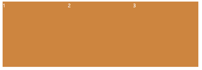
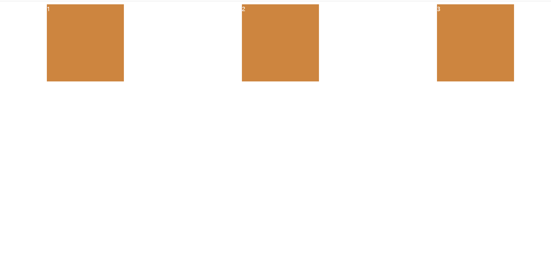
body 태그 안에 3개의 div 태그들이 존재하는데, 각자 가로 세로 길이가 200px 이다.
display flex 를 사용해서 inline-block 같은 효과로 생각할 수 있지만, 각 박스 사이에 여백이 없다.
복습하자면!
- flexbox container 는 자식 태그에 쓰는게 아니라, 부모 태그에 작성해야 한다.
- display flex 를 갖고 있는 직속 부모는 자식 태그의 위치를 움직이게 할 수 있다.
위의 결과물을 보면 'flex-direction : row' 상태인 것을 알 수 있다. (?)
이게 무슨 말일까?
flexbox 세계에서는 2가지가 존재한다.
- row 행 (가로)
- column 열 (세로)
flexbox 의 flex-direction 기본값은 row 상태인 것이다!
그럼 어떻게 수평으로 된 item 의 위치를 바꿀 수 있을까?
다행히 방법은 있다.
flexbox container 를 쓴 태그에 'justify-content:' 를 써주고 하나의 값을 골라준다.
justify-content 는
- 수평측에 있는 flex children 의 위치를 변경해준다.
그럼 값을 center 라고 작성해보면...
style.css
body {
  display : flex;
  justify-content: center;
}

.box {
  width : 200px;
  height: 200px;
  background : peru;
  color : white;
}
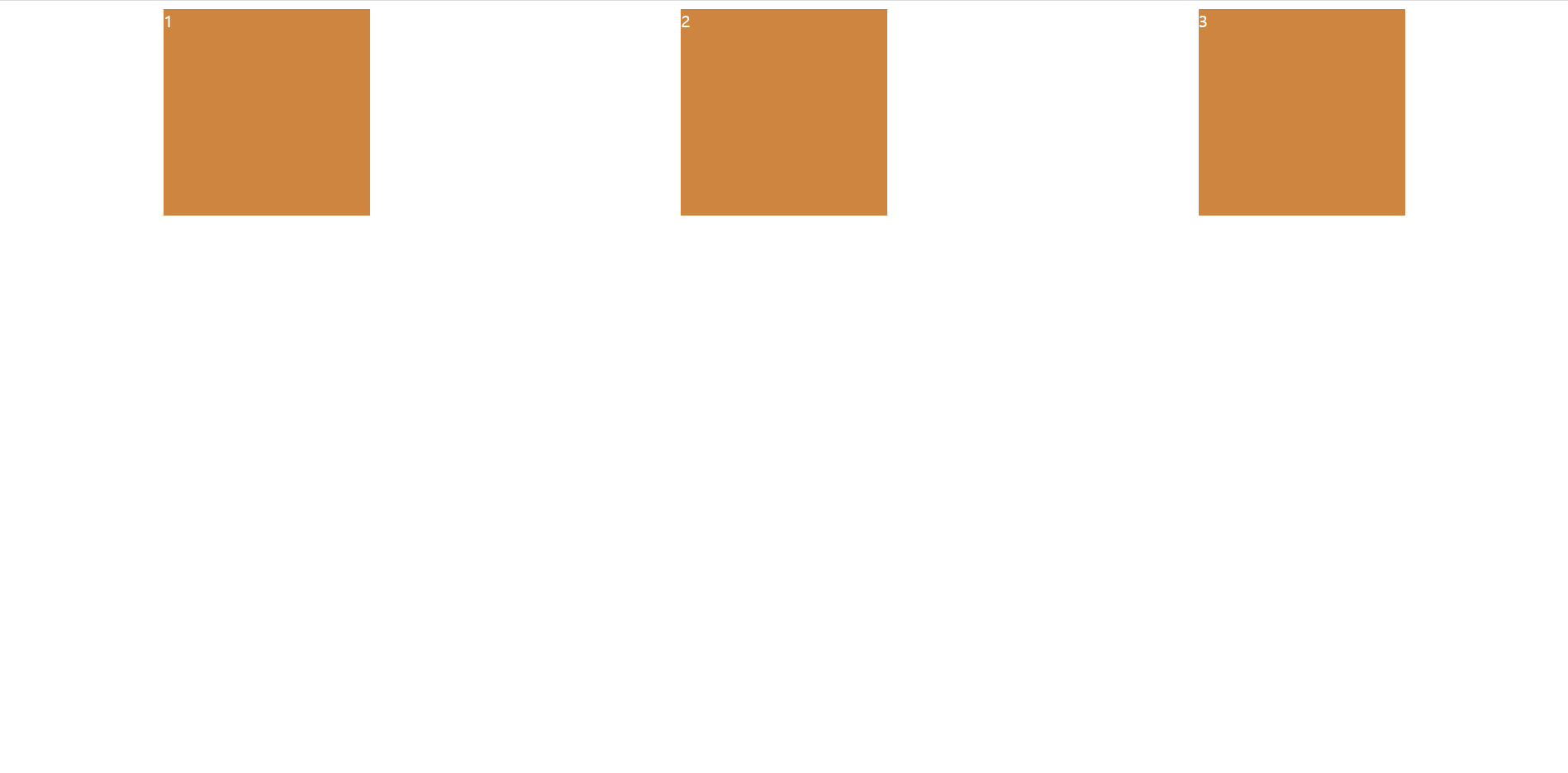
박스들이 중간으로 넘어왔다.
그리고 다른 값으로는 space-between 이 존재하는데 한 번 적용해보면...
style.css
body {
  display : flex;
  justify-content: space-between;
}

.box {
  width : 200px;
  height: 200px;
  background : peru;
  color : white;
}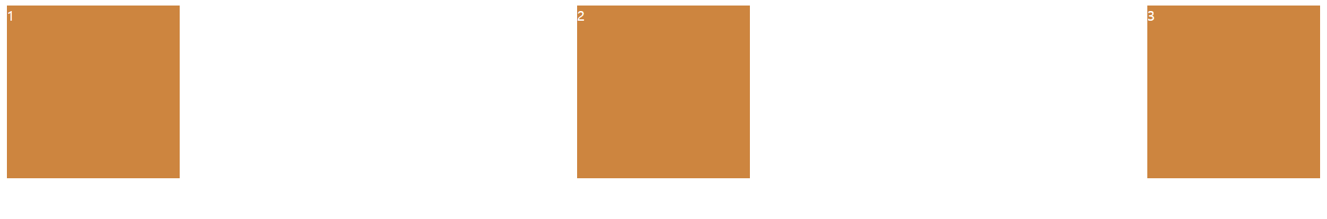
box 사이에 공간을 주면서 처음과 마지막의 박스는 끝으로 정렬되어 있다.
다음으로 space-around 는

space-between 과 비슷하지만, box 주변 옆 공간을 균등하게 정렬시킨다.
justify-content 프로퍼티를 활용해서 수평축에서 움직일 수 있게 되었다.
그런데 수평축이라는 이름이 보기 안좋아서 바꾸자면...
'main axis' 라고 부를수 있다.
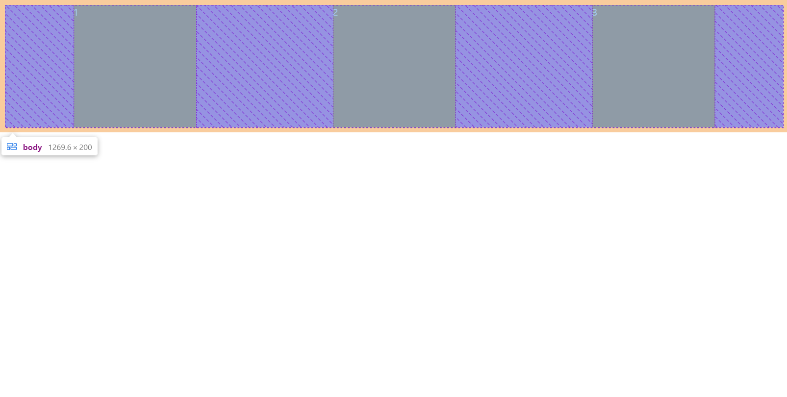
그러니까 'flex-direction : row' 일 때, horizontal axis (수평축)이 main axis 이다.
정리하자면...
기본 방향이 row 이면, main axis 는 가로이다
그러니까 main axis 에서 justify-content 를 사용하면 item 을 움직일 수 있다.
다른 axis 도 존재하는데, 그것은 바로!
cross axis 이다!
flex container 가 가로 방향을 가지고 있다면, cross axis 는 vertical (세로)이다.
flex-direction : row
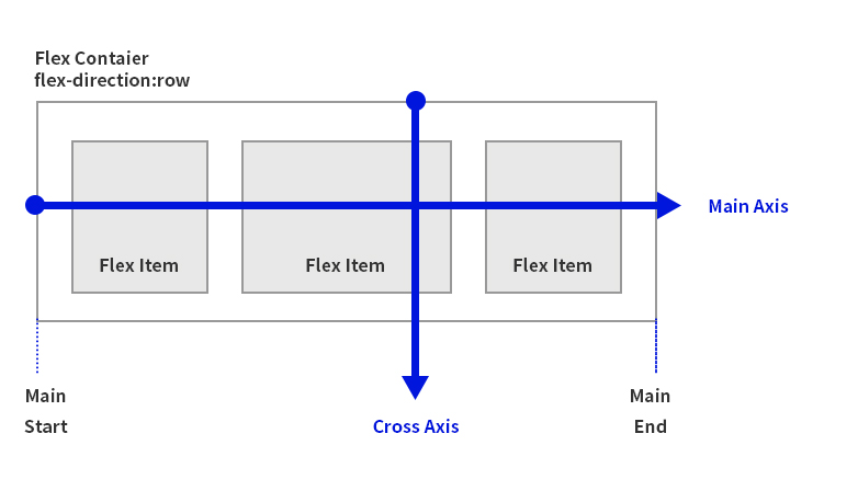
출처 : https://usingu.co.kr/references/css/css-layout/flexbox-layout/
정리하면
- flex-direction 이 row 인게 기본 방향이다.
- main axis 는 가로이다.
- cross axis 는 세로이다.
- main axis 방향으로 items 를 옮기기 위해서는 justify-content 를 써준다.
- 반면에 cross axis 방향으로 items 를 옮길 때는 align-items 를 사용해야 한다.
align-item 은 cross axis 방향으로 item 을 움직인다.
justify-content 와 마찬가지로 align-item 도 몇 가지를 선택할 수 있다.
하지만 justify-content 와 같은 선택지는 아니다!
우선 center 값으로 해주면...
style.css
body {
  display : flex;
  justify-content:space-around;
  align-items: center;
}

.box {
  width : 200px;
  height: 200px;
  background : peru;
  color : white;
}
결과
아무런 변화가 없는데 그 이유는...
body 태그는 현재 box 크기만큼 높이를 가지고 있어서 바뀌는게 없는 것이다.
'align-items: center' 를 했는데도 가운데로 가지 않아, 많은 사람들이 흔히 겪고 있는 실수 중 하나이다.
가운데로 갈 수 없는 높이를 가지고 있어서 높이를 추가해주는 것이다!
style.css
body {
  display : flex;
  justify-content:space-around;
  align-items: center;
  height: 100vh;
}

.box {
  width : 200px;
  height: 200px;
  background : peru;
  color : white;
}
결과

body 태그가 높이를 가지면서, item 들은 cross axis 방향의 가운데에 있는 것이다!
다음은 값을 'stretch' 로 바꿔보자면...
style.css
body {
  display : flex;
  justify-content:space-around;
  align-items: stretch;
  height: 100vh;
}

.box {
  width : 200px;
  height: 200px;
  background : peru;
  color : white;
}
결과
아무런 변화가 없는데 이 때 .box 클래스 태그들의 height 를 지워주면...
style.css
body {
  display : flex;
  justify-content:space-around;
  align-items: stretch;
  height: 100vh;
}

.box {
  width : 200px;
  background : peru;
  color : white;
}
결과는

body 태그만큼 box 가 늘어난 것이다.
다음으로 'flex-end' 는...

item 의 맨 끝으로 정렬하게 한다.
horizontal (가로) 말고 다른 방향이 있는데 그것은...
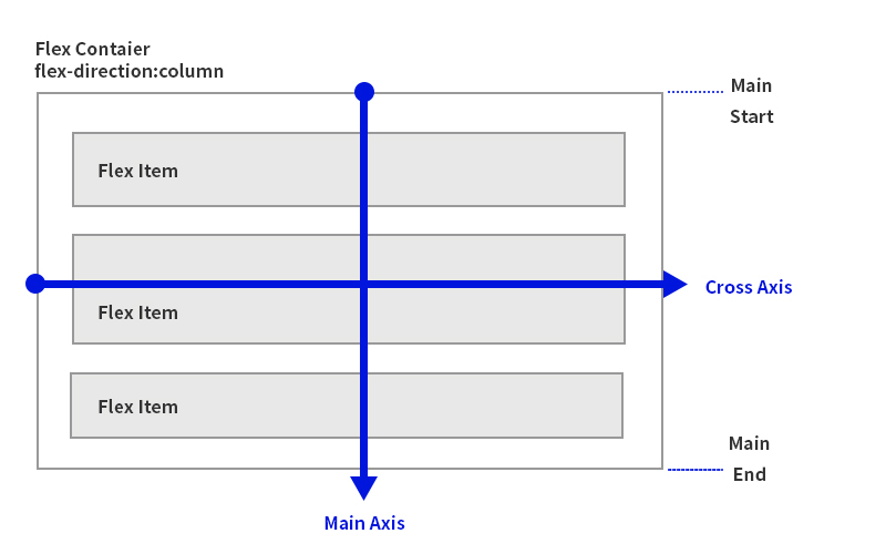
column (세로)이다!
그러면 이제 'flex-direction: column' 으로 바꾸면...
style.css
body {
  display : flex;
  flex-direction: column;
  justify-content:space-around;
  align-items: center;
  height: 100vh;
}

.box {
  width : 200px;
  height: 200px;
  background : peru;
  color : white;
}
결과는...

기존의 가로로 정렬되어 있던 item 들이 세로로 정렬된 것을 알 수 있다.
flex-direction: column 일 때...
- main axis 가 세로축이다.
- cross axis 는 가로축이다.
그 말은, align-items: center 는 cross axis 가 가로축에 있어서 위에처럼 좌우 중간 정렬로 바뀐것이다.
그럼, align-items 값을 flex-end 로 바꾸면...

main axis 를 지정해주는 justify-content: space-around 을 해도 크게 변화가 없는 이유는 body 높이가 100vh 이여서 큰 차이가 없다.
결론적으로 말하자면...
flex-direction: column 으로 바꾸면 main 과 cross axis 가 서로 뒤바뀌는 것이다.
style.css
body {
  display : flex;
  flex-direction: column;
  justify-content:center;
  align-items: center;
  height: 100vh;
}

.box {
  width : 200px;
  height: 200px;
  background : peru;
  color : white;
}
정확히 가운데로 정렬된 것이다.
align-items 그러니까 가로를 stretch 하면은...
style.css
body {
  display : flex;
  flex-direction: column;
  justify-content:center;
  align-items: stretch;
  height: 100vh;
}

.box {
  height: 200px;
  background : peru;
  color : white;
}
결과는...

.box 의 width 를 지워주고 align-items 를 stretch 를 바꾸니까 위에처럼 결과가 나타났다.
flex-direction : column
출처 : https://usingu.co.kr/references/css/css-layout/flexbox-layout/
끝으로 :
- flexbox 에 대해 입문하는 사람들은 main axis 와 cross axis 가 헷갈릴 수 있다.
- 이것은 당연한 일이니 계속해서 공부해보자!
