중단점
각 css 프레임 워크 회사 마다 중단점이 다르다. 만들고자 하는 홈페이지에 따라 변경하면 좋다.
| 프레임워크 | 아주 작은 화면 | 작은 화면 | 중간 화면 | 큰 화면 | 아주 큰화면 |
|---|---|---|---|---|---|
| 부트스트램 | 576px 미만 | 576px 이상 | 768px 이상 | 992px 이상 | 1200px 이상 |
| 마젠토 | 640px 미만 | 640px 이상 | 768px 이상 | 1024px 이상 | 1440px 이상 |
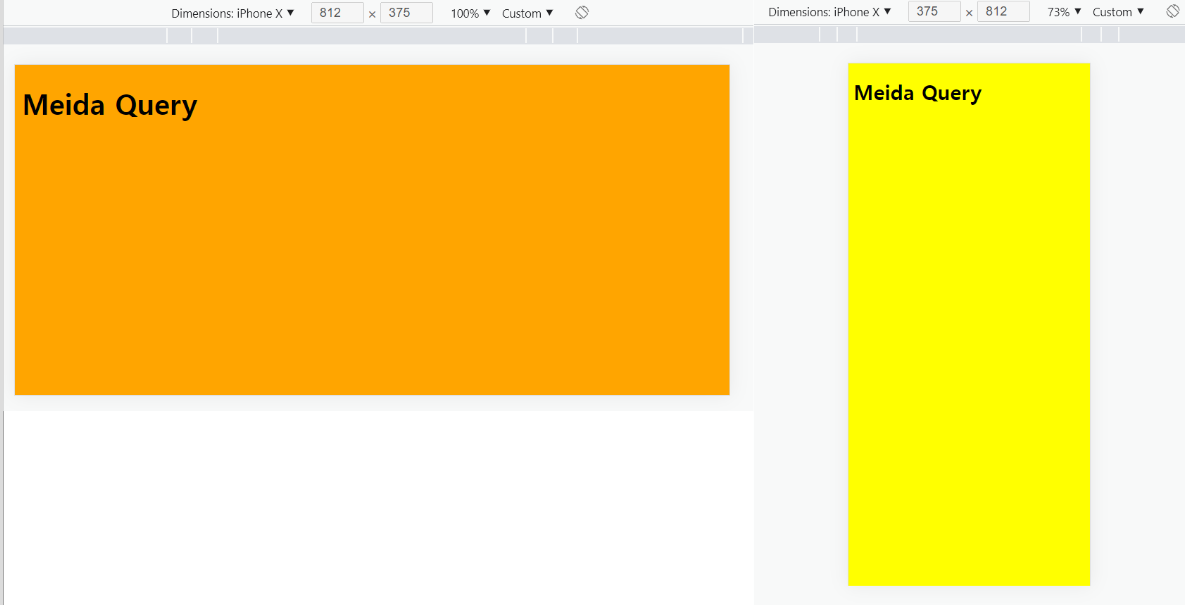
모바일 가로보기
/*가로보기*/
@media screen and (orientation : landscape){
	옵션 내용
}

/*세로보기*/
@media screen and (orientation : portrait){
	옵션 내용
}
<style>
	body {
		background-color:#eee;
	}

	@media screen and (orientation:landscape) {
		body {background-color:orange;}
	}
	@media screen and (orientation:portrait) {
		body {background-color:yellow;}
	}
</style>

AllTimeDevelop