
INDIGO
INDIGO의 홈페이지는 크게 헤더와 네비게이션 부분, 슬라이드 이미지화면(구동X),
홈페이지에 대한 section 부분, footer(지도 포함) 부분을 나누어 표현한 홈페이지로
간단한 회사 소개와 연락처 공유, 오는 길 소개를 할 수 있는 홈페이지다.
반응형으로 제작하였으며 flex가 아닌 float를 이용하여 수동으로 각 너비와 높이를 적절히 결정하고 모바일 > 테블릿 > pc 순으로 css를 작성하였다.
INDIGO 홈페이지 바로 가기
페이지 소개
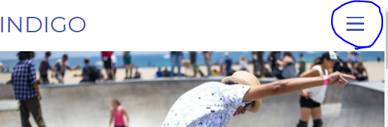
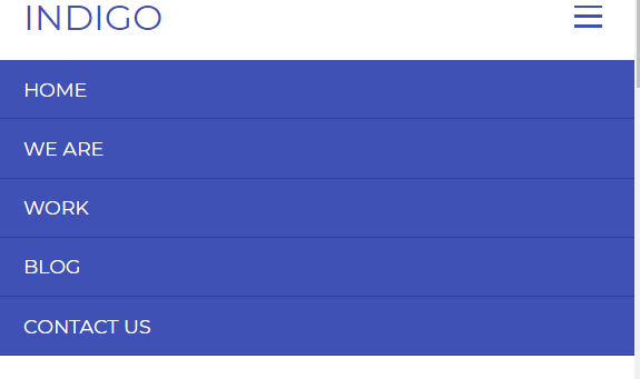
헤더
이 부분은 로고 부분과 네비 부분이 헤더를 차지하고 바로 밑에는 슬라이더 부분으로 이루어 졌다.

html, css 코드
<div id="wrap">
        <header class="header cfixed">
            <h1 class="logo"><a href="">INDIGO</a></h1>
            <nav>
                <ul class="gnb">
                    <li><a href="">HOME</a></li>
                    <li><a href="">WE ARE</a></li>
                    <li><a href="">WORK</a></li>
                    <li><a href="">BLOG</a></li>
                    <li><a href="">CONTACT US</a></li>
                </ul>
            </nav>
            <span class="menu-toggle-btn">
                <span></span>
                <span></span>
                <span></span>
            </span>
        </header>
        <article class="slider">
            <img src="images/p-images/slide01.jpg" alt="">
        </article>
/* 모바일용 */
.container {
width: 90%;
max-width: 1132px;
margin: 0 auto;
}
/* 부모요소가 해당요소의 높잇값을 인식하지 못하는 문제가 발생하여
가상 엘리먼트를 이용하여 부모 요소의 마지막 위치값을 알 수 있게 만든다.*/
.cfixed:after,
.container:after {
display: block;
content: "";
clear: both;
}
.blind {
position: absolute;
width: 0;
height: 0;
line-height: 0;
text-indent: -9999px;
overflow: hidden;
}
.sec-tit {
font-size: 42px;
color: #3f51b5;
font-weight: normal;
}
.divider {
width: 90%;
max-width: 1132px;
margin: 0 auto;
margin-top: 77px;
background: #eee;
}
.m-divider {
width: 20px;
margin: 0 auto;
margin-top: 77px;
background: #3f51b5;
}
/* 헤더 영역 */
.header {
position: relative;
padding: 18px 5%;
}
.header .logo {
float: left;
}
.header .logo a {
font-size: 26px;
color: #3f51b5;
font-weight: normal;
}
.header .gnb {
display: none;
position: absolute;
top: 100%;
left: 0;
width: 100%;
background: #3f51b5;
}
.header .gnb li {
border-bottom: 1px solid #303f9f;
}
.header .gnb li a {
display: block;
padding: 14px 0 14px 5%;
font-size: 14px;
color: #fff;
}
.header .menu-toggle-btn {
float: right;
width: 20px;
margin-top: 4px;
cursor: pointer;
}
.header .menu-toggle-btn span {
display: block;
width: 100%;
height: 2px;
background: #3f51b5;
}
.header .menu-toggle-btn span:nth-child(2) {
margin: 5px 0;
}
/* 슬라이더 영역 */
.slider img {
display: block;
width: 100%;
max-width: 100%;
height: auto;
}
/* 디스플레이 영역 */
.display-section {
margin-top: 59px;
text-align: center;
}
.display-section .sec-tit {
margin-bottom: 30px;
}
.display-section .desc {
font-family: "PT Seriff";
color: #616161;
line-height: 1.9;
}section 부분
section 부분은 크게 section을 담는 content와 그 안에는 디스플레이, 프로모션, 최근 작업, 최근 글, 연락처 영역으로 나뉘어져 있다.
각각 section으로 구분되어있는 것을 알 수 있다.
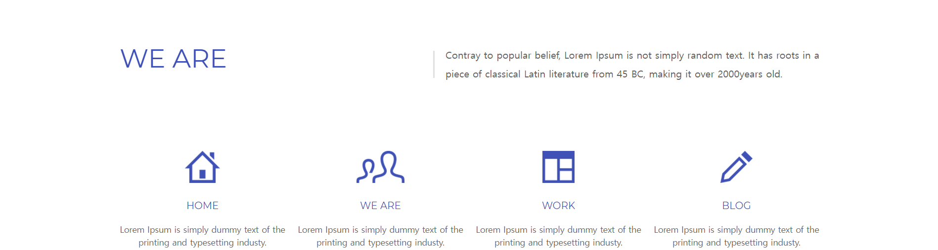


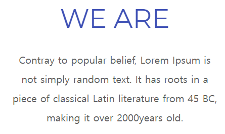
section - display영역
html의 코드는 다음과 같다.
html 코드
 <section class="display-section">
         <div class="container">
              <h2 class="sec-tit">WE ARE</h2>
                 <p class="desc">Contray to popular belief,
                   Lorem Ipsum is not simply random text.
                   It has roots in a
                   <br> piece of classical Latin literature
                   from 45 BC, making it over 2000years old.</p>
         </div>
 </section>
css 코드
모바일화면
모바일 화면의 css/* 중앙 정렬에 마진으로 수동으로 조작함.*/ .display-section { margin-top: 59px; text-align: center; } .display-section .sec-tit { margin-bottom: 30px; } .display-section .desc { font-family: "PT Seriff"; color: #616161; line-height: 1.9; }
테블릿화면
모바일과 동일하여 생략

pc화면
모바일, 테블릿과 다르게 좌측 정렬에 중앙에 줄이 추가되었다./* 디스플레이 영역 */ .display-section { text-align: left; } .display-section .sec-tit { float: left; margin-bottom: 0; } .display-section .desc { position: relative; float: right; padding-left: 20px; font-family: "PT Serif"; color: #616161; line-height: 1.9; } /* 세로 구분선 만들기 */ .display-section .desc:before { display: block; position: absolute; top: 9px; left: 0; width: 2px; height: 44px; background: #e0e0e0; content: ""; }

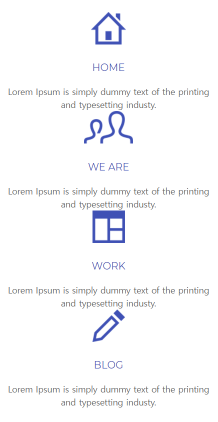
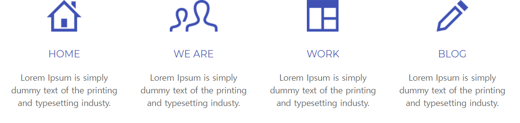
section - promotion 영역
html 코드
<section class="promotion-section">
                <div class="container">
                    <ul class="promo-list">
                        <li>
                            <a href="">
                                <img src="images/s-images/promo01.png" alt="">
                                <h3>HOME</h3>
                                <p>Lorem Ipsum is simply dummy text of the printing and typesetting industy.</p>
                            </a>
                        </li>
                        <li>
                            <a href="">
                                <img src="images/s-images/promo02.png" alt="">
                                <h3>WE ARE</h3>
                                <p>Lorem Ipsum is simply dummy text of the printing and typesetting industy.</p>
                            </a>
                        </li>
                        <li>
                            <a href="">
                                <img src="images/s-images/promo03.png" alt="">
                                <h3>WORK</h3>
                                <p>Lorem Ipsum is simply dummy text of the printing and typesetting industy.</p>
                            </a>
                        </li>
                        <li>
                            <a href="">
                                <img src="images/s-images/promo04.png" alt="">
                                <h3>BLOG</h3>
                                <p>Lorem Ipsum is simply dummy text of the printing and typesetting industy.</p>
                            </a>
                        </li>
                    </ul>
                </div>
            </section>
css 코드
모바일화면
/* 프로모션 영역 */
.promotion-section {
  margin-top: 68px;
}
.promotion-section .promo-list {
  margin-top: 52px;
  text-align: center;
}
.promotion-section .promo-list:first-child {
  margin-top: 0;
}
.promotion-section .promo-list li img {
  height: 52px;
}
.promotion-section .promo-list li h3 {
  margin: 29px 0 20px 0;
  color: #3f51b5;
  font-weight: normal;
}
.promotion-section .promo-list li p {
  font-size: 14px;
  font-family: "PT Serif";
  color: #616161;
  line-height: 1.5;
}
테블릿화면
/* 프로모션 영역 */
  .promotion-section {
    margin-top: 110px;
  }
  .promotion-section .promo-list li {
  /*왼쪽으로 float하여 가로로 배치하였다.*/
    float: left;
    width: 23.04%;
    margin-left: 2.604%;
    margin-top: 0;
  }
  .promotion-section .promo-list li:first-child {
    margin-left: 0;
  }
pc화면
/*크기를 다소 조정하였다.*/
.promotion-section .promo-list li {
    width: 23.674%;
    margin-left: 1.766%;
  }

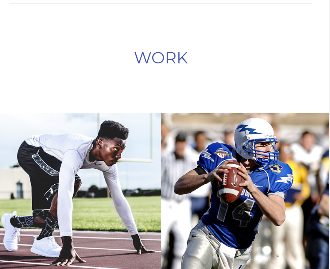
section - work(최근작업) 영역
html 코드
hr태그는 초기화 css코드에 따로 저장함.
깃 허브참조
            <hr class="divider">
<section class="work-section cfixed">
                <h2 class="sec-tit">WORK</h2>
                <ul class="work-list">
                    <li>
                        <a href="">
                            <div class="info">
                                <h3>Running</h3>
                                <span>WEB/PRINT</span>
                            </div>
                            <img src="images/p-images/work01.jpg" alt="">
                        </a>
                    </li>
                    <li>
                        <a href="">
                            <div class="info">
                                <h3>Rugby</h3>
                                <span>WEB/PRINT</span>
                            </div>
                            <img src="images/p-images/work02.jpg" alt="">
                        </a>
                    </li>
                    <li>
                        <a href="">
                            <div class="info">
                                <h3>Weight</h3>
                                <span>WEB/PRINT</span>
                            </div>
                            <img src="images/p-images/work03.jpg" alt="">
                        </a>
                    </li>
                    <li>
                        <a href="">
                            <div class="info">
                                <h3>Marathon</h3>
                                <span>WEB/PRINT</span>
                            </div>
                            <img src="images/p-images/work04.jpg" alt="">
                        </a>
                    </li>
                    <li>
                        <a href="">
                            <div class="info">
                                <h3>Boxing</h3>
                                <span>WEB/PRINT</span>
                            </div>
                            <img src="images/p-images/work05.jpg" alt="">
                        </a>
                    </li>
                    <li>
                        <a href="">
                            <div class="info">
                                <h3>Ice Hockey</h3>
                                <span>WEB/PRINT</span>
                            </div>
                            <img src="images/p-images/work06.jpg" alt="">
                        </a>
                    </li>
                    <li>
                        <a href="">
                            <div class="info">
                                <h3>Skate Board</h3>
                                <span>WEB/PRINT</span>
                            </div>
                            <img src="images/p-images/work07.jpg" alt="">
                        </a>
                    </li>
                    <li>
                        <a href="">
                            <div class="info">
                                <h3>Basketball</h3>
                                <span>WEB/PRINT</span>
                            </div>
                            <img src="images/p-images/work08.jpg" alt="">
                        </a>
                    </li>
                </ul>
            </section>
css 코드
모바일 화면
한줄 배치에 최 상단에 구분선이 있다. (이 부분은 html의 hr태그를 참조)
또한 사진에 마우스를 올리면 사진의 설명이 나오도록 하였다..work-section { margin-top: 73px; } .work-section .sec-tit { width: 90%; max-width: 1132px; margin: 0 auto; margin-bottom: 47px; text-align: center; } .work-section word-list li { width: 100%; } .work-section .work-list li a { display: block; position: relative; width: 100%; height: 100%; } .work-section .work-list li a:before { display: block; position: absolute; top: 0; left: 0; z-index: 10; width: 100%; height: 100%; background: #3f51b5; content: ""; opacity: 0; transition: all 0.2s; } .work-section .work-list li a:hover { opacity: 0.86; } .work-section .work-section li .info { position: absolute; top: 0; left: 23px; z-index: 20; opacity: 0; transition: all 0.3s; } .work-section .work-list li a:hover .info { transform: translateY(23px); opacity: 1; } .work-section .work-list li .info h3 { margin-bottom: 8px; font-size: 23px; color: #fff; font-weight: normal; } .work-section .work-list li .info span { font-size: 11px; color: #fff; } .work-section .work-list li img { display: block; width: 100%; max-width: 100%; height: auto; }

테블릿 화면
동일한 기능에 화면구성만 2줄로 바뀌었다./* 프로모션 영역 */ .promotion-section { margin-top: 110px; } .promotion-section .promo-list li { float: left; width: 23.04%; margin-left: 2.604%; margin-top: 0; } .promotion-section .promo-list li:first-child { margin-left: 0; }
pc화면
화면구성이 여러줄로 바뀌었으며 sec-tit도 좌측 정렬로 바뀌었다.z
float를 하였기 때문에 너비만 조절하였다./* 최근 작업 영역 */ .work-section .sec-tit { text-align: left; } .work-section .work-list li { width: 25%; }

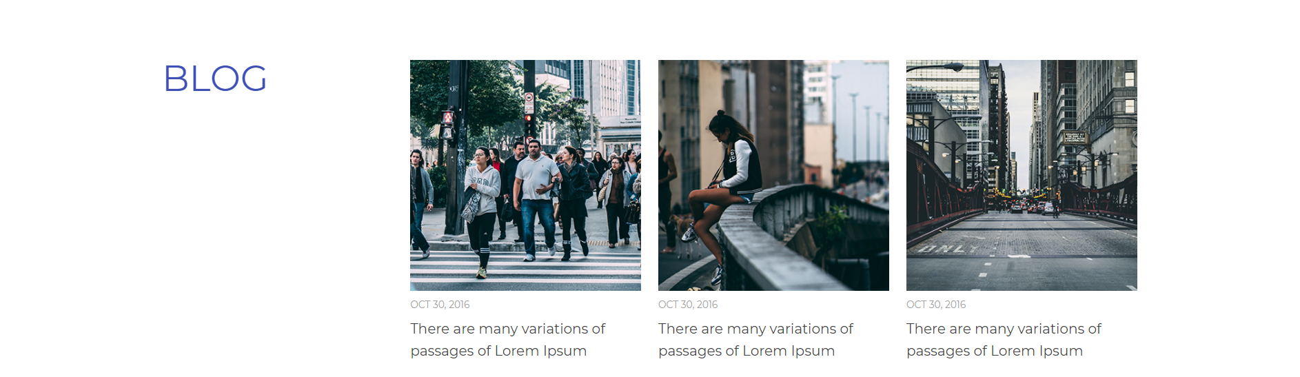
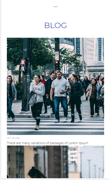
section - blog(최근 글) 영역
html 코드
<hr class="m-divider">
            <section class="blog-section">
                <div class="container">
                    <h2 class="sec-tit">BLOG</h2>
                    <ul class="blog-list">
                        <li>
                            <a href=""><img src="images/p-images/blog01.jpg" alt=""></a><time datetime="2016-10-30">OCT 30, 2016</time>
                            <a href=""><h3>There are many variations of passages of Lorem Ipsum</h3></a>
                        </li>
                        <li>
                            <a href=""><img src="images/p-images/blog02.jpg" alt=""></a><time datetime="2016-10-30">OCT 30, 2016</time>
                            <a href=""><h3>There are many variations of passages of Lorem Ipsum</h3></a>
                        </li>
                        <li>
                            <a href=""><img src="images/p-images/blog03.jpg" alt=""></a><time datetime="2016-10-30">OCT 30, 2016</time>
                            <a href=""><h3>There are many variations of passages of Lorem Ipsum</h3></a>
                        </li>
                    </ul>
                </div>
            </section>
css 코드
모바일 화면
/* 최근 글 영역 */
.blog-section {
  margin-top: 77px;
}
.blog-section .sec-tit {
  margin-bottom: 47px;
  text-align: center;
}
.blog-section .blog-list li:first-child {
  margin-top: 0;
}
.blog-section .blog-list li img {
  display: block;
  width: 100%;
  max-width: 100%;
  height: auto;
}
.blog-section .blog-list li time {
  display: block;
  margin: 11px 0 10px 0;
  font-size: 11px;
  color: #9e9e9e;
}
.blog-section .blog-list li h3 {
  color: #424242;
  font-weight: normal;
  line-height: 1.6;
}
테블릿 화면
/* 최근 글 영역 */
  .blog-section {
    margin-top: 124px;
  }
  .blog-section .sec-tit {
    margin-bottom: 76px;
  }
  .blog-section .blog-list li {
    float: left;
    width: 31.59%;
    margin-left: 2.604%;
    margin-top: 0;
  }
  .blog-section .blog-list li:first-child {
    margin-left: 0;
  }
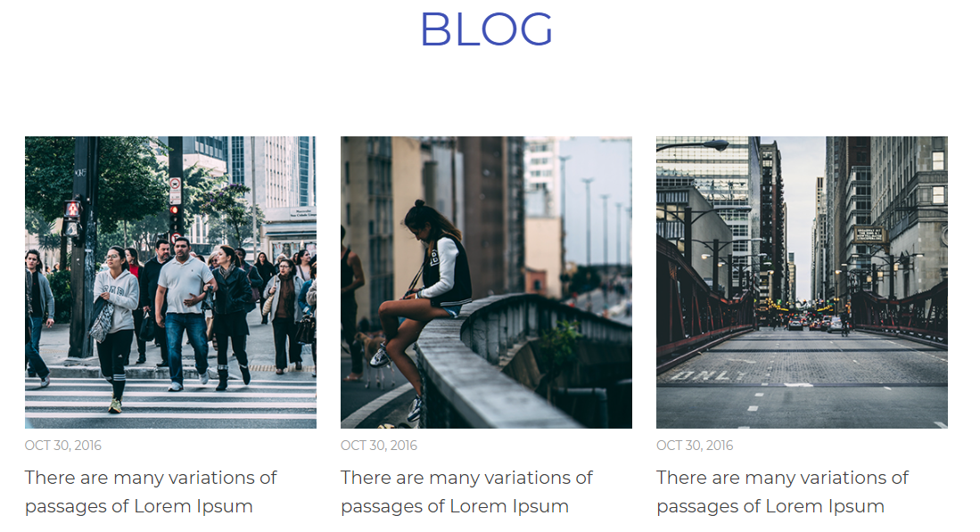
pc화면
/* 최근 글 영역 */
  .blog-section .sec-tit {
    float: left;
    margin-bottom: 0;
  }
  .blog-section .blog-list {
    float: right;
    width: 74.55%;
  }
  .blog-section .blog-list li {
    width: 31.75%;
    margin-left: 2.369%;
  }

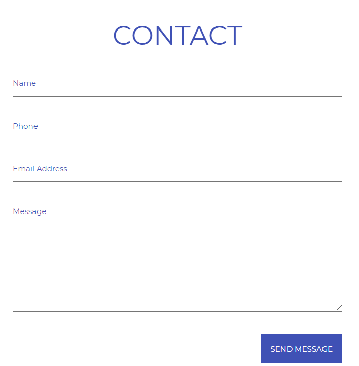
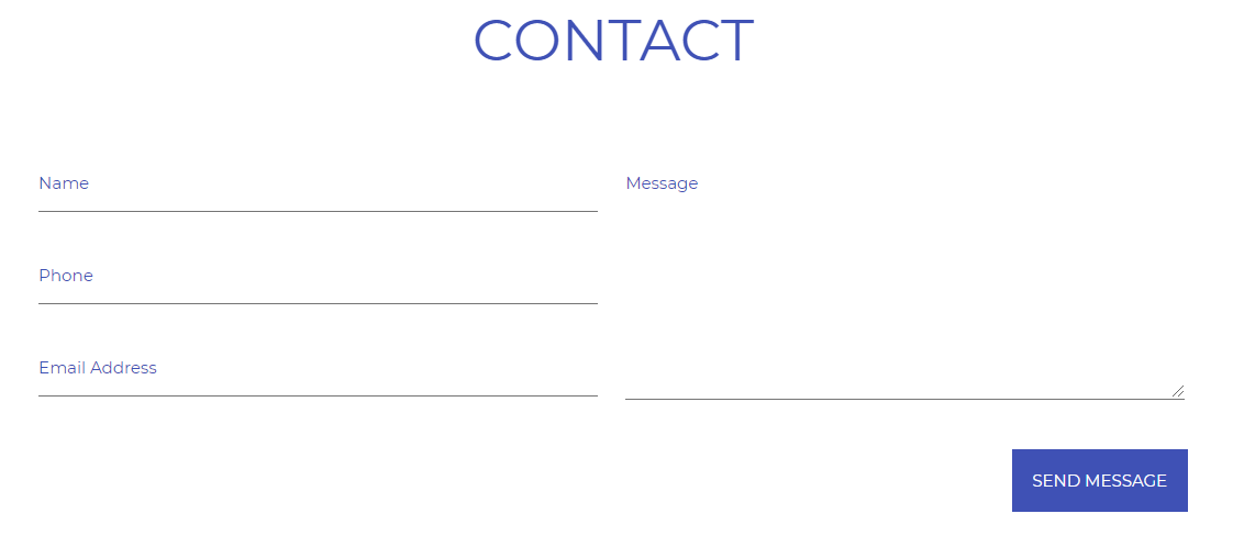
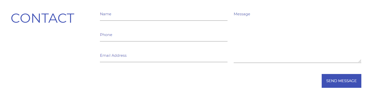
section - contact 영역
html 코드
form을 이용하여 사용자의 이름, 전화번호, 이메일, 전달사항을 받도록 하고 버튼을 만들었다.
<section class="contact-section">
                <div class="container">
                    <h2 class="sec-tit">CONTACT</h2>
                    <div class="form-box">
                        <form action="" method="">
                            <fieldset class="cfixed">
                                <legend class="blind">CONTACT US</legend>
                                <div class="form">
                                    <label for="name" class="blind">name</label>
                                    <input type="text" id="name" placeholder="Name">
                                    <label for="phone" class="blind">phone</label>
                                    <input type="tel" id="phone" placeholder="Phone">
                                    <label for="email" class="blind">email</label>
                                    <input type="email" id="email" placeholder="Email Address">
                                </div>
                                <div class="textarea">
                                    <label for="message" class="blind">message</label>
                                    <textarea name="message" id="message" placeholder="Message"></textarea>
                                </div>
                            </fieldset>
                            <div class="send-btn">
                                <button>SEND MESSAGE</button>
                            </div>
                        </form>
                    </div>
                </div>
            </section>
css 코드
모바일 화면
/* 연락처 영역 */
.contact-section {
  margin-top: 109px;
}
.contact-section .sec-tit {
  margin-bottom: 47px;
  text-align: center;
}
.contact-section .form-box .form input {
  padding-bottom: 13px;
  margin-bottom: 38px;
}
.contact-section .form-box .textarea textarea {
  height: 165px;
}
.contact-section .form-box .send-btn {
  margin-top: 36px;
  text-align: right;
}
.contact-section .form-box .send-btn button {
  padding: 15px;
  margin: 0;
  border: 0;
  font-size: 12px;
  color: #fff;
  background: #3f51b5;
  font-family: "Montserrat";
  cursor: pointer;
}
테블릿 화면
 /* 연락처 영역 */
  .contact-section {
    margin-top: 176px;
  }
  .contact-section .sec-tit {
    margin-bottom: 76px;
  }
  .contact-section .form-box .form,
  .contact-section .form-box .textarea {
    float: left;
    width: 48.6979%;
  }
  .contact-section .form-box .form {
    margin-right: 2.36966%;
  }
  .contact-section .form-box .form input:last-child {
    margin-bottom: 0;
  }
pc화면
  /* 연락처 영역 */
  .contact-section .sec-tit {
    float: left;
    margin-bottom: 0;
  }
  .contact-section .form-box {
    float: right;
    width: 74.55%;
  }
  .contact-section .form-box .form,
  .contact-section .form-box .textarea {
    width: 48.815%;
  }
  .contact-section .form-box .form {
    margin-right: 2.369%;
  }
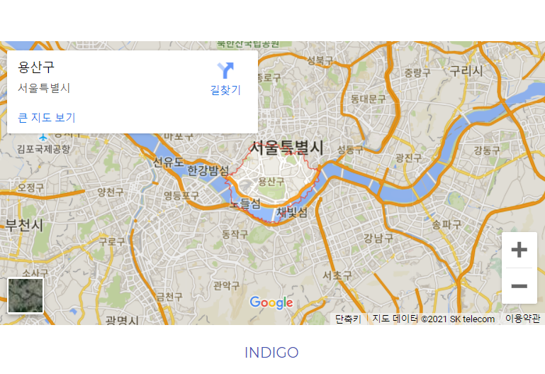
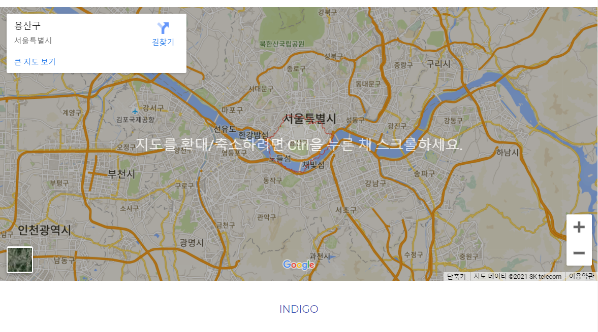
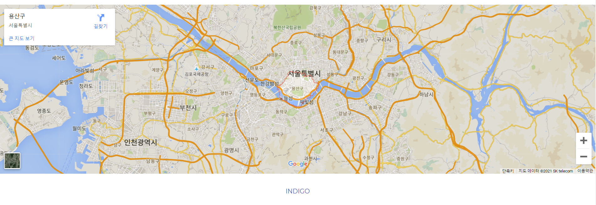
footer 부분
footer
지도는 각 화면에 따라서 높이만 조절하였으며 구글지도에서 지도의 링크를 가져왔다.
구글은 오픈소스라 지도의 제공이 원활하다.
html 코드
<footer class="footer">
              <!-- 구글 지도 홈페이지에서 링크를 가져왔다. -->
            <iframe src="https://www.google.com/maps/embed?pb=!1m18!1m12!1m3!1d101249.35369599063!2d126.91092691339621!3d37.53050006856059!2m3!1f0!2f0!3f0!3m2!1i1024!2i768!4f13.1!3m3!1m2!1s0x357ca23c7e313fd3%3A0xa4342ca52af9b117!2z7ISc7Jq47Yq567OE7IucIOyaqeyCsOq1rA!5e0!3m2!1sko!2skr!4v1636882007412!5m2!1sko!2skr" width="600" height="450" style="border:0;" allowfullscreen="" loading="lazy"></iframe>
          <p class="copyright">INDIGO</p>
        </footer>
css 코드
모바일 화면
.footer {
  margin-top: 104px;
}
.footer iframe {
  width: 100%;
  height: 320px;
}
.footer p {
  margin: 21px 0;
  color: #3f51b5;
  text-align: center;
}
테블릿 화면
.footer iframe {
    height: 432px;
  }
  .footer p {
    margin: 34px 0;
  }
pc화면
/*테블릿과 동일*/
토글 사용 설명
토글은 span의 css를 설정하여 마치 옵션화면처럼 보이게 트릭을 줄 수 있다.
<header class="header cfixed">
            <h1 class="logo"><a href="">INDIGO</a></h1>
            <nav>
                <ul class="gnb">
                    <li><a href="">HOME</a></li>
                    <li><a href="">WE ARE</a></li>
                    <li><a href="">WORK</a></li>
                    <li><a href="">BLOG</a></li>
                    <li><a href="">CONTACT US</a></li>
                </ul>
            </nav>
            <span class="menu-toggle-btn">
                <span></span>
                <span></span>
                <span></span>
            </span>
        </header>
토글의 위치조절과 위에서 설명한 옵션아이콘처럼 보이게 하는 트릭코드이다.
/* 자바스크립트를 사용하기 전까지 안보이게 함*/
.header .gnb {
  display: none;
  position: absolute;
  top: 100%;
  left: 0;
  width: 100%;
  background: #3f51b5;
}

.header .gnb li {
  border-bottom: 1px solid #303f9f;
}

.header .gnb li a {
  display: block;
  padding: 14px 0 14px 5%;
  font-size: 14px;
  color: #fff;
}

.header .menu-toggle-btn {
  float: right;
  width: 20px;
  margin-top: 4px;
  cursor: pointer;
}

.header .menu-toggle-btn span {
  display: block;
  width: 100%;
  height: 2px;
  background: #3f51b5;
}

.header .menu-toggle-btn span:nth-child(2) {
  margin: 5px 0;
}
이 토글버튼을 활성화 시키기 위해서는 자바스크립트를 이용하면 된다.
여기서는 jquery라는 프레임워크를 활용하여 자바스크립트의 기능을 구현하였다.
js 코드
jQuery(function($){
    $(".menu-toggle-btn").click(function(){
        $(".gnb").stop().slideToggle("fast")
    });
});
html 코드
	<!-- jquery를 사용하기 위한 스크립트 -->
    <script src="js/jquery.min.js"></script>
	<!-- jquery 코드가 담겨있는 스크립트 -->
    <script src="js/indigo.min.js"></script>
위와 같이 작성하면 아래와 같이 동작한다.
한계점
float만을 사용하여 만들때 단점은 이 원하는 모양을 잡기에 많은 시간이 들이며 위치를 하나하나 선정하고 테스트해야 하는 단점이 있다.
또한 jquery를 사용하면 코드가 간단하지만 이 코드를 실행시키기위한 별도의 파일이 필요함으로 코드의 길이나 구현하는 동작이 많아지면 얘기치 못한 오류가 발생할 수 있다.
따라서 다음에 만들어 볼 웹사이트는 동일한 구성을 한 flex 기반과 프레임워크 없이 자바스크립트를 활용한 토글 버튼 구현을 해보겠다.
