🔍 Styled Components
HTML + JS + CSS까지 묶어서 하나의 JS파일 안에서 컴포넌트 단위로 개발할 수 있게 도와주는 라이브러리로, CSS를 컴포넌트 안으로 캡슐화한다.
👀 setting
터미널에 아래의 명령어를 입력해 styled components 라이브러리를 설치하고,
# with npm
$ npm install --save styled-components

# with yarn
$ yarn add styled-components
package.josn에 아래의 코드를 추가하여 여러 버전의 styled components가 설치되는 것을 방지한다.
{
  "resolutions": {
    "styled-components": "^5"
  }
}
이 후, app.js에 import styled from "styled-components" 를 최상단에 작성해 import 해주면 styled components를 사용할 수 있다.
👀 문법
1. 컴포넌트 만들기
ES6의 Templete Literals 문법을 사용하기 때문에 백틱( ` )을 사용하여 컴포넌트를 만든다.
import styled from "styled-components";

//Styled Components로 컴포넌트를 만들고
const Button = styled.button`
  background-color: blue;
  color: white;
`;

export default function App() {
  // React 컴포넌트를 사용하듯이 사용한다.
  return <Button>Button</Button>;
}
2. 컴포넌트 재활용
만들어진 컴포넌트를 재활용하여 새로운 컴포넌트를 생성한다.
import styled from "styled-components";

//Styled Components로 컴포넌트를 만들고
const Button = styled.button`
  background-color: blue;
  color: white;
`;

// 위의 컴포넌트를 재활용하여 새로운 컴포넌트를 생성한다.
const BigButton = styled(Button)`
  padding: 10px;
  margin-top: 10px;
`;

export default function App() {
  // React 컴포넌트를 사용하듯이 사용한다.
  return (
    <>
      <Button>Button</Button>
      <br />
      <BigButton>Big Button</BigButton>
    </>
  );
}
3. Props 활용
React 컴포넌트처럼 props를 내려줄 수 있으며, props 값에 따라서 컴포넌트를 렌더링할 수도 있다.
조건부 렌더링
import styled from "styled-components";

//받아온 prop에 따라 조건부 렌더링을 해준다
// props의 값이 blue면 background의 색은 blue, 아니면 white
const Button = styled.button`
  background: ${(props) => (props.blue ? "blue" : "white")};
`;

export default function App() {
  return (
    <>
      <Button>Button</Button>
      <Button blue>Button</Button>
    </>
  );
}
props 값으로 렌더링
import styled from "styled-components";

//받아온 prop 값으로 렌더링한다
const Button = styled.button`
  background: ${(props) => (props.color ? props.color : "white")};
`;

//다음과 같은 형식으로도 활용할 수 있다.
const Button2 = styled.button`
  background: ${(props) => props.color || "white"};
`;

export default function App() {
  return (
    <>
      <Button>Button1</Button>
      <Button color="blue">Button1</Button>
      <Button color="red">Button1</Button>
      <br />
      <Button2>Button2</Button2>
      <Button2 color="yellow">Button2</Button2>
      <Button2 color="pink">Button2</Button2>
    </>
  );
}
4. 전역 스타일 설정
바로 위위 **props 값으로 렌더링** 예시 코드에 전역 스타일을 적용하면 아래와 같다.
import styled from "styled-components";

// 전역 스타일 설절을 위한 함수 import
import { createGlobalStyle } from "styled-components";

// 전역 스타일 설정
const GlobalStyle = createGlobalStyle`
	button {
		padding : 5px;
    margin : 2px;
    border-radius : 5px;
	}
`

//받아온 prop 값으로 렌더링한다
const Button = styled.button`
  background: ${(props) => (props.color ? props.color : "white")};
`;

//다음과 같은 형식으로도 활용할 수 있다.
const Button2 = styled.button`
  background: ${(props) => props.color || "white"};
`;

export default function App() {
  return (
    <>
      <GlobalStyle />{/*전역 스타일 컴포넌트 적용*/}
        <Button>Button1</Button>
        <Button color="blue">Button1</Button>
        <Button color="red">Button1</Button>
        <br />
        <Button2>Button2</Button2>
        <Button2 color="yellow">Button2</Button2>
        <Button2 color="pink">Button2</Button2>
    </>
      );
}
👀 실습 예시
위의
// app.js

import "./styles.css";

export default function App() {
  return <button id="practice">Practice!</button>;
}
// CSS

* {
  margin: 0.5rem;
}

#practice {
  padding: 1rem;
  font-size: 2rem;
  background: powderblue;
  border-radius: 1rem;
  transition: 0.5s;
}

#practice:hover {
  background: cornflowerblue;
  color: white;
  transition: 0.5s;
}
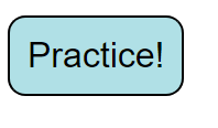
- 나타나는 버튼
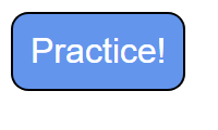
- hover 시, 버튼 디자인 변경
위의 코드(기본 CSS)에 styled components를 적용 하면 아래와 같다.
// app.js

import "./styles.css";
import styled from "styled-components";
import { createGlobalStyle } from "styled-components";

// Styled Components는 이미 설치되어 있습니다. import 하는 것 잊지 마세요.
// 전역 스타일도 Styled Components 컴포넌트로 바꿔서 적용해보세요.
// #practice:hover 속성은 어떻게 Styled Components 컴포넌트에 적용할 수 있을까요? 검색을 통해 알아보고 적용해보세요.

const GlobalStyle = createGlobalStyle`
	button {
		margin: 0.5rem;
  }
  `

const Button = styled.button`
  padding: 1rem;
  font-size: 2rem;
  background: powderblue;
  border-radius: 1rem;
  transition: 0.5s;
  &:hover{
    background: cornflowerblue;
    color: white;
    transition: 0.5s;
  }
`;


export default function App() {
  return (
    <>
    <GlobalStyle />
    <Button>Practice!</Button>
    </>
    );
}
Reference: 코드스테이츠