[TIL] 220516 리액트 디테일 잡기-(Context, Portal, Render Props, PropTypes, Reconciliation)
TIL(Today I Learn)
목록 보기
19/19
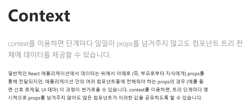
1. Context
https://ko.reactjs.org/docs/context.html#gatsby-focus-wrapper
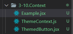
- 예제
//Example.jsx
import React, { Component } from "react";
import { ThemeContext, themes } from "./ThemeContext";
import ThemedButton from "./ThemedButton";

export default class Example extends Component {
  constructor(props) {
    super(props);
    this.state = {
      theme: themes.light,
    };
    this.toggleTheme = () => {
      this.setState((prev) => ({
        theme: prev.theme === themes.dark ? themes.light : themes.dark,
      }));
    };
  }
  render() {
    return (
      <div>
        <ThemeContext.Provider value={this.state.theme}>
          <ThemedButton changeTheme={this.toggleTheme} />
          <ThemeContext.Consumer>
            {(theme) => (
              <div
                style={{
                  height: 300,
                  width: 300,
                  backgroundColor: theme.background,
                }}
              ></div>
            )}
          </ThemeContext.Consumer>
        </ThemeContext.Provider>
        <ThemedButton />
      </div>
    );
  }
}

// ThemeContext.jsx
import React from 'react';

export const themes = {
  light: {
    foreground: '#000000',
    background: '#eeeeee',
  },
  dark: {
    foreground: '#ffffff',
    background: '#222222',
  }
}

export const ThemeContext = React.createContext(themes.dark);

//ThemedButton.jsx
// import React, { Component } from "react";
// import { ThemeContext } from "./ThemeContext";

// class ThemedButton extends Component {
//   render() {
//     let props = this.props;
//     let theme = this.context;

//     return (
//       <button
//         {...props}
//         onClick={props.changeTheme}
//         style={{ backgroundColor: theme.background, color: theme.foreground }}
//       >
//         Button
//       </button>
//     );
//   }
// }

// ThemedButton.contextType = ThemeContext;

// export default ThemedButton;

import React, { useContext } from "react";
import { ThemeContext } from "./ThemeContext";

export default function ThemedButton(props) {
  const theme = useContext(ThemeContext);
  return (
    <button
      {...props}
      onClick={props.changeTheme}
      style={{ backgroundColor: theme.background, color: theme.foreground }}
    >
      Button
    </button>
  );
}
2. Portal
https://ko.reactjs.org/docs/portals.html#gatsby-focus-wrapper
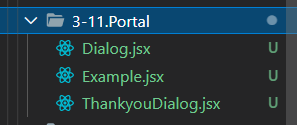
- 예시
// Dialog.jsx
import React, { useState } from "react";

export default function Dialog(props) {
  const [isOpen, setIsOpen] = useState(false);
  return (
    <>
      <button
        style={{ position: "absolute", left: 100 }}
        onClick={() => setIsOpen(true)}
      >
        Open{" "}
      </button>
      {isOpen && (
        <div
          style={{
            position: "absolute",
            zIndex: 99,
            top: "50%",
            left: "50%",
            transform: "translate(-50%, -50%)",
            border: "1px solid black",
            padding: "24px",
            backgroundColor: "white",
          }}
        >
          {typeof props.title === "string" ? (
            <h1>{props.title}</h1>
          ) : (
            props.title
          )}

          {typeof props.description === "string" ? (
            <h5>{props.description}</h5>
          ) : (
            props.description
          )}

          {typeof props.button === "string" ? (
            <button
              style={{ backgroundColor: "red", color: "white" }}
              onClick={() => setIsOpen(false)}
            >
              {props.button}
            </button>
          ) : (
            <div onClick={() => setIsOpen(false)}>{props.button}</div>
          )}
        </div>
      )}
      {isOpen && (
        <div
          style={{
            position: "fixed",
            top: 0,
            left: 0,
            bottom: 0,
            right: 0,
            backgroundColor: "lightgray",
          }}
        />
      )}
    </>
  );
}

// Example.jsx
import React from "react";
import { createPortal } from "react-dom";
import ThankyouDialog from "./ThankyouDialog";

const Portal = (props) => {
  return createPortal(props.children, document.getElementById("portal"));
};

export default function Example() {
  return (
    <div onClick={() => console.log("div")}>
      <Portal>
        <ThankyouDialog />
      </Portal>
      <div style={{ position: "absolute" }}>
        <button>하하하</button>
      </div>
    </div>
  );
}

//ThankyouDialog.jsx
import React from "react";
import Dialog from "./Dialog";

export default function ThankyouDialog() {
  return (
    <Dialog
      title={<h1 style={{ color: "royalblue" }}>Thanks</h1>}
      description="It is honor to meet you!"
      button={
        <button style={{ backgroundColor: "pink", color: "white" }}>
          close
        </button>
      }
    />
  );
}
3. Render Props
아래 공식문서 보기
https://ko.reactjs.org/docs/render-props.html#gatsby-focus-wrapper
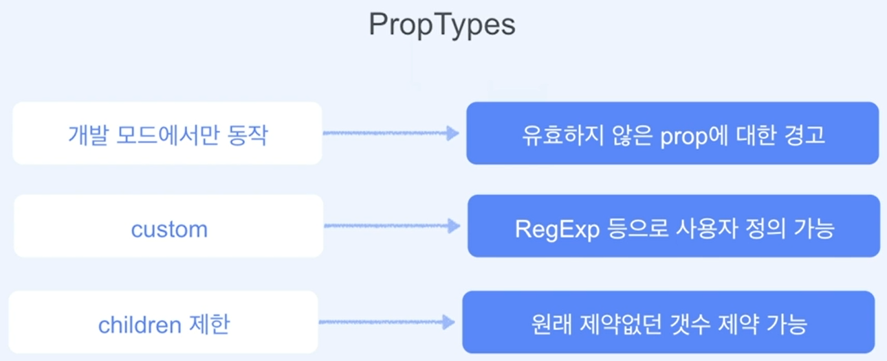
4. PropTypes
https://ko.reactjs.org/docs/typechecking-with-proptypes.html#gatsby-focus-wrapper
- 예시
import React from "react";
import PropTypes from "prop-types";

function PropComponent(props) {
  return <div>{props.name}</div>;
}

PropComponent.defaultProps = {
  name: "kwak",
  age: 31,
};

PropComponent.propTypes = {
  name: PropTypes.string,
  age: function (props, propName, componentName) {
    if (!/matchme/.test(props[propName])) {
      return new Error(
        "Invalid prop `" +
          propName +
          "` supplied to" +
          " `" +
          componentName +
          "`. Validation failed."
      );
    }
  },
};

export default function Component() {
  return (
    <div>
      <PropComponent />
    </div>
  );
}
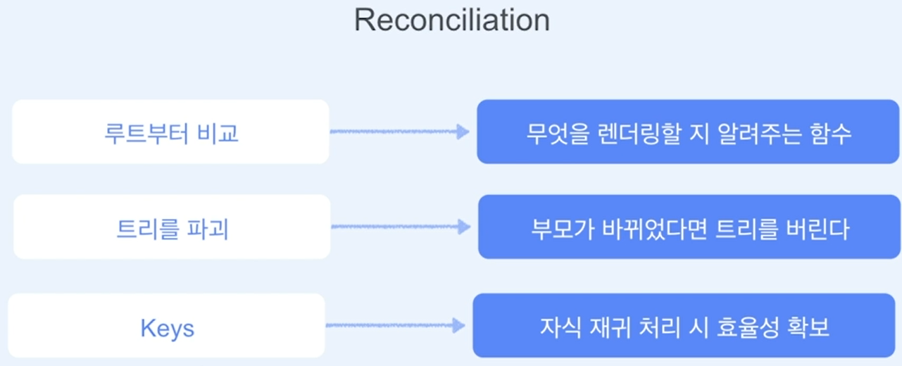
5. Reconciliation
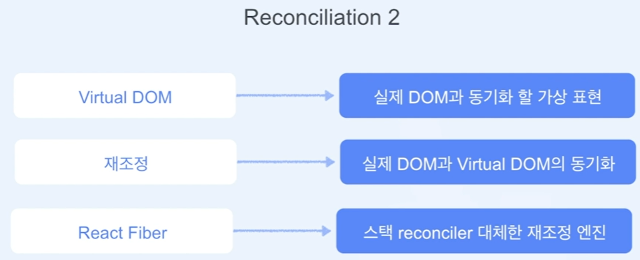
재조정
아래의 공식문서를 읽어보자.
https://ko.reactjs.org/docs/reconciliation.html#gatsby-focus-wrapper
프론트엔드 개발자