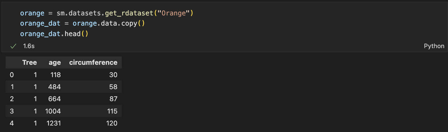
✔️ matplotlib.pyplot을 이용해서 산점도 그리기
plt.plot(orange_dat["age"],
         orange_dat["circumference"], "o")
plt.scatter(orange_dat["age"],
            orange_dat["circumference"],
            c="red")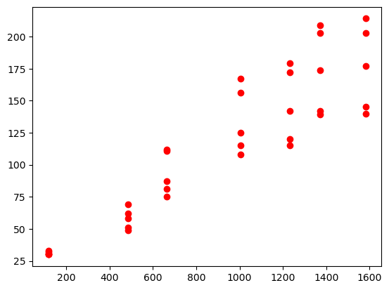
plt.scatter(orange_dat["age"],
            orange_dat["circumference"],
            c=orange_dat["Tree"], #-> cmap을 사용하기 위해서 그룹핑
            cmap="plasma")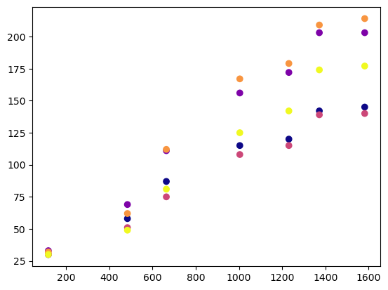
plt.plot은 한번에 여려개의 산점도를 그릴 수 있지만
plot.scatter은 여러개를 그리려면 도화지를 그려야한다.
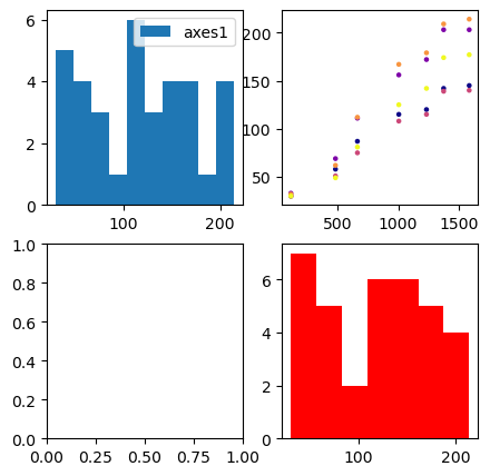
fig, axes = plt.subplots(2,2,figsize =(5,5))
# subplots(2,2 -> 개수 총 4개의 차트를 그린다. figsize는 크기를 나타낸다.
axes[0, 0].hist(orange_dat["circumference"])
axes[0, 0].legend(["axes1"])
axes[0, 1].scatter(orange_dat["age"], orange_dat["circumference"], s=5, c=orange_dat["Tree"], cmap="plasma")
axes[1, 1].hist(orange_dat["circumference"],bins = 7, color='r')
✔️ seaborn을 이용해서 산점도 그리기
sns.scatterplot(data = orange_dat, # 데이터셋 입력
                x = "age",
                y = "circumference",
                hue = "Tree",
                s = orange_dat.circumference*0.5) # 원의 크기를 입력할 수 있다.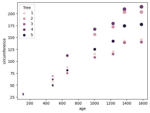
✔️ pairplot으로 여러 그래프 한번에 그리기
sns.pairplot(data = orange_dat,
             vars = ["age", "circumference", "Tree"],
             hue = "Tree",
             # 대각원소 교체
             diag_kind = "kde",
             # 상삼각제거
             corner = True)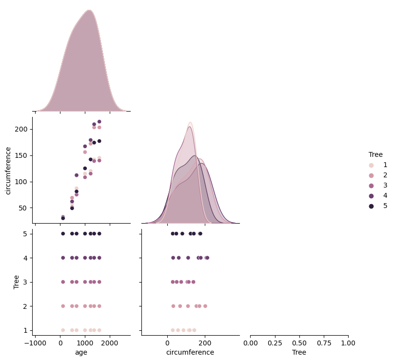
✔️ plt.subplots() 이용하기
fig, ax = plt.subplots() #fig는 도화지 ax는 축이다.
orange_dat.plot.scatter(x = "age",
                        y = "circumference", ax = ax)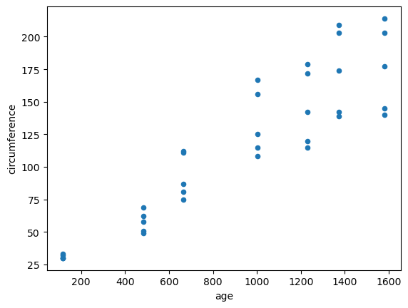
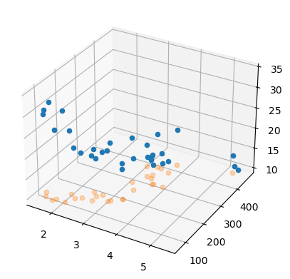
✔️ 3d 산점도 그리기
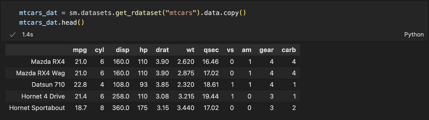
fig = plt.figure()
axes = fig.add_subplot(111, projection = "3d") # 111-> 숫자가 커지면 작아진다.

axes.scatter(mtcars_dat.wt,
             mtcars_dat.disp,
             mtcars_dat.mpg,
             depthshade = False)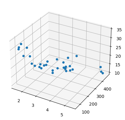
아래는 mpg축을 mpg 최소값에 고정시켜 정사형 시킨 형태의 3d 그래프를 얻을 수 있다.
axes.scatter(mtcars.wt,
             mtcars.disp,
             zs =  mtcars.mpg.min(), # 특정축 고정
             zdir = "z",
             depthshade = False,
             alpha = 0.3)