
import numpy as np
from matplotlib import pyplot as plt
부채꼴 그래프
fig = plt.figure()
ax = fig.add_subplot(111, polar=True)

ax.set_thetamin(45)
ax.set_thetamax(135)
plt.show()
방사형 차트
지금은 없어진 듯하지만 김박사넷에 연구실 정보를 오각형으로 나타낸 적이 있었다. 이처럼 여러 개의 파라미터를 동시에 나타내는 차트를 방사형 차트 (radar chart)라고 한다. 극좌표계를 활용하면 방사형 차트를 쉽게 그릴 수 있다.
labels = ['ambience', 'personality', 'pay', 'paper', 'lecture']
num_labels = len(labels)

angles = [x/float(num_labels)*(2*np.pi) for x in range(num_labels)]
angles += angles[:1]    # 시작점으로 다시 돌아와야하므로 시작점 추가

data = [70, 45, 85, 60, 30]
data += data[:1]     # 시작점으로 다시 돌아와야하므로 시작점 추가

fig = plt.figure()
ax = plt.subplot(polar=True)
ax.set_theta_offset(np.pi / 2)   # 시작점
ax.set_theta_direction(-1)    # 그려지는 방향 시계방향
plt.xticks(angles[:-1], labels)    # x축 눈금 라벨
ax.set_rlabel_position(0)    # y축 각도 설정 (degree 단위)
plt.yticks([20, 40, 60, 80],['D+', 'C+', 'B+', 'A+'])
plt.ylim(0,100)
ax.plot(angles, data)
ax.fill(angles, data, c='green', alpha=0.4)
plt.show()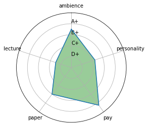
그림 전체를 오각형으로 만들고 싶다면 아래 코드를 추가해주면 된다. 다만 눈금까지 오각형으로 만드는 것은 잘 안 됨.
# the modules for pentagon shape
from matplotlib.spines import Spine
from matplotlib.path import Path
from matplotlib.transforms import Affine2D

spine = Spine(axes=ax,
          spine_type='circle',
          path=Path.unit_regular_polygon(len(labels)))

spine.set_transform(Affine2D().scale(.5).translate(.5, .5)+ax.transAxes)

ax.spines = {'polar':spine}
파이 차트
labels = ['fried chicken', 'seasoned chicken']
data = np.array([51, 49])

fig, ax = plt.subplots()
ax.pie(data,labels=labels, autopct='%0.0f%%', startangle=90)    # %1.1f%% -> 소수점 아래 한 자리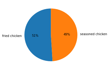
아래 코드를 추가하면 가운데에 원이 비면서 도넛 차트 모양으로 바꿀 수 있다.
centre_circle = plt.Circle((0,0),0.70,fc='white')
ax.add_artist(centre_circle)
tree map
import squarify

fig, ax = plt.subplots()
values = [100, 200, 300, 400]
label = list('ABCD')
color = ['blue', 'red', 'yellow', 'green']

squarify.plot(values, label=label, color=color, pad=0.2,
               text_kwargs={'color':'white', 'weight':'bold'}, ax=ax)

ax.axis('off')
plt.show()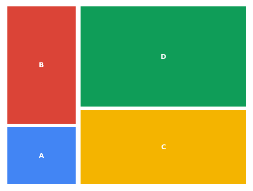
와플 차트
from pywaffle import Waffle

data = {'A': 50, 'B': 45, 'C': 15}

fig = plt.figure(FigureClass=Waffle, rows=5, values=data)
plt.show()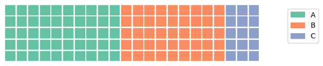
icons 옵션을 사용하면 사각형이 아니라 원하는 모양으로 바꿀 수 있다. (legend에도 반영하려면 icon_legend=True를 해야 한다. 여기를 참고해보면 별, 구름 등 다양한 모양을 사용할 수 있다.
벤 다이어그램
from matplotlib_venn import venn3    # venn2는 2개 그룹의 벤 다이어그램

set1 = set(['A', 'B', 'C', 'D'])
set2 = set(['B', 'C', 'D', 'E'])
set3 = set(['C', 'D',' E', 'F', 'G'])

venn3([set1, set2, set3], ('group 1', 'group 2', 'group 3'))
plt.show()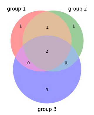
References
https://zephyrus1111.tistory.com/63 (radar chart)
Let it code