Media Query는 web뿐 아니라 mobile 기기에서 접속했을 때도 문제없이 웹 사이트를 사용할 수 있는 반응형 웹(responsive web)을 만들기 위한 CSS property로 브라우저에 접속한 디바이스에 따른 사이즈에 맞게 보여준다.
미디어 쿼리를 사용하기 위한 2가지 요건
-
HTML : head에 viewport meta 선언
<meta name: "viewport" content:"width: device-width"> -
CSS : media query
@media screen and (min-width/max-width: px)
{
	CSS 변화값
}- width: 100% / vp(viewport width)
- height: 100vh(viewport height)
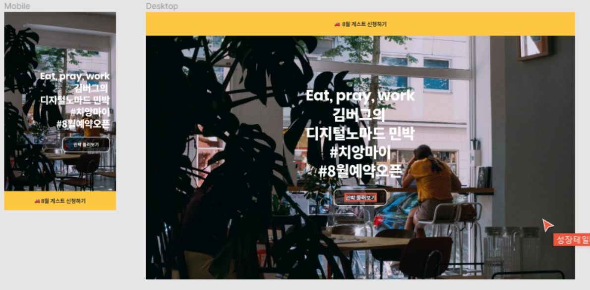
예제
CSS source code
* {
  box-sizing: border-box;
  margin: 0;
}

body {
  font-family: "Noto Sans KR", sans-serif;
  letter-spacing: -0.01em;
}

a {
  text-decoration: none;
}

.landing {
  background-image: url("./assets/img-bg.jpg");
  background-size: cover;
  background-position: center center;
  background-repeat: no-repeat;
}

.landing-title {
  line-height: 1.25;
  letter-spacing: -0.03em;
  color: #fff;
}

.landing-title strong {
  display: block;
  font-family: "Poppins", sans-serif;
  letter-spacing: -0.01em;
}

.landing-link {
  line-height: 1;
  color: #fff;
}

.banner-title a {
  color: #1f2d3d;
}

.banner {
  position: fixed;
  bottom: 0;
  left: 0;
  width: 100%;
  background-color: #FFC82C;
}

.banner-title a {
  display: flex;
  justify-content: center;
  align-items: center;
  width: 100%;
  height: 64px;
  font-size: 15px;
}

.landing {
  display: flex;
  flex-direction: column;
  justify-content: center;
  align-items: flex-end;
  width: 100%;
  height: 100vh;
  padding: 0 20px;
}

.landing-title {
  margin-bottom: 24px;
  font-size: 32px;
  text-align: right;
}

.landing-link {
  display: flex;
  justify-content: center;
  align-items: center;
  border: 2px solid #FFFFFF;
  border-radius: 16px;
  font-size: 15px;
  width: 160px;
  height: 52px;
  background: rgba(0, 0, 0, 0.5);
}

@media screen and (min-width: 768px) {
  .banner {
    top: 0;
    bottom: auto;
  }

  .banner-title a {
    height: 80px;
    font-size: 18px;
  }

  .landing {
    align-items: center;
  }

  .landing-title {
    margin-bottom: 32px;
    font-size: 50px;
    text-align: center;
  }

  .landing-link {
    width: 180px;
    height: 56px;
    font-size: 18px;
  }
}
HTML source code
<!DOCTYPE html>
<html lang="ko">
  <head>
    <meta charset="UTF-8" />
    <meta name="viewport" content="width=device-width, initial-scale=1.0" />
    <title>Media Query</title>
    <link
      href="https://fonts.googleapis.com/css2?family=Noto+Sans+KR:wght@700;900&family=Poppins:wght@700&display=swap"
      rel="stylesheet"
    />
    <link rel="stylesheet" href="./style.css" />
  </head>
  <body>
    <aside class="banner">
      <h1 class="banner-title">
        <a href="#">
          🚗 모집 임박! 8월 게스트 신청하기
        </a>
      </h1>
    </aside>

    <section class="landing">
      <h1 class="landing-title">
        <strong lang="en">Eat, pray, work</strong>
        김버그의<br />
        디지털노마드 민박<br />
        #치앙마이<br />
        #8월예약오픈
      </h1>
      <a href="#" class="landing-link">
        민박 둘러보기
      </a>
    </section>
  </body>
</html>
Questions & Learned
- 반응형 웹을 만들 때는 작은 크기(mobile)부터 시작한다. (iphone 5)
/cf/ breakpoints : 통상적 모바일 기기 사이즈 기준 (standard가 있는 건 아님)
- 320px — 480px: Mobile devices
- 481px — 768px: iPads, Tablets
- 769px — 1024px: Small screens, laptops
- 1025px — 1200px: Desktops, large screens
- 1201px and more — Extra large screens, TV
- Media query란에는 '변화된 요소'만 넣는다.
출처: '김버그의 HTML&CSS는 재밌다'를 학습하고 정리한 내용입니다.
