Background(배경) 속성
- background-color : 배경에 색상을 넣어준다.
hex, rgb, rgba로 표현할 수 있다. - background-image : 배경에 이미지를 넣어준다.
url(*이미지 경로) - background-repeat : 배경 이미지의 반복(패턴)
repeat(*기본값) / no-repeat - background-size : 배경 이미지의 크기
contain(*) - 이미지 전체가 (영역에 상관없이) 들어감
cover - 이미지 전체가 영역에 맞게 들어감
custom - 지정값 - background-position : x(가로축), y(세로축) / 센터
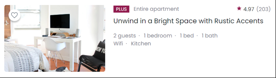
예제 (Airbnb card)
CSS source code
* {
  box-sizing: border-box;
  margin: 0;
}

body {
  font-family: 'Poppins', sans-serif;
}

.sr-only {
  position: absolute;
  z-index: -100;
  width: 1px;
  height: 1px;
  overflow: hidden;
  opacity: 0;
}

.card {
  display: flex;
  width: 840px;
  padding: 24px;
}

.card-image {
  position: relative;
  width: 300px;
  height: 200px;
  border-radius: 6px;
  margin-right: 24px;
  background-image: url('./assets/img-house.jpg');
  background-position: cente cente;
  background-repeat: no-repeat;
  background-size: cover;
}

.like-button {
  position: absolute;
  top: 12px;
  left: 12px;
  width: 36px;
  height: 36px;
  border-radius: 50%;
  border: none;
  background-color: #fff;
  background-image: url('./assets/icon-favorite.svg');
  background-size: 24px 24px;
  background-repeat: no-repeat;
  background-position: cente cente;
  box-shadow: 0px 4px 4px rgba(0, 0, 0, 0.25);
  cursor: pointer;
}

.card-content {
  flex-grow: 1;
}

.card-header {
  display: flex;
  justify-content: space-between;
  align-items: cente;
  margin-bottom: 8px;
}

.plus-badge {
  display: inline-block;
  padding: 1px 8px;
  border-radius: 4px;
  margin-right: 8px;
  font-size: 14px;
  font-weight: 500;
  line-height: 1.42857143;
color: #fff;
  text-transform: uppercase;
  background-color: #92174D;
}

.property-type span {
  font-size: 16px;
  font-weight: 400;
  line-height: 1.25;
  color: #7D858F;
}

.property-rate {
  font-size: 16px;
  line-height: 1.25;
}

.property-rate {
  display: flex;
  justify-content: flex-end;
  align-items: cente;
}

.property-rate::before {
  content: '';
  position: relative;
  top: 2px;
  display: inline-block;
  width: 16px;
  height: 16px;
  background-image: url('./assets/icon-star.svg');
  background-size: contain;
  background-repeat: no-repeat;
  background-position: cente cente;
}

.property-rate strong {
  margin-right: 2px;
  font-weight: 400;
  color: #151B26;
}

.property-rate span {
  color: #7D858F;
}

.card-title {
  margin-bottom: 16px;
  font-size: 20px;
  font-weight: 400;
  line-height: 1.6;
  color: #151B26;
}

.property-detail {
  font-size: 14px;
  font-weight: 400;
  line-height: 1.14285714;
  color: #7D858F;
}

.property-detail div:first-child {
  margin-bottom: 8px;
}

.property-detail dd span::after {
  content: '·';
  margin: 0 8px;
}

.property-detail dd span:last-child::after {
  content: '';
  margin: 0;
HTML source code
<!DOCTYPE html>
<html lang="en">
  <head>
    <meta charset="UTF-8" />
    <meta name="viewport" content="width=device-width, initial-scale=1.0" />
    <title>Background</title>
    <link rel="preconnect" href="https://fonts.gstatic.com">
    <link href="https://fonts.googleapis.com/css2?family=Poppins:ital,wght@0,400;1,500&display=swap" rel="stylesheet">
    <link rel="stylesheet" href="./style.css" />
  </head>
  <body>
    <article class="card">
      <div class="card-image">
        <button type="button" class="like-button" aria-label="Like this property"></button>
      </div>
      <div class="card-content">
        <header class="card-header">
          <div class="property-type">
            <strong class="plus-badge">Plus</strong>
            <span>Entire apartment</span>
          </div>
          <div class="property-rate">
            <strong aria-label="Review: 4.97">
              4.97
            </strong>
            <span aria-label="Total 203 reviews">(203)</span>
          </div>
        </header>
        <h1 class="card-title">
          Unwind in a Bright Space with Rustic Accents
        </h1>
        <div class="card-detail">
          <dl class="property-detail">
            <div>
              <dt class="sr-only">Rooms and beds</dt>
              <dd>
                <span>2 guests</span>
                <span>1 bedroom</span>
                <span>1 bed</span>
                <span>1 bath</span>
              </dd>
            </div>
            <div>
              <dt class="sr-only">Amenities</dt>
              <dd>
                <span>Wifi</span>
                <span>Kitchen</span>
              </dd>
            </div>
          </dl>
        </div>
      </div>
    </article>
  </body>
</html>
Questions & Learned
- background-image와 position, repeat, size는 셋뚜셋뚜!
- 이미지를 HTML img로 처리하느냐, CSS background로 주느냐가 고민이로다...
=> 논리적 사고에 따른 선택이 필요해!
예제로 생각해보면,
1. 이미지 특성: host-user가 자율적으로 이미지를 업로드 한다.
-> 어떤 크기의 이미지를 올릴 것인지, 이미지 비율을 예측할 수 없다.
2. html img로 마크업 했을 때, 즉 CSS에서 img를 꾸며야 할 경우,
-> 크기가 고정되어있으므로 크기가 맞지 않는 이미지는 제대로 업로드 불가능할 수 있다.
3. 또한, 이미지의 방향(vertical, horizontal)에 따라 각각의 코드를 작성해야 하는데,
.card-image img {
display: flex;
justify-content: cente;
align-items: cente;
width: 100%;
height: auto;
overflow: hidden; (vertical)- 서버와 JavaScript가 개고생하게 된다....
- CSS background를 쓰면 이미지 비율에 따라 자동으로 맞춰지기 때문에 CSS background image로 처리하겠다! 의 결론이 도출된다. 😙
- 이모티콘(별)의 경우 정보로서의 의미가 없기 때문에 HTML로 마크업 하지 않고, CSS background로 처리한다.
어떻게? '가상 요소'를 넣어준다! - 현재 위치에서 사알짝 이동할 경우
position:relative;를 써준다. - 가상요소의 기본 display값은 inlne. 따라서 top, bottom효과 줄 수 없고, left, right는 가능하다.
- 전체 배경에 공간이 남으면 컨텐츠가 차지할 것인가 아닌가를 결정하는 속성은
flex-grow: 정수;를 쓴다.
Screen-reader only(sr-only)
- 부트스트랩(Bootstrap) 유틸리티 서비스로 범용적으로 쓰인다.
- 스크린 리더에서는 보이되, 웹 상에서는 보이지 않게 처리한다.
display: none처리를 하면 웹 상에서 보이지 않지만, 스크린 리더에서도 보이지 않는다는 단점이 있다.
sr-only code Tip
.sr-only {
  position: absolute;
  z-index: -100%; or -1;
  width: 1px;
  height: 1px;
  overflow: hidden;
  opacity: o;
출처: '김버그의 HTML&CSS는 재밌다'를 학습하고 정리한 내용입니다.
