지난 포스팅에 이은 데이터 분석과 시각화 두 번째 시간.
07 파이 그래프
선그래프와 막대, 파이 그래프의 문법을 정리해보자.
선그래프
.plot()
.plot(kind = 'line')
막대그래프
.plot(kind = 'bar')
.plot(kind = 'barh')
`파이그래프'
.plot(kind = 'pie')
08 실리콘 밸리에는 누가 일할까? (2)
%matplotlib inline
import pandas as pd
df = pd.read_csv('data/silicon_valley_details.csv')
# 여기에 코드를 작성하세요
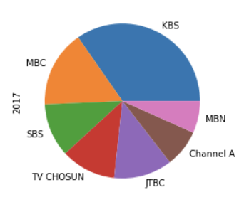
df2 = df[(df['company'] == 'Adobe') & (df['race'] == 'Overall_totals') & (df['job_category'] !='Totals') & (df['job_category'] != "Previous_totals") & (df['count'] != 0)]
df2.set_index(keys = 'job_category', inplace = True)
df2.plot(kind = 'pie', y = 'count')09 히스토그램
히스토그램 작성 코드까지 알아보자.
.plot(kind = 'hist', y= '')
df.plot(kind = 'hist', y = 'Height')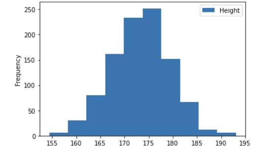
bins 를 통해 쪼갤 수도 있다.
df.plot(kind = 'hist', y = 'Height', bins = 15)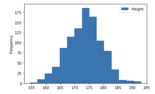
15로 쪼갠 것이다!
09 스타벅스 음료의 칼로리는?
%matplotlib inline
import pandas as pd

df = pd.read_csv('data/starbucks_drinks.csv')

df.plot(kind='hist', y='Calories', bins= 20)
10 박스 플롯
박스 플롯은 무엇일까?
최솟값, 25% 지점, 중간값, 75%지점, 최댓값으로 표시된 그래프를 뜻한다. 그림과 함께 이해하자.
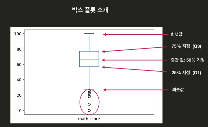
박스 밖에 있는 점들은 이상점(outliers)이라고 한다.
박스 플롯을 만드는 코드를 보자.
.plot(kind = 'box', y = '')
df.plot(kind = 'box', y = 'math score')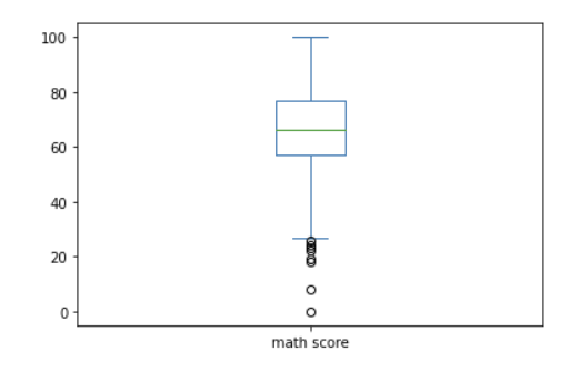
더 원하는 값이 있다면 y 안에 리스트를 활용하여 넣어주면 된다!
12 스타벅스 음료의 칼로리는? (2)
%matplotlib inline
import pandas as pd

df = pd.read_csv('data/starbucks_drinks.csv')

# 여기에 코드를 작성하세요
df['Calories'].plot(kind = 'box')
13 산점도
산점도 scatter plot 은 두 변수 사이의 연관성을 확인할 수 있는 자료로 점을 찍어 확인한다.
.plot(kind = 'scatter plot', x = '', y = '')
적용코드
df.plot(kind = 'scatter', x = 'reading score', y = 'writing score')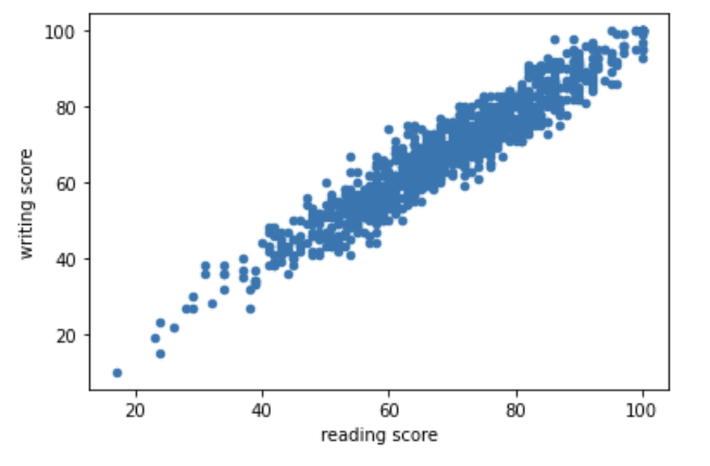
14 국가 지표 분석하기
15 어느 그래프가 어울릴까?
한 자료 안에서 변화 : 선 그래프
비율 : 파이
카테고리 간 비교 : 막대 그래프
범위와 분포 : 히스토그램
연관성 분석 : `산점도'

Mathematics, Algorithm, and IDEA for AI research🦖