2. 팝업창이 사라지면서+하얀 화면 가로 슬라이드
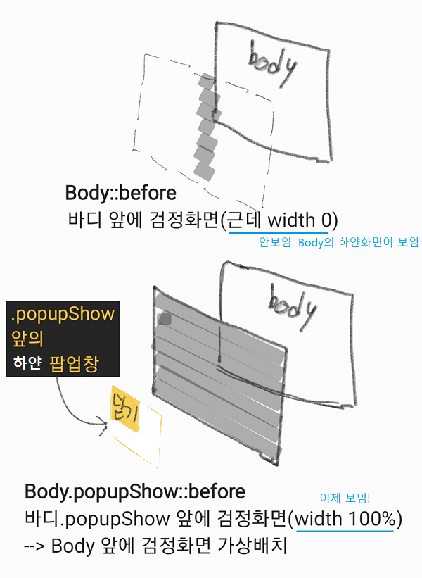
2-1. body::before{ 검정 배경색; transition: 0.5초; 가로길이: 0 }
베이스에 존재하는 body 배경색 검정.
즉, Body::before/바디 앞에 검정화면 (근데 width: 0 이라서 보이지 않음)
→ 그래서 (Body::before 검정화면 뒤의) Body의 하얀화면이 보임 → 하얀화면 상태
<style>
  /* -------검정 배경------- */
  /* (1) body 배경색 검정, 근데 width:0 이라서 안보임! 그래서 하얀 화면 */
  body::before{
      content: "";
      display: block;
      position: fixed;
      left: 0; top: 0; bottom: 0;
      background-color: rgba(0,0,0,0.5);
      transition: 0.5s;
      width: 0;			 /* 하얀 화면 */
  }

  /* -------하얀 네모------- */
  .popupShow div{
      display: block;
  }
  div{
      display: none;

      position: absolute;
      left: 0; right: 0; top: 0; bottom: 0;
      width: 600px; height: 600px;
      margin: auto;
      background-color: yellow;
  }
</style>
2-2. body.popupShow::before{ width: 100%; }
<style>
  /* -------검정 배경------- */
  body::before{
      content: "";
      display: block;
      position: fixed;
      left: 0; top: 0; bottom: 0;
      background-color: rgba(0,0,0,0.5);
      transition: 0.5s;
      width: 0;			 /* 하얀 화면 */
  }
  						 /* 검정 화면 */
  body.popupShow::before{ width: 100%; }
  /* (2) j쿼리에 의해 -> 클래스 ".popupShow"가 생기면 width:100%로 값이 추가/대체됨!*/
  /* body::before가 화면에 나타남 + 애니메이션 transition 발동 */

  /* -------하얀 네모------- */
    .popupShow div{
        display: block;
   }
    div{
        display: none;

        position: absolute;
        left: 0; right: 0; top: 0; bottom: 0;
        width: 600px; height: 600px;
        margin: auto;
        background-color: yellow;
    }
</style>
2-3. (제이쿼리) 닫기 버튼 Click!
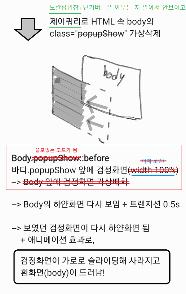
<script>
    $(document).ready(function(){ // = "파일이 준비되면 실행할게"
        $('#btn1').click(function(){ // = #byn 버튼 클릭하면
            $('body').removeClass('popupShow'); // = body의 .popupShow "제거"한다
        });
    });
</script>
(?)제이쿼리에 의해 .popupShow 사라지면
(?)→ body::before 값들 중에서 width: 0이 width: 100%로 바뀜!
(?)→ body::before(검정 배경색) 화면에 나타남 + 가로 슬라이드 transition
  content: "";
  display: block;
  position: fixed;
  left: 0; top: 0; bottom: 0;
  background-color: rgba(0,0,0,0.5);
  transition: 0.5s;
  width: 100%;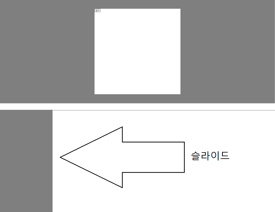
2-4. 코드 총 정리
<style>
  /* -------검정 배경------- */
  body::before{
      content: "";
      display: block;
      position: fixed;
      left: 0; top: 0; bottom: 0;
      background-color: rgba(0,0,0,0.5);
      transition: 0.5s;
      width: 0;			 /* 하얀 화면 */
  }
  						 /* 검정 화면 */
  body.popupShow::before{ width: 100%; }

   /* -------하얀 네모------- */
  .popupShow div{
      display: block;
  }

  div{
      display: none;
      position: absolute;
      left: 0; right: 0; top: 0; bottom: 0;
      width: 600px; height: 600px;
      margin: auto;
      background-color: white;
  }
</style>
2'. 검정배경+노란 팝업창 함께 가로 슬라이드 (기출변형)
작성할 순서를 맞춰보세요
<style>

  body::before{

  }

  body.popupShow::before{

  }

  body.popupShow #popup1{

  }

  body #popup1{

  }
</style>
정답
(1) body::before
(2) body.popupShow::before
(3) body #popup1 - /안 보이고/ div 영역 ( =정사각형 노란박스 + '닫기'버튼 )
(4) body.popupShow #popup1 - /보이고/ .popupShow 추가 시, (3)에서 무슨 값이 변할지 추가 지정
<style>
  /* (1) */
  body::before{
      content: "";
      position: fixed;
      background-color: rgba(0,0,0,0.5);
      left:-100vw; width: 100%;
      top: 0; bottom: 0;
      transition: left 0.5s;
  }

  /* (2) */
  body.popupShow::before{
      left: 0;
  }

  /* (4) .popupShow 추가 시, (3)에서 무슨 값이 변할지 지정 *//* 보이고 */
  body.popupShow #popup1{
      left: 50%;
      transform: translate(-50%, -50%);
  }

  /* (3) 먼저 지정 *//* div 영역 - 정사각형 노란박스 + [닫기] *//* 안 보이고 */
  body #popup1{
      position: absolute;
      width:600px;
      height: 600px;
      background-color: yellow;
      transition: 0.5s;
      left: 0;
      top: 50%;
      transform: translate(-100%, -50%);
  }
</style>
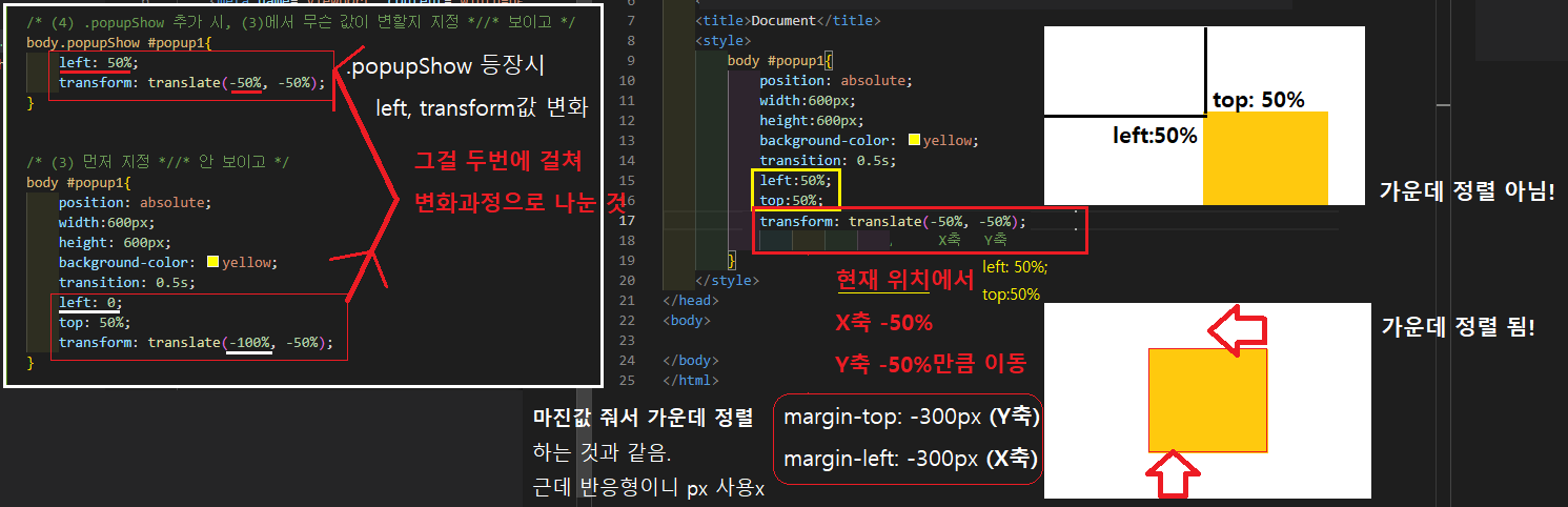
Q) transform 수치값 translate(-50%, -50%); 왜?
(1) left: 50%; top: 50%; 지정해도 가운데 정렬 NO!
<style>
  body #popup1{
      position: absolute;
      width:600px;
      height: 600px;
      background-color: yellow;
      transition: 0.5s;
      left: 50%; /* 왼쪽에서 50%; 위에서 50%; 지정해도 가운데 정렬 NO */
      top: 50%;
  }
</style>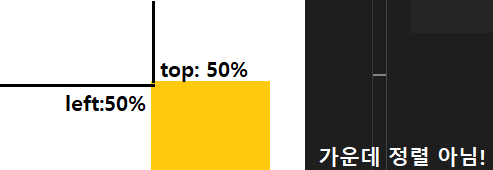
(2) transform: translate(-50%, -50%); 추가 → 사각형 이동하여 가운데 정렬 됨!
"현재 위치( left: 50%; top: 50%; )에서 X축으로 -50% / Y축으로 -50% 이동하라"
<style>
  body #popup1{
      position: absolute;
      width:600px;
      height: 600px;
      background-color: yellow;
      transition: 0.5s;
      left: 50%;
      top: 50%;
      transform: translate(-50%, -50%); /* 가운데 정렬 됨! */
  }
</style>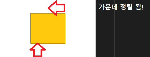
+) transform: translate(-50%, -50%); = 마진값 줘서 가운데 정렬하는 것과 같음
margin-left: -300px; (X축)
margin-top: -300px; (Y축)
<style>
  body #popup1{
      position: absolute;
      width:600px;
      height: 600px;
      background-color: yellow;
      transition: 0.5s;
      left: 50%;
      top: 50%;
      margin-top: -300px; /* Y축 이동 */
	  margin-left: -300px; /* X축 이동 */
  }
</style>
근데 반응형이니까 px 사용하기보다 % 사용하고자 margin 말고 transform 씁시다!
그것을 두 번에 걸쳐 변화하는 과정(transition)으로 분리하면
↓
↓
(3) body.popupShow #popup1 에서 body #popup1
- body #popup1
body #popup1{ left: 0; top: 50%; transform: translate(-100%, -50%); }
↓
↓
클래스 .popupShow 추가 시, (3)에서 left, transform 값 변화!
↓
↓ - body.popupShow #popup1
body.popupShow #popup1{ left: 50%; transform: translate(-50%, -50%); }
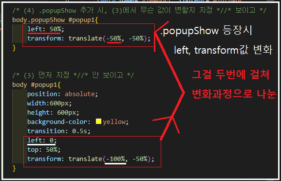
이 부분 코드만 보자면
<style>
  /* (4) .popupShow 추가 시, (3)에서 무슨 값이 변할지 지정 *//* 보이고 */
  body.popupShow #popup1{
      left: 50%;
      transform: translate(-50%, -50%);
  }

  /* (3) 먼저 지정 *//* div 영역 - 정사각형 노란박스 + [닫기] *//* 안 보이고 */
  body #popup1{
      position: absolute;
      width:600px;
      height: 600px;
      background-color: yellow;
      transition: 0.5s;
      left: 0;
      top: 50%;
      transform: translate(-100%, -50%);
  }
</style>