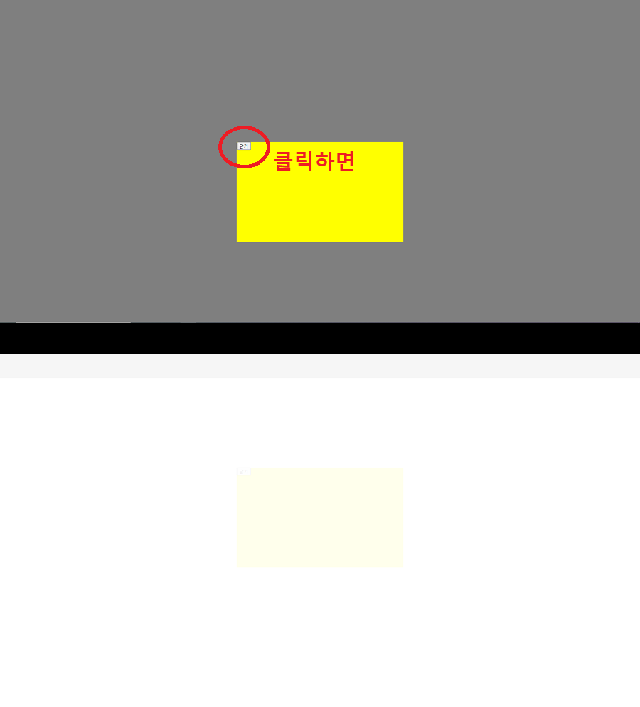
3. 위로 슬라이드
3-1. 팝업창은 가로 + 검정배경은 위로 슬라이드
<style>
  body::before{
      content: "";
      position: fixed;
      background-color: rgba(0,0,0,0.5);
      left:0; right: 0;
      top: 0; height: 0;
      transition: 0.5s;
  }

  body.popupShow::before{ height: 100%; }

  body #popup1{
      position: absolute;
      width:600px; height: 600px;
      background-color: yellow;
      transition: 0.5s;
      left: 0; top: 50%;
      transform: translate(-100%, -50%);
  }

    body.popupShow #popup1{
      left: 50%;
      transform: translate(-50%, -50%);
  }
</style>
3-2. 팝업창+검정배경 함께 위로 슬라이드
<style>
body::before{
content: "";
position: fixed;
background-color: rgba(0,0,0,0.5);
left:0; right: 0;
top: 0; height: 0;
transition: 0.5s;
}
body.popupShow::before{ height: 100%; }
body #popup1{
position: absolute;
width:500px; height: 300px;
background-color: yellow;
transition: 0.5s;
left: 0; right: 0; margin: auto;
top: 0;
transform: translateY(-100%);
}
body.popupShow #popup1{
top: 50%;
transform: translateY(-50%);
}
</style>
4. 투명하게 변하기
4-1. 팝업창+검정배경 함께 위로 슬라이드하면서 투명화
- opacity: 0; visibility: hidden;
- opacity: 1; visibility: visible;
<style>
body::before{
content: "";
position: fixed;
background-color: rgba(0,0,0,0.5);
left:0; right: 0;
top: 0; height: 0;
transition: 0.5s;
opacity: 0;
visibility: hidden;
}
body.popupShow::before{
height: 100%;
opacity: 1;
visibility: visible;
}
body #popup1{
position: absolute;
width:500px;
height: 300px;
background-color: yellow;
transition: 0.5s;
left: 0; right: 0; margin: auto;
top: 0;
transform: translateY(-100%);
opacity: 0;
visibility: hidden;
}
body.popupShow #popup1{
top: 50%;
transform: translateY(-50%);
opacity: 1;
visibility: visible;
}
</style>