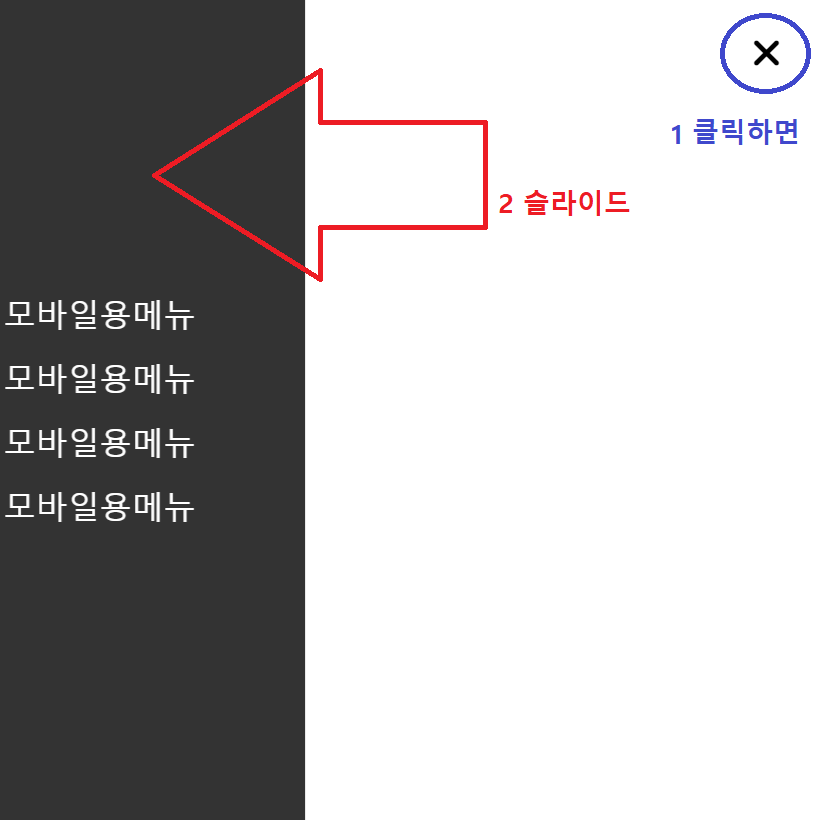
1. 모바일용 메뉴 HTML
HTML
<header id="hd">
    <button id="allMenu">
    	<label for="allMenu" class="sr-only">전체메뉴</label>
    	<i class="fa-solid fa-bars"></i>
    </button>
   <!-- -------삼지창 아이콘------- -->

    <div id="category">
        <ul>
            <li><a href="">모바일용메뉴</a></li>
            <li><a href="">모바일용메뉴</a></li>
            <li><a href="">모바일용메뉴</a></li>
            <li><a href="">모바일용메뉴</a></li>
        </ul>
    </div>
</header>
CSS
<style>

#allMenu.show i:before {
    content: '\f00d';
}

#allMenu{
    outline: 0;
    border: 0; background-color: transparent;
    font-size: 2.5rem;

    position: fixed;
    top: 2rem;
    right: 2rem;
}
 /* -------삼지창 아이콘------- */

#category{
    position: fixed;
    left: 0;
    width: 50vw;
    top: 0;
    bottom: 0;
    background-color: rgba(0, 0, 0, 0.8);
}

</style>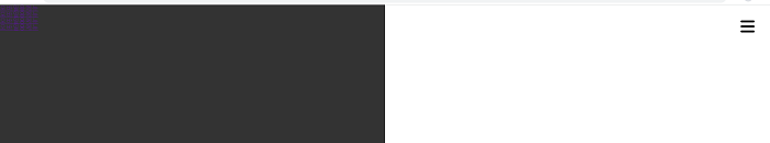
2. li를 일렬로 나열하는 display:flex
- flex-direction: column;
- justify-content: center;
- align-items: center;
<style>

#category{
    position: fixed;
    left: 0;
    width: 50vw;
    top: 0;
    bottom: 0;
    background-color: rgba(0, 0, 0, 0.8);

    display: flex;
    flex-direction: column;
    justify-content: center;
    align-items: center;
}

#category a{
    text-decoration: none;
    color: white;
    font-size: 2rem; line-height: 2;
}

</style>
3. 삼지창버튼 클릭 시, 모바일 메뉴창 숨김/꺼냄
3-1. 모바일 메뉴창 X축 -100%로 이동
transform: translateX(-100%); 네 너비만큼 왼쪽으로 들어가
<style>

#category{
    position: fixed;
    left: 0;
    width: 50vw;
    top: 0;
    bottom: 0;
    background-color: rgba(0, 0, 0, 0.8);

    display: flex;
    flex-direction: column;
    justify-content: center;
    align-items: center;

    transform: translateX(-100%); /* 네 너비만큼 왼쪽으로 들어가 */
}

#category a{
    text-decoration: none;
    color: white;
    font-size: 2rem; line-height: 2;
}

</style>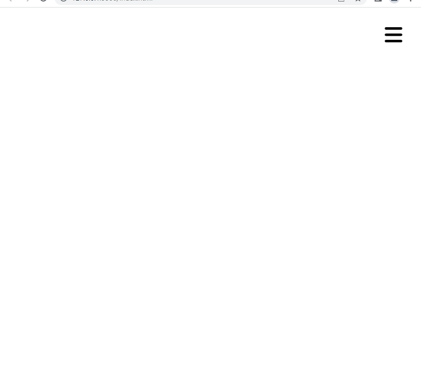
3-2.
제이쿼리 - #allMenu 버튼에 .show를 토글 처리(생겼다/지웠다)
<script>

$(document).ready(function(){
    $("#allMenu").click(function(){ //버튼을 클릭하면
        $(this).toggleClass('show');  // 그 버튼에 show 클래스를 토글처리해라
    })
})

</script>
CSS
#allMenu가 .show를 가졌을 때(.show가 들어왔을때),
-> 바로 밑의 동생 #category를 { 원래 자리로 돌려놔 }
<style>

#category{
    position: fixed;
    left: 0;
    width: 50vw;
    top: 0;
    bottom: 0;
    background-color: rgba(0, 0, 0, 0.8);

    display: flex;
    flex-direction: column;
    justify-content: center;
    align-items: center;

    transform: translateX(-100%); /* 네 너비만큼 왼쪽으로 들어가 */
    transition: 0.5s;
}

#category a{
    text-decoration: none;
    color: white;
    font-size: 2rem; line-height: 2;
}

/* #allMenu가 .show를 가졌을 때(.show가 들어왔을때), 바로 밑의 동생 #category를 { 원래 자리로 돌려놔 } */
.show + #category{
    transform: translateX(0);
}

</style>
