학습내용
transform, transition, animation, 실습
transform 형태 변화
rotate(음수~양수deg): 2차원 회전(좌우)scale(width, height): 비율로 크기 조절skew(x축, y축): 3차원 회전translate(x축, y축): 상하좌우 이동transform: 속성값을 스페이스로 띄우고 연달아 입력 가능
.transform {
    width: 300px;
    height: 300px;
    background-color: yellow;
    /* transform: rotate(45deg); */
    /* transform: scale(0.5); */
    /* transform: skew(-10deg, 20deg); */
    /* transform: translate(100px, 300px); */
    transform: rotate(45deg) scale(0.2);
}
transform 이용 시 주의점
여러 브라우저의 이전 버전에서는 그냥 사용할 수 없다.(ex. explorer는 10.0이상에서만 사용 가능) 이전 버전 브라우저에서 사용하려면 prefix 사용한 버전의 코드를 추가해주어야 한다. 이때 prefix 없는 형태는 default로 같이 넣어주어야 한다.
-webkit-transform: 크롬, 사파리
-moz- :파이어폭스
-ms :익스플로러
-o :오페라
transition 움직임
transition-property: 어떤 속성이 변화하는가transition-duration: 변화 지속 시간transition-timing-function: 이동 방식 (점점 빠르게, 균등하게linear등)transition-delay: 변화 시작 전 지연시간transition: 속성값을 스페이스로 띄우고 연달아 입력 가능. 요소 순서 상관 없으나 시간의 경우 먼저 오는 것이duration, 나중에 나오는 것이delay
.transition {
    width: 300px;
    height: 300px;
    background-color: teal;

    /* transition-property: width;
    transition-duration: 2s;
    transition-timing-function: linear;
    transition-delay:1s; */

    transition: width 2s linear, height 2s linear;
}
.transition:hover {
    width: 600px;
    height: 600px;
}
animation 사용자 행동에 관계없이 일어나는 움직임
animation-nameanimation-iteration-count: 실행 횟수 (infinite무한반복)animation-direction: 진행방향 (normal:1회,alternate:왕복).alternate돌아올 때도iteration-count소모@keyframes {animation-name}으로 실행 내용 정해주기. from-to, 0%-25%-100% 혼용 가능
.animation {
    width: 300px;
    height: 300px;
    background-color: tomato;

    animation-name: changeWidth;
    animation-duration: 3s;
    animation-timing-function: linear;
    animation-delay: 1s;
    animation-iteration-count: infinite;
    animation-direction: alternate;
}
@keyframes changeWidth {
    0% {
        width: 300px;
        height: 300px;
        background-color: tomato;
        border: solid 0px blue;
    }
    50% {
        background-color: brown;
    }
    100% {
        width: 600px;
        height: 600px;
        background-color: yellowgreen;
        border: solid 10px blue;
    }
}
animation prefix 사용 시 유의점
animation은 @keyframes와 같이 쌍으로 사용하게 되는데, keyframes에 prefix를 붙여도 내부 코드에 prefix가 적용되는 것이 아니므로 그 안에서 prefix가 필요한 코드가 있으면 일일이 붙여주어야 함
.spin-lion {
width: 150px;
height: 150px;
background-color: blue;
-webkit-animation: spinLion 1500ms linear infinite alternate;
}
@-webkit-keyframes spinLion {
from { -webkit-transform: rotate(-10deg); }
to { -webkit-transform: rotate(10deg); }
}
@keyframes spinLion {
from { transform: rotate(-10deg); }
to { transform: rotate(10deg); }
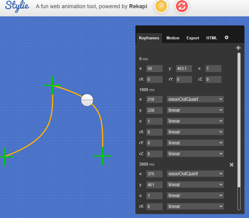
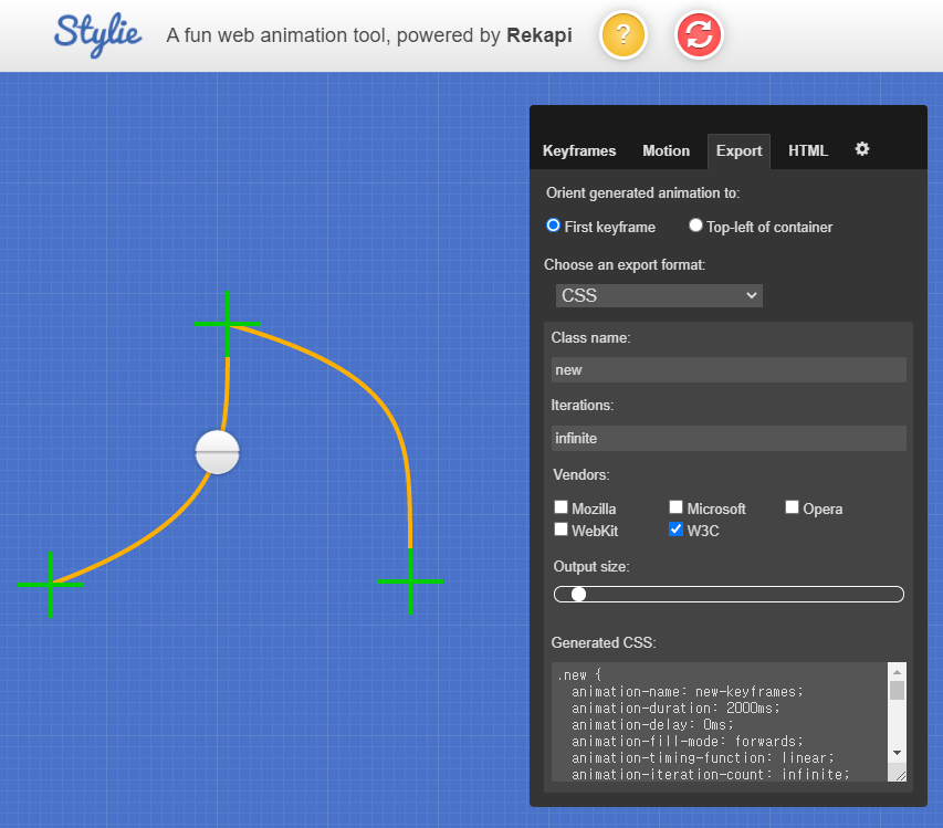
}복잡한 animation 만드는 사이트
https://jeremyckahn.github.io/stylie/
1. keyframes에서 keyframe추가, 조정
2. export
- class-name, iterations(count), vender(prefix) 조정
- output size: keyframes을 얼마나 많이 사용할 것인지 결정한다. keyframe이 많을수록 코드는 길어지지만 움직임이 부드러워진다.
- generated css 부분의 코드를 복사 붙여넣기한다.
실습
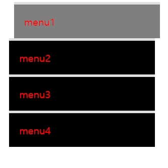
마우스 올리면 배경색 바뀌는 메뉴
1. 메뉴요소 만들기
- color 값 지정 시 opacity(투명도)도 같이 지정하기: rgba(0,0,0,1)
추후<li>태그의 투명도를transition으로 바꿀 때 내부 글자의 투명도는 바꾸지 않고background-color만 바꾸기 위해 설정함
.mouse-animation li {
    width: 250px;
    background-color: rgba(0,0,0,1);
    padding: 20px;
    border-top: solid 5px #dfdfdf;
}
.mouse-animation li a {
    color: red;
    font-size: 20px;
}
2. 마우스 올렸을 때 효과 추가
li:hover로 background-color와 위치(margin-left) 변경- 해당 움직임을 부드럽게 만들기 위해
transition설정:(transition-property transition-duration)
.mouse-animation li {
	transition: opacity 0.5s, margin-left 0.5s;
}
.mouse-animation li:hover {
    background-color: rgba(0,0,0,0.5);
    margin-left: 10px;
}
형태와 색상이 바뀌면서 이동하는 박스
1. 박스 요소 만들기
.move-box {
    width: 200px;
    height: 200px;
    background-color: red;
}
2. 원이 되었다가 사각형으로 돌아오기
alternate:animation-direction속성값으로 움직임이 왕복으로 일어남keyframes50%에 border-radius:50% (원 속성값): 사각형에서 모서리가 부드럽게 완만해지다가 움직임이 반 진행된 순간 완전한 원이 됨.
.move-box {
	animation: moveBox 4s linear 1s infinite alternate;
}
@keyframes moveBox {
	from {}
    50% { border-radius: 50%; }
    to {}
}
3. 배경색, 위치 바꾸기
animation으로left,top값을 사용하기 위해position:relative로 설정
.move-box {
	position: relative;
	animation: moveBox 4s linear 1s infinite alternate;
}
@keyframes moveBox {
    0% {
        background-color: green;
        left: 0;
        top: 0;
    }
    25% {
        background-color: yellow;
        left: 500px;
        top:0;
    }
    50% {
        background-color: gray;
        left: 500px;
        top: 500px;
        border-radius: 50%;
    }
    75% {
        background-color: blue;
        left: 0;
        top: 500px;
    }
    100% {
        background-color: red;
        left: 0;
        top: 0;
    }
}
4. 추가적인 animation 속성 적용하기
animatiion-play-state: running / pausedanimation-fill-mode:backwards(0% 기준으로 화면 보여줌) 현재 animation 시작 배경색은 green인데 원래 요소 배경색은 red로 다르다. animation delay가 있어서 기본 red였다가 움직이기 시작하면 green으로 바뀌는게 부자연스럽다.backwards를 적용하면 움직임 시작 상태를 기본으로 보여준다.
.move-box {
    animation: moveBox 4s linear 1s infinite alternate;
    animation-play-state: paused;
    animation-fill-mode: backwards;
}
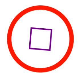
원형 크기 변하면서 내부 사각형도 변하는 도형(부모자식 태그)
<div class="outer-border">
    <div class="inner-border"></div>
</div>
1. 외부 원 도형 만들기
- 요소 x축 중앙 정렬:
margin: 0 auto; - 내부 사각형을 원 중심에 두기 위해
flex사용 border-color(테두리 선 색),scale(x,y)(비율에 따른 크기 변화) 애니메이션 적용transform: scale(x,y): 부모 요소에 적용하면 자식 요소도 같이 크기 변화함
.outer-border {
    display: flex;
	justify-content: center;
	align-items: center;

    width: 200px;
    height: 200px;
    border: solid 15px red;
    border-radius: 50%;
    margin: 0 auto;
    margin-top: 200px;

    animation-name: outerBorder;
    animation-duration: 2s;
    animation-iteration-count: infinite;
}
@keyframes outerBorder {
    0% { border-color: red; transform: scale(1);}
    25% { border-color: yellow; transform: scale(1.2);}
    50% { border-color: blue; transform: scale(1.3);}
    75% { border-color: green; transform: scale(1.2);}
    100% { border-color: pink; transform: scale(1);}
}
2. 내부 사각형 만들기
box-sizing:border-box: 설정한 요소의 크기 안에서 border, padding 등 삽입transform: rotate(0deg): 처음과 끝만 지정해줘도 알아서 부드럽게 움직임border-width: 테두리 선 굵기 조절 속성
.inner-border {
    box-sizing: border-box;
    width: 75px;
    height: 75px;
    border: 5px solid purple;
    animation: innerBorder 2s infinite alternate;
}
@keyframes innerBorder {
    0% { transform: rotate(0deg);}
    25% { border-color: blue; border-width: 10px;}
    50% { border-color: yellow; border-width: 20px;}
    75% { border-color: green; border-width: 40px;}
    100% { transform: rotate(360deg); border-color: gray; border-width: 5px;}
}
슈퍼마리오 동전효과
<div class="mario-container">
    <div class="mario-coin"></div>
    <div class="mario-box"></div>
</div>
1. 위로 점프하는 듯한 움직임 만들기
tranform:translate(x,y): x축, y축으로 이동할 때 사용- 둘 중 한 방향으로만 이동할 때는
translateX(),translateY()사용 animation-direction으로alternate값을 주어 위, 아래로 반복해서 움직임
.mario-container .mario-box {
    animation: jumpBox 0.5s linear infinite alternate;
}
@keyframes jumpBox {
    0% { transform: translateY(0px); }
    50% { transform: translateY(-10px); }
    100% { transform: translateY(0px); }
}
.mario-container .mario-coin {
    animation: jumpCoin 0.8s linear infinite;
}
@keyframes jumpCoin {
    0% { transform: translateY(0px);}
    50% { transform: translateY(-100px)}
    100% { transform: translateY(-100px); }
}
2. y축으로 3차원 회전하면서 사라지는 동전
- transform: rotate()는 2차원에서 좌, 우로 움직이는 속성
- rotateX(), rotateY()는 3차원에서 앞뒤, 좌우로 돌아가는 속성. 여기서는 roteteY()사용해서 마리오 코인을 만들었다.
- 코인이 다시 아래로 돌아오지 않고 사라지게 만들기 위해 투명도를 조절했다.
.mario-container .mario-coin {
    animation: jumpCoin 0.8s linear infinite;
}
@keyframes jumpCoin {
    0% { transform: translateY(0px); opacity: 1; }
    50% { transform: translateY(-100px) rotateY(180deg); }
    100% {
         transform: translateY(-100px) rotateY(360deg);
         opacity: 0;
    }
}
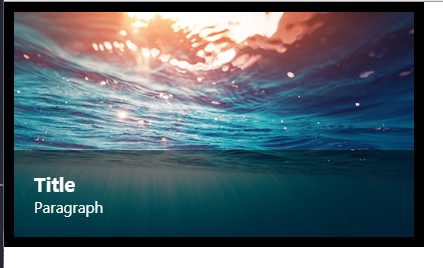
마우스 올리면 확대되는 이미지+올라오는 설명문
<div class="hover-image" >
    <img src="https://ec.europa.eu/programmes/horizon2020/sites/default/files/newsroom/29_05_17_small_22078.jpg">
    <div class="image-info">
        <h2>Title</h2>
        <p>Paragraph</p>
    </div>
</div>
1. 마우스 올리면 확대되는 이미지
- img
vertical-align:middle:img 태그가 원래 가지고 있는 아래 공백 없앨 때 사용. img태그에 default로 넣어주기 transform먼저 설정 ->transition으로 움직임 제어 ->overflow:hidden으로 부모태그 넘치는 것 안 보이게 처리- img:hover
cursor: pointer:<a>태그 아닌데 커서모양 바꾸고 싶을 때 사용 - 부모가 3차원이고 자식이 3차원이면 width값을 부모 기준 비율로 설정 가능
.hover-image {
    position: relative;
    width: 400px;
    border: solid 10px black;
    overflow: hidden;
}
.hover-image img {
    width: 100%;
    vertical-align: middle;
    transition: transform 0.3s linear;
}
.hover-image img:hover {
    transform: scale(1.3);
    cursor: pointer;
}
2. 숨어있다가 마우스 올리면 올라와서 보이는 설명문
position: absolute: 부모가 3차원이면 부모 기준에서 움직임bottom: 요소의 높이 브라우저 검사로 알아내서 그만큼 내려줌->부모의overflow:hidden덕분에 안 보임
.hover-image .image-info {
    box-sizing: border-box;
    position: absolute;
    width: 100%;
    background-color: rgba(0,0,0,0.5);
    padding: 20px;
    left: 0;
    bottom: -87px;
    transition: bottom 0.3s linear;
}
.hover-image:hover .image-info {
    bottom: 0;
}
더 많은 css 애니메이션
애니메이션 소스코드
https://animate.style/
1. CDN: <link>태그 복사해서 css 파일 연동 코드 위쪽에 붙여넣기
2. 원하는 효과를 가진 클래스를 찾아 요소 클래스에 추가해준다.
다른 사람이 만든 소스코드 보기
어려웠던 내용
오늘 새로 배운 css 속성 자체는 엄청 많진 않았지만 해당 속성들을 다양하게 조합해서 수 많은 효과를 만들어낼 수 있을 거라는걸 조금 느꼈다.
해결방법
animate.css 사이트 등에서 다양한 효과들을 사용해보았다.
소감
예전에 웹사이트를 간단히 만들었을 땐 애니메이션을 전혀 공부하지 않아서 오늘 배운 것들은 특히 더 새로운 느낌이었다. 개인적으론 마리오 코인을 만든 것이 재미있었다. 애니메이션을 적절히 사용하면 웹사이트를 좀더 고급스럽게 만들 수 있을 것 같아 기대가 된다.