학습내용
네이버 리빙 메뉴 만들기, 카카오톡 친구목록 페이지 만들기, tripadvisor홈페이지 만들기(+animation), 텐바이텐 홈페이지 일부 만들기
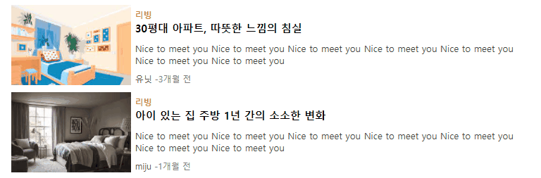
네이버 리빙 메뉴
주요포인트
리스트 메뉴에 마우스 커서를 올리면 제목에 밑줄 + 사진이 부드럽게 확대되는 transform:scale(), transition 을 사용하였다.
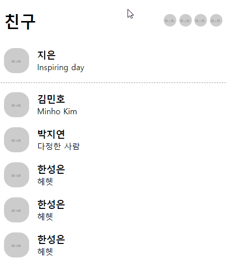
카카오톡 친구목록 페이지
주요 포인트
- 리스트 메뉴에 커서 올리면 배경색 바뀜
- html에서 구분선 만들 때 사용하는
<hr>태그 사용
<hr class="border-line" noshade>.border-line {
border: dashed 1px #ededed;
width: 95%;
opacity: 0.5;
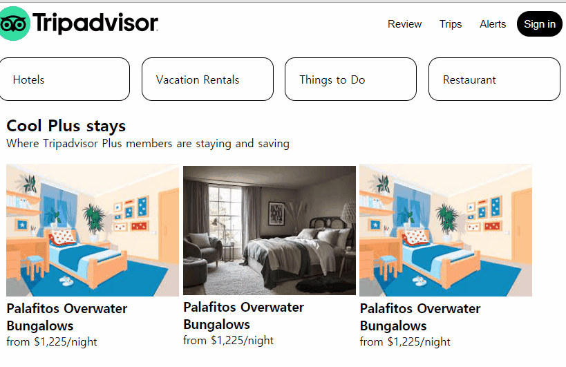
}tripadvisor 페이지
github소스코드-tripadvisor+animation
주요 포인트
<header>버튼 리스트 구현
tripadvisor 페이지 상단을 보니 네비게이션 메뉴가 버튼으로 만들어져 있어서 나도 버튼을 써보기로 했다. 버튼에 마우스를 올렸을 때 글자색은 안 바뀌고 background-color, opacity만 바뀌게 하기 위해 색상값을rgba()로 설정해주었다. 또 버튼 요소는 마우스 올렸을 때 커서 모양이 바뀌지 않아서cursor:pointer로 직접 추가해주었다.
header .header-nav ul li {
    display: inline-block;
    vertical-align: middle;
}
header .header-nav ul li button {
    border: none;
    background-color: rgba(1,1,1,0);
    font-size: 15px;
    padding: 10px;
    border-radius: 20px;
}
header .header-nav ul li button:hover {
    background-color: rgba(237, 237, 237, 1);
}
header .header-nav ul li .btn-signin {
    background-color: rgba(0,0,0,1);
    color: white;
}
header .header-nav ul li .btn-signin:hover {
    background-color: rgba(0,0,0,0.5);
}<main>의 nav 메뉴 구현
<header>의 버튼 리스트와 유사하지만flex와justify-content:space-around속성을 이용해 양쪽 내부 공백 포함해서 x축 정렬하였다.또한 마우스을 올렸을 때 효과로 글자색과 배경색을 부드럽게 변화시키기 위해transition을 사용하였다. 공백도 고려하며 메뉴 요소의 크기를 동일하게 맞추기 위해 넓이를width:23%으로 주었다.
main .nav-menu ul {
    display: flex;
    justify-content: space-around;
    align-items: center;
    height: 100px;
}
main .nav-menu ul li a {
    padding: 20px;
    display: block;
    text-align: left;
    border: solid 1px #000000;
    border-radius: 15px;
    transition: background-color 0.1s, color 0.1s;
}
main .nav-menu ul li a:hover {
    background-color: #000000;
    color: white;
}<main>의 숙소 리스트 구현
각 리스트 안에 숙소 이미지와 이름, 간단한 설명이 들어있다. 리스트 요소 위에 마우스를 올리면 이미지는 투명해지고 이름에 밑줄이 생긴다. 리스트에 고정 넓이값을 지정하고 이미지는width:100%로 설정했다.
.stay-lists div ul li {
    box-sizing: border-box;
    display: inline-block;
    vertical-align: middle;
    width: 250px;
    overflow: hidden;
}
.stay-lists div ul li a .stay-img {
    width: 100%;
    transition: opacity 0.1s;
}
.stay-lists div ul li a:hover .stay-img {
    opacity: 0.7;
}
.stay-lists div ul li a:hover .stay-info h3 {
    transition: opacity 0.1s, text-decoration 0.1s;
}
.stay-lists div ul li a:hover .stay-info h3 {
    text-decoration: underline;
    opacity: 0.7;
}
animation 연습
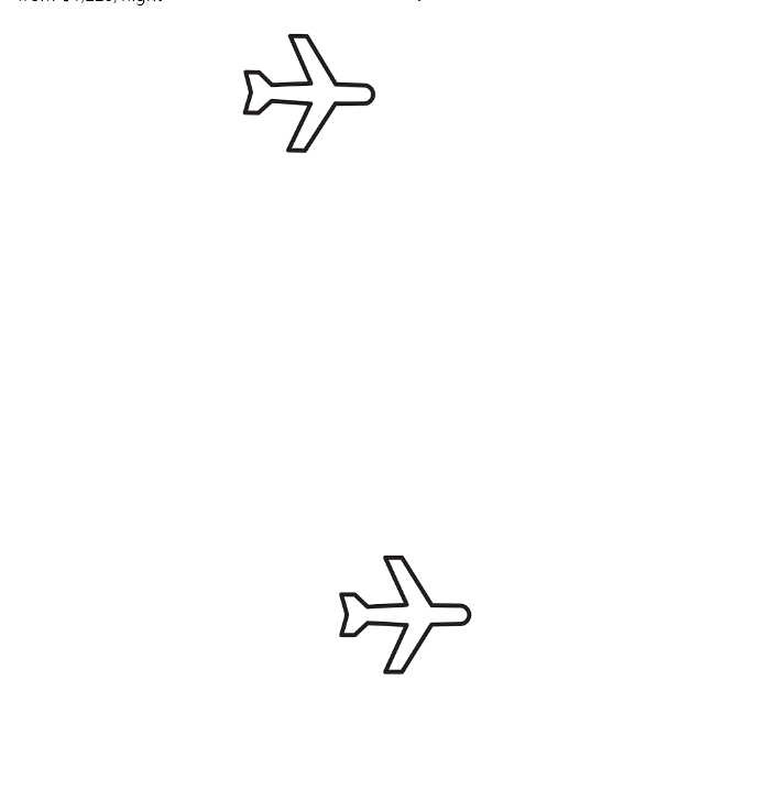
animation 실습을 못 해봐서 그냥 임의로 비행기가 날아가는 모습을 만들어보기로 했다. 위 비행기는 직접 제작했고 아래는 Stylie를 사용해 만들었다.
1. 직접 만든 animation
left,top등을 사용하기 위해position:relative적용- 비행기 앞부분이 들렸다가 다시 내려가는 움직임:
transform: rotate() - 비행기 이동:
left,top - 글 쓰면서 다시보니 나름 부드럽게 하려고
keyframe을 늘렸는데 어차피 경로 상의 frame 값을 그대로 쓴거라 효과가 없었던 것 같다. 완만하게 하려면 위치 값을 경로 직선 상의 점 말고 다른 걸로 바꿔야 할 듯. 확인 차 25%지점과 75%지점의 코드를 주석처리해보니 결과가 똑같음..ㅠ
.sky .airplane-img {
    position: relative;
    width:150px;
    height: 150px;
    left: 0;
    top: 100px;
    animation: airplaneFly 2s linear 0.5s 5 normal backwards;
}
@keyframes airplaneFly {
    0% {
        transform: rotate(-20deg);
        left: 0;
        top: 100px;
    }
    25% {
        transform: rotate(-10deg);
        left: 100;
        top: 50px;
    }
    50% {
        transform: rotate(0deg);
        left: 200px;
        top: 0px;
    }
    75% {
        transform: rotate(10deg);
        left: 100;
        top: 50px;
    }
    100% {
        transform: rotate(20deg);
        left: 400px;
        top: 100px;
    }
}
2. Stylie를 이용한 animation
완만한 포물선을 만들고 싶어서 Stylie를 한번 사용해보았다. 근데 포물선 도대체 어떻게 만드는지 감이 잘 안 온다. 거기다 keyframe size를 낮췄더니 비행기가 미묘하게 움찔대면서 움직이는게 보인다. 여기다가 rotate()를 추가해주면 좀 더 나을 것 같긴 하다.
.sky2 .airplane-path {
    animation-name: airplane-path-keyframes;
    animation-duration: 2000ms;
    animation-delay: 0ms;
    animation-fill-mode: forwards;
    animation-timing-function: linear;
    animation-iteration-count: infinite;
    transform-origin: 0 0;
  }
  @keyframes airplane-path-keyframes {
    0% {transform:translate(0px, 0px) scale(1) rotateX(0deg) rotateY(0deg) rotateZ(0deg) translate(-50%, -50%);}
    16.67% {transform:translate(88.4291px, -36.6667px) scale(1) rotateX(0deg) rotateY(0deg) rotateZ(0deg) translate(-50%, -50%);}
    33.33% {transform:translate(141.5709px, -73.3333px) scale(1) rotateX(0deg) rotateY(0deg) rotateZ(0deg) translate(-50%, -50%);}
    50% {transform:translate(230px, -110px) scale(1) rotateX(0deg) rotateY(0deg) rotateZ(0deg) translate(-50%, -50%);}
    66.67% {transform:translate(332.2702px, -71.3333px) scale(1) rotateX(0deg) rotateY(0deg) rotateZ(0deg) translate(-50%, -50%);}
    83.33% {transform:translate(393.7298px, -32.6667px) scale(1) rotateX(0deg) rotateY(0deg) rotateZ(0deg) translate(-50%, -50%);}
    100% {transform:translate(496px, 6px) scale(1) rotateX(0deg) rotateY(0deg) rotateZ(0deg) translate(-50%, -50%);}
  }html::after { content: url(https://ga-beacon.appspot.com/UA-42910121-1/stylie?pixel); position: absolute; left: -999em; }
텐바이텐 만들기
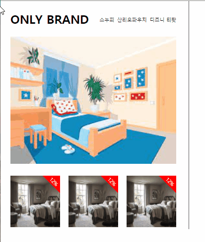
github소스코드-텐바이텐
일지를 다 쓰고 다른 분 블로그를 보다가 텐바이텐 메뉴를 만드신 걸 봤다. 마침 안보이다가 나타나는 메뉴 실습을 하기 적절한 예시를 못 찾고 있기도 했고 자극도 되서 나도 만들어보기로 했다.
주요포인트
flex,justify-content:space-between, 비율width같이 활용
특정 공간 안에 자식 태그들을 동일한 크기, 간격으로 x축 정렬하고 싶을 때 유용했다.
.left .img-lists {
    width: 100%;
    display: flex;
    justify-content: space-between;
    align-items: center;
    position: relative;
}
.left .img-lists li {
    width: 30%;
}- 이미지 위 할인율 표시 + 마우스 올리면 사라지게 하기
span태그에display:inline-block속성을 줘서 크기 및 색상을 지정하고text-align:center,padding-top로 글자를 중간 아래로 움직였다.transform:rotate(45deg)로 회전시킨 후right,top속성을 이용해 위치를 움직여줬다. 이때 부모 태그에overflow:hidden을 적용해 부모 태그 밖으로 나가면 보이지 않도록 했다. 마지막으로transition을 적용할 때all이라는 속성값을 주면 모든transition-property를 선택할 수 있다는 걸 알게 되었다.
.left .img-lists li .discount {
    display: inline-block;
    width: 50px;
    height: 50px;
    padding-top: 35px;
    box-sizing: border-box;
    transform: rotate(45deg);
    position: absolute;
    background-color: red;
    color: white;
    right:-25px;
    top: -25px;
    text-align: center;
    transition: all 0.2s;
}
.left .img-lists li:hover .discount {
    right:-100px;
    top: -100px;
}- 마우스 올리면 이미지 위로 설명 나타나게 하기
2번과 반대로 처음에 안 보였다가 나타나게 하는 텍스트 박스이다. 할인율 영역과 거의 비슷하고top값만 조절했다.
근데 아직 해결 못한 문제가 있다. 이 박스와 이미지 사이 약간의 공백이 있는데 도대체 어디서 왜 발생한 공백인지 찾지 못했다. 해결하고싶다..
어려웠던 내용
- 카카오톡 친구 목록 만들 때, 구분선을 넣어야 했는데 처음엔 위쪽 영역에 border-bottom을 사용해 만들었다. 그랬더니 원하는 대로 위치 조정하기도 애매하고 양 끝을 살짝 띄우고 싶은데 잘 안될 것 같았다.
- 트립어드바이저 main 상단의 메뉴를 만들 때
flex와justify-content:space-around를 사용했더니 분산은 잘 되었지만 리스트 요소 사이 남는 공간이 많았다. - 원하는 애니메이션을 stylie로 만드는 것도 쉽지 않았다. 물론 코드로 직접 쓰는 것보단 쉽겠지만..ㅠ
- 텐바이텐 왼쪽 오른쪽 큰 공간 분리 및 x축 정렬할 때 width를 50%로 줬더니
vertical-align,float,flex다 해봐도 옆으로 안 감. - 이미지 정사각형으로 맞추기: width가 비율값일 때 height도 같은 값으로 맞추는게 생각보다 쉽지 않았다.
- 오른쪽 상단 할인율 안 글자를 아래로 내리기:
<span>에inline-block속성을 부여해서 높이, 길이 주고text-align:center준건 좋았는데 내부 텍스트를 바닥으로 내릴 수가 없었다.
해결방법
- 검색해보니 html에서 구분선을 만들 때 사용하는
<hr>이라는 태그가 있었다. - 리스트 요소의 길이를 비율로 할당해주니 브라우저 크기가 변경되어도 동일한 넓이를 잘 유지했다.
- stylie를 다시 사용한다면 keyframe 속성을 좀 알아봐야겠다.
- 알고보니 자리 부족해서 그런거였다. 공백 생각해서 45%주니까 괜찮아졌고 50%에 box-sizing 적용해도 되는데 중간 border 안에 padding넣을 거 생각해서 좀 줄였다.
- height를 0으로 하고 padding, background-image을 이용한 방법 등을 찾아서 시도해봤지만 자리만 차지하고 사진이 보이지 않았다. 결국 고정값으로 주었다.
- 검색하다가 갑자기 깨달음. padding-bottom을 많이 줘서 내렸다.
소감
강의 분량을 어제 듣기도 했고 또 강의 길이도 짧았기 때문에 오늘은 혼자 만들어보는 활동을 주로 했다. 처음엔 이전 강의에서 다루었던 네이버 리빙 메뉴, 카카오톡 친구 목록 등을 보완하기도 하고 새로운 웹사이트(tripadvisor)도 한번 따라해보았다.
여러 웹사이트를 따라하면서 느낀 건데, 마우스를 올렸을 때의 움직임은 꽤 정형화되어있는 것 같았다. (예를 들어 이미지는 살짝 커짐. 문자열은 밑줄. 공통적으론 약간 투명해짐)
transform과 transition을 이용해 약간의 효과만 추가해줘도 훨씬 더 고급스러운 디자인이 되는 것 같아서 만족스러웠다.
다른 분이 텐바이텐 사이트를 만든 것 보고 어제 배운 거 연습용 예시로 적절한 것 같아서 나도 따라 만들어봤다.