학습내용
네이버 게임 main-right, footer
github소스코드
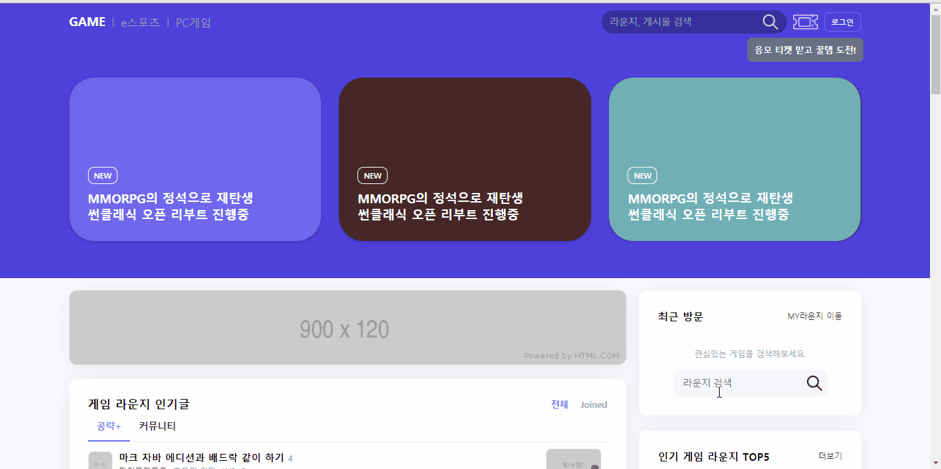
오른쪽 부분 default 클래스 만들기
right-secton등의 클래스명을 사용해 게임 페이지 오른쪽에 들어갈 영역의 default 클래스를 만들어주었다. 다른 페이지에도 비슷한 이름을 사용한다면 추가로 game 클래스 등을 적어주어서.game.right-section이런 식으로 설정할 수도 있을 것 같다.
.right-section {
    box-shadow: 0 2px 30px 0 rgb(0 0 0 / 6%);
    border-radius: 12px;
    padding: 30px;
    background-color: #ffffff;
    margin-bottom: 24px;
}
.right-section .title-wrap h2 {
    font-size: 17px;
    font-weight: 700;
}
.right-section .title-wrap a {
    font-size: 13px;
    font-weight: 400;
    color: #444;
}
.right-section .right-section-body {
    margin-top: 20px;
}
visitor-section
input-wrap중앙정렬 방법 두 가지 시도해보았고 둘 다 중앙정렬되었다.
1. 나:margin: 0 auto- 네이버(=강의): flex로 감싸서 1개 요소
align-item으로 센터 정렬
- 네이버(=강의): flex로 감싸서 1개 요소
<div class="input-wrap flex-start">
  <input type="text" placeholder="라운지 검색">
  <button type="button"></button>
</div>
#visitor-section .text-wrap .input-wrap {
position: relative;
overflow: hidden;
width: 250px;
height: 44px;
background-color: #f5f6fa;
border-radius: 12px;
margin-top: 18px;
/* margin: 18px auto 0 auto; */
}- input 태그의 경우
border:none하면 focus 되었을 때outline효과도 같이 사라짐
#visitor-section .text-wrap .input-wrap input {
    width: calc(100% - 44px);
    height: 100%;
    padding: 10px 16px;
    background-color: transparent;
    border: none;
    font-size: 15px;
}
/* #visitor-section .text-wrap .input-wrap input:focus {
    outline: none;
} */- input-wrap 안 button에 아이콘 넣어주었음
#visitor-section .text-wrap .input-wrap button {
    width: 44px;
    height: 100%;
    background-color: transparent;
    background-image: url(../img/search.png);
    background-repeat: no-repeat;
    background-size: 24px;
    background-position: center;
}
rank-section
순위 표시 숫자 + 등락 표시 레이아웃
- 순위 표시 숫자 아래 등락을 표시하는 부분을 추가하는 것이 복잡했음.
<a href="#">
  <div class="count-wrap">
    <span class="count">1</span>
    <div class="up-down-wrap">
      <div class="equal"></div>
    </div>
  </div>

  <div class="img-wrap">
  </div>

  <div class="txt-wrap">
</a>
...
<a href="#">
  <div class="count-wrap">
    <span class="count">4</span>
    <div class="up-down-wrap">
      <span class="up">1</span>
    </div>
  </div>
</a>
.rank-section .right-section-body li a {
display: flex;
flex-wrap: wrap;
align-items: center;
}
.rank-section .right-section-body li .count-wrap {
position: relative;
width: 25px;
/* text-align: center; */
}
.rank-section .right-section-body li .count-wrap .up-down-wrap {
position: absolute;
bottom: -13px;
}
/* position 변경없이 margin, padding으로 움직이려 하니 위치 변동 없었음
마진병합인지 아니면 position때문에 위치변경이 안된건지
*/
- 순위 표시 숫자와 등락 표시 부분이 한 공간에 들어있고 해당 공간은 flex-start의 영향으로 중앙정렬 되어 있음. 순위 표시 숫자만 flex-start로 중앙정렬 하기 위해 등락 표시 부분에
position:absolute를 주어 flex 영향에서 벗어나게 만들었음 - 등락 표시 영역 안에도 표시 종류에 따라 사용하는 태그가 달라서 (div, span) 각각 레이아웃 미세 조정 해 주어야 했음. 특히 span의 위치를 position 변경 없이 margin, padding으로만 움직이려 하니 전혀 이동하지 않아서 마진병합 때문인지 고민했음. 결국
position:relative를 주고top으로 이동했음.
.rank-section .right-section-body li .count-wrap .up-down-wrap .equal {
    display: inline-block;
    width: 5px;
    height: 3px;
    background-color: gray;
    margin-left: 4px;
}
.rank-section .right-section-body li .count-wrap .up-down-wrap span {
    position: relative;
    display: inline-block;
    top: 5px;
}
.rank-section .right-section-body li .count-wrap .up-down-wrap span::before {
    content: "";
    display: inline-block;
    position: relative;
    width: 7px;
    height: 3px;
    margin-right: 1px;
    top: -3px;
}- img-wrap 영역 안에 img 태그와 i태그가 겹쳐져 있고, i 태그는 영역 밖으로 살짝 벗어나 있음. 처음엔 img-wrap에
overflow:hidden을 이용해 영역의border-radius안에 내용물을 맞췄는데 아이콘이 잘려서border-radius속성을 이미지 자체로 옮겨주었음.
.rank-section .right-section-body li .img-wrap {
    position: relative;
    width: 55px;
    height: 55px;
    margin-right: 14px;
}
.rank-section .right-section-body li .img-wrap img {
    position: absolute;
    width: 100%;
    height: 100%;
    border-radius: 12px;
    border: solid 1px rgba(0, 0, 0, 0.06);
}
.rank-section .right-section-body li .img-wrap .chk {
    position: absolute;
    display: inline-block;
    width: 21px;
    height: 21px;
    background-color: #634ea4;
    border-radius: 50px;
    top: -4px;
    right: -4px;
}- li 태그 안 a태그에 after를 사용해 더보기 화살표 아이콘 넣어주었음.
.rank-section .right-section-body li a::after {
    content: "";
    width: 14px;
    height: 14px;
    background: url(../img/next.png) no-repeat;
    background-size: 10px;
}
banner 추가
- 기존 배너는 그냥 공간 만들고 사진 채우기만 했는데 역시 링크 연결을 해 줘야 할 것 같아서 a태그까지 넣어주었음.
<div class="game-banner">
  <a href="#">
    <img src="https://via.placeholder.com/357x200" alt="">
  </a>
</div>
.right .game-banner a {
display: block;
overflow: hidden;
width: 100%;
height: 200px;
border-radius: 12px;
margin-bottom: 24px;
}
.right .game-banner a img {
width: 100%;
height: 100%;
}어려웠던 점
- 순위 변동 표시 위치 조정: 처음에 강의에서 무엇을 하고자 하는지 이해를 못해서 몇 번 돌려본 것 같다. 레이어도 많고 position도 다양하게 사용해서 헷갈렸다. 특히 span 태그를 이동시키려고 했는데 margin, padding이 안 먹혀서 답답했다.
해결방법
inline-block요소도 분명 margin, padding이 적용될텐데 span에 왜 적용이 안 되는지 잘 이해는 안 됐다. 그래도 position을 바꿔서 원하는 대로 이동시킬 수 있었다. 지금 생각해보면 그것도 div 안에 들어있는 요소이니 부모div를 이동시키봤어야 했나 싶다. 하지만 변동 상태에 따라 태그 종류가 다르기 때문에 결과적으론 옳은 방법을 택한 것 같다.
소감
오늘은 작은 요소들의 위치를 미세하게 조정할 일이 꽤 있었다. 스스로 엄청 세심한 스타일은 아니라고 생각하는데 웹프론트를 공부하다보니 점점 작은 부분까지도 신경을 쓰는 방향으로 변화하고 있는 것 같다.

문서화를 좋아하는 개발자