CSS selector의 종류
1️⃣ element selector
기본 html 태그로 style을 지정하는 선택자
h1 {color: green;}2️⃣ ID selector
ID로 style을 지정하는 선택자 (고유하기 때문에 하나의 요소를 지정할 때 사용)
#section {color: green;}3️⃣ Class selector
class로 style을 지정하는 선택자 (ID와 달리 다수 선택 가능)
.section {color: green;}
p.section {color: red;} // element selector + class selector
4️⃣ Univeral selector
모든 요소의 style을 지정하는 선택자
* {font-size: 20px;}5️⃣ Grouping selector
여러 요소의 style을 지정하는 선택자
h1, h2, p {font-size: 20px;} 상태와 관련된 대표적인 selector
:hover : 마우스 커서가 element 위에 올아왔을 때
:active : 주로 <a> 태그에 사용되는데, element가 클릭됐을 때를 의미
:focus : 주로 <input> 태그에 사용되는데, element가 초점을 갖고 있을 경우를 의미
:checked : radio button이나 checkbox 같은 유형의 <input> 태그가 체크되어 있는 경우를 의미
:first-child,:last-child : 상위 element를 기준으로 각각 첫 번째 child, 마지막 child일 경우를 의미
레이아웃과 관련된 속성
display
display: none : element를 화면에서 숨기기 위해 사용
display: block : 블록 단위로 element 배치
display: inline : element를 라인 안에 넣는 것
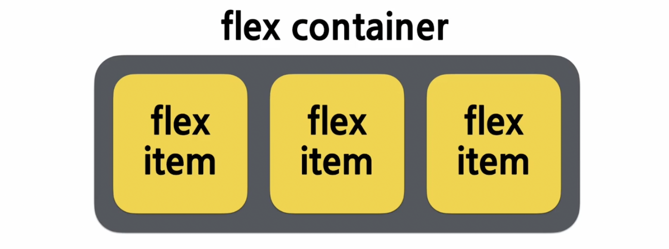
display: flex : element를 블록 레벨의 flex container로 표시
visibility
visibility: visible : element를 화면에 보이게 하는 것
visibility: hidden : element를 화면에서만 안 보이게 하는 것 (화면에서 영역을 그대로 차지)
position
position: static : 기본값으로 element를 원래의 순서대로 위치시킴
position: fixed : element를 브라우저 window에 상대적으로 위치시킴
position: relative : element를 보통의 위치에 상댖거으로 위치시킴
position: absolute : element를 절대 위치에 위치시킴
flexbox
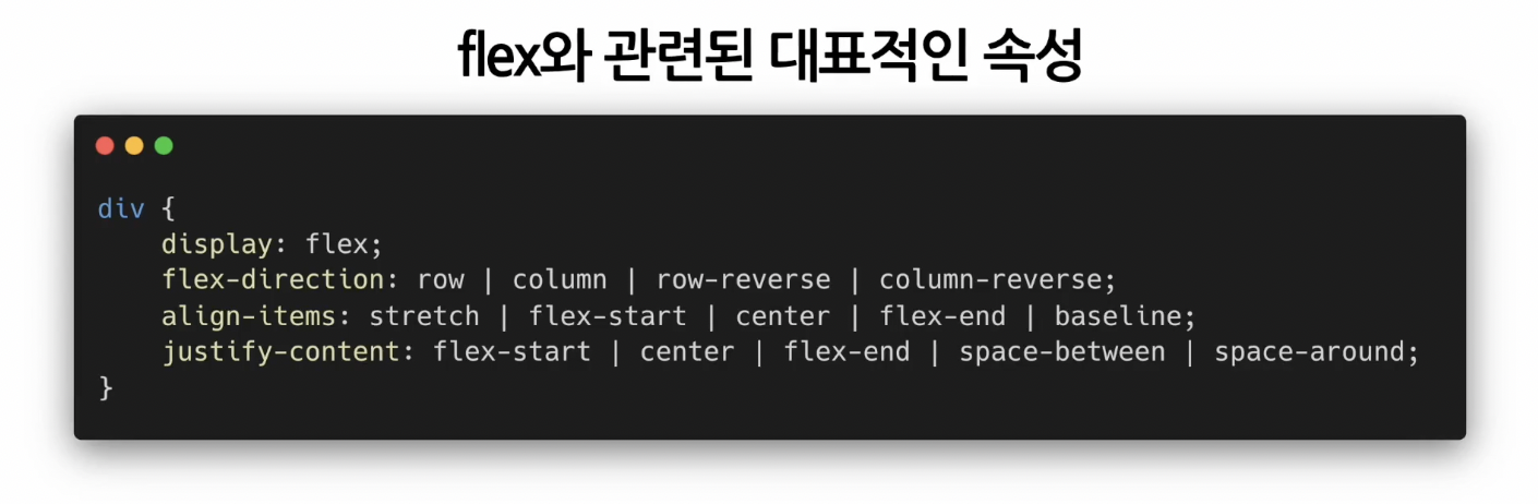
flex-direction: 아이템들이 어떤 방향으로 지정될 것인지
flex-direction: row : 기본값. 행을 따라 가로 순서대로 왼쪽부터 배치
flex-direction: column : 아이템을 열에 따라 세로 순서대로 위쪽부터 배치
flex-direction: row-reverse : 행의 역방향으로 오른쪽부터 배치
flex-direction: column-reverse : 열의 역방향으로 아래쪽부터 배치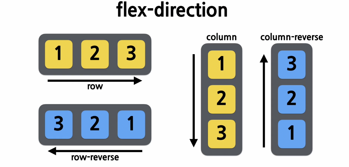
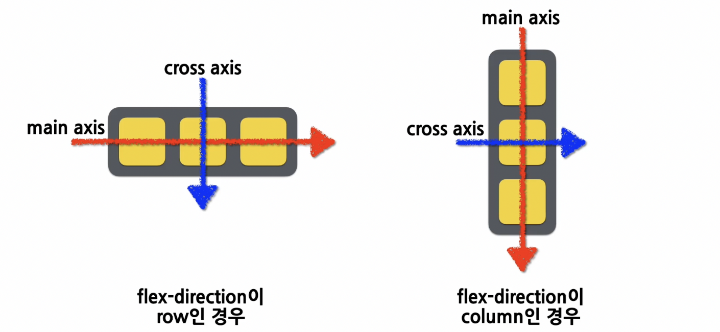
align-items: 컨테이너 내에서 아이템들을 어떻게 정렬할 것인지
align-items: stretch : 기본값. 아이템 늘려서 컨테이너 가득 채움
align-items: flex-start : cross axis의 시작지점으로 아이템 정렬
align-items: center : cross axis의 중앙으로 아이템을 정렬
align-items: flex-end : cross axis의 끝 지점으로 아이템을 정렬
align-items: baseline : 아이템을 baseline 기준으로 정렬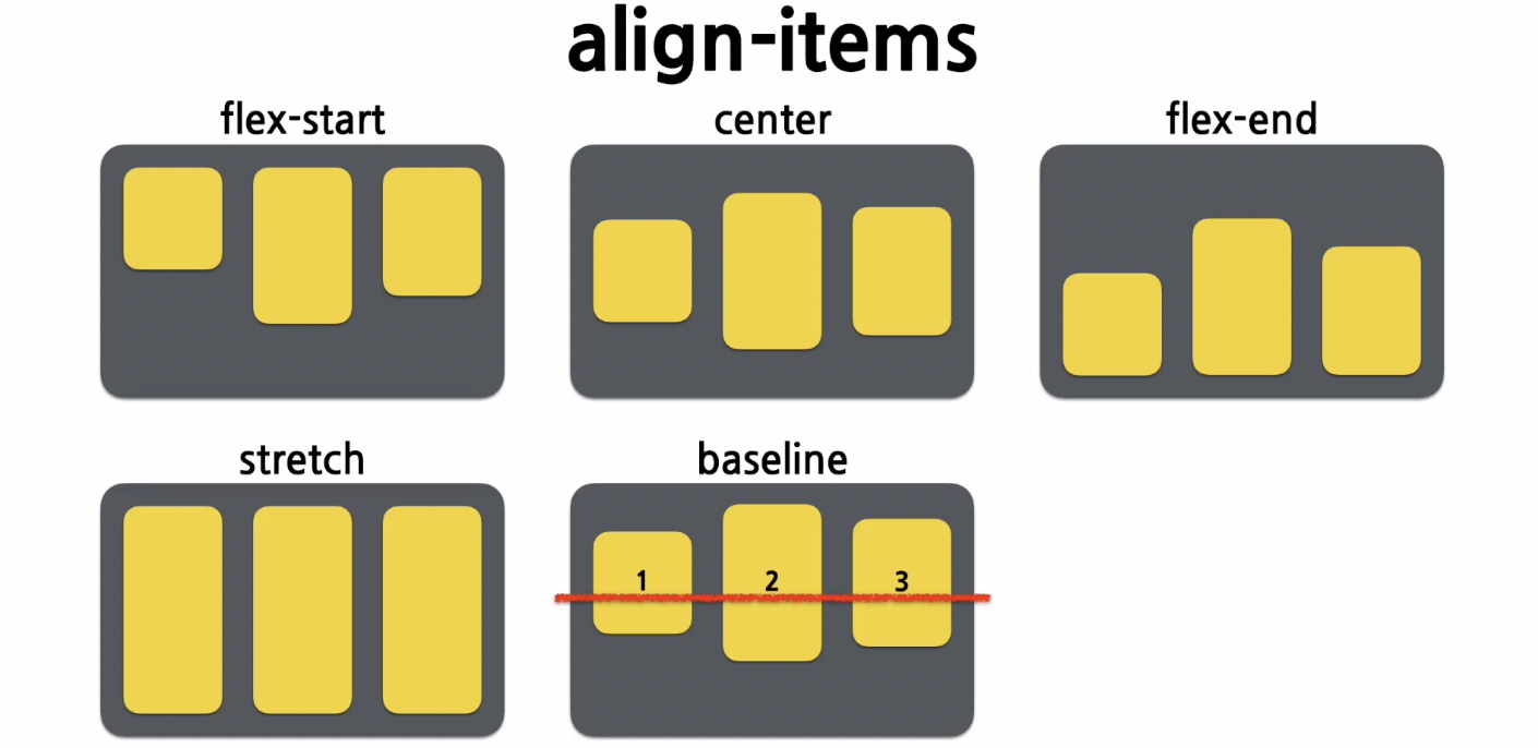
justify-content : 컨테이너 내에서 아이템들을 어떻게 나란히 맞출 것인지
justify-content: flex-start : main axis의 시작 지점으로 아이템을 맞춤
justify-content: center : main axis의 중앙으로 아이템을 맞춤
justify-content: flex-end : main axis의 끝 지점으로 아이템을 맞춤
justify-content: space-between : main axis를 기준으로 첫 아이템은 시작 지점에 맞추고 마지막 아이템은 끝 지점에 맞추며, 중간에 있는 아이템들 사이의 간격이 일정하게 되도록 맞춤
justify-content: space-around : main axis를 기준으로 각 아이템의 주면 간격을 동일하게 맞춤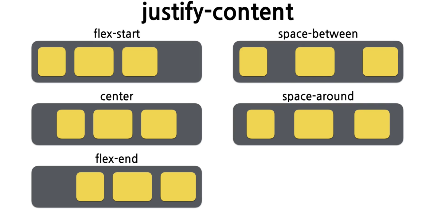
font 관련 속성
em은 브라우저에서 폰트 크기를 조절할 수 있는 속성이다.
16em = 1px
styled-compoenents
css 문법을 그대로 사용하면서 결과물을 스타일링된 컴포넌트로 만들어주는 오픈소스 라이브러리이다.
설치 방법
npm install --save styled-components
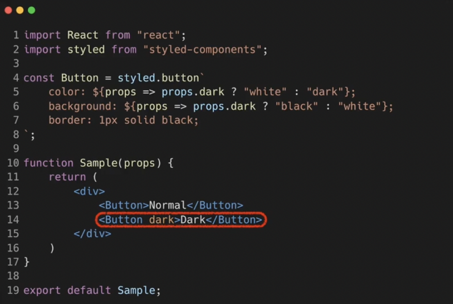
yarn add styled-componentsstyled-components에 props 넘기기
 다른 컴포넌트의 style 확장하기
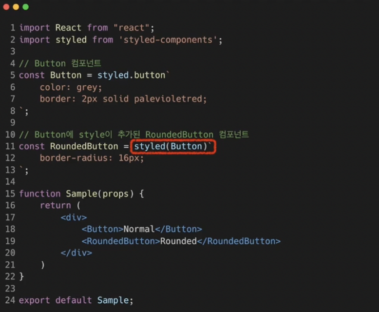
예제
// Blocks.jsx
import React from 'react'
import styled from 'styled-components';

const Wrapper = styled.div`
    padding: 1rem;
    display: flex;
    flex-direction: row;
    align-items: flex-start;
    justify-content: flex-start;
    background-color: lightgrey;
`;

const Block = styled.div`
    padding: ${(props) => props.padding};
    border: 1px solid black;
    border-radius: 1rem;
    background-color: ${(props) => props.backgroundColor};
    color: white;
    font-size: 2rem;
    font-weight: bold;
    text-align: center;
`

const blockItems = [
    {
        label: "1",
        padding: "1rem",
        backgroundColor: "red",
    },
    {
        label: "2",
        padding: "3rem",
        backgroundColor: "green",
    },
    {
        label: "3",
        padding: "2rem",
        backgroundColor: "blue",
    },
];

function Blocks(props) {
  return (
    <Wrapper>
        {blockItems.map((blockItem) => {
            return (
                <Block
                padding={blockItem.padding}
                backgroundColor={blockItem.backgroundColor}
                >
                    {blockItem.label}
                </Block>
            );
        })}
    </Wrapper>
  );
}

export default Blocks
styled-components를 이용하여 style이 다른 3개의 block 생성
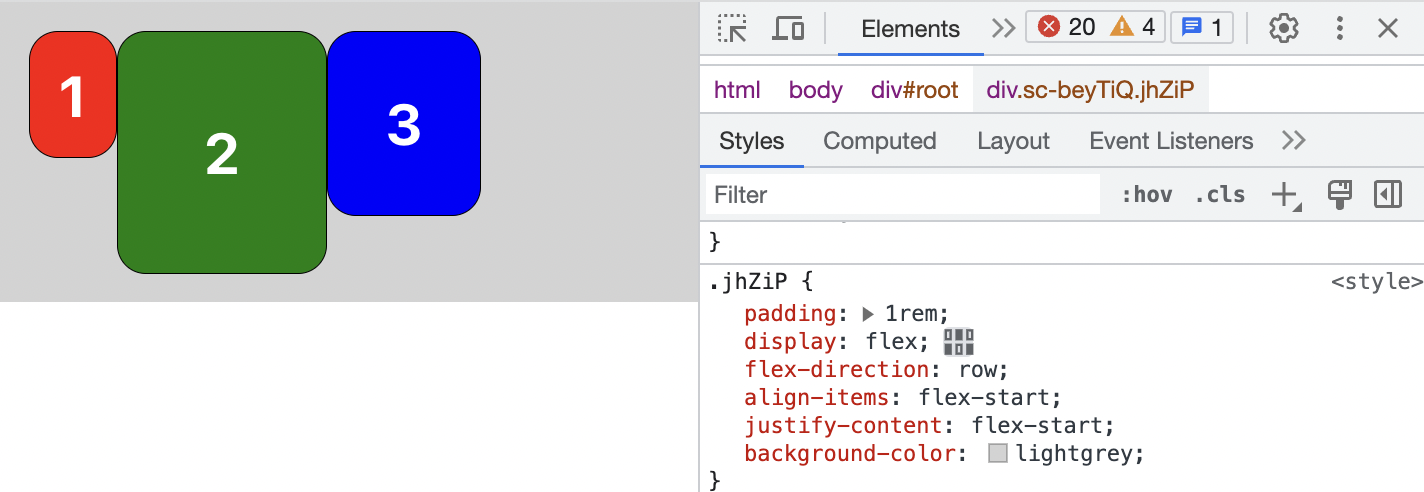
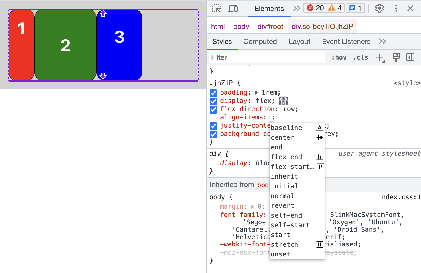
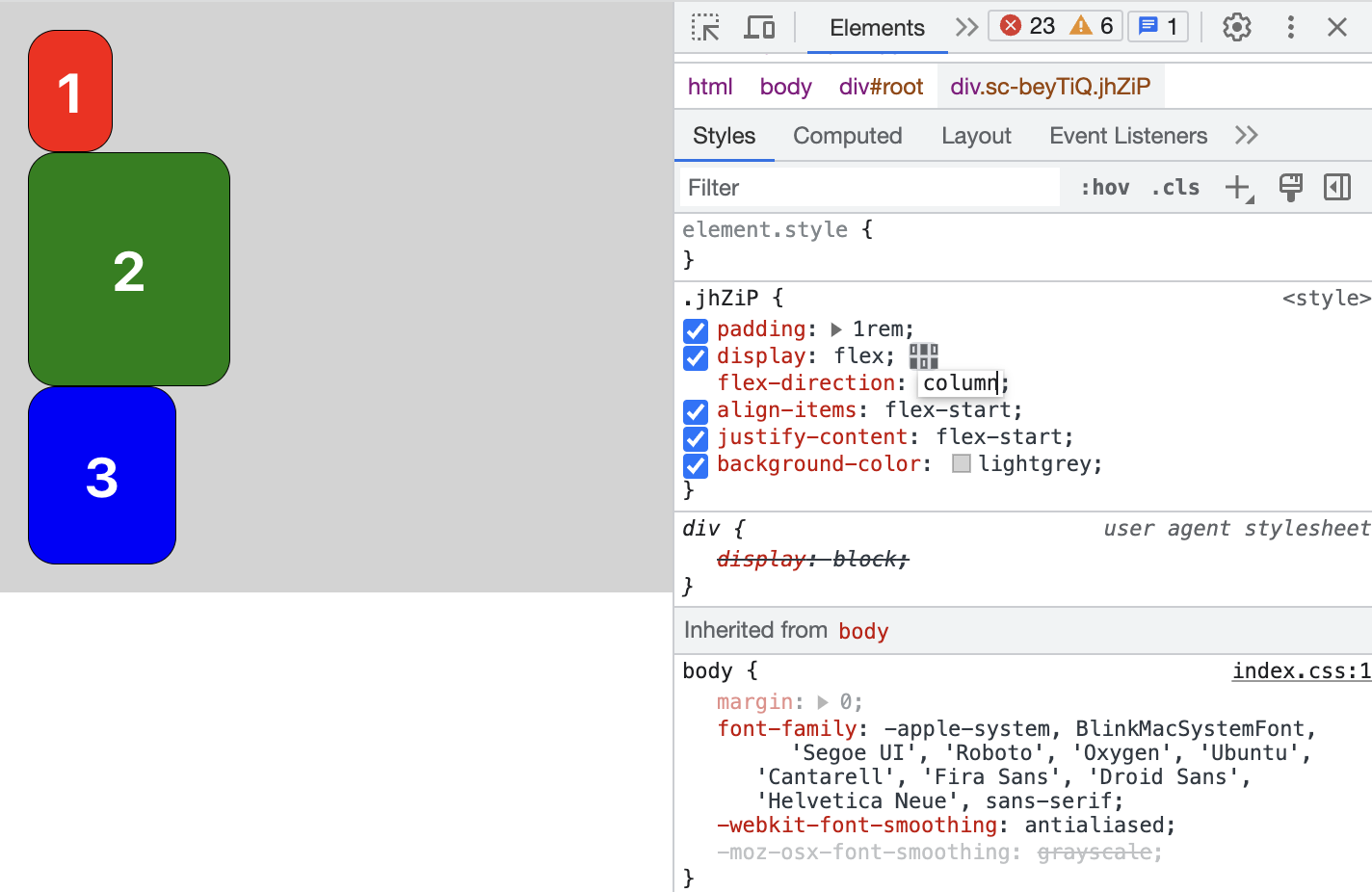 개발자 도구를 이용하여 css 속성을 변경해볼 수 있다.
✡️ vscode-styled-components plugin
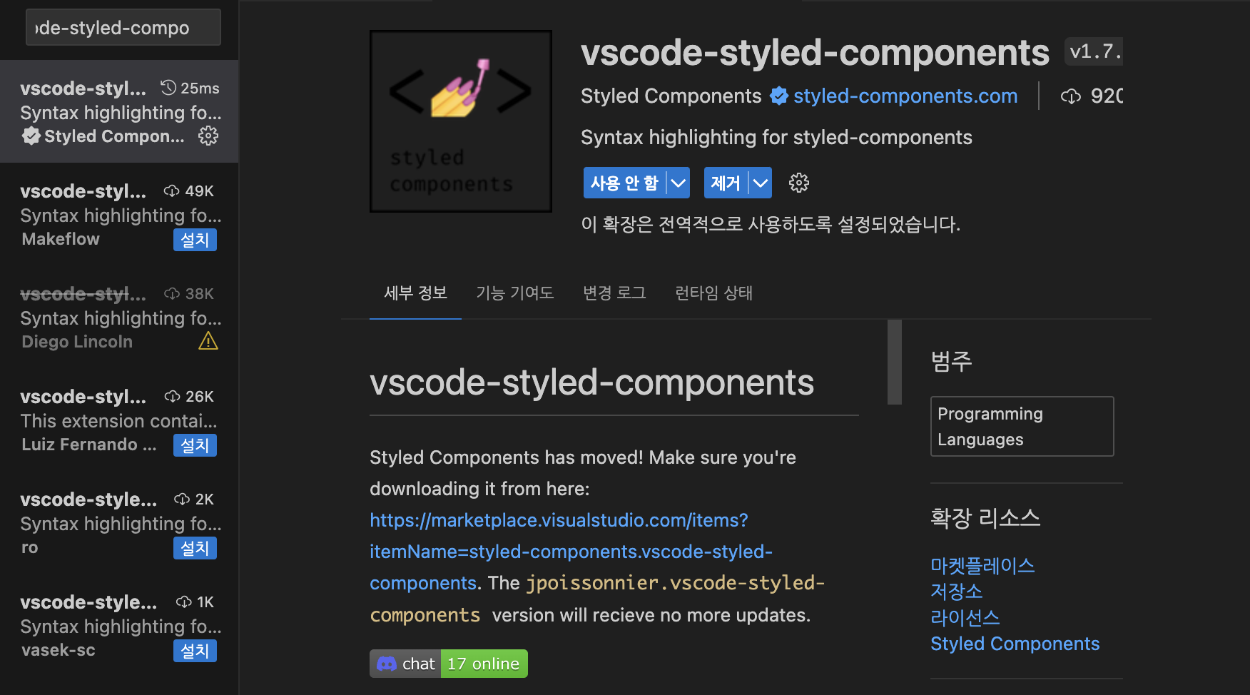 기존에는 styled components를 사용할 때 백틱 안에 문자열이 감싸지는 형태였는데, 이 플러그인을 사용하면 css 자동완성도 가능하고, 색 구분도 가능하다.
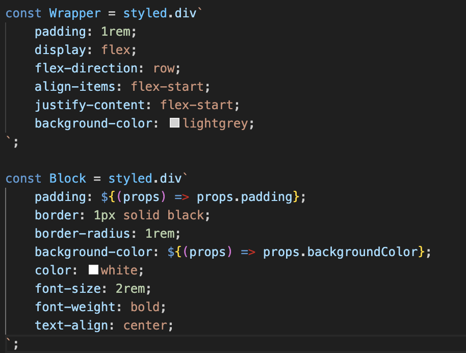
참고