
Container
child 옵션
class Home extends StatelessWidget {
const Home({super.key});
@override
Widget build(BuildContext context) {
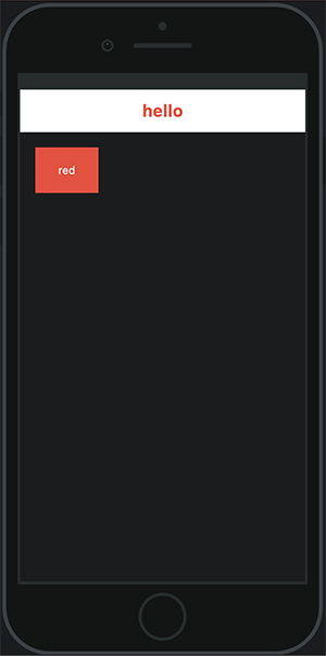
return Scaffold(
appBar: AppBar(
title: Text("hello", style: TextStyle(color:Colors.red, fontWeight: FontWeight.bold)),
backgroundColor: Colors.white,
),
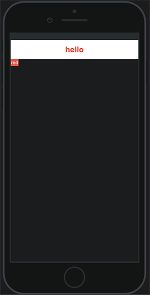
body: Container (
color: Colors.red,
child: Text("red"),
//child옵션의 Text 위젯으로 글자를 넣어줄 수 있다.
)
);
}
}📱 화면
텍스트를 넣어주면 텍스트 크기 만큼 Container크기가 변하게된다.
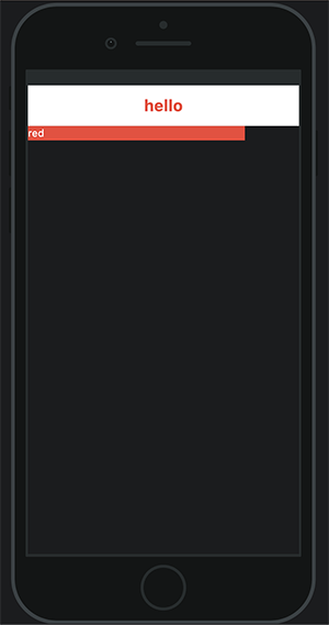
width
body: Container (
        color: Colors.red,
        width: 300,
        //container에 width값을 넣어보았다.

        child: Text("red"),
      )
width: 100%?
width: double.infinity,
📱 화면
conatiner의 width가 변경된다.
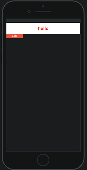
padding 옵션
1. 좌우에 padding을 주었다.
body: Container (
padding: EdgeInsets.symmetric(horizontal: 30),
color: Colors.red,
child: Text("red"),
)
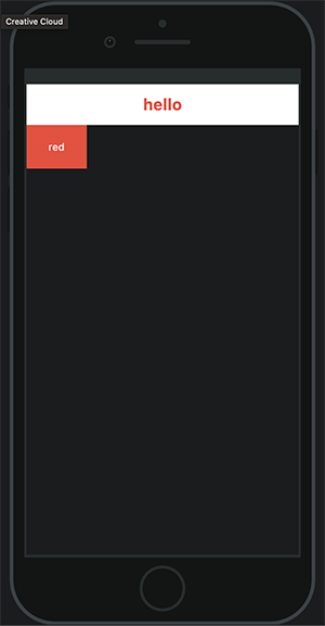
2. 상하 좌우 모두 padding을 주었다.
body: Container (
padding: EdgeInsets.symmetric(horizontal: 30, vertical: 20),
//vertical(상하) 옵션을 추가해준다.
color: Colors.red,
child: Text("red"),📱 화면
- 좌우에 padding 30이 적용되었다.
- 상하 좌우 모두 padding이 각각 20, 30씩 적용되었다.
margin 옵션
body: Container (
        padding: EdgeInsets.symmetric(horizontal: 30, vertical: 20),
        margin: EdgeInsets.symmetric(horizontal: 20, vertical: 20),
        // 상하 좌우에 margin 20을 넣었다.

        color: Colors.red,
        child: Text("red"),
      )
📱 화면
상하 좌우에 margin이 적용되었다.
EdgeInsets.all
4방향 한번에 같은 margin이 적용된다.
margin: EdgeInsets.all(20),EdgeInsets.only
4방향 각각 다른 margin을 적용할 수 있다.
margin: EdgeInsets.only(top: 10, right: 30, bottom: 10, left: 30),Column
children 옵션
✔️ Container 자식옵션 child
Column 자식옵션 children
class Home extends StatelessWidget {
const Home({super.key});
@override
Widget build(BuildContext context) {
return Scaffold(
appBar: AppBar(
title: Text("hello", style: TextStyle(color:Colors.red, fontWeight: FontWeight.bold)),
backgroundColor: Colors.white,
),
body: Column(
children: [
Container(
width: 100,
height: 100,
color: Colors.white,
),
Container(
width: 50,
height: 100,
color: Colors.cyan,
),
Container(
width: 120,
height: 100,
color: Colors.limeAccent,
)
],
)
);
}
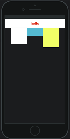
}📱 화면
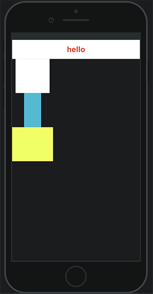
✔️ Column 자체의 넓이와 높이는 줄 수 없다.
✔️ Column의 높이는 남아있는 공간을 모두 차지한다.
✔️ Clomn의 넓이는 children중 가장 넓은 길이를 따른다.
mainAxisAlignment / crossAxisAlignment _ 축 옵션
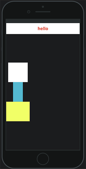
상하축 조절 _ mainAxisAlignment
body: Column(
        mainAxisAlignment: MainAxisAlignment.center,//추가

        children: [
          Container(
            width: 100,
            height: 100,
            color: Colors.white,
          ),
          Container(
            width: 50,
            height: 100,
            color: Colors.cyan,
          ),
          Container(
            width: 120,
            height: 100,
            color: Colors.limeAccent,
          )
        ],
      )
📱 화면
Colum은 전체 높이를 차지하기 때문에 center를 적용하면 전체 높이의 중간으로 위치하게된다.
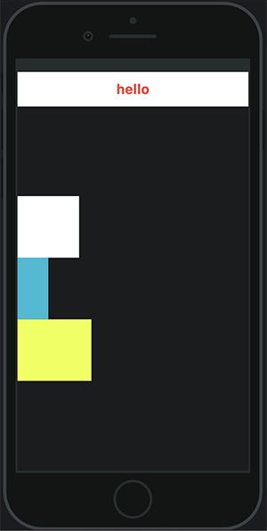
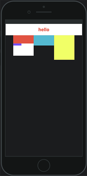
좌우축 조절 _ corssAxisAlignment
body: Column(
        mainAxisAlignment: MainAxisAlignment.center,
        crossAxisAlignment: CrossAxisAlignment.start,//추가

        children: [
          Container(
            width: 100,
            height: 100,
            color: Colors.white,
          ),
          Container(
            width: 50,
            height: 100,
            color: Colors.cyan,
          ),
          Container(
            width: 120,
            height: 100,
            color: Colors.limeAccent,
          )
        ],
      )
📱 화면
Row
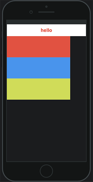
class Home extends StatelessWidget {
  const Home({super.key});

  @override
  Widget build(BuildContext context) {
    return Scaffold(
      appBar: AppBar(
        title: Text("hello", style: TextStyle(color:Colors.red, fontWeight: FontWeight.bold)),
        backgroundColor: Colors.white,
      ),

      //Column을 Row로 변경하였다.
      body: Row(
        mainAxisAlignment: MainAxisAlignment.center,
        crossAxisAlignment: CrossAxisAlignment.start,
        children: [
          Container(
            width: 100,
            height: 100,
            color: Colors.white,
          ),
          Container(
            width: 100,
            height: 50,
            color: Colors.cyan,
          ),
          Container(
            width: 100,
            height: 120,
            color: Colors.limeAccent,
          ),
        ],
      )
    );
  }
}
📱 화면
Container, Column, Row
Container, Column, Row를 적절히 활용하여 레이아웃을 만든다.
body: Row(
        mainAxisAlignment: MainAxisAlignment.center,
        crossAxisAlignment: CrossAxisAlignment.start,
        children: [
          Container(
            width: 100,
            height: 100,
            color: Colors.white,
            child: Column (
              crossAxisAlignment: CrossAxisAlignment.start,
              children: [
                Container(
                  width: 100,
                  height: 40,
                  color: Colors.red,
                ),
                Container(
                  width: 40,
                  height: 10,
                  color: Colors.deepPurpleAccent,
                )
              ],
            ),
          ),
          Container(
            width: 100,
            height: 50,
            color: Colors.cyan,
          ),
          Container(
            width: 100,
            height: 120,
            color: Colors.limeAccent,
          ),
        ],
      )
📱 화면
Expanded
flex옵션을 활용하여 비율로 영역의 크기를 설정할때 사용한다.
body: Row(
        children: [
          Container(
            width: 300,
            height: 300,
            color: Colors.white,

            //3개의 Expanded가 동일한 비율로 나누어진다.
            child: Column(
              children: [
                Expanded(
                  flex: 1,//flex:2 로변경할 경우 이 Expanded는 전체 Column에서 2/5영역을 차지하게된다.

                  child: Container(
                    color: Colors.red,
                  ),
                ),
                Expanded(
                  flex:1,
                  child: Container(
                    color: Colors.blue,
                  ),
                ),
                Expanded (
                  flex: 1,
                  child: Container(
                    color: Colors.lime,
                  ),
                ),
              ],
            ),
          ),
        ],
      )
📱 화면
부모 Column 크기의 1/3씩 영역을 차지하게된다.
Flexible
flex옵션을 활용하여 비율로 영역의 크기를 설정할때 사용한다. Expanded와 다르게 children내부에 선언된 위젯들이 차지하는 영역을 비율별로 나눌 수 있다.
- 아래와 같은 모양을 구현해볼건데 검색창 길이가 움직이는 반응형이다.
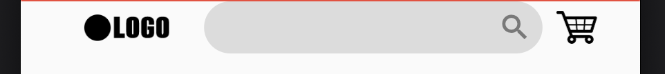
- code
Container(
              padding: EdgeInsets.symmetric(horizontal: 20),
              child: Row(
                mainAxisAlignment: MainAxisAlignment.center,
                //자식 children을 가운데 정렬

                children: [
                  Flexible(
                    flex: 3,
                    //자식 컨테이너에 지정되어있는 width를 기준으로 비율이 지정된다.

                    child: Container(
                      margin: EdgeInsets.only(right: 10),
                      child: Image(
                        width: 92,
                        image: AssetImage('assets/images/logo.png',),
                      ),
                    )
                  ),
                  Flexible(
                    flex: 6,
                    child: SizedBox(
                      height: 38,
                      child: TextField(
                        decoration: InputDecoration(
                          filled: true,
                          fillColor: Colors.black12,
                          suffixIcon: Icon(Icons.search),

                          enabledBorder: OutlineInputBorder(
                            borderRadius: BorderRadius.circular(100),
                            borderSide: BorderSide.none,
                          ),

                          focusedBorder: OutlineInputBorder(
                              borderSide: BorderSide.none,
                              borderRadius: BorderRadius.circular(100)
                          ),
                        ),
                      ),
                    ),
                  ),
                  Flexible(
                    flex: 1,
                    child: InkWell(
                      child: Container(
                        margin: EdgeInsets.only(left: 10),
                        child: Image.asset('assets/images/cart2.png', width: 30,),
                      ),
                    ),
                  )
                ],
              ),
            ),
출처: 백수코딩

한별잉