이 글을 읽고 Next + useSWR + Pre-Rendering 글도 읽어보는 것을 추천한다.
프로젝트
기프티콘 쇼핑에 관한 Web을 설계하는 과제이다.
배포주소 : https://gifticon-market.vercel.app/
초기 셋팅
스택
- FrontEnd
- React Hooks
- Next
- Emotion
- SWR
- Axios
- Antd-icon
- Test
- Cypress
- Deploy
- Vercel
설치
yarn create next-app 프로젝트이름 --typescript
yarn add axios swr @emotion/react @emotion/styled
yarn add @ant-design/icons@4.0.0
yarn add cypress
yarn add -D eslint eslint-config-airbnb eslint-plugin-import eslint-plugin-jsx-a11y eslint-plugin-react eslint-plugin-react-hooks
yarn add -D prettier eslint-config-prettier eslint-plugin-prettier
yarn add -D babel-eslint eslint-plugin-babel
절대경로
//tsconfig.json
    "baseUrl": ".",
    "paths": {
      "@*": ["./src/*"]
    }
절대경로를 사용하기 위해 tsconfig 파일을 수정해주었다. 이제 @components 와 같은 형태로 파일과 디렉터리를 import 할 수 있다.
글로벌 스타일
@import url("https://fonts.googleapis.com/css2?family=Noto+Sans+KR:wght@400;500;700&display=swap");
*,
*::before,
*::after {
  margin: 0;
  padding: 0;
  box-sizing: border-box;
}
body {
  font-family: "Apple SD Gothic Neo", "Noto Sans KR", sans-serif;
}
ul,
li {
  list-style: none;
}
a {
  text-decoration: none;
  outline: none;
  color: inherit;
}
a:hover,
a:active {
  text-decoration: none;
}
button {
  background-color: transparent;
  line-height: inherit;
  border: none;
}
input,
label,
select,
button,
textarea {
  margin: 0;
  border: 0;
  padding: 0;
  display: inline-block;
  background: none;
  line-height: 1;
  font: inherit;
}
global.css도 입맛에 맞게 초기 설정해주었다.
cypress
//package.json
"cypress": "cypress open"
E2E 테스트를 하기 위해 cypress 라이브러리를 설치하고, scripts 안에 추가해주었다. 추후에 사용 방법을 설명하겠다.
기능 구현
토글
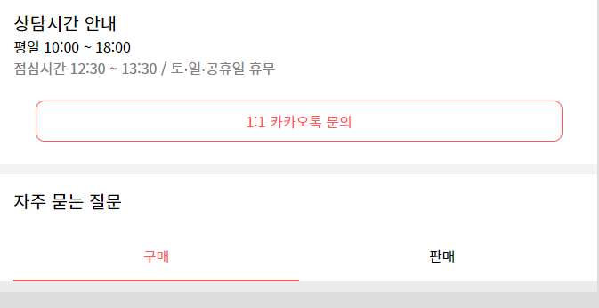
구매와 판매에 대한 토글 버튼을 구현했다. 구매와 판매 버튼 클릭 상태에 따라 추후에 오는 UI가 다르다. 그래서 어떻게 구현하면 효율적일지 생각해 보았다.
//Components/QnA/OftneQnA.tsx
<BuyBtn type="button" toggle={toggle} onClick={handleBuyBtn}>
  구매
</BuyBtn>
<SellBtn type="button" toggle={!toggle} onClick={handleSellBtn}>
  판매
</SellBtn>
return 부분에 구매와 판매에 대한 태그를 button으로 구성했다. 그리고 onClick 이벤트를 주고, toggle 값을 넘겨주고 있다.
//Components/QnA/OftneQnA.tsx
interface Toggle {
  toggle: boolean;
}
toggle은 boolean 타입으로 styled 에서 사용하기 위해 타입을 지정해주었다.
//Components/QnA/OftneQnA.tsx
const [toggle, setToggle] = useState(true);
  const handleBuyBtn = () => {
    if (!toggle) setToggle(!toggle);
  };
  const handleSellBtn = () => {
    if (toggle) setToggle(!toggle);
  };
toggle값은 true로 처음에 초기화하여 사용한다. 그리고 구매 또는 판매 버튼 클릭에 따라 값은 변경된다.
//Components/QnA/OftneQnA.tsx
const BuyBtn = styled.button<Toggle>`
  padding: 15px 0;
  color: ${({ toggle }) => (toggle ? COLOR.RED : COLOR.BLACK)};
  border-bottom: 2px solid ${({ toggle }) => (toggle ? COLOR.RED : COLOR.WHITE)};
  width: 50%;
  cursor: pointer;
`;
이 toggle 값을 styled에 넘겨주고, 상태에 따라 CSS의 값을 주어 빨간색 border-bottom과 color을 부여하고 있다.
토글 상태에 따른 데이터
//hooks/uesData.tsx
export const useData = (path: string, query: string = '') => {
  return useSWR(`${API_ENDPOINT}/${path}?${query}`, fetcher);
};
useSWR을 사용하여 데이터를 받아오기 위해 훅스를 생성했다. 파라미터로 path와 query를 받아오는데, 쿼리는 아규먼트에 없으면 path까지만 url로 넘겨준다.
//utils/fetcher.ts
export const fetcher = (url: string) => axios.get(url).then(res => res.data);
넘겨받은 url을 fetcher에서 사용하여 데이터를 요청하는 것이다.
//Components/QnA/OftneQnA.tsx
const { data: QnATypeData, error: QnATypeError } = useData('qa-types');

  if (!QnATypeData) return <div>로딩중..</div>;
  if (QnATypeError) return <div>페이지 에러</div>;
  console.log(QnATypeData);
이제 useData 훅스를 이용하여 데이터를 받아와보자.
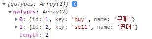
정상적으로 받아와지는것을 볼 수 있다.
//Components/QnA/OftneQnA.tsx
<BuyBtn type="button" toggle={toggle} onClick={handleBuyBtn}>
  {QnATypeData.qaTypes[0].name}
</BuyBtn>
<SellBtn type="button" toggle={!toggle} onClick={handleSellBtn}>
  {QnATypeData.qaTypes[1].name}
</SellBtn>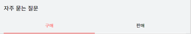
데이터 안에 name이 있으므로 return 부분에도 이것을 사용하는 것으로 변경해주었다. 구매와 판매가 UI에 정상적으로 나타나고 있다.
  const { data: QnAContentData, error: QnAContentError } = useData(
    'qas',
    `qaTypeId=${toggle ? 1 : 2}`
  );
  console.log(QnAContentData);
toggle값에 따라 useData에서 사용될 query의 값을 변경하여, 클릭에 따라 데이테를 다르게 받아오는 부분을 구현했다. toggle가 true면 구매에 대한 QnA 데이터가 들어올 것이고, false면 판매에 대한 QnA 데이터가 들어올 것이다.
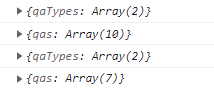
구매에 대한 QnA 데이터는 배열에 10개가 들어있고, 판매는 7개 들어가 있는것을 볼 수 있다.
토글과 데이터 리팩토링
잠깐 생각을 해보자. 구매라는 name을 가진 데이터는 id값이 1이었다. 그리고 qaTypeId=1 의 쿼리에 요청을 보내면 구매에 대한 데이터를 반환하고 있다. toggle을 그냥 냅두어도 되지만, boolean 보다는 id값으로 변경하며 사용하는 것이 조금 더 괜찮을 것 같다.
//pages/contacts.tsx
const ContactsPage: NextPage = () => {
  const { data: QnATypeData, error: QnATypeError } = useData('qa-types');
  if (!QnATypeData) return <div>로딩중..</div>;
  if (QnATypeError) return <div>페이지 에러</div>;

  return (
    <div>
      <QnAContainer QnATypeData={QnATypeData.qaTypes} />
    </div>
  );
};
우선 contacts 페이지에 들어가면 QnATypeData 를 받아오도록 하자. 그리고 QnATypeData값을 props로 넘겨준다.
//Components/QnA/QnAContainer.tsx
export const QnAContainer = ({ QnATypeData }: QTD) => {
  return (
    <div>
      <OneOnOne />
      <OftenQnA QnATypeData={QnATypeData} />
    </div>
  );
};
그리고 QnAContainer 에서 QnATypeData를 props로 받아 OftenQnA에 넘겨주었다.
//types/QTD.ts
export interface QTD {
  QnATypeData: {
    id: number;
    key: string;
    name: string;
  }[];
}
타입은 types 디렉터리에 ts파일 하나 생성하여 지정했다. 배열안에 객체이므로 뒤에 [ ]을 붙여주었다.
//Components/QnA/OftneQnA.tsx
export const OftenQnA = ({ QnATypeData }: QTD) => {
  const [toggle, setToggle] = useState(QnATypeData[0].id);
  const handleBuyBtn = () => {
    if (toggle === QnATypeData[1].id) setToggle(QnATypeData[0].id);
  };
  const handleSellBtn = () => {
    if (toggle === QnATypeData[0].id) setToggle(QnATypeData[1].id);
  };

  const { data: QnAContentData, error: QnAContentError } = useData(
    'qas',
    `qaTypeId=${toggle}`
  );
  if (!QnAContentData) return <div>로딩중..</div>;
  if (QnAContentError) return <div>페이지 에러</div>;
  console.log(QnAContentData);

  return (
    <Container>
      <Title>자주 묻는 질문</Title>
      <ToggleContainer>
        <BuyBtn type="button" toggle={toggle} onClick={handleBuyBtn}>
          {QnATypeData[0].name}
        </BuyBtn>
        <SellBtn type="button" toggle={toggle} onClick={handleSellBtn}>
          {QnATypeData[1].name}
        </SellBtn>
      </ToggleContainer>
    </Container>
  );
};
이제 QnATypeData의 id값을 이용하여 toggle 기능을 수행하고, useData에 요청할 query값을 결정한다.
sr-only 추가
.sr-only {
  position: absolute;
  clip: rect(0 0 0 0);
  top: auto;
  width: 1px;
  height: 1px;
  margin: -1px;
  overflow: hidden;
}
global.css에 스크린 리더에서만 읽히고 UI에서는 노출되지 않는 class 값 sr-only를 추가했다.
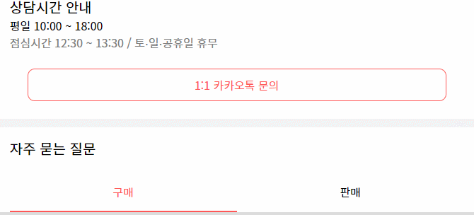
질문과 답변
사전 작업
구매나 판매 버튼을 클릭함에 따라 그에 맞는 데이터가 들어오는것 까지 구현했다. 이제 이 데이터를 사용해보자.
//Components/QnA/OftneQnA.tsx
      <QnAContent
        QnAContentData={QnAContentData.qas}
        name={QnATypeData[toggle - 1].name}
      />
OftenQnA 컴포넌트에서 받아온 구매 또는 판매 데이터를 nAContent 컴포넌트로 넘겨준다. 그리고 해당 데이터의 이름 (구매 또는 판매)도 props로 넘겨주고 있다.
export const QnAContent = ({ QnAContentData, name }: QCD) => {
  return (
    <Container>
      <h2 className="sr-only">{name} 고객 센터</h2>
    </Container>
  );
};

const Container = styled.article``;
이제 QnAContent 컴포넌트에서 QnAContentData와 name을 props로 받아 사용해주면 고객 센터 페이지는 무사히 설계할 수 있을 것이다.
name을 props로 받아와준 이유는 h 태그에 넣기 위함이다. article이나 section 태그 뒤에는 h태그를 사용하는것을 권장한다.(SEO, 웹 표준)
하지만 현재 UI에서는 h태그를 보여줄 필요가 없다. 그래서 스크린 리더에서만 읽히도록 className을 부여해주었고, 이 값은 global에서 추가했었다.
h2 태그가 존재하고, {name} 고객 센터 이므로 구매 고객 센터 가 UI에 나타나야 하지만 sr-only 로 인해 보이지 않는 것을 볼 수 있다.
데이터 사용 및 버튼
//components/QnA/QnAContent.tsx
    <Container>
      <h2 className="sr-only">{name} 고객 센터</h2>
      <ul>
        {QnAContentData.map(data => {
          return (
            <QnAContentItem
              key={`QnAContentData_${data.id}`}
              data={data}
            ></QnAContentItem>
          );
        })}
      </ul>
    </Container>
QnAContentData를 map 돌리며 데이터를 하나씩 가져온다. 이 데이터를 이용하여 QnAContentItem 컴포넌트에서 UI 설계를 해줄 것이다.
//components/QnA/QnAContentItem.tsx
export const QnAContentItem = ({ data }: Props) => {
  const { question, answer } = data;
  const [onAnswer, setOnAnswer] = useState(false);
  const handleAnswer = () => {
    setOnAnswer(!onAnswer);
  };

  return (
    <div>
      <Question onClick={handleAnswer}>
        <div>
          <Q>Q.</Q>
          {question}
        </div>
        <Icon>{onAnswer === true ? <DownOutlined /> : <UpOutlined />}</Icon>
      </Question>
      {onAnswer === true && <Answer>{answer}</Answer>}
    </div>
  );
};
question이 클릭됨에 따라 answer가 나타나도록 구현했다. 처음에는 useState 를 QnQContent 에서 사용했었는데, 그러면 질문을 클릭했을 경우 모든 답변이 나타난다. map 돌리면서 state를 하나의 data마다 생성해줘야 하는 것이다.
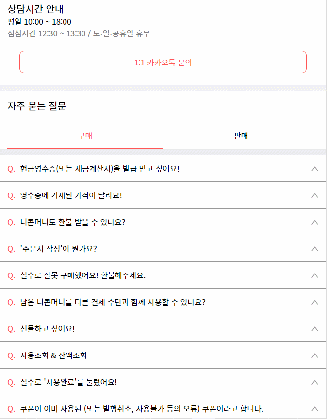
이렇게 API 에서 데이터를 받아와 UI를 설계하는 것까지 구현해보았다.
메뉴 바
햄버거 버튼을 클릭했을 때, 메뉴창이 왼쪽에서 나오도록 구현해보자. 처음에는 메뉴창을 fixed로 구현했었다. 그 이유는 메뉴창이 나타났을 때, 스크롤을 해도 화면은 메뉴창만 보여주게 하기 위함이었다. 하지만 왼쪽에서 나오는 모션을 구현하려고 하다보니, overflow가 먹히지 않아 왼쪽 회색부분에서 가려지지 않았다. 그래서 absolute를 이용하기로 했다.
//pages/index.tsx
      <Container menu={menu}>
        <Menu menu={menu} setMenu={setMenu} />
        <MainHeader setMenu={setMenu} />
  		//...
      </Container>
먼저 메뉴창은 index 페이지에서 컴포넌트를 추가했다. menu는 햄버거 버튼과 X 버튼의 클릭됨에 따라 변경되는 boolean 값이다.
  position: relative;
  overflow: hidden;
  height: ${({ menu }) => (menu === false ? 'auto' : '100vh')};
  width: ${STYLE.MAIN_WIDTH};
Container의 CSS다. Menu 컴포넌트에서 absolute를 사용할 수 있도록 relative를 해주었고, 메뉴에따라 height값을 주고있다. 메뉴창이 나타났는데 높이값이 없다면 스크롤 했을 경우 밑에 초과된 index의 UI가 보일 것이다.
100vh를 초과했는데 height를 100vh로 줄이면 UI가 줄어들어야 하지만 이것을 overflow:hidden으로 방지하고 있다. 그리고 이 속성 덕분에 Menu 컴포넌트를 왼쪽에서 꺼내와도 회색 부분에서 보여지지 않는 것이다(fixed는 이게 안됨.)
하지만 이 방법을 사용할 경우, y축 스크롤바가 사라져 버튼 클릭에 따라 UI가 흔들리게 되는데 overflow: scroll을 body에 주어 해결했다.
//components/main/Menu.tsx
export const Menu = ({ menu, setMenu }: Props) => {
  const handleMenu = () => {
    setMenu(false);
  };

  return (
    <Container menu={menu}>
      <h2 className="sr-only">메뉴창</h2>
      <Header>
        <CloseOutlined onClick={handleMenu} />
        <p>마이 페이지</p>
        <div></div>
      </Header>
      <Link href="/contacts" passHref>
        <Contacts>
          고객센터 <RightOutlined />
        </Contacts>
      </Link>
    </Container>
  );
};
메뉴창 UI이다.
  position: absolute;
  z-index: 200;
  top: 0;
  left: ${({ menu }) => (!menu ? `-${STYLE.MAIN_WIDTH}` : 0)};
  width: inherit;
  height: 100vh;
  max-width: inherit;
  transition: all 0.1s ease-in-out;
  background-color: ${COLOR.WHITE};
위에서 언급한 대로 absolute 속성을 부여하고, menu에 따라 left값을 변경하고 있다. 현재 UI의 크기인 STYLE.MAIN_WIDTH 만큼 px를 줘서 숨겨두었다가 햄버거 버튼을 클릭하면 0이 되어 나타나는 것이다.
Pre-Rendering( SSG, SSR )
여기서는 초기 렌더링 외에는 CSR을 하고 있다. Next + useSWR + Pre-Rendering 에서 CSR, SSR, SSG에 대한 개념과 Next에서 swr을 사용하는 경우의 Pre-Rendering 적용법을 설명하고 있으니 읽어보는것을 추천한다.