<body>
<main class="main">
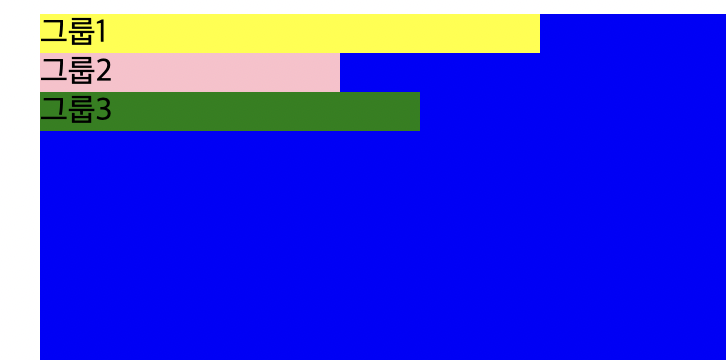
<div class="group group1">그룹1</div>
<div class="group group2">그룹2</div>
<div class="group group3">그룹3</div>
</main>
</body>3개의 div.group 를 어떻게 하면 3개의 column으로 배치할 수 있을까?
flex
.main {
  box-sizing: border-box;
  width: 940px;
  margin: 0 auto;
  background: blue;
  min-height: 400px;
  display: flex;
  flex-flow: row nowrap;
  justify-content: space-between;
  padding: 30px;
}
float
- flex가 나오기 이전에 사용했던 방식
- 워드에서 사용하던 것처럼 이미지 주위를 텍스트로 감싸기 위해 만들어진 것
참고 영상
https://www.youtube.com/watch?v=xara4Z1b18I
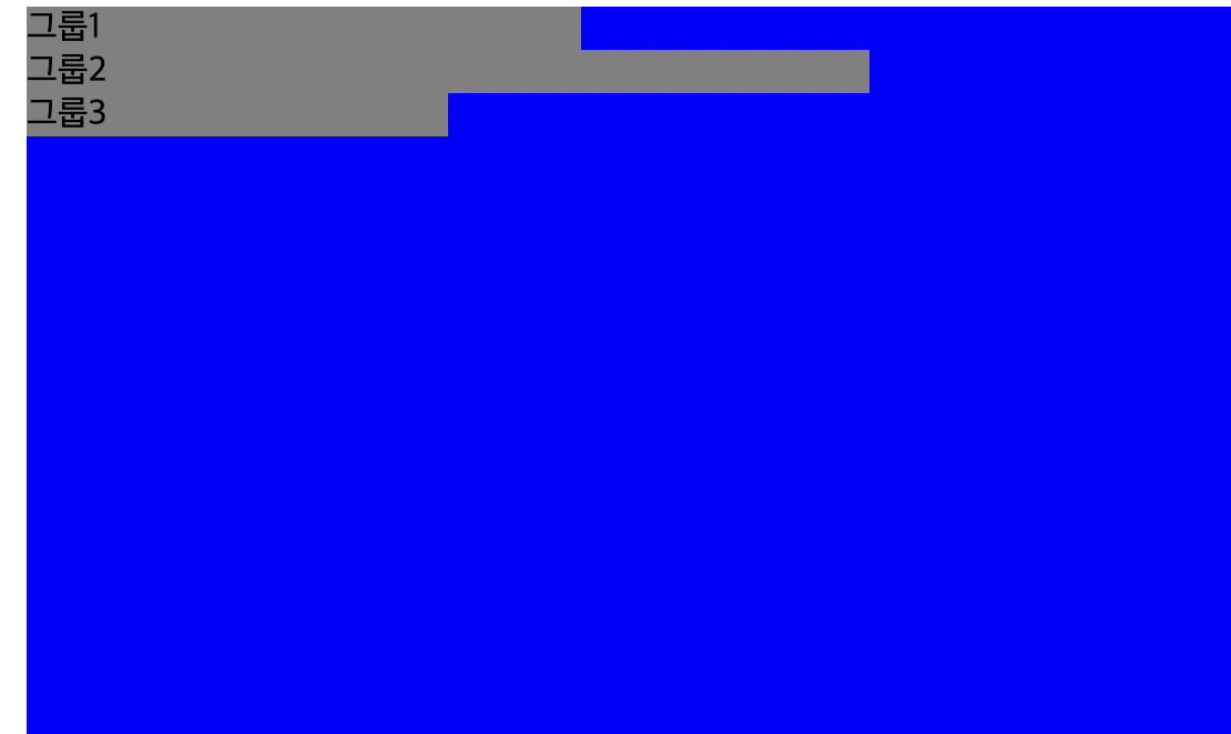
여기서 그룹1을 float:left 시키면 어떻게 될까?

마치 그룹1 옆에 그룹2가 붙은 것처럼 보인다. 하지만 그룹1 요소는 normal flow를 벗어나 한 층 위로 떠있는 상태이며, 그룹1이 차지하고 있던 자리가 비었기 때문에 그룹2가 채우고 있는 상태이다.
그룹1의 배경색을 지우면 더 이해가 쉽다.
→그룹2는 normal flow에 위치하고 있지만 그룹1이 차지하고 있는 width의 길이 때문에 그룹2의 텍스트가 옆에 위치해있는 것 뿐 그룹2가 오른쪽으로 옮겨진 것이 아니다.
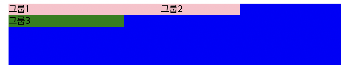
🤔 만약 그룹2의 넓이가 그룹1보다 작다면?
→ 그룹2의 텍스트가 옆으로 옮겨지는 것이 아니라 밑으로 내려오는 것을 확인할 수 있다.
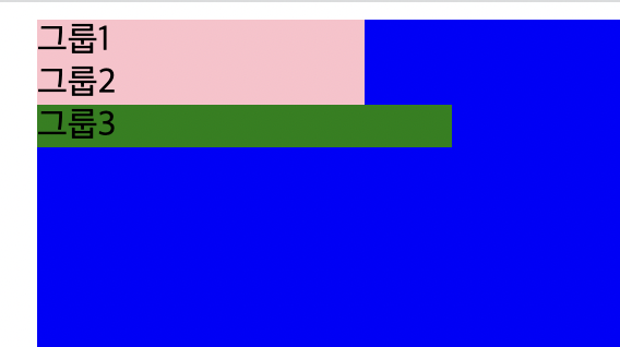
정리하자면,
- float를 시킨다는것은 부모컨테이너의 라인박스 기준으로 오른쪽, 왼쪽에 위치하도록 만드는것
- 하나의 블락 요소가 float가 되면 그 공간을 다른 블락 요소들이 하나씩 위로 채워지는 것
- float 된 길이를 뺀 길이를 기준으로 다음 요소가 위치한다.
- 만약 float 해야 할 요소보다 박스라인이 작다면? → 새로운 박스라인을 만들어서 밑에 줄에 위치한다.