display
- display: block = display를 block으로 설정
- display: inline = display를 inline으로 설정
- display: inline-block = display를 inline-block로 설정
- inline-block: 같은 줄에 배치할 수 있는 블록 요소
- display: none; = 화면에서 없어짐
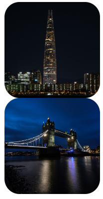
두번째 이미지를 display: none 처리해준 결과 차지하는 공간도 사라짐
float
- HTML 요소들은 기본 배치를 가진다.
1) 위에서 아래 방향으로 배치한다.
2) 왼쪽에서 오른쪽 방향으로 배치한다.
3) 블록 요소는 라인을 각각 차지하고, 인라인 요소는 라인에 포함된다. - HTML 기본 배치를 무시하고 새롭게 배치된다.
1) 왼쪽에 배치할 수 있다.
2) 오른쪽에 배치할 수 있다.
<style>
.wrap2 > div {
box-sizing: border-box;
width: 300px;
height: 300px;
border: 1px solid gray;
}
</style>
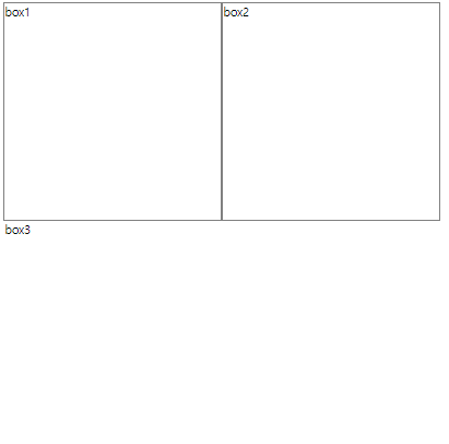
<div class="wrap2">
<div class="box1">box1</div>
<div class="box2">box2</div>
<div class="box3">box3</div>
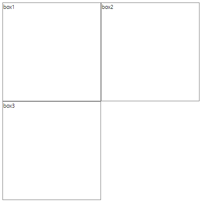
</div>위와 같이 box를 3개 만들어준다

(기본배치에 따라 위에서부터 아래로 배치된 모습)
  <style>
    .wrap2 > div {
      box-sizing: border-box;
      width: 300px;
      height: 300px;
      border: 1px solid gray;
    }
    .wrap2 > .box1 {
      float: left;
    }
    .wrap2 > .box2 {
      float: left;
    }

  </style>

  <div class="wrap2">
    <div class="box1">box1</div>
    <div class="box2">box2</div>
    <div class="box3">box3</div>
  </div>
box1과 box2에 float: left를 지정해서 기본배치를 무시하고 띄어서 left 배치해준다 (왼쪽에서부터 일렬배치)
그럼 위와같이 box3의 테두리가 사라진 것처럼 나타나는데 이는 테두리가 사라진 것이 아닌 box1 밑에 가려진 것 (상자 자체는 가려졌는데 텍스트만 밀려서 나온 것) = box1이 위로 올라가면서 기존 box1 자리를 box3가 차지
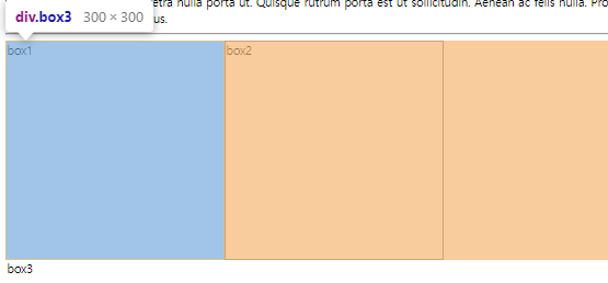
개발자툴로 검사해보면 어떤 식으로 배치되어 있는지 확인 가능
  <style>
    .wrap2 > div {
      box-sizing: border-box;
      width: 300px;
      height: 300px;
      border: 1px solid gray;
    }
    .wrap2 > .box1 {
      float: left;
    }
    .wrap2 > .box2 {
      float: left;
    }
    .wrap2 > .box3 {
      /* float 요소의 영역에서 벗어나시오. (left, right, both) */
      clear: left;  /* float: left; 에서 벗어나시오. */
      width: 600px;
      height: 100px;
    }
  </style>

  <div class="wrap2">
    <div class="box1">box1</div>
    <div class="box2">box2</div>
    <div class="box3">box3</div>
  </div>
box3에 clear:left를 설정해주면 float: left; (box1이 뜬 것)에 영향받지 않고 원래 자리에 표시됨
overflow
영역을 벗어났을 때
    .box1 {
      overflow: scroll;  /* 스크롤바가 생긴다. */
    }
    .box2 {
      overflow: hidden;  /* 숨긴다. */
    }
수평 레이아웃 설정하기
- float + clear 속성
- float + overflow 속성 / float + display 속성
- display 속성
1. float + clear 속성
1) 수평 배치할 box를 float 처리한다.
2) 수평 배치된 box 아래에 배치할 box에 clear 처리한다.
  <style>
    .wrap1 {
      width: 100%;
      max-width: 600px;
      margin: 10px auto;
    }
    .wrap1 > .box1 {
      width: 100%;
      height: 50px;
    }
    .wrap1 > .box2 {
      width: 48%;
      height: 100px;
      float: left;
    }
    .wrap1 > .box3 {
      width: 48%;
      height: 100px;
      float: right;
    }
    .wrap1 > .box4 {
      width: 100%;
      height: 50px;
      clear: both;
    }
  </style>

  <div class="wrap1">
    <div class="box1">box1</div>
    <div class="box2">box2</div>
    <div class="box3">box3</div>
    <div class="box4">box4</div>
  </div>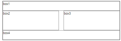
2. float + overflow 속성
1) box를 하나 만들어 수평으로 배치할 box들을 내부에 배치한다.
2) 부모 요소에 overflow 속성을 visible이 아닌 값을 설정한다. (주로 hidden 설정)
3) 자식 요소에 float 속성을 설정한다.
float + display 속성
1) box를 하나 만들어 수평으로 배치할 box들을 내부에 배치한다.
2) 부모 요소에 display 속성을 flow-root로 설정한다.
3) 자식 요소에 float 속성을 설정한다.
    .wrap2 {
      width: 100%;
      max-width: 800px;
      margin: 10px auto;
    }
    .wrap2 > .box1 {
      width: 100%;
      height: 50px;
    }
    .wrap2 > .wrapper {
      width: 100%;
      height: 100px;
      /* overflow: hidden; */
      display: flow-root;
    }
    .wrap2 > .wrapper > .box2 {
      width: 70%;
      height: 100%;
      float: left;
    }
    .wrap2 > .wrapper > .box3 {
      width: 25%;
      height: 100%;
      float: right;
    }
    .wrap2 > .box4 {
      width: 100%;
      height: 50px;
    }

  </style>

  <div class="wrap2">
    <div class="box1">box1</div>
    <div class="wrapper">
      <div class="box2">box2</div>
      <div class="box3">box3</div>
    </div>
    <div class="box4">box4</div>
  </div>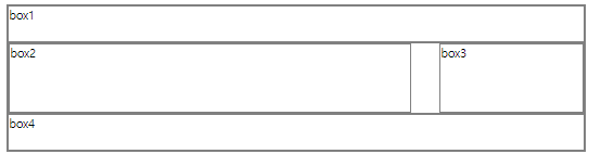
3. display 속성
1) box를 하나 만들어 수평으로 배치할 box들을 내부에 배치한다.
2) 부모 요소에 display 속성을 flex로 설정한다.
3) 부모 요소 : flex container, 자식 요소 : flex item
.wrap3 {
      width: 1000px;
      max-width: 1000px;
      margin: 10px auto;
    }
    .wrap3 > .box1 {
      width: 1000px;
      height: 50px;
    }
    .wrap3 > .wrapper {
      width: 1000px;
      height: 100px;
      display: flex;
      flex-direction: row;  /* row    : flex-item을 main axis(메인 축, x축)로 배치, 디폴트 */
                            /* column : flex-item을 cross axis(교차 축, y축)로 배치 */
      justify-content: space-between;  /* flex-item 사이에 공백을 둠 */
      flex-wrap: nowrap;    /* nowrap : flex-item을 flex-container를 벗어나지 않게 크기를 조절해서 배치, 디폴트 */
                            /* wrap   : flex-item의 크기가 그대로 사용되기 때문에 flex-container를 벗어날 수 있음 */
    }
    .wrap3 > .wrapper > .box2 {
      /* width: 700px; */
      flex: 7;  /* flex-item의 크기(비율로 적어서 width 대체 가능 (당연히 width로도 적어도됨) */
      height: 100px;
    }
    .wrap3 > .wrapper > .box3 {
      /* width: 300px; */
      flex: 3;  /* flex-item의 크기(width 대체) */
      height: 100px;
    }
    .wrap3 > .box4 {
      width: 1000px;
      height: 50px;
    }

</style> <div class="wrap3">
<div class="box1">box1</div>
<div class="wrapper">
<div class="box2">box2</div>
<div class="box3">box3</div>
</div>
<div class="box4">box4</div>
</div>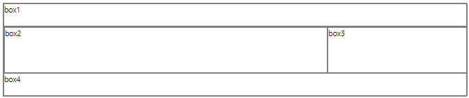
position
position: static;
1) 디폴트, 생략 가능
2) HTML 기본 배치를 따른다.
3) 위치 조정(top, bottom, left, right)이 불가능하다.
position: relative;
1) HTML 기본 배치를 따른다.
2) 위치 조정(top, bottom, left, right)이 가능하다.
3) HTML 기본 배치를 기준으로 위치가 조정된다.
position: absolute;
1) HTML 기본 배치를 따르지 않는다.
2) 부모 요소를 기준으로 위치 조정(top, bottom, left, right)이 가능하다.
3) 부모 요소가 position: static;이 아닌 경우에 동작 가능하다.
position: fixed;
1) HTML 기본 배치를 따르지 않고 특정 위치에 고정된 상태로 배치된다.
2) 브라우저 화면을 기준으로 위치 조정(top, bottom, left, right)이 가능하다.
3) fixed된 구성 요소는 다른 요소를 가린다.
반응형 웹
- 화면의 크기에 따라 웹 페이지의 레이아웃이 자동으로 변하는 기능이다.
- 뷰포트 설정이 필요하다.
<meta name="viewport" content="width=device-width, initial-scale=1.0">
1) width=device-width : 화면의 너비를 장치의 너비로 재지정한다.
2) initial-scale=1.0 : 페이지의 초기 확대/축소 지정을 1이다. - 상대 단위를 이용해서 작성한다.
%, vw, vh 등
미디어 쿼리
- 화면의 크기 변화를 감지하는 CSS 모듈이다.
- 선언 :
@media - 종류 : screen(화면), speech(낭독기), print(출력물), all(모든 미디어)
- 조건 예시
1) width: 640px 너비가 640px인 경우(현실적으로 사람이 이걸 딱 맞추기는 힘들다)
2) min-width: 640px 최소 640px인 경우(640px 이상인 경우에만 적용)
3) max-width: 640px 최대 640px인 경우(640px 이하인 경우에만 적용)
4) orientation: portrait 화면을 세워서 볼 때
5) orientation: landscape 화면을 눕혀서 볼 때
    @media screen and (min-width: 401px) and (max-width: 800px) {
      .wrap {
        width: 100%;
        display: flex;
        flex-wrap: wrap;
      }
너비가 401 이상이고 800 이하일 때 화면(screen)에 다음과 같은 css를 적용하겠다 이런 뜻
