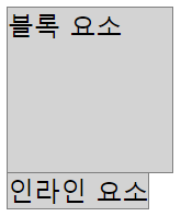
블록 요소, 인라인 요소
  <style>
    /* 블록 요소는 width, height를 지정할 수 있다. */
    .wrap1 > div {
      width: 100px;
      height: 100px;
      border: 1px solid gray;
      background-color: lightgray;
    }
    /* 인라인 요소는 width, height를 지정할 수 없다. */
    .wrap1 > span {
      width: 100px;
      height: 100px;
      border: 1px solid gray;
      background-color: lightgray;
    }
  </style>

  <div class="wrap1">
    <div>블록 요소</div>
    <span>인라인 요소</span>
  </div>
부모, 자식 크기
  <style>
    /* 부모 */
    .wrap2 {
      width: 200px;
      height: 200px;
      border: 1px solid gray;
    }
    /* 자식 : 부모 기준으로 % 값을 가질 수 있다. */
    .wrap2 > .box1 {
      width: 100%;
      height: 50%;
      border: 1px solid crimson;
    }
    /* 자식 : 부모보다 커지면 부모 영역 밖으로 나간다. */
    .wrap2 > .box2 {
      width: 300px;
      height: 105px;
      border: 1px solid crimson;
    }
  </style>
  <div class="wrap2">
    <div class="box1">box1</div>
    <div class="box2">box2</div>
  </div>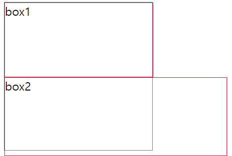
여백
내부여백 = padding
외부여백 = margin
- 박스 가운데 배치 = margin: 0 auto (좌우를 auto로 설정)
box-sizing
-
content-box
1) 디폴트 값
2) width, height는 내용(content)의 크기를 의미한다.
3) box 크기는 width/height + border + padding으로 계산한다. -
border-box
1) width, height는 테두리(border)까지의 크기를 의미한다.
2) box 크기는 width/height이다.
.wrap5 > .box1 {
      box-sizing: content-box;  /* 생략 가능 */
      width: 100px;
      height: 100px;
      border: 1px solid gray;
      padding: 10px;
      /* box1 크기 계산 : 내용(100px) + 테두리(1px * 2) + 내부여백(10px * 2) = 122px */
    }
    .wrap5 > .box2 {
      box-sizing: border-box;
      width: 100px;
      height: 100px;
      border: 1px solid gray;
      padding: 10px;
      /* box2 크기 계산 : 내용(78px) + 테두리(1px * 2) + 내부여백(10px * 2) = 100px */
border-box를 사용하면 width,height에 맞춰서 내용이 줄어든다
background
위치- 크기 단축 속성 사용
  <style>
    .box1 {

      box-sizing: border-box;
      width: 192px;
      height: 128px;

      background-image: url(../../assets/image/animal10.jpg);
      background-size: 192px 128px;

      background: url(../../assets/image/animal10.jpg) center/192px 128px;  /* 단축속성 : 위치(position)/크기(size) */

    }

  </style>

<div class="box1"></div> background-image: url(../../assets/image/attach1.png);
background-repeat: no-repeat; /* 반복없음 */
background-size: auto; /* 이미지 크기를 그대로 사용 */
background-position: right; /* top/bottom(세로 정렬), left/center/right(가로 정렬) */
background: url(../../assets/image/attach1.png) no-repeat right/auto;background-size
auto : 이미지 크기를 그대로 사용
contain : 이미지를 늘리거나 자르지 않고 최대한 크게 조정해서 표현
cover : 너비/높이 중 작은 부분을 최대한 여백 없이 표시하고 box 밖으로 나간 부분은 자름 */
- background-size는 너비 높이 중 하나만 줘도 다른 하나가 원래 크기 바탕으로 자동 조정됨
가운데 정렬
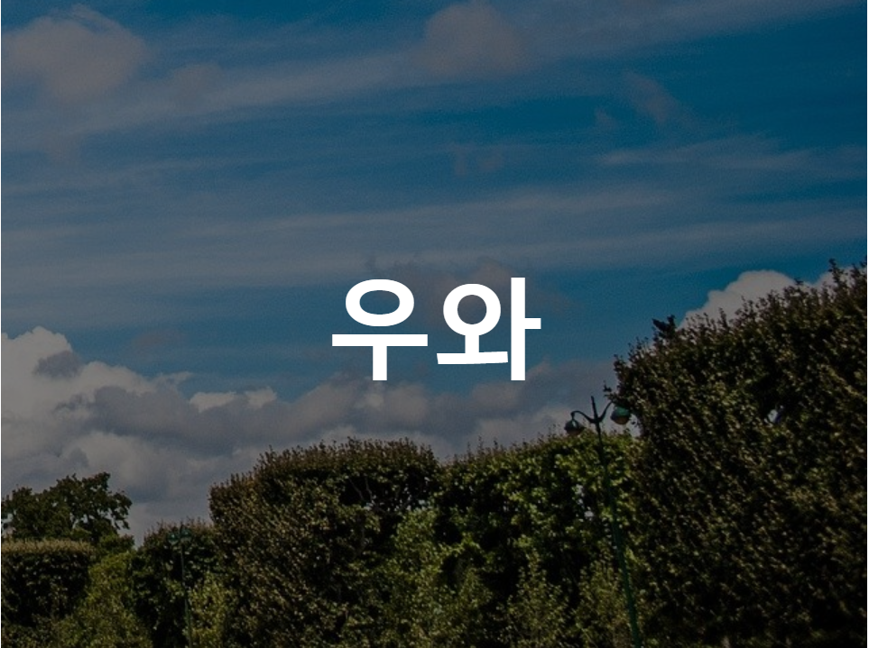
  <style>

    .box6 {

      box-sizing: border-box;
      width: 640px;
      height: 480px;

      background-image: url(../../assets/image/architecture2.jpg);
      background-size: 640px 480px;  /* background-size: 100%; */
      background-color: gray;

      background: url(../../assets/image/architecture2.jpg) 640px 480px gray;
      background-blend-mode: multiply;

      font-size: 80px;
      font-weight: 900;
      color: white;
      text-align: center;  /* 가로 가운데 정렬 */
      line-height: 480px;  /* box의 height와 line-height가 동일하면 세로 가운데 정렬 효과가 나타난다.(1줄만 가능) */
    }
  </style>
  <div class="box6">우와</div>
visibility,opacity
visibility: hidden - 안 보임, 블록 영역은 차지하고 있음
opacity: 0; - 안 보임, 투명도를 0으로 지정하면 안 보임
테이블 CSS
-
테두리 합치기 border-collapse: collapse;
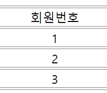
전
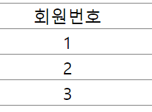
후 -
border,text정렬
 .wrap1 > table td {

      /* 테이블 테두리는 <td> 태그를 대상으로 처리하는 것이 일반적이다. */
      border-top: 1px solid gray;
      border-bottom: 1px solid gray;

      /* <td> 태그는 가로/세로 정렬이 모두 지원된다. */
      text-align: center;      /* 가로 방향 정렬 : left, center, right */
      vertical-align: middle;  /* 세로 방향 정렬 : top, middle, bottom */
    }