📌폰트
font: font-style font-variant font-weight font-size/line-height font-family | initial | inherit;
폰트 속성은 이를 기본값으로 하며 각각 속성에 대하여 알아본다.
font-size와 font-family는 반드시 있어야 하는 속성이며, 그 외의 빠진 속성은 기본값으로 지정된다.
ex)
font: oblique small-caps bold 16px/1.5 '돋움';🔑em, ex
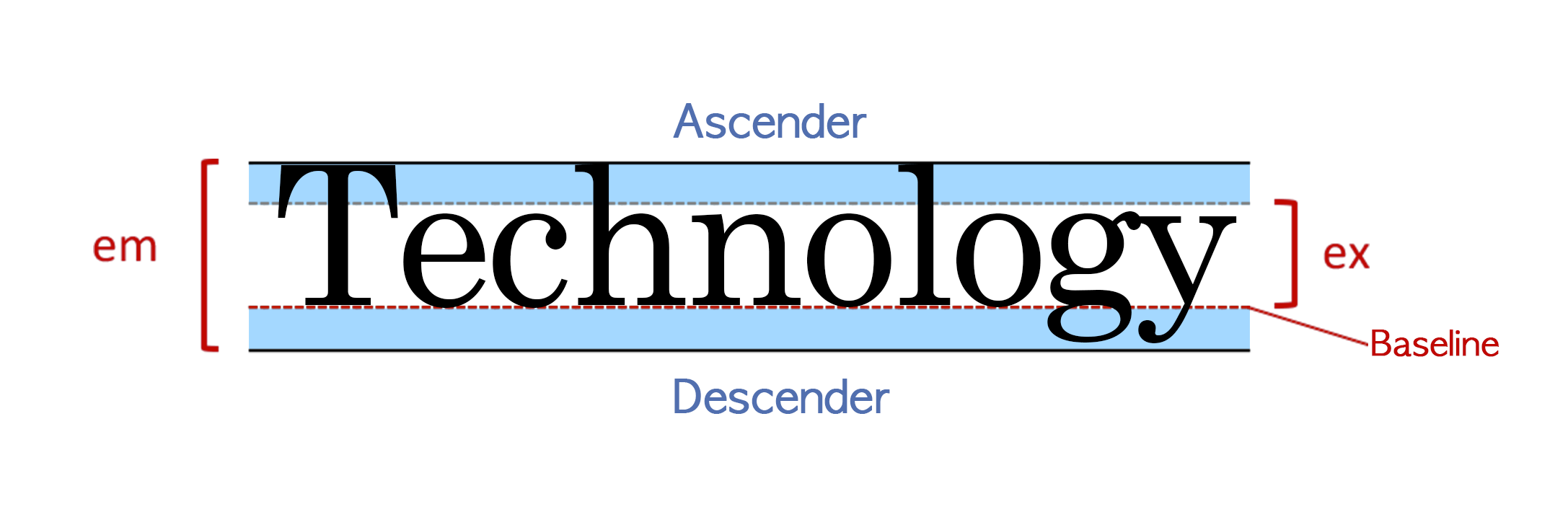
영문자는 baseline을 기준으로 작성되며, g,y와 같이 밑으로 더
써지는 문자는 descender부까지, 대문자와 같은 경우에는
ascender까지 쓰여진다. 이를 모두 포함하는 범위가 em,
baseline위와 ascender 이하로 까지의 범위는 ex이다.
🔑font family
font-family: family-name | generic-family ( | initial | inherit );font family는 사용할 폰트를 정의해주는 것으로 내가 사용할 폰트
의 이름을 적어주고, 마지막에는 폰트가 쓰이지 않는 것을 대비하여
css에서 오류없이 작동되는 폰트 ex)sans-serif등을 추가하여준다.
ex)
font-family: Helvetica, Dotum, '돋움', Apple SD Gothic Neo, sans-serif; //한글 폰트의 경우 꼭 영어도 함께
써주는 것이 좋음
🔑line height
line-height는 줄간격을 뜻하며
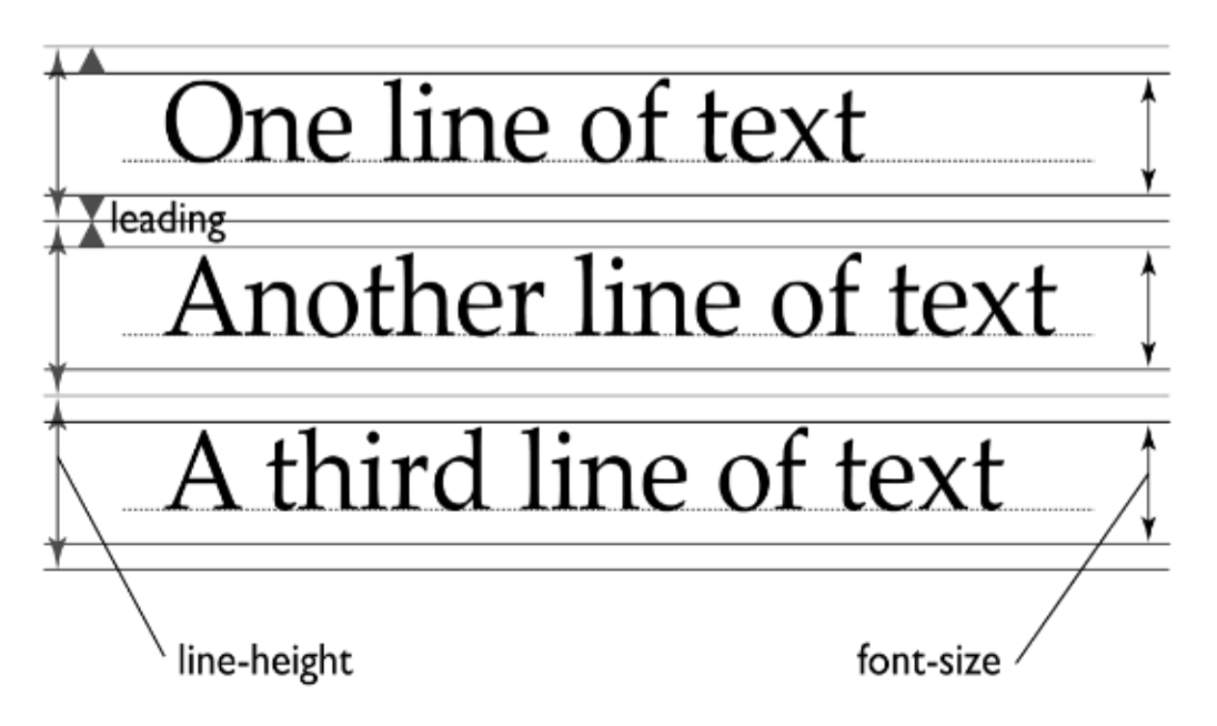
위와 같이 폰트에 따라서 유동적으로 변하도록, 혹은 고정값을 가지도록 설정해 줄 수 있다.
line-height: normal | number | length | initial | inherit ;
등으로 설정할 수 있다
normal
:기본값으로 브라우저의 기본 속성을 따름.
(보통 1.2 정도로 할당)
number
:font-size를 기준으로 설정한 숫자만큼 배율로 적용
length
:px, em 등 고정 수치로 할당
%
:font-size를 기준으로 설정한 퍼센트만큼 배율로 적용합니다.
body { font-size: 20px; line-height: 2; }
/* line-height = 40px; */
body { font-size: 20px; line-height: 200%; }
/* line-height = 40px; */

number와 %의 차이점은 자식 태그가 배율만을 가져오는지,
배율이 적용된 부모태그의 값을 가져오는지의 차이이다

body { font-size: 20px; line-height: 2; }
/* line-height = 40px; */
p { font-size: 10px; }
/* line-height = 20px; */


body { font-size: 20px; line-height: 200%; }
/* line-height = 40px; */
p { font-size: 10px; }
/* line-height = 40px; */
🔑font weight(굵기)
font-weight: normal | bold | bolder | lighter | number | initial | inherit ;
로 표현 가능
normal: 기본값(400)
bold: 700
bolder: 부모보다 두껍게
lighter: 부모보다 얇게
number: 숫자로 지정(100,200,,,900)
initial: 초기설정값
inherit: 부모의 값
🔑font style/variant(대문자 변환)
font-style: normal | italic | oblique(기울임) | initial | inherit;
font-variant: normal | small-caps | initial | inherit ;
small caps: 소문자를 작은 대문자로 변환
🔑@font-face
웹의 폰트를 다운로드하여 로컬 컴퓨터에서 사용할 수 있게끔 하는 것이다.
이 때 font-family와 src는 필수적으로 명시해 주어야 한다.
@font-face {
    font-family: webNanumGothic; /* 사용자 지정 웹 폰트명 */
    src: url(NanumGothic.eot); /* 적용 될 웹 폰트의 경로 */
    font-weight: bold; /* 필요에 따라 지정 */
    font-style: italic; /* 필요에 따라 지정 */
}

body {
    font-family: webNanumGothic;
}
🔑vertical-align(수직 정렬)
vertical-align은 인라인 요소에서만 적용되는 위,아래로 문자열을 움직일 수 있는 속성이다
vertical-align: keyword | length | percent | initial | inherit ;
length: 요소를 지정한 길이만큼 올리거나 내림. 음수 허용
%:요소를 line-height를 기준으로 올리거나 내림. 음수 허용
keyword: baseline(기본 값), sub, super, top, text-top, middle, bottom,
text-bottom
🔑이미지 vertical-align(수직 정렬)
 header{
    height: 66px;
    line-height: 66px;
    background-color: rgba(64, 64,64,0.75);

}

header img{
    vertical-align: middle;
}
이미지를 수직정렬하고 싶다면 이미지를 감싸는 태그에 height와 line-height를 동일한 값으로
준 후 vertical-align: middle; 을 해주면 된다.
🔑text-align
vertical-align과 마찬가지로 inline 요소에서만 적용된다.(div는 안됨)
text-align: left | right | center | justify | initial | inherit ;
left: 텍스트를 왼쪽으로 정렬
right: 텍스트를 오른쪽으로 정렬
center: 텍스트를 중앙으로 정렬
justify: 텍스트를 라인 양쪽 끝으로 붙여서 정렬. (마지막 라인은 정렬 하지 않음)
🔑text-indent(들여쓰기)
text-indent: length | initial | inherit;
📌레이아웃(배치)
🔑display(차지하는 영역)
display는 4가지의 방식이 있음(display:"none|block|inline|inline block")
1. none : 차지하는 영역이 없음
2. block : 한줄을 모두 차지
3. inline : 문자열만큼의 공간만 차지
4. inline-block : inline처럼 문자열만큼의 공간만 차지하되 block의 박스모델 속성을 가짐
| display | width | height | margin | padding | border |
|---|---|---|---|---|---|
| block | o | o | o | o | o |
| inline | x | x | 좌/우 | o | o |
| inline-block | o | o | o | o | o |
🔑visibility
visibility: visible | hidden | collapse | initial | inherit;
visible: 기본값으로 보이는 형태
hidden: display:none과는 다르게 공간을 차지함
collapse: 테이블 관련 요소에만 사용하며 셀간의 경계를 무시하고 숨김
🔑float/clear(흐름을 벗어난 배치)
float: 요소를 보통의 흐름에서 벗어나게 하는 것(문서편집기의 본문배치를 어울리게 하는 것과 비슷, 내가 가라는 곳에다 둘 수 있는 것)
float: none | left | right | initial | inherit;
float의 특징
1. display를 inline인 것도 block으로 바꿔줌(inline-table, flex 제외)
2. 주변 텍스트나 인라인 요소가 주위를 감쌈
clear: float된 요소에 의해 받는 영향에 벗어나게 해주는 것(문자가 float된 것을 감싸는 일 등을 방지)
clear: none | left | right | both | initial | inherit;
none: 양쪽으로 floating된 요소를 허용
left: 왼쪽으로 floating된 요소 허용 안함
right: 오른쪽으로 floating된 요소 허용 안함
both: 양쪽으로 floating된 요소 허용 안함
clear 특징:
block인 요소에 대해서만 clear 해줄 수 있음.
따라서 span과 같은 inline 요소를 clear하려고 한다면 display:block으로 바꿔줘야 올바르게 적용됨
<!DOCTYPE html>
<html>
    <head>
        <meta charset="UTF-8">
        <style>
            .float{
                float:left;
                height:300px;
                padding:30px;
                width:300px;
                background-color:green;
            }
            span{
                clear:left;
            }
        </style>
    </head>
    <body>
        <div class="float">float를 해보자</div>
        <span style="display: block;">clear을 해보자</span>
    </body>
</html>🔑position/offset(수치를 활용한 배치)
상대적, 절대적으로 요소의 위치를 지정해줄 수 있는 방법이다
position: static | absolute | fixed | relative | sticky | initial | inherit;
static: 기본값으로 일반적인 흐름에 따라 배치된다.
absolute: 부모 요소의 위치를 기준으로 offset에 따라 배치된다.
하지만 부모가 static인 경우에는 적용이 안되고 static이 아닌 조상이 나올 때까지 거슬러 올라간다.
fixed: 창(뷰포트)을 기준으로 offset에 따라 스크롤에 관계없이 항상 고정된 위치에 배치된다.
relative: 자신이 원래 있어야 할 위치를 기준으로 offset에 따라 배치된다.
sticky: 스크롤을 내리면 사라져야 할 시점에서 창 위쪽에 계속
보이게 끔 해준다. (아직 적용브라우저 범위가 넓지 않음)
sticky가 위치하게 될 곳을 꼭 css에 함께 표시해주어야 한다.
ex) 최상단에 위치할꺼라면 top:0%; 이런식으로
top|bottom|left|right: auto|length|initial|inherit;
오프셋은
    top: 50%;
    left: 10px;
    bottom: -10px;
    right: auto;
이와 같이 표현할 수 있으며 %는 height, 혹은 width값을 토대로 계산한다.
+,-는 top,left등의 첫 시작 위치를 기준으로 옮기는 좌표방향이다.
(bottom: -10px; 인 경우에는 아래를 기준으로 -10px 만큼 올라가므로 10px 내려가는 것과 같음)
🔑z-index(겹쳐 보이게 하기)
z-index는 요소가 겹치는 순서를 정해주는 기능이다.
z-index: auto | number | initial | inherit;
auto: 순차적으로 뒤에 나오는 것이 더 앞에 온다.
number: 숫자를 매겨주어 더 높은 숫자가 앞에 온다.
z-index 특징:
1. position 값이 static이면 안됨
2. 순서 값이 없을 경우 생성순서(코드상 순서)에 따라 쌓임
3. 부모가 z-index 값이 있을 경우 부모 안에서만 의미있음
(z-index가 부모10: 자식:100인 자식은 부모:11, 자식:1인 자식보다 밑으로 오게 됨)
4. 큰 값이 가장 위쪽(음수 사용 가능)
    <!DOCTYPE html>
    <html>
        <head>
            <meta charset="UTF-8">
            <style>
                .parent1,.parent2{
                    height: 100px;
                    width: 100px;
                    position: relative;
                    background-color: blue;

                    z-index:0;
                }

                .parent2{
                    z-index: 1;
                }

                .parent1 > *{
                    height: 120px;
                    width: 120px;
                    position: relative;
                    top:30px;
                    left:30px;
                    background-color: red;

                    z-index: 100;
                }

                .parent2 > *{
                    height: 120px;
                    width: 120px;
                    position: relative;
                    top:30px;
                    left:30px;
                    background-color: green;
                    z-index: 10;
                }
            </style>
        </head>
        <body>
            <div class="parent1">
                parentbox1
                <div>childbox1</div>


            </div>
            <div class="parent2">
                parentbox2
                <div>childbox1</div>

            </div>

        </body>
    </html>

의 경우에는 parent2의 childbox가 z-index가 작음에도 불구하고
부모의 차이로 인해 더 위에 위치하게 된다.
🔑inline 속성인 경우 여백 문제
📌이미지를 CSS로 배경으로 넣기
background-image: url("../image/section_invite.jpg");
background-repeat:no-repeat;
background-position: center;
background-image: 이미지를 배경으로 넣기위하여 사용한다. url()속에 이미지 위치를 넣는다.
background-repeat: 이미지는 기본적으로 크기에 따라 반복해여 배경에 나타난다.
-기본값: 가로,세로 반복적 배열
-repeat-x: 가로로만 반복하여 배열
-repeat-y: 세로로만 반복하여 배열
-no-repeat: 이미지가 반복 배열되지 않음
background-attachement: 배경 이미지를 어떻게 고정할지 결정
-기본값(scroll): 기본값으로, 요소에 대한 상대적 위치에 있음
-fixed: 이미지가 윈도우 창의 고정된 위치에 있음
-local: 스크롤 할 때 요소의 내용에 상대적인 위치
background-position
background-size
-width, height길이로 표시
-cover: 배경 지역이 이미지로 완전히 덮이도록 크게 함
-contain: 너비와 높이가 내용 안쪽에 알맞은 방식으로 이미지를 크게 조절
-initial: 기본값으로 초기화
📌반응
🔑hover
#elements :nth-child(2):hover{
    border:1px solid #454545;
    font-weight: bold;
}

element id의 두번째 자식에 마우스가 올라갔을 때 에대한 조건을 줄 수 있다.