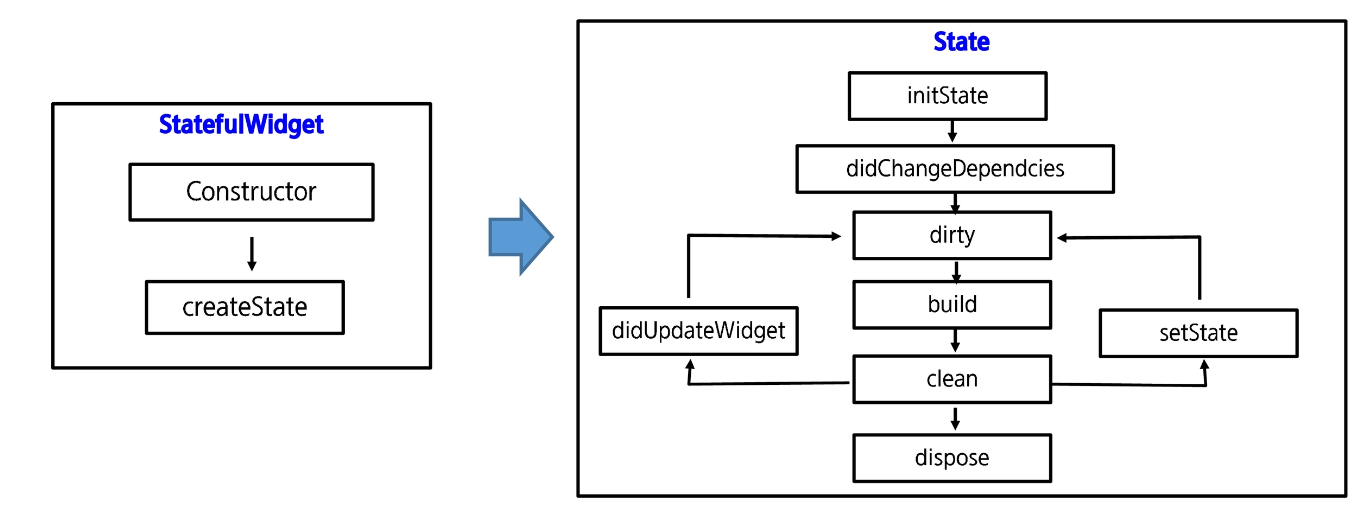
📌 Stateful vs Stateless widget
- 플러터 앱을 구성하는 위젯은 상태 관리 여부에 따라 Stateless와 Stateful로 구분
- StateLess : 내용 갱신이 불필요
- Stateful : 위젯의 상태를 감시하고 있다가 특정 상태가 되면 상황에 맞는 작업을 수행하는 위젯
StatefulWidget 구조
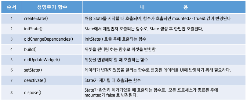
📌 Widget LifeCycle
📌 Navigate(화면 이동)
Navigator.push 로 context와 다음 넘어갈 화면 정보(app 혹은 화면 widget)를 넣고, 필요한 경우 key를 전달하여 이동한다.
ElevatedButton(
                onPressed: () {
                  Navigator.push(
                      context,
                      MaterialPageRoute(
                          builder: (context) => MyHomePage2(title: "hello")));
                },
                child: Text("next page")),
다시 되돌아 오기 위해서는
pop을 해오면 된다.
Navigator.pop(context);📌 Widgets
🔑 Container
아무것도 없는 위젯
- 가로 세로 색 패딩 마진 설정 가능
- 자식으로 다른 위젯을 가질 수 있음
🔑 Column, Row
수직, 수평 방향 위젯 배치
mainAxis : 위젯의 기본 방향 (위아래, 좌우)
crossAxis : 위젯의 수직방향(좌우, 위아래)
mainAxisSize : mainAxis 상수값 크기
- max(최대 크기만큼),
- min(포함된 콘텐츠 크기만큼)
mainAxisAlignment, CrossAxisAlignment : center, start, end 등 다양한 정렬 가능
🔑 Stack
children의 위젯들을 순서대로 겹쳐줌
가장 먼저 작성된 위젯이 가장 아랫쪽에 배치됨
      body: Stack(
        children: <Widget>[
          Container(
            width: 200,
            height: 200,
            color: Colors.amber,
          ),
          Container(
            width: 150,
            height: 150,
            color: Colors.red,
          ),
          Container(
            width: 100,
            height: 100,
            color: Colors.blue,
          ),
        ],
      ),
🔑 Sizedbox
모양만 가지는 빈 박스영역 만들고 싶를 때 자주 사용
SizedBox(height: 10, width: 10, ),🔑 Card
그림자, 둥근 모서리 등의 속성을 사용할 수 있는 위젯
shape: RoundedRectangleBorder(   //모서리를 둥글게 하기 위해 사용
      borderRadius: BorderRadius.circular(16.0),
),

 elevation: 4.0,   //그림자의 깊이를 설정
📌 목록형 위젯
🔑 ListView, ListTile, ListBody
리스트를 표시하는 위젯
- 리스트 뷰 안에 리스트 타일을 넣어 편리하게 작성 가능
- leading, title, trailing 속성을 통해 아이콘, 글자의 위치 지정 가능
- onTap 프로퍼티로 이벤트 구현
- ListBody안에 원하는 목록을 넣어서 구현할 수 있는데 스크롤이 되기 위해서는 singleChildScrollView 추가해야 함
ListView + ListTile
      body: ListView(
        children: <Widget>[
          ListTile(
            title: Text('1. 화면 배치를 위한 위젯'),
            onTap: () {
              Navigator.push(
                context,
                MaterialPageRoute(builder: (context) => MultiMenu()),
              );
            },
          ),
          ListTile(
            title: Text('2. 위치, 정렬, 크기를 위한 위젯'),
            onTap: () {
              Navigator.push(
                context,
                MaterialPageRoute(builder: (context) => LayoutMenu()),
              );
            },
          ),
ListBody
final items = List.generate(100, (i) => i).toList();
body: SingleChildScrollView(
        child: ListBody(
          children: items.map((i) => Text('$i')).toList(),
        ),
      ),
🔑 GridView
열수를 지정하여 grid 형태로 표현
GridView.count()를 통해 그리드 생성
crossAxisCount 프로퍼티로 열 수 지정
화면 이동/ 구성용 위젯
🔑 PageView
여러 페이지를 좌우로 슬라이드 하여 넘길 수 있도록 기능 제공
- 일반적으로 tab과 연동하여 사용하지 않음
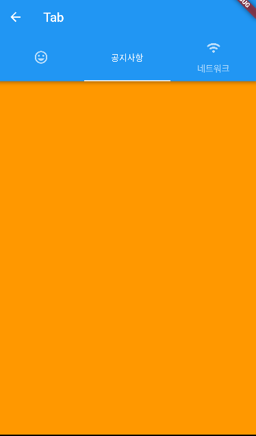
🔑 AppBar, TabBar, TabView
- PageView보다 좀더 화면을 유연하게 구성 가능
- 일반적으로 Scaffold를 DefaultTabController로 감싼다.
- Tab에 아이콘 및 글자 표시 가능
    return DefaultTabController(
      length: 3,
      child: Scaffold(
        appBar: AppBar(
          title: Text('Tab'),
          bottom: TabBar(
            tabs: <Widget>[
              Tab(icon: Icon(Icons.tag_faces)),
              Tab(text: '공지사항'),
              Tab(icon: Icon(Icons.wifi_rounded), text: '네트워크'),
            ],
          ),
        ),
        body: TabBarView(
            children: <Widget>[
              Container(color: Colors.yellow,),
              Container(color: Colors.orange,),
              Container(color: Colors.black26,),
            ]),
      ),
    );
🔑 BottomNavigationBar
- 하단에 2~5개의 tab 메뉴를 구성할 수 있으며, 메뉴 선택 시 화면 전환 가능
- BottomNavigationBar 프로퍼티를 이용하여 작성
- BottomNavigationBar 내부의 item 프로퍼티에 BottomNavigationBarItem 위젯을 추가하여 구성
      bottomNavigationBar: BottomNavigationBar(
          currentIndex: _selectedIndex, //현재 선택된 Index
          onTap: (int index) {
            setState(() {
              _selectedIndex = index;
            });
          },
          items: [
        BottomNavigationBarItem(
          icon: Icon(Icons.home),
          label: '홈',
        ),
        BottomNavigationBarItem(
          icon: Icon(Icons.person),
          label: '개인정보',
        ),
        BottomNavigationBarItem(
          icon: Icon(Icons.notifications),
          label: '알림',
        ),
      ]),
      body: Center(
        child: _widgetOptions.elementAt(_selectedIndex),
      ),
    );
  }
}

List _widgetOptions = [
  Text(
    '홈',
    style: TextStyle(fontSize: 30),
  ),
  Text(
    '개인정보',
    style: TextStyle(fontSize: 30),
  ),
  // FirstPage(),
  Text(
    '알림',
    style: TextStyle(fontSize: 30),
  ),
];
📌 버튼 위젯
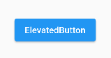
🔑 ElevatedButton
가장 일반적인 버튼
- 버튼 위젯은 onPressed에서 이벤트 처리
- onPressed에 null 지정시 비활성화
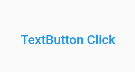
🔑 TextButton
텍스트가 입력된 평평한 형태의 버튼
- 크기는 텍스트 영역을 감싸는 네모만큼이다.
🔑 IconButton
아이콘 표시용 버튼
- icon 프로퍼티에 아이콘 설정,
- iconSize 프로퍼티에 크기 지정

🔑 FloatingActionButton
FAB 버튼
- 그림자를 넣을 수 있다.

📌 화면 표시용 위젯
🔑 Text
- style 프로퍼티에서 글자크기, 폰트, 색상, italic, letterspacing 등의 설정이 가능하다.
🔑 Image
이미지 표시 위젯
- network 함수를 통해 네트워크에 있는 이미지도 간단히 표시가 가능하다.
- 프로젝트 내 폴더(assets)를 만들고 저장 후 asset() 함수로 표시 가능
- asset통해 이미지에 접근할 경우 아래와 같이 pubspec.yaml 파일 수정 필요
  # To add assets to your application, add an assets section, like this:
  assets:
    - assets/
    - assets/sample.jpg
    - assets/flutter.jpg
    - assets/flutter.png
assets/ 까지만 써도 하위 파일들이 모두 된다.
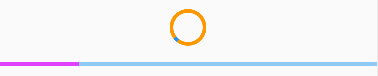
🔑 ProgressIndicator
            CircularProgressIndicator(
              backgroundColor: Colors.orange,
            ),
            SizedBox(
              height: 20,
            ),
            LinearProgressIndicator(
              color: Colors.purpleAccent,
            ),
🔑 CircleAvatar
CircleAvatar(
          radius: 100,
          child: Icon(Icons.person, size: 200,),
),- radius : 감싸는 원의 반지름
- child : 원 안의 영역

📌 입력용 위젯
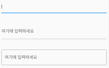
🔑 Textfield
materialDesign 에서 볼 수 있는 형태로 edittext를 꾸며줄 수 있다.
              TextField(),
              SizedBox(
                height: 40,
              ),
              TextField(
                decoration: InputDecoration(
                  labelText: '여기에 입력하세요',   // 힌트
                ),
              ),
              SizedBox(
                height: 40,
              ),
              TextField(
                decoration: InputDecoration(
                  border: OutlineInputBorder(),   // 외각선
                  labelText: '여기에 입력하세요',
                ),
TextEditingController
textField에 쓰인 값 저장을 위해 Controller를 사용한다.
TextEditingController value1 = TextEditingController();

TextField(
                controller: value1,
                decoration: InputDecoration(
                  labelText: '여기에 입력하세요',   // 힌트
                ),
              ),
🔑 Form, TextFormField
TextFormField는 form내부를 구성하는 textfield 위젯이다. Validator를 만들어 원하는 형태로 검증을 할 수 있다.
TextFormField(
                    controller: _email,
                    validator: (value) =>
                        (value!.isEmpty) ? "이메일을 입력해 주세요" : null,
                    style: style,
                    decoration: InputDecoration(
                        prefixIcon: Icon(Icons.email),
                        labelText: "Email",
                        border: OutlineInputBorder()),
                  ),
🔑 Checkbox, Switch, Radio
Radio는 RadioListTile 혹은 ListTile에 Radio를 넣어서 구성할 수 있다.
ListTile은 라디오 버튼 영역만, RadioListTile은 해당 라디오가 차지한 전체 영역을 클릭했을 때 토글할 수 있다.
      ListTile(
                title: Text('남자'),
                leading: Radio(
                  value: Gender.MAN,
                  groupValue: _gender,
                  onChanged: (value) {
                    setState(() {
                      _gender = Gender.MAN ;
                    });
                  },
                ),
              ),
이를 감싸는 form에서는 formKey를 속성으로 가져 validation이 모두 통과일 경우 currentState를 validate로 해줄 수 있다.
class _LoginPageState extends State<LoginPage> {
...

  final _formKey = GlobalKey<FormState();
  ...
버튼 클릭이 되면 validation을 검증하도록 하였다
                    child: MaterialButton(
                      onPressed: () {
                        if (_formKey.currentState!.validate()) {}
                      },
📌 Dialog 위젯
AlertDialog, DatePicker, TimePicker 등등 사용 가능
🔑 AlertDialog
  Future<void> _neverSatisfied() async {
    return showDialog<void>(
      context: context,
      barrierDismissible: false, // user must tap button!
      builder: (BuildContext context) {
        return AlertDialog(
          title: Text('제목'),
          content: SingleChildScrollView(
            child: ListBody(
              children: <Widget>[
                Text('Alert Dialog 입니다'),
                Text('OK를 눌러 닫습니다'),
              ],
            ),
          ),
          actions: <Widget>[
            TextButton(
              child: Text('OK'),
              onPressed: () {
                // Todo
                Navigator.of(context).pop();
              },
            ),
            TextButton(
              child: Text('Cancel'),
              onPressed: () {
                Navigator.of(context).pop();
              },
            ),
          ],
        );
      },
    );
  }
builder를 통해 alertdialog을 만들어주는 _neverStatisfied 함수를 만들어주었다. 시간이 걸리는 작업이므로 async로 처리한다.
📌 Event 처리
위젯들 중에서는 onTap, onClcked 속성이 따로 달려있지 않아 제스처를 받는 위젯으로 감싸주어야 한다.
GestureDetector(
              onTap: () {
                print('GestureDetector 클릭!!');
              },
              child: Text('클릭 Me!!'),
            ),
            SizedBox(
              height: 40,
            ),
            InkWell(
              onTap: () {
                print('InkWell 클릭!!');
              },
              child: Text('클릭 Me!!'),
            ),
🔑 InkWell, GestureDetector
Inkwell은 클릭 영역이 보이고, 제스쳐 detector는 영역이 보이지 않지만 둘다 감싸는 위젯을 클릭할 수 있게 해준다.
onTapDown, onTapUp, onTap, onTapCancel 등의 속성 있음