
개요
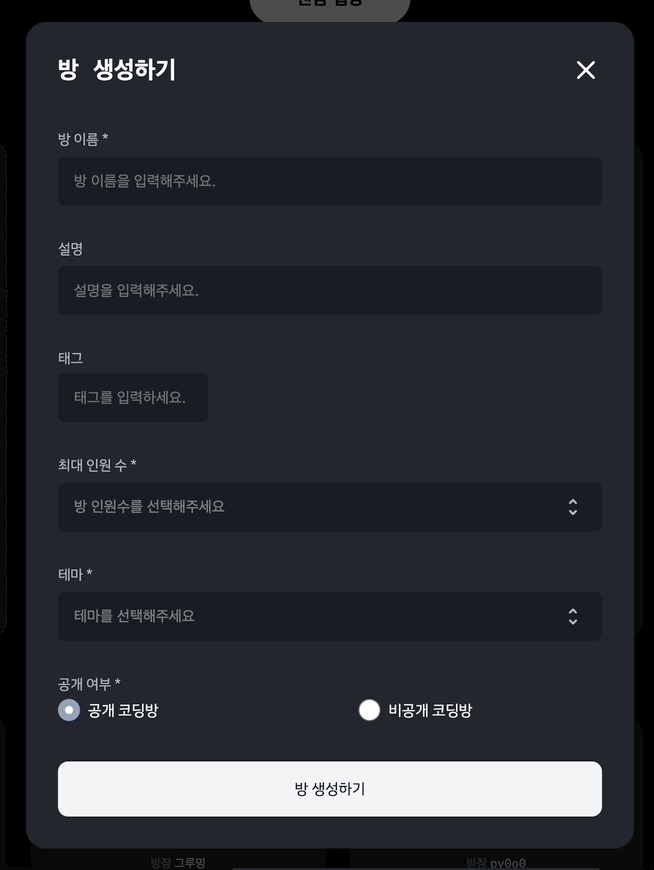
현재 SW마에스트로에서 진행하고 있는 프로젝트에서 방 생성하기 모달창이 있습니다. 모달창 필드 중 최대 인원 수와 테마를 선택하는 부분이 있는데 이를 드랍다운 애니메이션을 이용하여 커스텀하였습니다. 기본적으로 input태그의 audio type이 있지만 모달 ui와 맞지 않아 직접 구현해보았습니다. 아래 코드에서는 typescript, react, styled-component를 사용하였습니다.
구현하기
CreateRoomForm.tsx
우선 모달창 안에 있는 form에 대한 컴포넌트입니다. 본문 내용과 관련 없는 부분들은 생략 및 삭제하였습니다.
import styled from 'styled-components';
import React from 'react';
import Theme from './Theme';
import Total from './Total';

export default function CreateRoomForm({
  inputs,
  onClickTheme,
  onClickTotal,
}) {
  const { total } = inputs;

  return (
    <Form onSubmit={mutate}>
		...
      <Total total={total} onClickTotal={onClickTotal} />
      <Theme onClickTheme={onClickTheme} />
		...
    </Form>
  );
}

const Form = styled.form`
  display: flex;
  flex-direction: column;
  align-items: flex-start;
  justify-content: flex-start;
  width: 100%;
  color: #b0b8c1;
  font-size: 1.4rem;
  font-family: IBMPlexSansKRRegular, Arial;
  overflow-y: auto;
  ::-webkit-scrollbar {
    display: none;
  }
`;
Theme.tsx
Total과 Theme에서 사용한 드랍다운 애니메이션이 중복되므로 Theme.tsx에서만 설명드리겠습니다.
import { useState } from 'react';
import styled from 'styled-components';
import themeJson from '../../../theme.json';

export default function Theme({ onClickTheme }) {
  const [isDropDown, setIsDropDown] = useState(false);
  const [selectedTheme, setSelectedTheme] = useState('');

  const onClickOption = (e: React.MouseEvent<HTMLButtonElement>) => {
    onClickTheme(e.target.value);
    setSelectedTheme(e.target.innerText);
    setIsDropDown(false);
  };

  const onClickSelect = () => {
    setIsDropDown(!isDropDown);
  };

  return (
    <Component>
		...
      <SelectButton type="button" onClick={onClickSelect}>
        <Select isThemeSelected={selectedTheme !== ''}>
          {selectedTheme === '' ? '테마를 선택해주세요' : selectedTheme}
        </Select>
		...
      </SelectButton>
      {isDropDown && (
        <DropDown>
          {themeJson.map((theme) => (
            <Option
              value={theme.value}
              key={theme.value}
              onClick={onClickOption}
            >
              {theme.name}
            </Option>
          ))}
        </DropDown>
      )}
    </Component>
  );
}

const Component = styled.div`
  display: flex;
  flex-direction: column;
  align-items: center;
  margin-top: 2.9rem;
  width: 100%;
  position: relative;
`;

const SelectButton = styled.button`
  width: 100%;
  display: flex;
  align-items: center;
  height: 4.9rem;
  margin-top: 0.25rem;
  background-color: #191f28;
  border-radius: 0.6rem;
  padding: 1.3rem 1.6rem;
  cursor: pointer;
`;

const Select = styled.div<{ isThemeSelected: boolean }>`
  width: 95%;
  outline: none;
  border: none;
  color: ${(props) => (props.isThemeSelected ? '#f9fafb' : 'gray')};
  font-size: 1.5rem;
  text-align: left;
`;

const DropDown = styled.div`
  position: absolute;
  width: 100%;
  background-color: #191f28;
  border-radius: 0.6rem;
  top: 8.9rem;
  height: 15rem;
  overflow-y: auto;
  @keyframes dropdown {
    0% {
      transform: translateY(-5%);
    }
    100% {
      transform: translateY(0);
    }
  }
  animation: dropdown 0.4s ease;
`;

const Option = styled.button`
  width: 100%;
  color: #f1f5f9;
  font-family: IBMPlexSansKRRegular;
  font-size: 1.5rem;
  height: 4.9rem;
  &:hover {
    border-radius: 0.6rem;
    background-color: rgba(255, 255, 255, 0.1);
    cursor: pointer;
  }
`;
테마를 선택해주세요 필드를 눌렀을 때
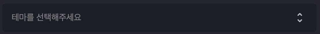
<SelectButton type="button" onClick={onClickSelect}>
<Select isThemeSelected={selectedTheme !== ''}>
{selectedTheme === '' ? '테마를 선택해주세요' : selectedTheme}
</Select>
...
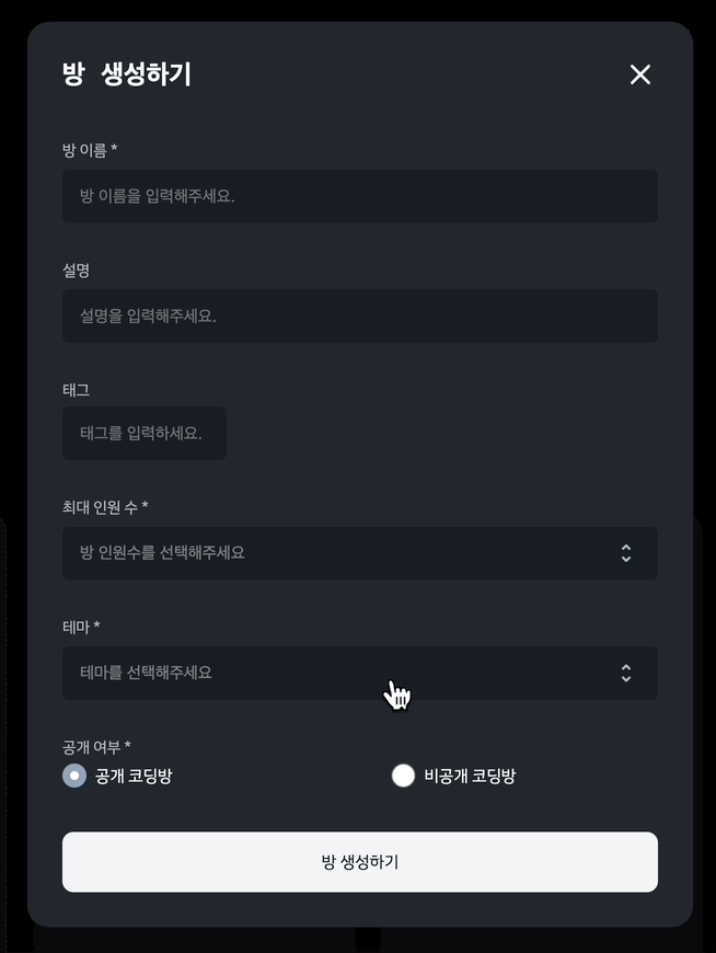
</SelectButton>SelectButton이 위 사진에 나온 필드입니다. 버튼 타입을submit이 아닌 button 으로 해주었으며 onClick이벤트가 발생할 때 isDropDown이 toggle 됩니다.
드랍다운 메뉴
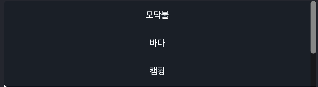
	{isDropDown && (
		<DropDown>
          {themeJson.map((theme) => (
            <Option
              value={theme.value}
              key={theme.value}
              onClick={onClickOption}
            >
              {theme.name}
            </Option>
          ))}
        </DropDown>
)}SelectButton을 클릭하여 isDropDown이 true로 될 때 드랍다운 메뉴가 보입니다. keyframes에서 0%일때 translateY에 음수를 주어 살짝 위에 위치하게 만들고 100%일 때 원래 있어야할 위치로 가게 애니메이션을 설정해주었습니다.
하지만 한가지 위와 같은 문제가 생겼습니다. 테마를 선택해주세요 필드를 클릭했을 때 보이는 메뉴의 height이 form에 지정한 height보다 커져서 overflow가 되어 스크롤을 내려야 하는 불편함이 생겼습니다. 이를 해결하고자 메뉴 자체에 height을 지정하여 컨텐츠가 overflow 되었을 때 스크롤되도록 변경하였습니다.
드랍다운 메뉴에 있는 옵션을 누르면 onClick이벤트로 onClickOption이 실행됩니다. onClickTheme(e.target.value); 에서 해당 옵션의 value를 테마에 저장해두었고 테마를 선택해주세요라는 메세지 대신 해당 테마명을 보이게 하기 위해 setSelectedTheme(e.target.innerText);를 해주었습니다. 또한 메뉴가 사라져야 하므로 isDropDown을 false로 설정하였습니다.
마치며
최대 인원 수도 테마와 같은 방식으로 해주었습니다. 직접 커스텀해준게 역시 더 이쁜것 같습니다..^^ (만족)
