회귀란?
독립변수/설명변수(X)가 종속변수/목표변수(Y) 간 상관관계를 모델링해서 얼마나 영향을 미치는지 알아보기 위해 사용
eg) 공부시간(X) 이 시험성적(Y) 에 얼마나 영향을 끼치는가?
답(Y) 가 있으니 지도학습으로 분류된다
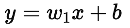
x : 독립변수
y : 종속변수
w : 가중치/ 학습과정에서 조정
b : 절편/ 데이터의 기본값
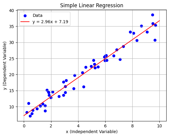
- 단순 선형 회귀
import numpy as np
import matplotlib.pyplot as plt
from sklearn.linear_model import LinearRegression

# 샘플 데이터 생성
np.random.seed(42)
x = np.random.rand(50, 1) * 10  # 독립변수 (0~10 사이의 값)
y = 3 * x + 7 + np.random.randn(50, 1) * 2  # 종속변수 (노이즈 추가)

# 모델 생성 및 학습
model = LinearRegression()
model.fit(x, y)

# 예측
x_range = np.linspace(0, 10, 100).reshape(-1, 1)
y_pred = model.predict(x_range)

# 회귀 계수 출력
w = model.coef_[0][0]  # 기울기
b = model.intercept_[0]  # 절편

# 시각화
plt.scatter(x, y, label="Data", color="blue")  # 실제 데이터
plt.plot(x_range, y_pred, label=f"y = {w:.2f}x + {b:.2f}", color="red")  # 회귀 직선
plt.title("Simple Linear Regression")
plt.xlabel("x (Independent Variable)")
plt.ylabel("y (Dependent Variable)")
plt.legend()
plt.grid(True)
plt.show()
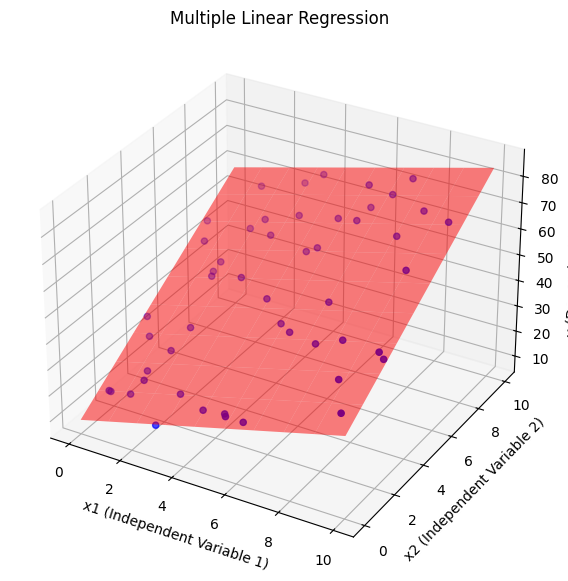
- 다중 선형 회귀

import numpy as np
from sklearn.linear_model import LinearRegression
import matplotlib.pyplot as plt
from mpl_toolkits.mplot3d import Axes3D

# 1. 데이터 생성
np.random.seed(42)  # 랜덤 시드 고정
x1 = np.random.rand(50, 1) * 10  # 독립변수 1 (0~10 사이 값)
x2 = np.random.rand(50, 1) * 10  # 독립변수 2 (0~10 사이 값)
y = 3 * x1 + 5 * x2 + 7 + np.random.randn(50, 1) * 3  # 종속변수 생성 (노이즈 추가)
X = np.hstack((x1, x2))  # 두 독립변수를 합쳐서 모델 입력 데이터로 사용

# 2. 모델 생성 및 학습
model = LinearRegression()  # 선형 회귀 모델 생성
model.fit(X, y)  # 모델 학습

# 3. 학습 결과 출력
w1, w2 = model.coef_[0]  # 독립변수의 가중치
b = model.intercept_[0]  # 절편
print(f"w1: {w1}, w2: {w2}, b: {b}")  # 학습된 회귀 계수와 절편 출력

# 4. 예측 평면 생성
x1_range = np.linspace(0, 10, 10)  # x1 축 범위 설정
x2_range = np.linspace(0, 10, 10)  # x2 축 범위 설정
x1_grid, x2_grid = np.meshgrid(x1_range, x2_range)  # 그리드 생성
X_grid = np.c_[x1_grid.ravel(), x2_grid.ravel()]  # 예측용 데이터 생성
y_pred = model.predict(X_grid).reshape(x1_grid.shape)  # 예측 값 계산

# 5. 시각화
fig = plt.figure(figsize=(10, 7))
ax = fig.add_subplot(111, projection='3d')  # 3D 그래프 설정
ax.scatter(x1, x2, y, label="Data", color="blue")  # 실제 데이터 시각화
ax.plot_surface(x1_grid, x2_grid, y_pred, alpha=0.5, color="red")  # 예측 평면 시각화
ax.set_title("Multiple Linear Regression")
ax.set_xlabel("x1 (Independent Variable 1)")
ax.set_ylabel("x2 (Independent Variable 2)")
ax.set_zlabel("y (Dependent Variable)")
plt.show()
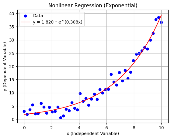
- 비선형 회귀
import numpy as np
import matplotlib.pyplot as plt
from scipy.optimize import curve_fit
# 1. 데이터 생성
np.random.seed(42) # 랜덤 시드 고정
x = np.linspace(0, 10, 50) # 독립변수 (0~10 사이 균등 분포)
true_a, true_b = 2, 0.3 # 실제 계수
y = true_a * np.exp(true_b * x) + np.random.randn(50) * 2 # 종속변수 (노이즈 추가)
# 2. 비선형 모델 정의
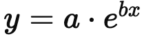
def exponential_model(x, a, b):
return a * np.exp(b * x)
# 3. 모델 학습 (curve_fit 사용)
popt, pcov = curve_fit(exponential_model, x, y, p0=(1, 0.1)) # 초기 추정값 p0
a_est, b_est = popt # 학습된 계수
print(f"Estimated coefficients: a = {a_est:.3f}, b = {b_est:.3f}")
# 4. 예측
x_range = np.linspace(0, 10, 100) # 예측 범위
y_pred = exponential_model(x_range, a_est, b_est) # 예측 값
# 5. 시각화
plt.scatter(x, y, label="Data", color="blue") # 실제 데이터
plt.plot(x_range, y_pred, label=f"y = {a_est:.3f} * e^({b_est:.3f}x)", color="red") # 예측 곡선
plt.title("Nonlinear Regression (Exponential)")
plt.xlabel("x (Independent Variable)")
plt.ylabel("y (Dependent Variable)")
plt.legend()
plt.grid(True)
plt.show()
회귀의 목적?
- 변수간의 관계를 파악
- 미래의 값 예측
- 변수의 영향력 평가
- 특정상황에서 최적의 값 찾기
- 패턴 및 추세탐지
회귀 모델에서 성능지표가 필요한 이유?
- 모델의 품질 평가
모델이 과적합되어있는지, 과소적합 되어있는지 판단할 수 있다 - 모델 비교
- 모델 최적화
- 데이터 이상 검출
이상치 탐지 가능
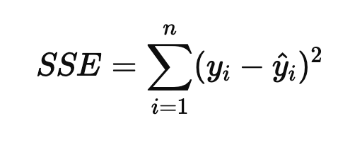
y𝑖 : 관측값
𝑦^𝑖 : 예측값
n : 샘플 개수
𝑒𝑖 = y𝑖 - 𝑦^𝑖 : 잔차
MSE (Mean Squared Error)평균 제곱 오차
제곱값이므로 실제값과 예측값의 차이가 강조됨
이상치에 민감하다
0에 가까울수록 좋다
MAE(Mean Absolute Error)평균 절대 오차
데이터의 단위가 동일해서 이상치에 덜 민감하다
이상치의 영향을 줄이고 싶을때 사용
0에 가까울수록 좋다
RMSE(Root Mean Squared Error평균 제곱근 오차
제곱후 평균을 구한뒤 루트를 씌워 변환한 값
큰 오차가 더 강조된다
이상치가 있을경우 과대평가 될 수 있다
0에 가까울수록 좋다
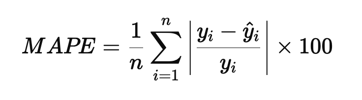
MAPE
데이터의 단위와 관계없이 오차를 평가할 수 있다
0에 가까울수록 예측이 정확하다
서로다른 단위를 가진 데이터를 비교할 수 있다
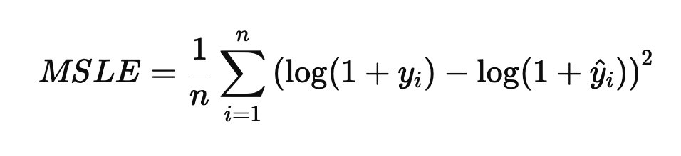
MSLE
상대적인 오차를 강조하고, 작은 오차를 과하게 반영하지 않는다
작은데이터에 안정적이다
0에 가까울수록 좋다
R^2(R-Squared)결정계수
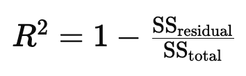
모델이 얼마나 데이터를 얼마나 잘 설명하는가의 설명력
1 : 모델이 데이터를 완벽하게 설명함. 선형 상관관계를 가진다
0 : 모델이 데이터를 전혀 설명하지 못함. 선형 상관관계가 없다
-1 : 모델이 데이터를 반대로 설명함
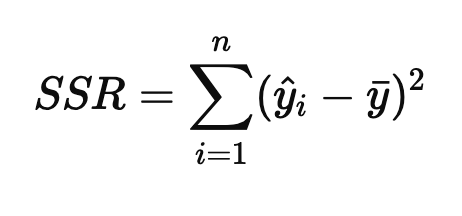
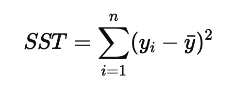
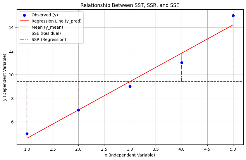
SST = SSR + SSE
SSE = 회귀 제곱합, 예측값과 평균의 차이
SSR : 잔차 제곱합, 관측값과 예측값의 차이
SST : 총 제곱합, 관측값과 평균의 차이
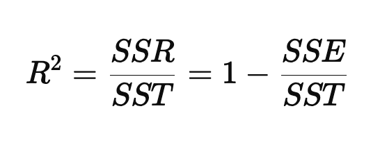
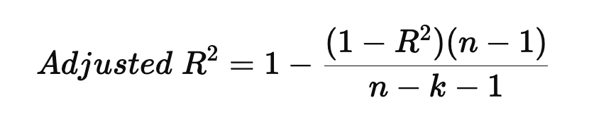
하지만 설명변수가 많아질수록 증가하는 성질이 있기 때문에 데이터의 샘플수를 고려한 수정된 결정계수로 보안
수정된 결정계수(Adjusted R^2)
import numpy as np
from sklearn.metrics import mean_squared_error, mean_absolute_error, mean_squared_log_error, r2_score

# 1. 데이터 생성 (실제값과 예측값)
y_true = np.array([10, 20, 30, 40, 50])  # 실제값
y_pred = np.array([12, 18, 29, 43, 48])  # 예측값

# 2. MSE (Mean Squared Error)
mse = mean_squared_error(y_true, y_pred)

# 3. MAE (Mean Absolute Error)
mae = mean_absolute_error(y_true, y_pred)

# 4. RMSE (Root Mean Squared Error)
rmse = np.sqrt(mse)

# 5. MAPE (Mean Absolute Percentage Error)
mape = np.mean(np.abs((y_true - y_pred) / y_true)) * 100

# 6. MSLE (Mean Squared Logarithmic Error)
msle = mean_squared_log_error(y_true, y_pred)

# 7. R^2 (Determination Coefficient)
r2 = r2_score(y_true, y_pred)

# 8. Adjusted R^2
n = len(y_true)  # 데이터 개수
k = 1  # 독립 변수 개수 (예제에서는 단일 변수로 가정)
adjusted_r2 = 1 - (1 - r2) * (n - 1) / (n - k - 1)

# 결과 출력
print(f"MSE: {mse:.3f}")
print(f"MAE: {mae:.3f}")
print(f"RMSE: {rmse:.3f}")
print(f"MAPE: {mape:.3f}%")
print(f"MSLE: {msle:.3f}")
print(f"R^2: {r2:.3f}")
print(f"Adjusted R^2: {adjusted_r2:.3f}")
MSE: 4.400
MAE: 2.000
RMSE: 2.098
MAPE: 8.967%
MSLE: 0.009
R^2: 0.978
Adjusted R^2: 0.971