이 글은 2019.09.11 공작발 수업 실습 내용입니다. 이 외에 필요한 내용은 교수님이 주신 Sample 파일 참고
Scatter - 점
import matplotlib.pyplot as plt

# scatter(x, y, size =, color =, alpha = , label = )
plt.scatter(data1, data2, s=53, c="red", alpha=0.5,  label='Inline label' )

# x,y 축 범위 설정
plt.xlim([-10,30])
plt.ylim([-10,30])

plt.legend()
plt.show()
Plot - 선 그래프
import matplotlib.pyplot as plt
# plot( x축 데이터, y축 데이터, '${color}${maker} )
plt.plot([1, 2, 3, 4], [1, 4, 9, 16], 'ko-')
plt.ylabel('some numbers')
plt.show()
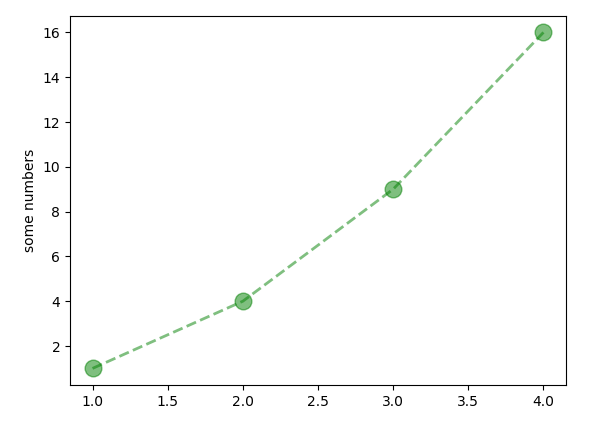
# Option for marker
plt.plot([1, 2, 3, 4], [1, 4, 9, 16], color='green', marker='o',\
linestyle='dashed', linewidth=2, markersize=12, alpha=.5)
plt.ylabel('some numbers')
plt.show()
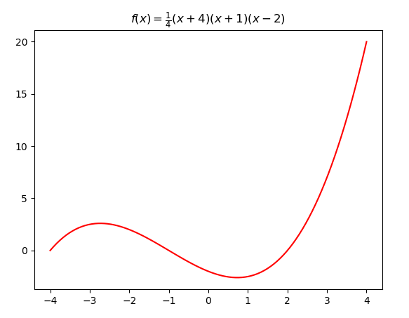
수식을 이용한 Plot
import numpy
import matplotlib.pyplot as plot


# -4에서 4까지 1024 등분분
X = numpy.linspace(-4, 4, 1024)
Y = .25 * (X + 4.) * (X + 1.) * (X - 2.)

# r은 row string이라는 의미, $는 수식을 쓴다는 의미
# \frac{분자}{분모}
plot.title(r'$f(x)=\frac{1}{4}(x+4)(x+1)(x-2)$')
plot.plot(X, Y, c = 'r')
plot.show()
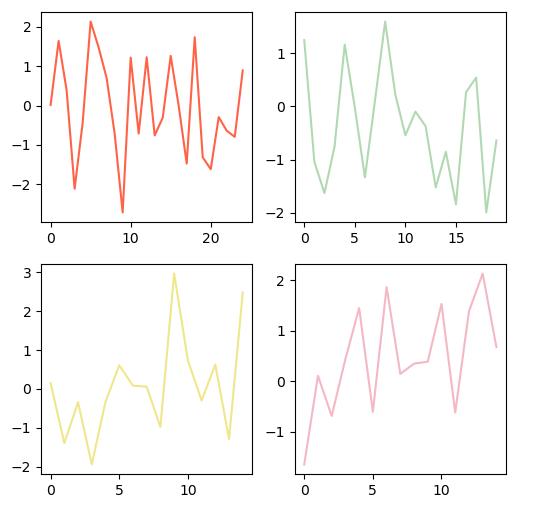
SubPlot
import numpy as np
import matplotlib.pyplot as plt

data = np.random.randn(25)

fig = plt.figure(figsize=(7,7))

# (2,2) 중 (x,y) 의 서브 그래프를 그리겠다.
ax1 = plt.subplot2grid((2,2), (0,0),)
ax2 = plt.subplot2grid((2,2), (1,0),)
ax3 = plt.subplot2grid((2,2), (0,1),)
ax4 = plt.subplot2grid((2,2), (1,1),)

ax1.plot(data)
ax2.plot(data)
ax3.plot(data)
ax4.plot(data)

plt.show()
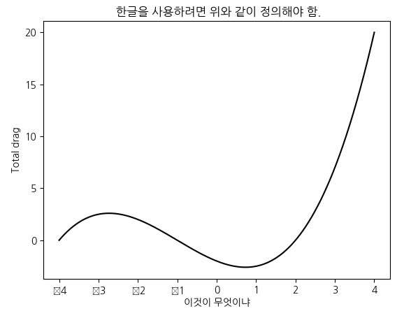
Label 및 한글 사용
import numpy
import matplotlib.pyplot as plot

from matplotlib import font_manager, rc
font_name = font_manager.FontProperties(fname="c:/Windows/Fonts/NanumGothic.ttf").get_name()
rc('font', family=font_name)


X = numpy.linspace(-4, 4, 1024)
Y = .25 * (X + 4.) * (X + 1.) * (X - 2.)

plot.title(' 한글을 사용하려면 위와 같이 정의해야 함.')
plot.xlabel('이것이 무엇이냐')
plot.ylabel('Total drag')

plot.plot(X, Y, c = 'k')
plot.show(
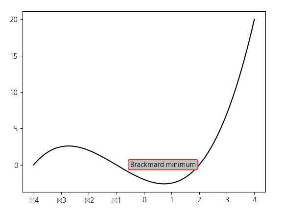
그래프에 글자 삽입
import numpy
import matplotlib.pyplot as plot

from matplotlib import font_manager, rc
font_name = font_manager.FontProperties(fname="c:/Windows/Fonts/NanumGothic.ttf").get_name()
rc('font', family=font_name)

X = numpy.linspace(-4, 4, 1024)
Y = .25 * (X + 4.) * (X + 1.) * (X - 2.)

box = {
	'facecolor' : '.75',
	'edgecolor' : 'r',
    'boxstyle'  : 'round'
}

# 왼쪽 아래 박스 좌표 기준
plot.text(-0.5, -0.20, 'Brackmard minimum', bbox = box)

plot.plot(X, Y, c = 'k')
plot.show()
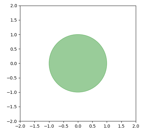
도형삽입
import matplotlib.pyplot as plot

shape = plot.Circle((0, 0), radius = 1., color = 'green', alpha=0.4)
plot.gca().add_patch(shape)

plot.grid(False)
plot.axis('scaled')
plot.xlim([-2,2])
plot.ylim([-2,2])
plot.show()
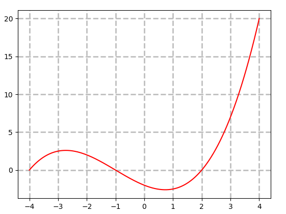
Griding line
import numpy
import matplotlib.pyplot as plot

X = numpy.linspace(-4, 4, 1024)
Y = .25 * (X + 4.) * (X + 1.) * (X - 2.)

plot.plot(X, Y, c = 'k')

#  lw = line width
plot.grid(True, lw = 2, ls = '--', c = '.75')
plot.show()
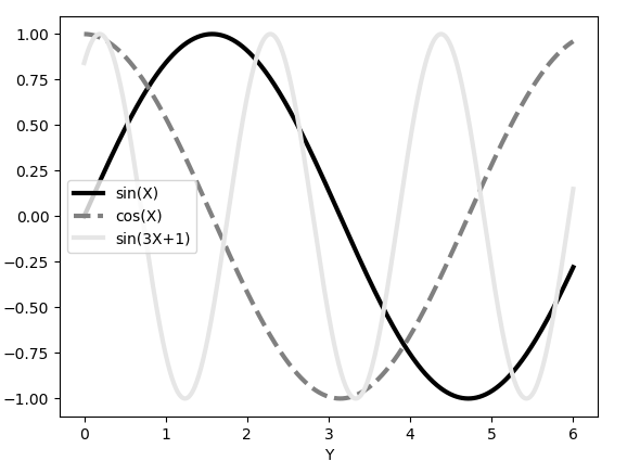
Sin, Cos
import numpy
import matplotlib.pyplot as plot

X = numpy.linspace(0, 6, 1024)
Y1 = numpy.sin(X)
Y2 = numpy.cos(X)
Y3 = numpy.sin(X*3 + 1)

plot.xlabel('X')
plot.xlabel('Y')

plot.plot(X, Y1, c = 'k',             lw = 3., label = 'sin(X)')
plot.plot(X, Y2, c = '.5', ls = '--', lw = 3., label = 'cos(X)')
plot.plot(X, Y3, c = '.9', ls = '-', lw = 3., label = 'sin(3X+1)')

plot.legend()
plot.show()
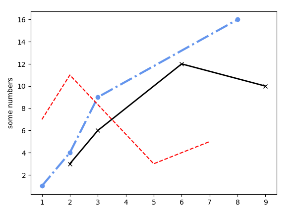
Line Style
import matplotlib.pyplot as plt

mycolor = 'cornflowerblue'
plt.plot([1, 2, 3, 8], [1, 4, 9, 16],  marker='o', linestyle="-.",  color=mycolor, linewidth=3)
plt.plot([1, 2, 5, 7], [7, 11, 3, 5] , linestyle="--",  color="red")
plt.plot([2, 3, 6, 9], [3, 6, 12, 10] ,  marker='x', linestyle="-",  color="black", linewidth=2)

plt.ylabel('some numbers')
plt.show()
Maker Control
import numpy as np
import matplotlib.pyplot as plt

# 평균이 50, 분산인 2
A = np.random.standard_normal(( 50, 2))
A += np.array((-1, -1))
B = np.random.standard_normal(( 50, 2))
B += np.array((1, 1))

print(A)
print(B)

plt.scatter(B[:,0], B[
:,1], c = 'k', s = 100.)
plt.scatter(A[:,0], A[:,1], c = 'r', s = 25.)

plt.show()

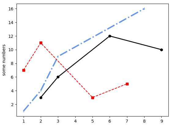
Choose Maker Style
##character           description
##================    ===============================
##   -                solid line style
##   --               dashed line style
##   -.               dash-dot line style
##   :                dotted line style
##   .                point marker
##   ,                pixel marker
##   o                circle marker
##   v                triangle_down marker
##   ^                triangle_up marker
##   <                triangle_left marker
##   >                triangle_right marker
##   1                tri_down marker
##   2                tri_up marker
##   3                tri_left marker
##   4                tri_right marker
##   s                square marker
##   p                pentagon marker
##   *                star marker
##   h                hexagon1 marker
##   H                hexagon2 marker
##   +                plus marker
##   x                x marker
##   D                diamond marker
##   d                thin_diamond marker
##   |                vline marker
##   _                hline marker


import matplotlib.pyplot as plt

mycolor = 'cornflowerblue'
plt.plot([1, 2, 3, 8], [1, 4, 9, 16],  marker='|', linestyle="-.",  color=mycolor, linewidth=3)
plt.plot([1, 2, 5, 7], [7, 11, 3, 5] ,  marker='s', linestyle="--",  color="red")
plt.plot([2, 3, 6, 9], [3, 6, 12, 10] ,  marker='h', linestyle="-",  color="black", linewidth=2)

plt.ylabel('some numbers')
plt.show()
Histogram
import numpy as np
import matplotlib.mlab as mlab
import matplotlib.pyplot as plt


x = [21,22,23,4,5,6,77,8,9,10,31,32,33,34,35,36,37,18,49,50,100]
num_bins = 5

# num_bins 만큼 나눈다
n, bins, patches = plt.hist(x, num_bins, facecolor='red', alpha=0.5, normed=False,rwidth=0.8)
plt.title('Red Chart')
plt.show( )


# normed = ??
# n, bins, patches ???
n, bins, patches = plt.hist(x, num_bins, facecolor='blue', alpha=0.7, normed=True, rwidth=0.7)
plt.title('Blue Chart')
plt.show()

# In a standard histogram, the total area of all bins is either 1
# if normed or N. Here's a simple example:
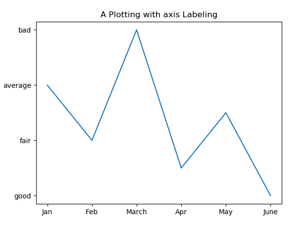
Axis Marking
#!/usr/bin/python

import matplotlib.pyplot as plt
plt.title("A Plotting with axis Labeling")
x=[5, 3, 7, 2, 4, 1]
plt.plot(x)

plt.xticks(list(range(len(x))), ['Jan', 'Feb', 'March', 'Apr', 'May', 'June'])

plt.yticks(list(range(1, 8, 2)), ['good', 'fair', 'average', 'bad'])
plt.show()
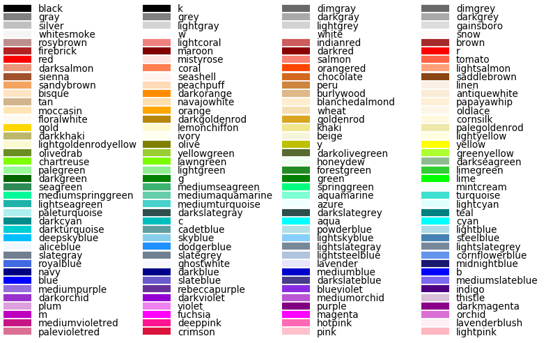
Show Color Name
#-*- coding: cp949 -*-
# Name:        module1
# Author:      Zoh
# Created:     15-12-2018
#-------------------------------------------------------------------------------

"""
========================
Visualizing named colors
========================

Simple plot example with the named colors and its visual representation.
"""


import matplotlib.pyplot as plt
from matplotlib import colors as mcolors


colors = dict(mcolors.BASE_COLORS, **mcolors.CSS4_COLORS)

# Sort colors by hue, saturation, value and name.
by_hsv = sorted((tuple(mcolors.rgb_to_hsv(mcolors.to_rgba(color)[:3])), name)
                for name, color in list(colors.items()))
sorted_names = [name for hsv, name in by_hsv]

n = len(sorted_names)
ncols = 4
nrows = n // ncols + 1

fig, ax = plt.subplots(figsize=(8, 5))

# Get height and width
X, Y = fig.get_dpi() * fig.get_size_inches()
h = Y / (nrows + 1)
w = X / ncols

for i, name in enumerate(sorted_names):
    col = i % ncols
    row = i // ncols
    y = Y - (row * h) - h

    xi_line = w * (col + 0.05)
    xf_line = w * (col + 0.25)
    xi_text = w * (col + 0.3)

    ax.text(xi_text, y, name, fontsize=(h * 0.8),
            horizontalalignment='left',
            verticalalignment='center')

    ax.hlines(y + h * 0.1, xi_line, xf_line,
              color=colors[name], linewidth=(h * 0.6))

ax.set_xlim(0, X)
ax.set_ylim(0, Y)
ax.set_axis_off()

fig.subplots_adjust(left=0, right=1,
                    top=1, bottom=0,
                    hspace=0, wspace=0)
plt.show()

어려운 문제를 함께 풀어가는 것을 좋아합니다.