.png)
SW과정 머신러닝 1025(14)
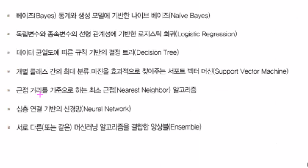
1. Pima Indians by Kaggle
import pandas as pd

import warnings
warnings.filterwarnings('ignore')

df = pd.read_csv('diabetes.csv')
df.head(2)

df.info()

X = df.iloc[:,:-1]

y = df.iloc[:,-1]

X

y

from sklearn.model_selection import train_test_split

X_train, X_test, y_train, y_test = train_test_split(X,y,test_size=0.2,random_state=156,stratify=y)

from sklearn.linear_model import LogisticRegression #Ctrl + Shift + - 커서를 기준으로 작업열 분리시킴

from sklearn.metrics import confusion_matrix,accuracy_score, precision_score, recall_score, f1_score, precision_recall_curve,roc_auc_score

def get_clf_eval(y_test,pred):
    confusion = confusion_matrix(y_test, pred)
    accuracy = accuracy_score(y_test,pred)
    precision = precision_score(y_test,pred)
    recall = recall_score(y_test,pred)
    f1 = f1_score(y_test,pred)
    roc_auc = roc_auc_score(y_test,pred)
    print('오차행렬')
    print(confusion)
    print(f'정확도:{accuracy:.4f} 정밀도:{precision:.4f} 재현율:{recall:.4f} F1:{f1:.4f} AUC{roc_auc:.4f}' )

lr_clf = LogisticRegression()
lr_clf.fit(X_train, y_train)
pred = lr_clf.predict(X_test)
get_clf_eval(y_test,pred)

def precision_recall_curve_plot(y_test , pred_proba_c1):
    # threshold ndarray와 이 threshold에 따른 정밀도, 재현율 ndarray 추출.
    precisions, recalls, thresholds = precision_recall_curve( y_test, pred_proba_c1)

    # X축을 threshold값으로, Y축은 정밀도, 재현율 값으로 각각 Plot 수행. 정밀도는 점선으로 표시
    plt.figure(figsize=(8,6))
    threshold_boundary = thresholds.shape[0]
    plt.plot(thresholds, precisions[0:threshold_boundary], linestyle='--', label='precision')
    plt.plot(thresholds, recalls[0:threshold_boundary],label='recall')

    # threshold 값 X 축의 Scale을 0.1 단위로 변경
    start, end = plt.xlim()
    plt.xticks(np.round(np.arange(start, end, 0.1),2))

    # x축, y축 label과 legend, 그리고 grid 설정
    plt.xlabel('Threshold value'); plt.ylabel('Precision and Recall value')
    plt.legend(); plt.grid()
    plt.show()

pred_proba_c1 = lr_clf.predict_proba(X_test)[:,1]

import matplotlib.pyplot as plt
import numpy as np
precision_recall_curve_plot(y_test,pred_proba_c1)

precision_recall_curve( y_test, pred_proba_c1)

df.describe()

plt.hist(df['Glucose']) #히스토그램을 만들어 보자

df.columns #count()에서는 널값을 빼고 계산함(널값 없어서 행수 같음)

zero_features = ['Glucose', 'BloodPressure', 'SkinThickness', 'Insulin',
       'BMI']
total_count = df['Glucose'].count()
for feature in zero_features:
    zero_count = df[df[feature]==0][feature].count()
    print('{} 0건수:{} 퍼센트 {:.2f}%'.format(feature,zero_count,(100*zero_count/total_count)))

mean_zero_features = df[zero_features].mean()

df[zero_features] = df[zero_features].replace(0,mean_zero_features)

X = df.iloc[:,:-1]
y = df.iloc[:,-1]
X_train, X_test, y_train, y_test = train_test_split(X,y,test_size=0.2,random_state=156,stratify=y)
lr_clf = LogisticRegression()
lr_clf.fit(X_train, y_train)
pred = lr_clf.predict(X_test)
get_clf_eval(y_test,pred)
# 오차행렬
# [[88 12]
#  [23 31]]
# 정확도:0.7727 정밀도:0.7209 재현율:0.5741 F1:0.6392 AUC0.7270

from sklearn.metrics import roc_curve

pred_proba_class1 = lr_clf.predict_proba(X_test)[:,1]
pred_proba_class1 #반올림해서 1 or 0이 나옴

roc_curve(y_test,pred_proba_class1)

def roc_curve_plot(y_test , pred_proba_c1):
    # 임곗값에 따른 FPR, TPR 값을 반환 받음.
    fprs , tprs , thresholds = roc_curve(y_test ,pred_proba_c1)

    # ROC Curve를 plot 곡선으로 그림.
    plt.plot(fprs , tprs, label='ROC')
    # 가운데 대각선 직선을 그림.
    plt.plot([0, 1], [0, 1], 'k--', label='Random')

    # FPR X 축의 Scale을 0.1 단위로 변경, X,Y 축명 설정등
    start, end = plt.xlim()
    plt.xticks(np.round(np.arange(start, end, 0.1),2))
    plt.xlim(0,1); plt.ylim(0,1)
    plt.xlabel('FPR( 1 - Sensitivity )'); plt.ylabel('TPR( Recall )')
    plt.legend()
    plt.show()

roc_curve_plot(y_test,pred_proba_class1)

from sklearn.preprocessing import Binarizer #함수안에 넣어도 실행됨
def get_eval_by_threshold(y_test , pred_proba_c1, thresholds):
    # thresholds list객체내의 값을 차례로 iteration하면서 Evaluation 수행.
    for custom_threshold in thresholds:
        binarizer = Binarizer(threshold=custom_threshold).fit(pred_proba_c1)
        custom_predict = binarizer.transform(pred_proba_c1)
        print('임곗값:',custom_threshold)
        get_clf_eval(y_test , custom_predict)

thresholds = [0.3,0.33,0.36,0.39,0.42,0.45,0.48,0.5]
pred_proba = lr_clf.predict_proba(X_test)
get_eval_by_threshold(y_test,pred_proba[:,1].reshape(-1,1),thresholds)
2. 분류
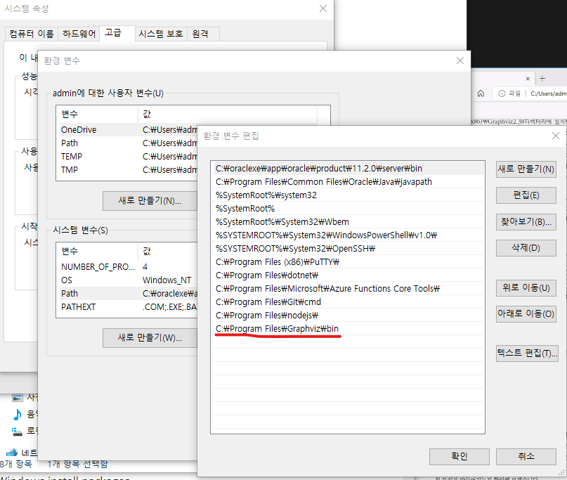
3. Graphviz
설치 => Anaconda Propt
pip install graphviz
환경변수 확인
from sklearn.tree import DecisionTreeClassifier
#gini 계수 : 0이 가장  평등하고, 1로 갈수록 불평등합니다.
#다양하게 분포가 될 수록 평등하다. 한쪽으로 쏠릴수록 불평등하다.

DecisionTreeClassifier() #gini가 기본값, gini,entropy 가능함

import graphviz

from sklearn.tree import DecisionTreeClassifier
from sklearn.datasets import load_iris
from sklearn.model_selection import train_test_split
import warnings
warnings.filterwarnings('ignore')

dt_clf = DecisionTreeClassifier(random_state=156) #max_depth 트리 단계 설정
iris_data = load_iris()
X_train, X_test, y_train, y_test=train_test_split(iris_data.data,
                                                  iris_data.target,
                                                 test_size=0.2,
                                                 random_state=11)
dt_clf.fit(X_train,y_train)

from sklearn.tree import export_graphviz

export_graphviz(dt_clf,
                out_file='tree.dot',
                class_names=iris_data.target_names,
                feature_names=iris_data.feature_names,filled=True)

with open('tree.dot') as f:
    dot_grape = f.read()
graphviz.Source(dot_grape)

dt_clf.feature_importances_

iris_data.feature_names

import seaborn as sns
import numpy as np

for name, value in zip(iris_data.feature_names,dt_clf.feature_importances_):
    print(name, '  ', value)

sns.barplot(x=dt_clf.feature_importances_,y=iris_data.feature_names)

from sklearn.datasets import make_classification
import matplotlib.pyplot as plt

X,y = make_classification(n_features=2,
                          n_redundant=0,
                          n_classes=3,
                          n_clusters_per_class=1,
                          random_state=0)
y

plt.title('3 class values with 2Features sample data creation')
plt.scatter(X[:,0],X[:,1],marker='o',c=y, s=25,edgecolors='k')

def visualize_boundary(model, X, y):
    fig,ax = plt.subplots()

    # 학습 데이타 scatter plot으로 나타내기
    ax.scatter(X[:, 0], X[:, 1], c=y, s=25, cmap='rainbow', edgecolor='k',
               clim=(y.min(), y.max()), zorder=3)
    ax.axis('tight')
    ax.axis('off')
    xlim_start , xlim_end = ax.get_xlim()
    ylim_start , ylim_end = ax.get_ylim()

    # 호출 파라미터로 들어온 training 데이타로 model 학습 .
    model.fit(X, y)
    # meshgrid 형태인 모든 좌표값으로 예측 수행.
    xx, yy = np.meshgrid(np.linspace(xlim_start,xlim_end, num=200),np.linspace(ylim_start,ylim_end, num=200))
    Z = model.predict(np.c_[xx.ravel(), yy.ravel()]).reshape(xx.shape)

    # contourf() 를 이용하여 class boundary 를 visualization 수행.
    n_classes = len(np.unique(y))
    contours = ax.contourf(xx, yy, Z, alpha=0.3,
                           levels=np.arange(n_classes + 1) - 0.5,
                           cmap='rainbow', clim=(y.min(), y.max()),
                           zorder=1)

dt_clf = DecisionTreeClassifier().fit(X,y)
visualize_boundary(dt_clf,X,y)

dt_clf = DecisionTreeClassifier(min_samples_leaf=6).fit(X,y)
visualize_boundary(dt_clf,X,y)
4. Human_activity(UCI HAR Dataset)
다운로드 링크
feature.txt 불러와서 사용함
import pandas as pd
import matplotlib.pyplot as plt
import numpy as np
feature_name_df=pd.read_csv('./human_activity/UCI HAR Dataset/features.txt',
                           sep='\s+',
                           header=None,
                           names=['column_index','column_name'])
feature_name_df.head(2)

feature_name = feature_name_df.iloc[:,1].values.tolist()
feature_name

feature_dup_df = feature_name_df.groupby('column_name').count()

feature_dup_df.head(2)

feature_dup_df[feature_dup_df['column_index']>1]

def get_new_feature_name_df(old_feature_name_df):
    feature_dup_df = pd.DataFrame(data=old_feature_name_df.groupby('column_name').cumcount(),
                                 columns=['dup_cnt'])
    feature_dup_df = feature_dup_df.reset_index()
    new_feature_name_df = pd.merge(old_feature_name_df.reset_index(), feature_dup_df, how='outer') #how=''는 조인 방법을 뜻함
    new_feature_name_df[['column_name','dup_cnt']].apply(lambda x:x[0]+'_'+str(x[1])
                                                          if x[1]>0 else x[0],axis=1)
    new_feature_name_df = new_feature_name_df.drop(['index'],axis=1)
    return new_feature_name_df

temp = get_new_feature_name_df(feature_name_df)
temp[temp['dup_cnt']>0]

def get_human_dataset( ):

    # 각 데이터 파일들은 공백으로 분리되어 있으므로 read_csv에서 공백 문자를 sep으로 할당.
    feature_name_df = pd.read_csv('./human_activity/UCI HAR Dataset/features.txt',sep='\s+',
                        header=None,names=['column_index','column_name'])
    # DataFrame에 피처명을 컬럼으로 부여하기 위해 리스트 객체로 다시 변환
    feature_name = feature_name_df.iloc[:, 1].values.tolist()

    # 학습 피처 데이터 셋과 테스트 피처 데이터을 DataFrame으로 로딩. 컬럼명은 feature_name 적용
    X_train = pd.read_csv('./human_activity/UCI HAR Dataset/train/X_train.txt',sep='\s+', names=feature_name)
    X_test = pd.read_csv('./human_activity/UCI HAR Dataset/test/X_test.txt',sep='\s+', names=feature_name)

    # 학습 레이블과 테스트 레이블 데이터을 DataFrame으로 로딩하고 컬럼명은 action으로 부여
    y_train = pd.read_csv('./human_activity/UCI HAR Dataset/train/y_train.txt',sep='\s+',header=None,names=['action'])
    y_test = pd.read_csv('./human_activity/UCI HAR Dataset/test/y_test.txt',sep='\s+',header=None,names=['action'])

    # 로드된 학습/테스트용 DataFrame을 모두 반환
    return X_train, X_test, y_train, y_test
DataEngineer Lee.