
form에 대한 설정 값만으로 자동 Input Form 만들기
핵심 컴포넌트
- HForm.tsx
- HInput.tsx
그 외에도 HButton, PressableButton 등 내가 만든 다른 컴포넌트들이 있지만 위 두 핵심 컴포넌트에 대해서 작성해보고자 한다.
(HForm을 만들기 전에 마지막 부분에 있는 HInput을 먼저 만든다.)
컨셉
usage
HForm 컴포넌트를 소개하기 전에 사용법부터 확인해보자.
설정 값
어떠한 입력값을 받을지, 이 input box는 어떤 설정이 필요한지 form의 구성 요소에 대한 설정 값을 미리 만들어둔다.
타입에 대한 설명은 생략한다.
type SignupFormIds = 'name' | 'mobile' | 'email' | 'pwd1' | 'pwd2';
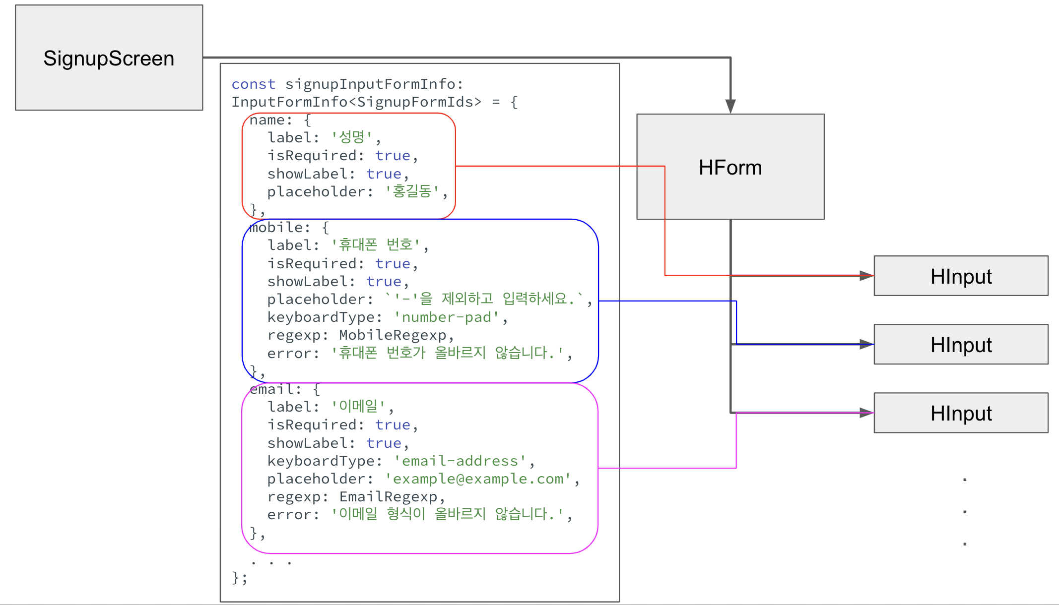
const signupInputFormInfo: InputFormInfo<SignupFormIds> = {
name: {
label: '성명',
isRequired: true,
showLabel: true,
placeholder: '홍길동',
},
mobile: {
label: '휴대폰 번호',
isRequired: true,
showLabel: true,
placeholder: `'-'을 제외하고 입력하세요.`,
keyboardType: 'number-pad',
regexp: MobileRegexp,
error: '휴대폰 번호가 올바르지 않습니다.',
},
email: {
label: '이메일',
isRequired: true,
showLabel: true,
keyboardType: 'email-address',
placeholder: 'example@example.com',
regexp: EmailRegexp,
error: '이메일 형식이 올바르지 않습니다.',
},
pwd1: {
label: '비밀번호',
isRequired: true,
showLabel: true,
password: true,
regexp: PasswordRegexp,
error: '영문자와 숫자, 특수문자를 포함하여 8자리 이상이어야 합니다.',
},
pwd2: {
label: '비밀번호 확인',
isRequired: true,
showLabel: true,
password: true,
regexp: CheckPasswordRegexp,
error: '비밀번호가 일치하지 않습니다.',
},
};pwd2의 정규식은 미리 정해놓을 수 없기 때문에 함수 형태이다. 유효성 검사는 HForm 컴포넌트에서 submit되기 전에 수행된다.
jsx
const SignupScreen = () => {
  const {css} = useStyle();

  const regist = (values: InputFormValues<SignupFormIds>) => {
    console.log('regist@@@ > ', values);
  };

  return (
    <ScreenWrapper>
       <HForm
         styles={[css.mt10, css.mb10, css.gap15]}
         inputFormInfo={signupInputFormInfo}
         submitButtonOptions={{label: '가 입 하 기', color: 'primary'}}
         withResetButton
         submit={regist}
       />
    </ScreenWrapper>
  );
};
export default SignupScreen;
SignupScreen에서 위에서 만든 설정 값을 HForm에 넘겨주기만 하면 된다.
HForm
HForm 컴포넌트의 Props 타입
form 구성 요소인 input 들에 대한 설정 값과 submit 함수, 제출 버튼의 옵션 등등을 props로 전달 받는다.
type HFormProps<T extends string> = {
  inputFormInfo: InputFormInfo<T>;
  submitButtonOptions: PartialByKey<HButtonProps, 'onPress'>;
  submit: (values: InputFormValues<T>) => void;
  withCancelButton?: boolean;
  cancel?: () => void;
  withResetButton?: boolean;
  styles?: ViewStyle | ViewStyle[];
};
reducer 함수
form에 입력된 값 및 에러 메시지들을 useReducer를 사용해 관리한다.
type Action<T extends string> =
  | {
      type: 'SET_VALUE';
      payload: {id: T; value: string};
    }
  | {
      type: 'SET_ERROR';
      payload: {id: T; error?: string};
    }
  | {
      type: 'RESET';
      payload: InputFormInfo<T>;
    };

function inputFormReducer<T extends string>(
  state: InputFormValues<T>,
  {type, payload}: Action<T>,
) {
  switch (type) {
    case 'SET_VALUE':
      return {
        ...state,
        [payload.id]: {
          value: payload.value,
          error: '',
        },
      };
    case 'SET_ERROR':
      return {
        ...state,
        [payload.id]: {
          ...state[payload.id],
          error: payload.error || '',
        },
      };
    case 'RESET':
      return makeDefaultInputFormValues(payload);
  }
}
jsx
<>
  <View style={styles}>
    {formItems.map(([id, options], idx) => (
      <HInput
        key={id}
        id={id}
        {...{...options, error: inputFormValues[id].error}}
        value={inputFormValues[id].value}
        isFocused={focusedId === id}
        returnKeyType={idx === formItems.length - 1 ? 'done' : 'next'}
        onChange={changeInputFormValues}
        setFocus={changeFocusedId}
        onEnter={() => {
          const nextId = nextFormId(id as keyof typeof inputFormInfo);
          if (nextId) {
            changeFocusedId(nextId);
          } else {
            submitForm();
          }
        }}
      />
    ))}
  </View>
  <View style={[css.fd_row, css.gap20]}>
    {withResetButton && (
      <View style={css.flex1}>
        <HButton
          label='초 기 화'
          icon='restore'
          onPress={resetForm}
          size={submitButtonOptions.size || 'full'}
        />
      </View>
    )}
    <View style={[css.flex1, css.fd_row, css.gap10, css.jc_flex_end]}>
      {withCancelButton && (
        <HButton
          label='취 소'
          size={submitButtonOptions.size || 'full'}
          onPress={cancel}
        />
      )}
      <HButton {...submitButtonOptions} onPress={submitForm} />
    </View>
  </View>
</>;
전달 받은 설정 값을 배열로 만든 후 map으로 HInput 컴포넌트를 그린다. HInput 컴포넌트에 각각의 설정 값을 전달한다.
유효성 검사
input의 값을 설정하거나 초기화, 포커스 주기 등은 간단하고 reducer 함수를 참고하여 만들 수 있으므로 설명은 생략한다. 유효성 검사 함수를 보자. 유효성 검사는 HForm에 props로 넘겨준 submit() 함수를 실행하기 전에 먼저 실행된다.
const checkValiationInputForm = () => {
  let isValid = true;
  formItems.forEach(([id, {regexp, error, isRequired}]) => {
    const value = inputFormValues[id].value;

    if (
      (regexp instanceof RegExp && !regexp.exec(value)) ||
      (regexp instanceof Function &&
        'pwd1' in inputFormValues &&
        !regexp(
          (inputFormValues.pwd1 as ValueOf<InputFormValues<T>>).value,
        ).exec(value))
    ) {
      setInputFormValues({type: 'SET_ERROR', payload: {id, error}});
      isValid = false;
    }
    if (isRequired && !value) {
      setInputFormValues({
        type: 'SET_ERROR',
        payload: {id, error: '필수 입력사항입니다.'},
      });
      isValid = false;
    }
  });
  return isValid;
};
넘겨준 설정 값에 regexp가 존재하는 경우에만 유효성 검사를 수행한다. (그 외 isRequired가 true인 경우 입력 값이 있는지도 확인한다.)
비밀번호 확인(pwd2)같은 경우 첫 번째 비밀번호(pwd1)와 일치하는지 확인해야 하므로 함수로 작성했었다.
첫 번째 if문의 조건 안에서 regexp가 존재하는지, 있다면 정규식에 일치하는지 확인한다.
그리고 두 번째 if문에서 필수 값인지, 입력 되었는지를 확인한다.
HInput
HForm에서 HInput 컴포넌트를 사용하므로 우선 HInput 부터 생성한다.
input box 위에 라벨을 표시할지, placeholder를 나타낼지, 비밀번호 여부, 키 타입 등등 여러 설정 값을 props로 전달 받아 TextInput을 구성한다.
isRequired는 초반엔 라벨 옆에 빨간색으로 *를 표시해주기 위해 받았는데, 시각적으로 이상해서 * 표시는 뺐다. 하지만 여전히 타입에 존재하는 이유는 HForm에서 유효성 검사를 할 때 필수 값인지 확인하기 위함이다.
import {useEffect, useRef, useState} from 'react';
import {
  KeyboardTypeOptions,
  ReturnKeyTypeOptions,
  Text,
  TextInput,
  View,
} from 'react-native';
import Icons from 'react-native-vector-icons/MaterialCommunityIcons';
import {useStyle} from '../hooks/style';
import PressableButton from './PressableButton';

export type InputProps<T extends string> = {
  id: T;
  label: string;
  value: string;
  isRequired?: boolean;
  isFocused?: boolean;
  placeholder?: string;
  showLabel?: boolean;
  password?: boolean;
  error?: string;
  returnKeyType?: ReturnKeyTypeOptions;
  keyboardType?: KeyboardTypeOptions;
  onChange: (id: T, value: string) => void;
  setFocus?: (id: T | null) => void;
  onEnter: () => void;
};

const HInput = <T extends string>({
  id,
  label,
  value,
  // isRequired,
  isFocused,
  placeholder,
  showLabel,
  password,
  error,
  returnKeyType,
  keyboardType,
  onChange,
  setFocus,
  onEnter,
}: InputProps<T>) => {
  const {isDarkMode, styles, colors, css} = useStyle();
  const [isEntered, setIsEntered] = useState(false);
  const [isHidden, setIsHidden] = useState(password);
  const inputRef = useRef<TextInput>(null);

  useEffect(() => {
    if (isFocused) inputRef.current?.focus();
  }, [isFocused]);

  return (
    <View>
      {showLabel && (
        <Text style={styles.text}>
          {/* {isRequired && <Text style={{color: colors.error}}>*</Text>} */}
          {label}
        </Text>
      )}
      <View
        style={[
          styles.input,
          !isDarkMode && css.shadow,
          {
            borderColor: error
              ? colors.error
              : isFocused
              ? colors.active
              : colors.inactive,
          },
        ]}>
        <TextInput
          style={[css.flex1, styles.text]}
          keyboardAppearance={isDarkMode ? 'dark' : 'light'}
          value={value}
          placeholder={!showLabel && !placeholder ? label : placeholder}
          placeholderTextColor={colors.inactive}
          secureTextEntry={isHidden}
          returnKeyType={returnKeyType}
          onChangeText={text => {
            onChange(id, text);
            setIsEntered(text === '' ? false : true);
          }}
          {...(setFocus
            ? {onFocus: () => setFocus(id), onBlur: () => setFocus(null)}
            : {})}
          onSubmitEditing={onEnter}
          keyboardType={keyboardType}
          ref={inputRef}
        />
        <View style={styles.input_buttons}>
          {isEntered && (
            <PressableButton
              onPress={() => {
                onChange(id, '');
                setFocus && setFocus(id);
                setIsEntered(false);
              }}>
              <Icons name='close-circle' color={colors.inactive} size={25} />
            </PressableButton>
          )}
          {password && (
            <PressableButton
              onPress={() => {
                setFocus && setFocus(id);
                setIsHidden(hidden => !hidden);
              }}>
              <Icons
                name={isHidden ? 'eye-outline' : 'eye-off-outline'}
                color={colors.inactive}
                size={27}
              />
            </PressableButton>
          )}
        </View>
      </View>
      {error && <Text style={{color: colors.error}}>{error}</Text>}
    </View>
  );
};
export default HInput;
결론
비록 아직은 Input만 존재하는 form이기도 하고, 스타일까지 자유자재로 만들 수는 없지만 설정 값만으로 손쉽게 Form을 만들어보았다.
