Day 3. 다크모드, 라이트모드 설정하기
페이지를 구성하며 가장 먼저 서비스의 테마를 설정하기 위한 다크/라이트 모드를 구축했다.
단계는 다음과 같다.
styled-components를 통해theme선언하기recoil과 연동해 전역으로theme값을 저장하기local storage를 통해 값을 저장하고, 새로고침 이후에도 설정 테마 유지하기
1. 테마 지정하기
-
먼저 styled-components를 설치한다.
npm install styled-components
npm install --save-dev @types/styled-components -
theme파일을 선언한다.
src/styles/theme.ts
import { DefaultTheme } from "styled-components";

export const lightTheme: DefaultTheme = {
    background: '#ffffff',
    color: '#000000',
  };

  export const darkTheme: DefaultTheme = {
    background: '#262626',
    color: '#f7f7f7',
  };
src/styles/styled.d.ts
import 'styled-components';

declare module 'styled-components' {
  export interface DefaultTheme {
    background: string;
    color: string;
  }
}App.tsx에GlobalStyle을 선언한다.
src/App.tsx
import styled, { ThemeProvider, createGlobalStyle } from 'styled-components';
import { lightTheme, darkTheme } from './styles/theme';

const GlobalStyle = createGlobalStyle`
  body {
    background-color: ${(props) => props.theme.background};
    color: ${(props) => props.theme.color};
    transition: all 0.25s linear;
  }
`;
2. 테마 변경 버튼
- 테마 변경 용 버튼을 만들어준다.
src/components/ThemeBtn.tsx
import styled from 'styled-components';
import { CiLight, CiDark } from 'react-icons/ci';

const Button = styled.button<{ isDark: boolean }>`
  border-radius: 50%;
  border: ${(props) => (props.isDark ? '1px solid white' : '1px solid black')};
  ...
  justify-content: center;
`;

interface ThemeBtnProps {
  isDark: boolean;
  toggleTheme: () => void;
  theme: 'light' | 'dark';
}

const ThemeBtn: React.FC<ThemeBtnProps> = ({ isDark, toggleTheme, theme }) => (
  <Button isDark={isDark} onClick={toggleTheme}>
    {theme === 'light' ? <CiDark size={24} /> : <CiLight size={24} color="white" />}
  </Button>
);

export default ThemeBtn;

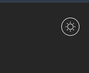
다음과 같은 모습으로 생긴다.
3. 테마 Atom
recoil을 통해 테마 값을 전역으로 저장하고 이를local storage에 저장해 동기화한다.
npm i recoil
src/atoms/themeAtom.ts
import { atom } from 'recoil';

// 테마 초기값 로컬 스토리지에서 가져오기
const getInitialTheme = () => {
  const savedTheme = localStorage.getItem('theme');
  // 로컬 스토리지에 key = 'theme' 값 가져옴
  return savedTheme ? (savedTheme as 'light' | 'dark') : 'light';
  // default : light
};

export const themeAtom = atom<'light' | 'dark'>({
  key: 'themeAtom', // atom 고유 ID
  default: getInitialTheme(), // 초기값, 스토리지에서 가져옴
  effects : [ // atom 상태 변화에 따라 사이드 이펙트 설정 함수
    ({ onSet }) => {
      onSet((newTheme) => { // onSet이라는 콜백함수 사용
        localStorage.setItem('theme', newTheme); // theme가 변경될 때마다 로컬 스토리지에 저장
      })
    }
  ]
});- 이를
App.tsx에서 읽어와 저장된 테마로 지정한다.
src/App.tsx
import { useRecoilState } from 'recoil';
import { themeAtom } from './atoms/themeAtom';
import ThemeBtn from './components/ThemeBtn';

...

const App: React.FC = () => {
  const [theme, setTheme] = useRecoilState(themeAtom);

  const toggleTheme = () => {
    setTheme((prevTheme) => (prevTheme === 'light' ? 'dark' : 'light'));
  };

  return (
    <ThemeProvider theme={theme === 'light' ? lightTheme : darkTheme}>
      <GlobalStyle />
      <div className="App">
        <ThemeBtn isDark={theme === 'dark'} toggleTheme={toggleTheme} theme={theme} />
        <h1>Hello, World!</h1>
      </div>
    </ThemeProvider>
  );
};

export default App;index.tsx를RecoilRoot로 감싼다.
src/index.tsx
import { RecoilRoot } from 'recoil';
...
const root = ReactDOM.createRoot(
  document.getElementById('root') as HTMLElement
);
root.render(
  <React.StrictMode>
    <RecoilRoot>
      <App />
    </RecoilRoot>
  </React.StrictMode>
);
...
결과물
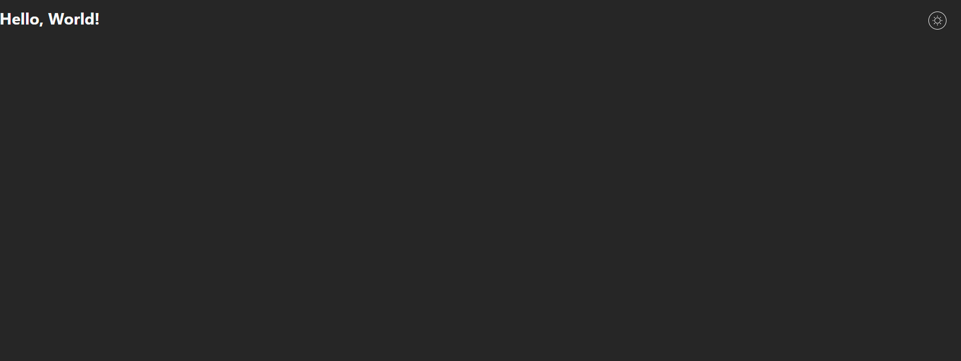
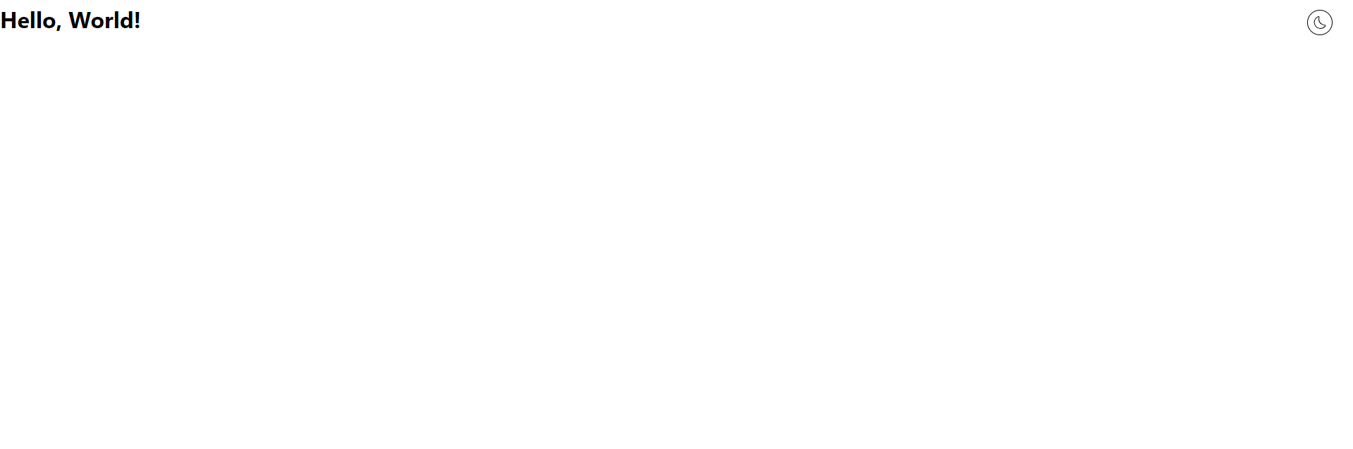
일단 한 발짝 걸었다에 의의를 두겠다...

Being a Modern Project Manager