
0829복습
그리드
- 반응형으로 사용할 html요소들을 둘러싸는 기본 클래스는 container(내부 요소들은 기본적으로 중앙정렬)
container: 고정 너비/ container-fluid: width:100%
row(12개의 칼럼) - 칼럼 클래스는 웹을 사용할 화면에 따라 지정하면 됨
If you choose col-lg, then the columns will stack when the width is < 1200px.
If you choose col-lg, then the columns will become horizontal when the width is >= 1200px. 링크
➡여기서 width는 화면의 너비를 말하는 것 - 칼럼 클래스 마지막에 숫자 col-- 는 12개 중 차지할 칸의 수를 나타낸다고 보면 됨
col-md-11 ➡ width: 91.66666667%; 링크 - 스크린 사이즈에 따라 구역 지정하기
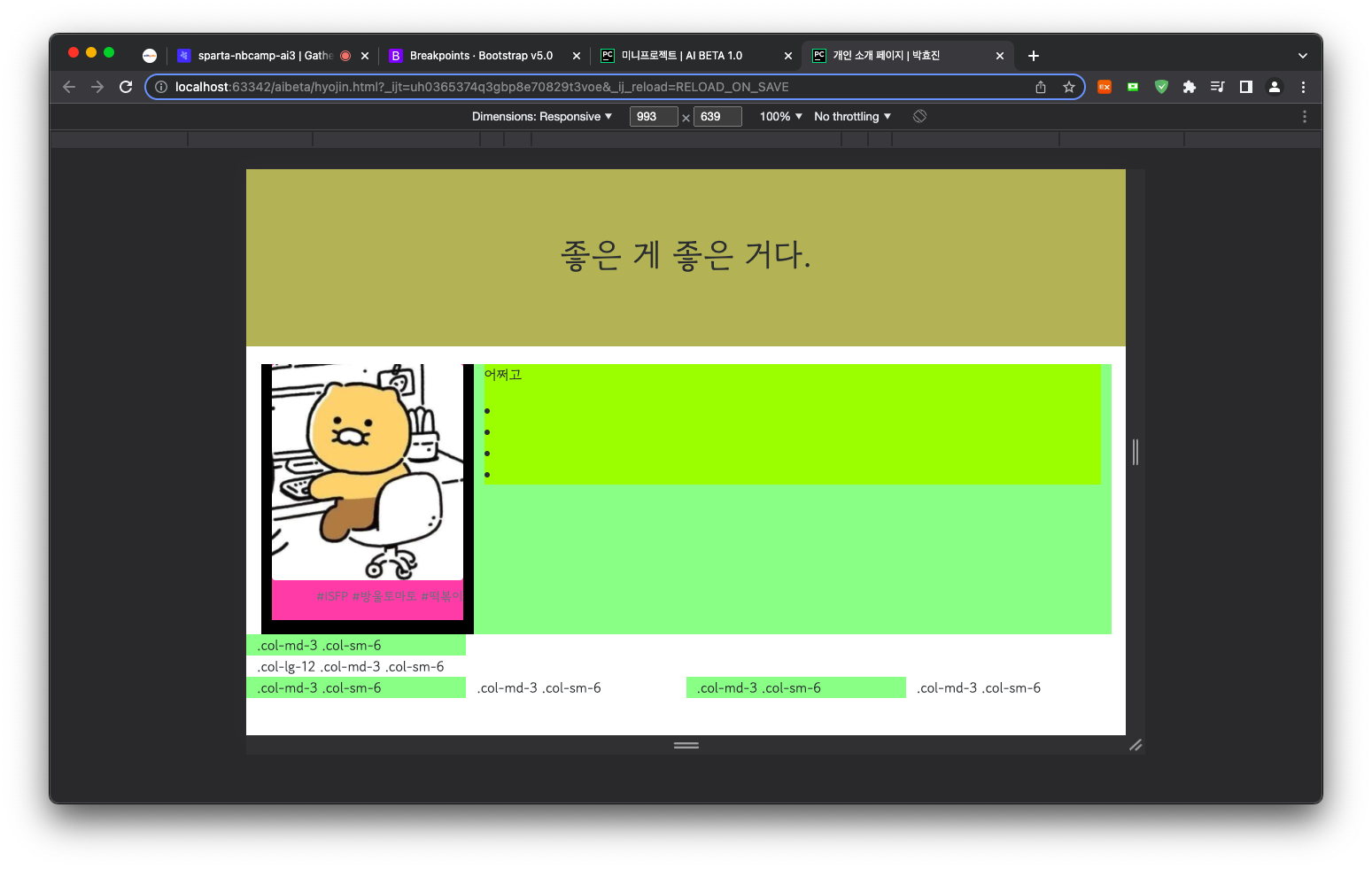
<div class="container-fluid">
    <div class="row">
        <div class="col-md-3 col-sm-6" style="background-color: palegreen;">.col-md-3 .col-sm-6</div>
        <div class="col-lg-12 col-md-3 col-sm-6">.col-lg-12 .col-md-3 .col-sm-6</div>
        <div class="col-md-3 col-sm-6" style="background-color: palegreen;">.col-md-3 .col-sm-6</div>
        <div class="col-md-3 col-sm-6">.col-md-3 .col-sm-6</div>
        <div class="col-md-3 col-sm-6" style="background-color: palegreen;">.col-md-3 .col-sm-6</div>
        <div class="col-md-3 col-sm-6">.col-md-3 .col-sm-6</div>
    </div>
</div>
xs~576(미만,px)/sm 576~768/md 768~992/lg 992~1200/xl 1200~1400/xxl 1400~
- 칼럼 분리하기
<!-- Force next columns to break to new line at md breakpoint and up -->
    <div class="w-100 d-none d-md-block"></div>
이미지크기
요소의 위치
- position 종류:
relative 요소 스스로(static) 기준으로 배치
absolute 부모 클래스 position기준으로 배치
➡부모 position이 없는 경우 뷰포트 기준 fixed 뷰포트 기준으로 배치
static 기준 없음
stickey 스크롤 영역 기준으로 배치
➡ static을 제외하고는 top,bottom,left,right로 위치 지정 가능

looooggi