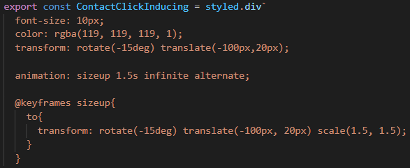
포트폴리오 사이트 하단의 Contact 섹션에서, 아이콘에 주소 복사나 링크 연결을 해두었는데 아무도 클릭을 하지 않을 것 같아서.. 애니메이션을 이용해 간단하게 클릭 유도 요소를 넣어두었습니다! animation 속성은 전에 정리해보았지만, @keyframes 규칙을 처음 봤으므로 다시 한 번 작성합니다😎
1. CSS animation
- 왜 JS 사용하지 않고 CSS로?
: 브라우저는 애니메이션의 성능을 효율적으로 최적화 할 수 있다. 예를 들어, 현재 안보이는 element에 대한 animation은 업데이트 주기를 줄여 부하를 최소화한다. - 하위 속성
animation-delayelement 로드 후 언제 시작할지animation-direction애니메이션 종료 후 진행 방향animation-duration한 싸이클이 얼마에 걸쳐 일어날지animation-iteration-count몇 번 반복될지(infinite 지정 가능)animation-name중간 상태 지정 -> @keyframes 규칙 이용animation-play-state멈추거나 다시 시작animation-timing-function중간 상태 전환의 시간 간격animation-fill-mode시작 전이나 끝난 후 적용할 값
-> 중간 상태는 따로 @keyframes 규칙 이용하여 기술하고, animation-name에 적어주어야 함!
2. @keyframes
: 애니메이션에 두 개 이상의 중간 상태 기술
 p {
  animation-duration: 3s;
  animation-name: slidein;
}

@keyframes slidein {
  from {
    margin-left: 100%;
    width: 300%
  }

  to {
    margin-left: 0%;
    width: 100%;
  }
}
+) percentage도 이용 가능
75% {
  font-size: 300%;
  margin-left: 25%;
  width: 150%;
}
참고자료
https://developer.mozilla.org/ko/docs/Web/CSS/CSS_Animations/Using_CSS_animations

2년차 프론트엔드 개발자의 소소한 기록을 담습니다 :-)