
일반적으로 웹페이지의 레이아웃은 css의 display, float, position 등과 같은 속성을 사용해 구현하는데, 이러한 속성을 사용할 경우 레이아웃을 표현하는 것은 굉장히 복잡해 진다.
이러한 복잡한 레이아웃을 간단하게 구현할 수 있게 나온 것이 css3에 추가된 flexbox입니다. flexbox를 사용할 경우 요소의 크기와 순서를 유연하게 배치할 수 있다.
1) FlexBox(flex)
- flexbox 인터페이스 내의 아이템 간 공간 배분과 강력한 정렬 기능을 제공하기 위한 1차원 레이아웃 모델로 설계
- 가로정렬, 세로정렬 = 1차원정렬
- 둘 중 하나만
- flexbox를 1차원이라 칭하는 것은 레이아웅ㅅ을 다룰 때 한 번에 하나의 차원(행이나 열)만을 다룬다는 뜻이다.
- 기존 방식보다 훻씬 강력하고 편리한 기능
- float을 대체
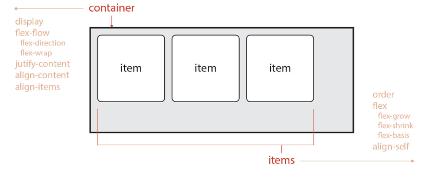
- 부모 요소인 container를 Flex Container(플렉스 컨테이너) 라고 한다.
- 정렬하고자하는 요소의 부모
- 자식 요소인 item들을 Flex Item(플렉스 아이템) 이라고 한다.
- 컨테이너가 Flex의 영향을 받는 부모요소, 설정된 속성에 따라 각각의 아이템들이 배치
- max-axis(중심축): flex container 방향에 따라 다르다.
- cross-axis(반대축): max-axis(중심축)의 반대방향
- Ex) flex-direction: row; → 중심축:가로방향, 반대축:세로방향
2) 부모(container)한테 속성설정
-
display: flex;
-
display: inline-flex;
-
flex-direction
- 가로정렬할래? 세로정렬할래? ⇒ 중심축을 어떻게 할래?
- flex-direction: row; → 기본이 가로방향
- flex-direction: column; → 세로방향
- flex-direction: column -reverse; → 세로방향, 순서반대
-
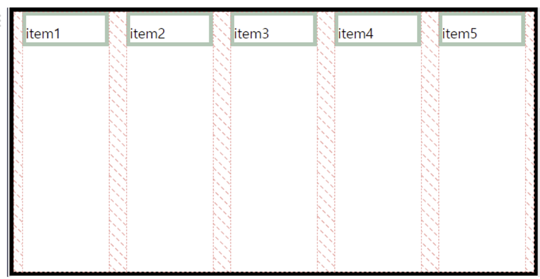
flex-wrap
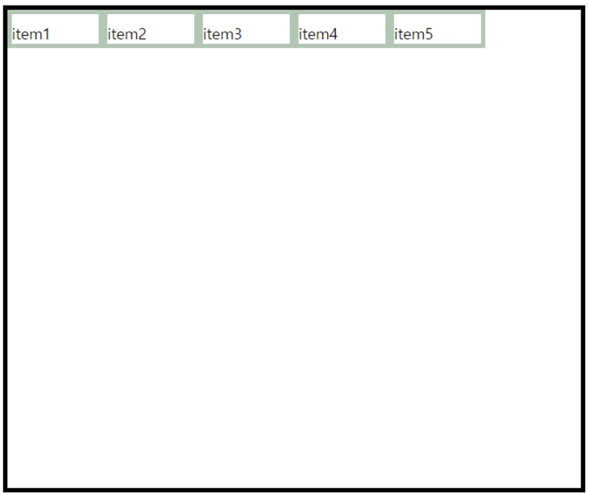
- flex-wrap: nowrap; → 기본이 넘치지 않는다.
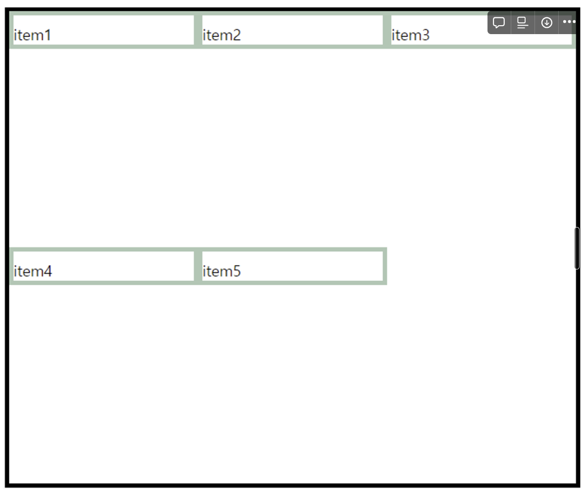
- flex-wrap: wrap;하위요소가 많으면 다음 행으로 넘쳐 흐른다.
- 넘치지 않는 모습
- 넘쳐 흐르는 모습
-
flec-flow
-
justify-content⭐⭐⭐
- 중심축 방향으로 item을 정렬한다,
- gnb(가로정렬)에서 가장 많이 사용한다.
- flex-direction: row; 상태에서
- justify-content: flex-start; → 하위요소가 기본배치(앞 부터)(기본)
- justify-content: flex-end; → 하위요소가 기본배치(끝 부터)
- justify-content: center; → 하위요소가 기본배치(가운데부터)
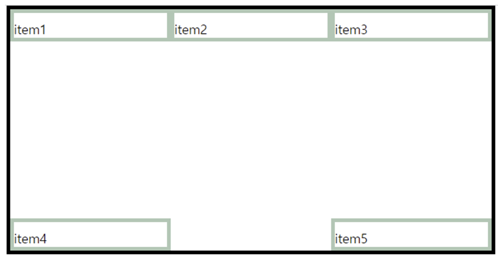
- justify-content: space-between; → 하위요소가 처음과 끝 사이에 같은 간격으로 배치(가장 많이 사용한다.)
- 같은 간격으로 배치된 모습
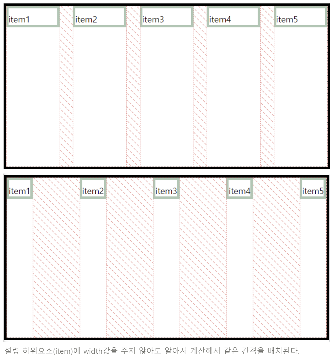
- 같은 간격으로 배치된 모습
-
align-content
- 반대축에서 item배치 → 높이 설정
- 한줄인 경우 align-content
- align-items: center; → 반대축 가운데
- 확인
- 확인
- align-items: baseline; → 텍스트 중심
- align-items: strectch; → 기본 **height: auto일 경우는 container height의 100%이다.
- align-items: flex-start; → 처움
- align-items: flex-end; → 끝
-
align-items
-
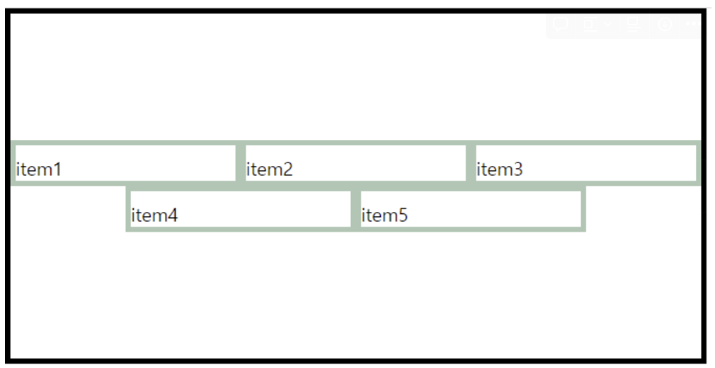
두 줄인 경우 align-items
-
align-content: space-between; → 반대축 끝에 items를 배치하고 간격 같게
- 확인
- 확인
-
align-content: center; → 반대축 중간에 items를 배치
-
확인
justify-content: center;
align-content: center;
-
-
3)자식(item)요소에 속성설정
-
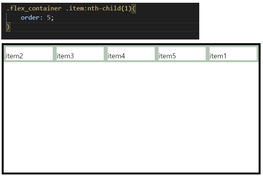
order
- 1, 2, 3 → item의 순서를 지정
- 기본 0
- 큰 수가 뒤로 간다.
- 1 → 5순서
-
flex-grow
- 기본: 0, 원래지정값
- 1, 2, 3 크기가 상대적으로 변한다.
- 같은 비율로 변화
- 커진다.
-
flex-shrink
- 기본: 0
- 1, 2, 3 items이 줄어들었을 때 상대적으로 변한다.
- 2 → 2배로 줄어든다.
- 작아진
-
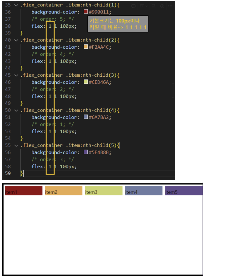
****flex 1 1 100px;**** ⭐
- flex: flex-grow flex-shrink flex-basis
- flex자식요소크기를 설정한다.
- 예시
- flex: 0 0 300px;
- 해당 item은 고정값이 된다.
-
flex-basis
- auto (지정값)
- 30% 지정값대로 상대적으로 변화
-
align-self
- 특정 item의 위치를 배치
-
**flex: 1**
- 선택된 item 전체의 상대비율이 1이다.
- 부모에 대해서 동일비율
5) 실습
- html
<!DOCTYPE html> <html> <head> <meta charset="UTF-8"> <title>float</title> <link rel="stylesheet" href="css/flex_ex3.css" /> </head> <body> <div id="wrap"> <div class="header"> <div class="nav"> <h1 class="logo"><a href="#">LOGO</a></h1> <div class="gnb"> <ul> <li><a href="#">HOME</a></li> <li><a href="#">ADMIN</a></li> <li><a href="#">SHOPMALL</a></li> <li><a href="#">JOIN</a></li> <li><a href="#">LOGIN</a></li> </ul> </div> </div> </div> <div class="container"> <div class="sections"> <div class="section sec1">SECTION1</div> <div class="section sec2">SECTION2</div> </div> </div> <div class="footer"> <div class="fcon"> 주소 저작권 </div> </div> </div> </body> </html> - css
@import url(common/reset.css);

#wrap {
    width: 100%;
    height: auto;
    border: 5px solid #000000;
    box-sizing: border-box;
}

/* header시작 */
.header {
    width: 100%;
    height: auto;
    /* border: 5px solid orange; */
    box-sizing: border-box;
    padding: 20px 0;

}

.header .nav {
    max-width: 1200px;
    height: auto;
    margin: 0 auto;
    box-sizing: border-box;
    background-color: white;
    display: flex;
    justify-content: space-between;
}

.header .nav h1.logo {
    width: 120px;
    height: 60px;
    /* border: 5px solid#c72c1b; */
    box-sizing: border-box;
    text-align: center;
    line-height: 60px;
    background-color: #333D79;
    color: #FCF6F5;
}

.header .nav h1.logo a {
    color: inherit;
    /* 부모요소속성 상속 */
}

.header .nav .gnb {
    width: 500px;
    height: auto;
    /* border: 5px solid white; */
}

.header .nav .gnb>ul {
    display: flex;
    justify-content: space-evenly;
}

.header .nav .gnb>ul>li {
    width: 20%;
    height: 60px;
    /* border: 5px solid #c72c1b; */
    box-sizing: border-box;
    text-align: center;
    line-height: 60px;
    background-color: white;
    /* 0.3초 동안 효과를 적용 */
    transition: all 0.3s;
}

.header .nav .gnb>ul>li:hover {
    background-color: #333D79;
    font-size: 16px;
    color: #FAEBEF;
    /* 손모양 커서 */
    cursor: pointer;
}

.header .nav .gnb>ul>li:hover a {
    color: inherit;
}

.header .nav .gnb>ul>li a {
    color: #222222;
}

/* container시작 */
.container {
    /* clear:both; 성질을 없애준다.*/
    width: 100%;
    height: auto;
    /* border: 5px solid #2BAE66; */
    box-sizing: border-box;
    /* background-color: #2BAE66; */
    /*      위 좌/우 아래 */
    padding: 30px 0 30px;
}
.container .sections{
    width: 100%;
    max-width: 1600px;
    height: auto;
    /* border: 5px solid black; */
    box-sizing: border-box;
    margin: 0 auto;
    /*    위/아래 좌/우 */
    padding: 20px 20px;
    box-shadow: 2px 2px 8px #cccccc;
}
.container .sections .section{
    /* !important 동일 스타일 설정이 우선 적용*/
    border: 5px solid #333D79!important;
    box-sizing: border-box;
    font-size: 40px;
    text-align: center;
}
.container .sections .section.sec1{
    width: 100%;
    height: 400px;
    border: 5px solid #07553B;
    box-sizing: border-box;
    /* margin: 나하고 다른 컨텐츠와의 여백 */
    /* 다른 컨텐츠 sec1을 기준으로 아래에 있음 */
    margin-bottom: 20px;
    line-height: 400px;
}
.container .sections .section.sec2{
    width: 100%;
    max-width: 1200px;
    height: 300px;
    margin: 0 auto;
    line-height: 300px;
}
/* footer시작 */
.footer {
    width: 100%;
    height: auto;
    /* border: 5px solid #0063B2; */
    box-sizing: border-box;
    background-color: white;
}
.footer .fcon{
    width: 100%;
    max-width: 1200px;
    height: 200px;
    margin: 0 auto;
    box-sizing: border-box;
    color: black;
    font-size: 30px;
    text-align: center;
    line-height: 200px;
}

개발을 개발괴발하지 않기 위한 노력