CSS Box Model
CSS Box Model
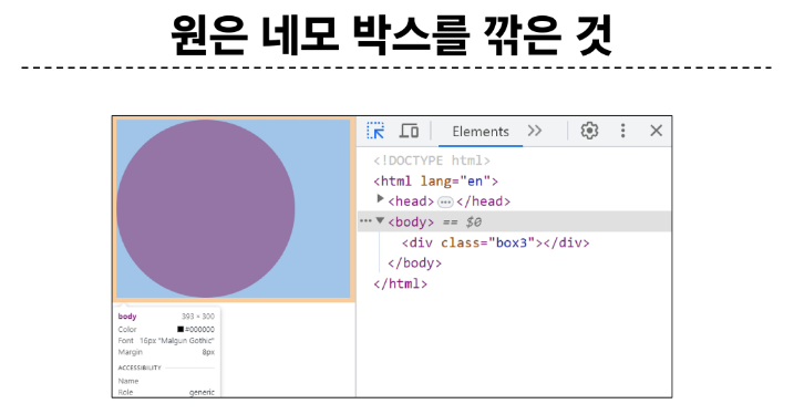
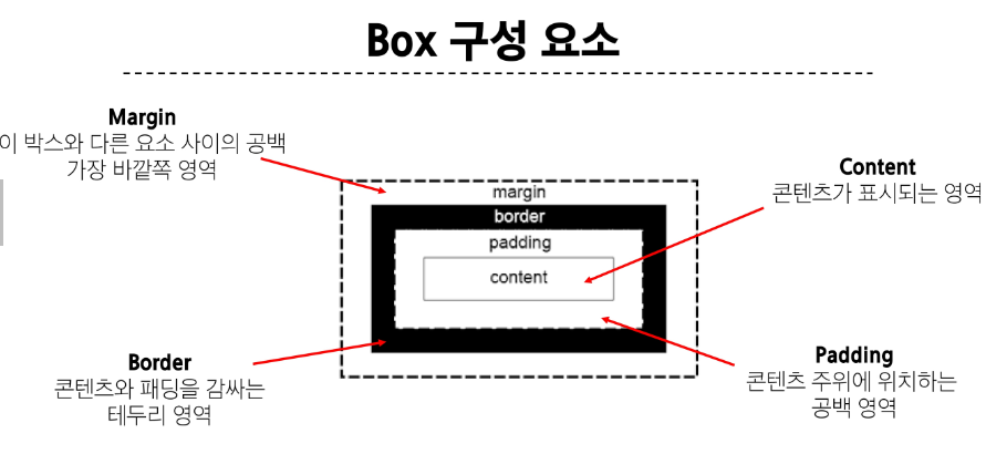
모든 HTML 요소를 사각형 박스로 표현하는 개념
CSS Box Model
모든 HTML 요소를 사각형 박스로 표현하는 개념
▷ 내용 (content), 안쪽 여백 (padding), 테두리 (border), 외부 간격(margin)으로 구성되는 개념
<!DOCTYPE html>
<html lang="en">
<head>
<meta charset="UTF-8">
<meta http-equiv="X-UA-Compatible" content="IE=edge">
<meta name="viewport" content="width=device-width, initial-scale=1.0">
<title>Document</title>
<style>
.box1 {
width: 200px;
padding-left: 25px;
padding-bottom: 25px;
margin-left: 25px;
margin-top: 50px;
border-width: 3px;
border-style: solid;
border-color: black;
}
.box2 {
width: 200px;
padding: 25px 50px;
margin: 25px auto;
border: 1px dashed black;
}
</style>
</head>
<body>
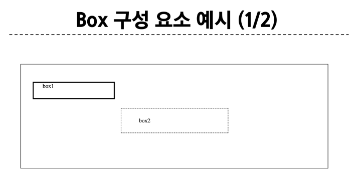
<div class="box1">box1</div>
<div class="box2">box2</div>
</body>
</html>
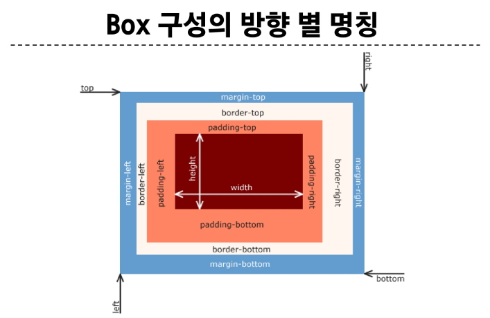
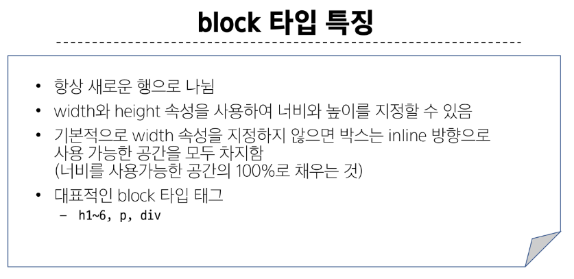
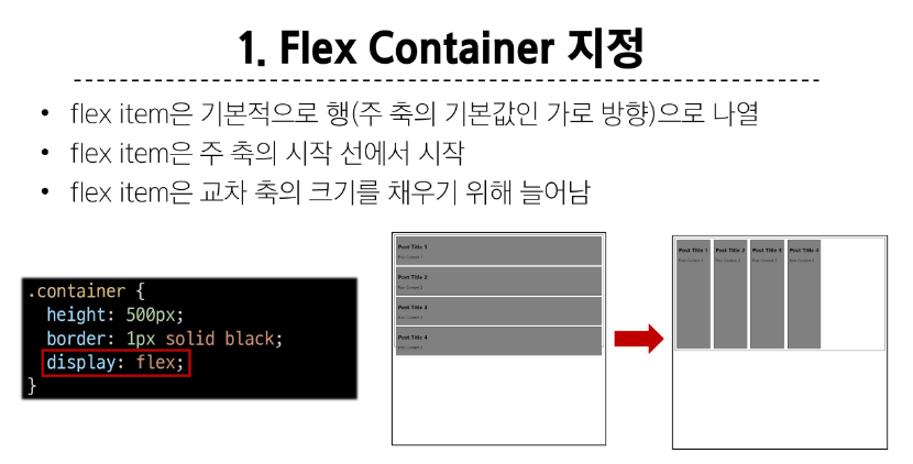
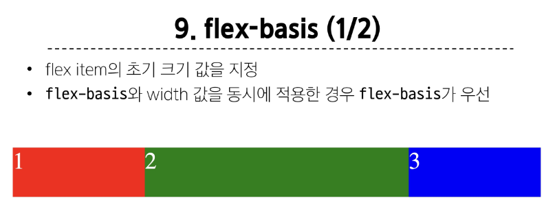
width & height 속성
요소의 너비와 높이를 지정
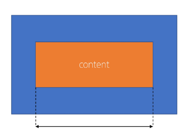
이때 지정되는 요소의 너비와 높이는 콘텐츠 영역을 대상으로 함
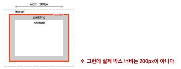
CSS가 width 값을 계산하는 기준
CSS는 border가 아닌 content의 크기를 width 값으로 지정
<!DOCTYPE html>
<html lang="en">
<head>
<meta charset="UTF-8">
<meta http-equiv="X-UA-Compatible" content="IE=edge">
<meta name="viewport" content="width=device-width, initial-scale=1.0">
<title>Document</title>
<style>
.box {
width: 100px;
border: 2px solid black;
padding: 10px;
margin: 20px;
background-color: yellow;
}
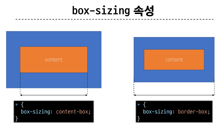
.content-box {
box-sizing: content-box;
}
.border-box {
box-sizing: border-box;
}
</style>
</head>
<body>
<div class="box content-box">content-box</div>
<div class="box border-box">border-box</div>
</body>
</html>
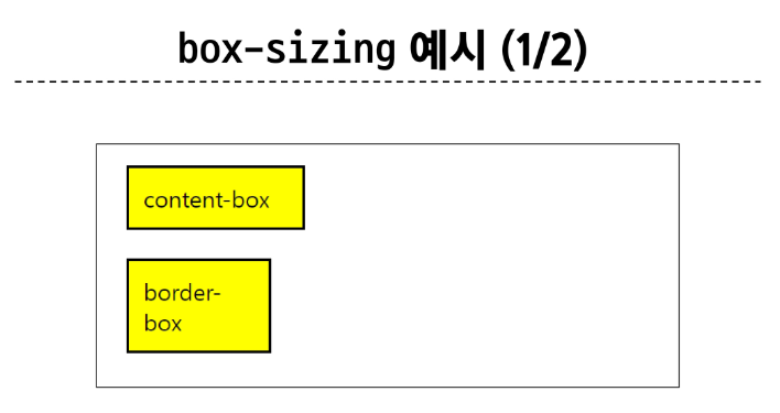
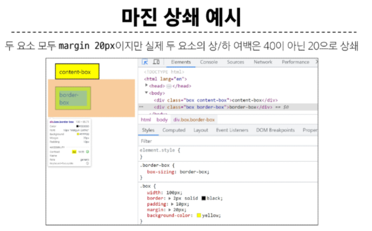
border box로 작업해야 박스 사이즈를 명확히 할 수 있음
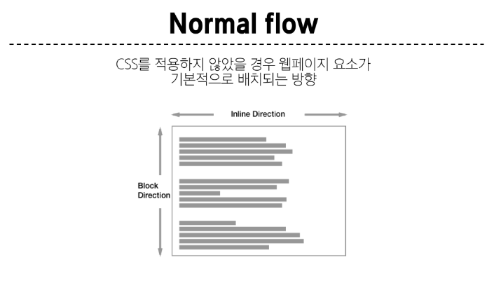
CSS를 적용하지 않았을 경우, 무조건 좌측 상단에서부터 요소들이 배치됨(글, 사진 무관)
block direction 무조건 아랫방향으로 영향 오른쪽 모든 요소를 차지하고 있기 때문에
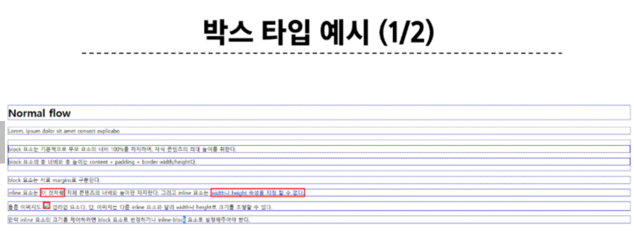
정렬의 주체에 중심을 두지 않고 영역을 어떻게 나눌지를 고민해야 함
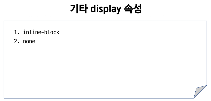
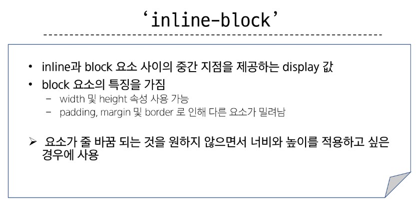
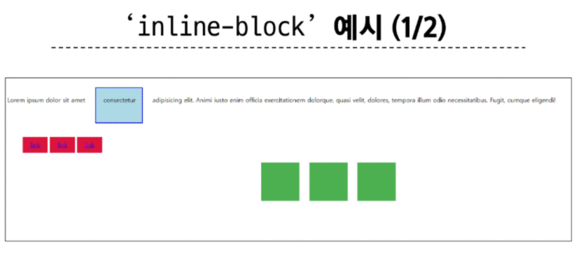
기타 display 속성
<!DOCTYPE html>
<html lang="en">

<head>
  <meta charset="UTF-8">
  <meta http-equiv="X-UA-Compatible" content="IE=edge">
  <meta name="viewport" content="width=device-width, initial-scale=1.0">
  <title>Document</title>
  <style>
    span {
      margin: 20px;
      padding: 20px;
      width: 80px;
      height: 50px;
      background-color: lightblue;
      border: 2px solid blue;
      /* display: inline-block; */
    }

    ul>li {
      background-color: crimson;
      padding: 10px 20px;
      /* display: inline-block; */
    }


    .box {
      /* display: inline-block; */
      width: 100px;
      height: 100px;
      background-color: #4CAF50;
      margin: 10px;
    }

    .container {
      /* text-align: center; */
    }
  </style>
</head>

<body>
  <!-- 1. 이제 다른 요소를 밀어낼 수 있는 span -->
  <p>Lorem ipsum dolor sit amet <span>consectetur</span> adipisicing elit. Animi iusto enim officia exercitationem
    dolorque, quasi velit, dolores, tempora illum odio necessitatibus. Fugit,
    cumque eligendi!</p>

  <!-- 2. 리스트 요소를 가로로 정렬 -->
  <ul>
    <li><a href="#">link</a></li>
    <li><a href="#">link</a></li>
    <li><a href="#">link</a></li>
  </ul>

  <!-- 3. div 요소를 가로로 정렬 -->
  <div class="container">
    <div class="box"></div>
    <div class="box"></div>
    <div class="box"></div>
  </div>
</body>

</html>

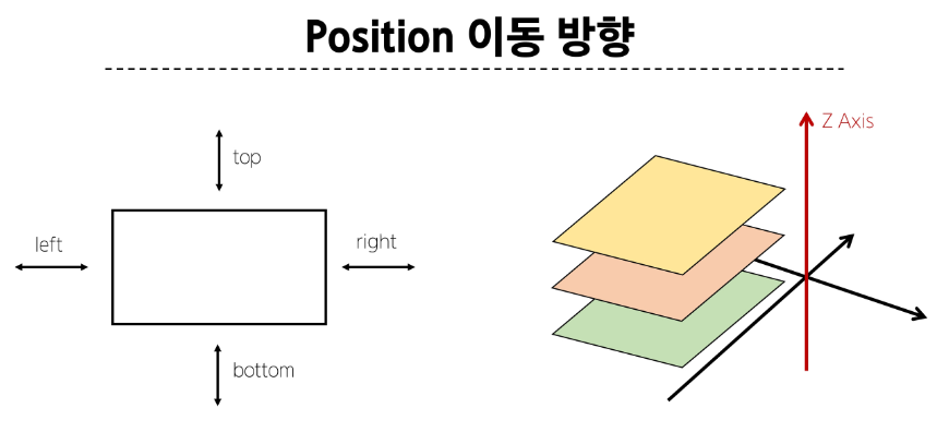
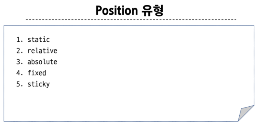
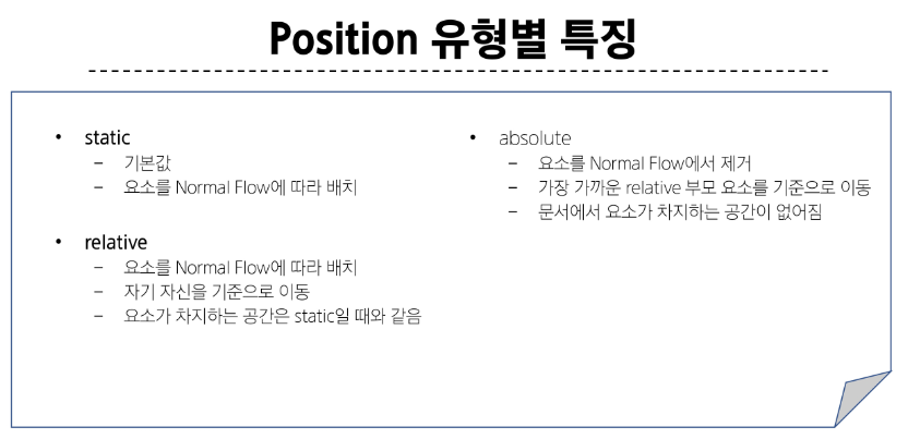
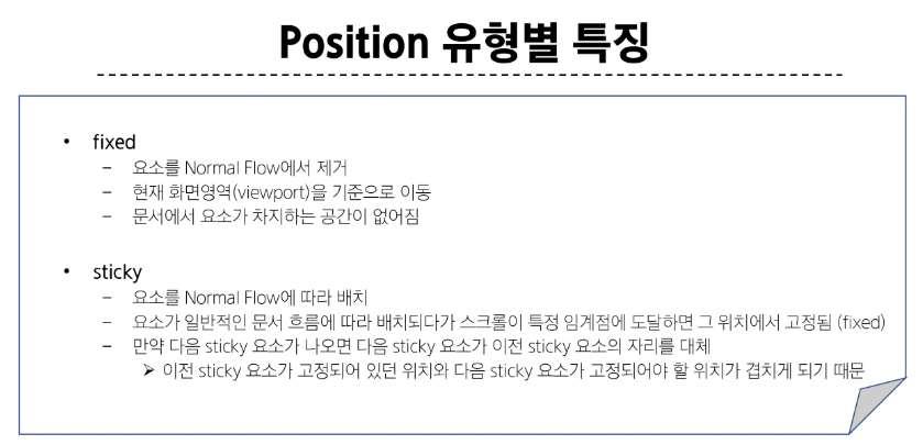
CSS Position
CSS Layout
각 요소의 위치와 크기를 조정하여 웹 페이지의 디자인을 결정하는 것
Display, Position, Float, Flexbox 등
CSS Position
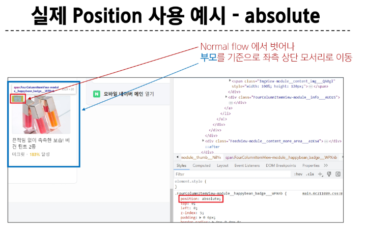
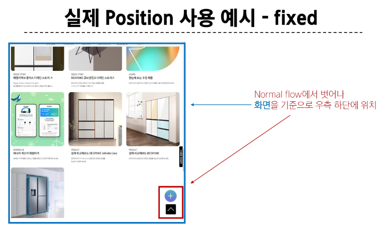
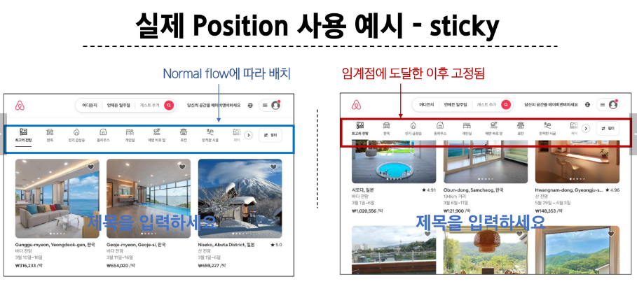
요소를 Normal Flow에서 제거하여 다른 위치로 배치하는 것
다른 요소 위에 올리기, 화면의 특정 위치에 고정시키기 등
absolute의 기준 필요 : static이 아닌 부모 찾음
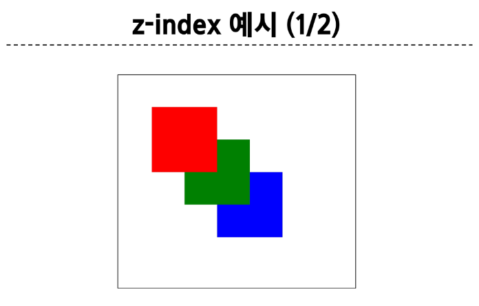
z-index
요소가 겹쳤을 때 어떤 요소 순으로 위에 나타낼 지 결정
z-index 특징
정수 값을 사용해 Z 축 순서를 지정
더 큰 값을 가진 요소가 작은 값의 요소를 덮음
<!DOCTYPE html>
<html lang="en">

<head>
  <meta charset="UTF-8">
  <meta http-equiv="X-UA-Compatible" content="IE=edge">
  <meta name="viewport" content="width=device-width, initial-scale=1.0">
  <title>Document</title>
  <style>
    .container {
      position: relative;
    }

    .box {
      position: absolute;
      width: 100px;
      height: 100px;
    }

    .red {
      background-color: red;
      top: 50px;
      left: 50px;
      /* z-index: 3; */
    }

    .green {
      background-color: green;
      top: 100px;
      left: 100px;
      /* z-index: 2; */
    }

    .blue {
      background-color: blue;
      top: 150px;
      left: 150px;
      /* z-index: 1; */
    }
  </style>
</head>

<body>
  <div class="container">
    <div class="box red"></div>
    <div class="box green"></div>
    <div class="box blue"></div>
  </div>
</body>

</html>
참고
Position의 역할
전체 페이지에 대한 레이아웃을 구성하는 것이 아닌 페이지 특정 항목의 위치를 조정하는 것
CSS Flexbox
CSS Flexbox
요소를 행과 열 형태로 배치하는 1차원 레이아웃 방식
▶ 공간 배열 & 정렬

구성 요소
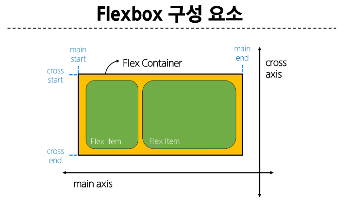
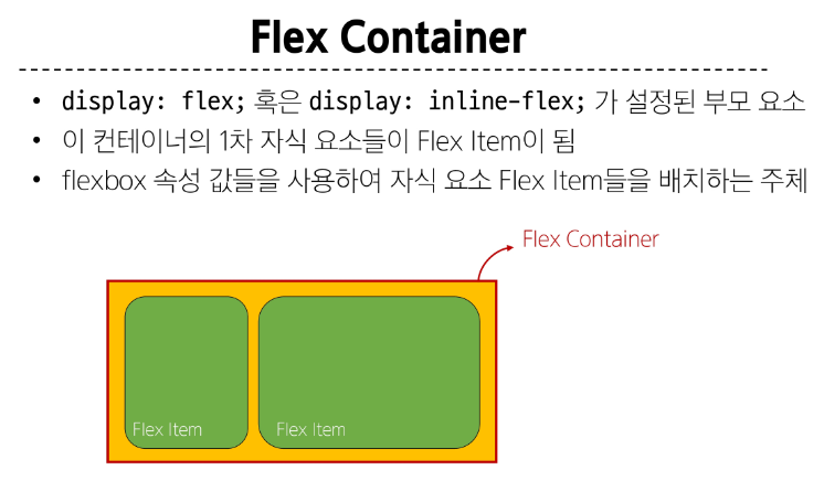
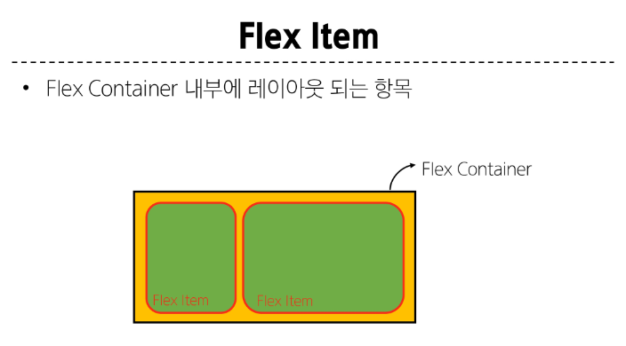
Flex container가 컨트롤 할 것임
레이아웃 구성

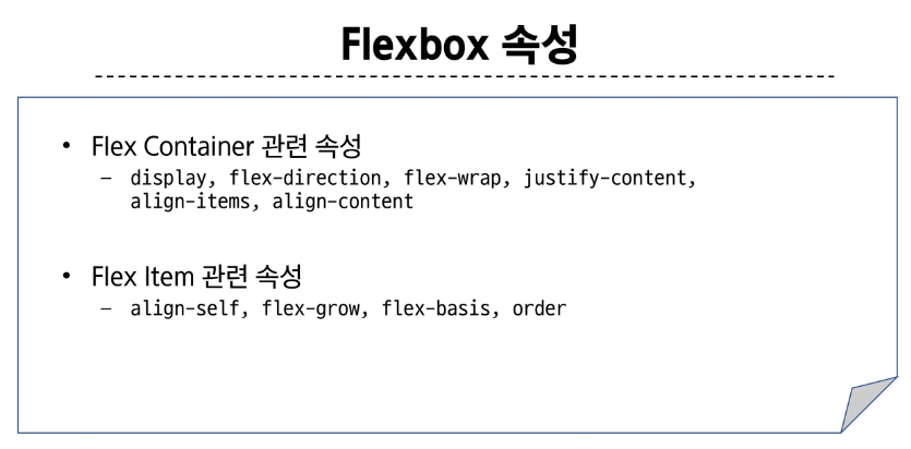
목적에 따른 속성 분류
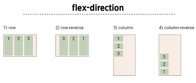
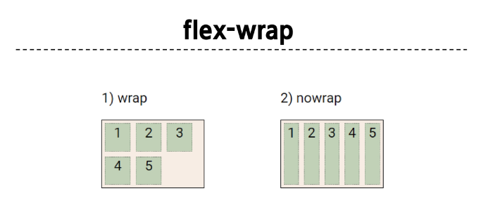
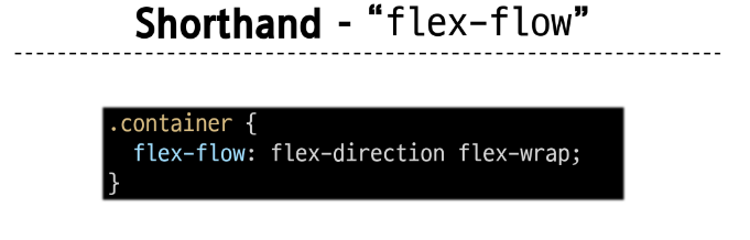
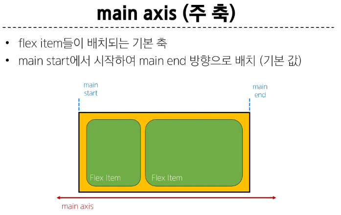
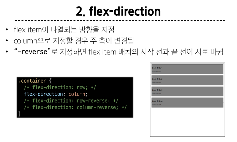
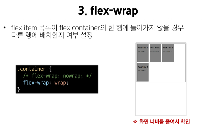
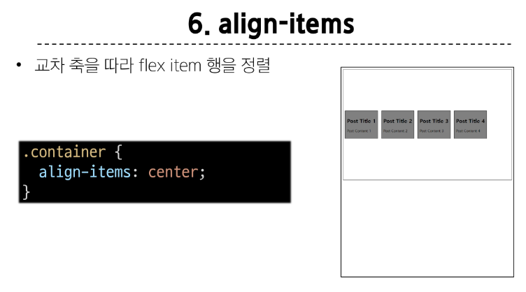
배치 : flex direction, flex-wrap
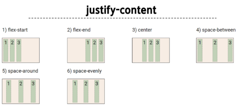
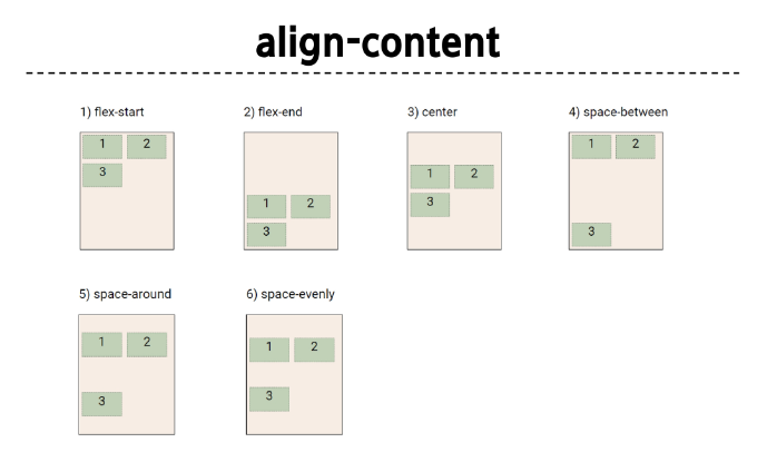
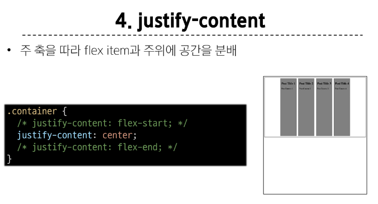
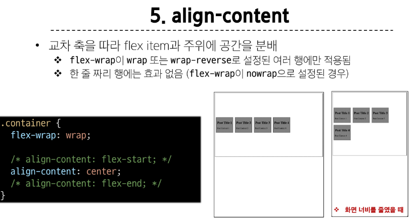
공간 분배 : justify-content, align-content
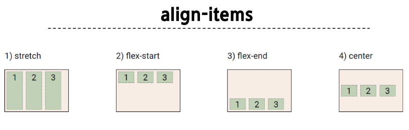
정렬 : align-items, align-self
속성명 tip
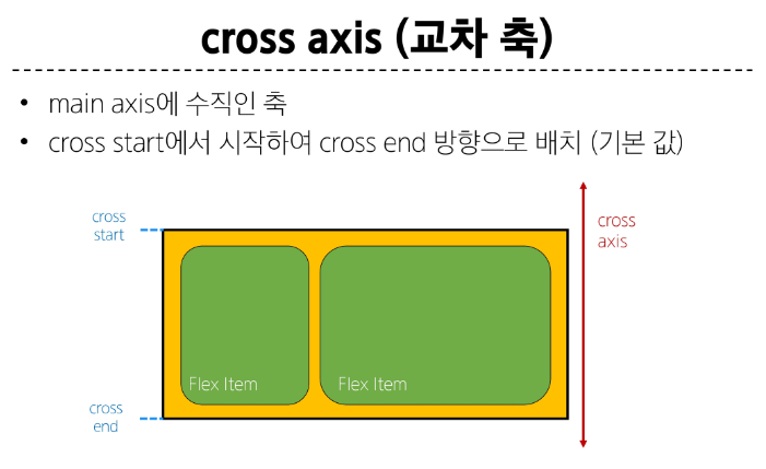
justify : 주축
align : 교차축
contents → 여러줄
items → 한줄
self → 요소 한개
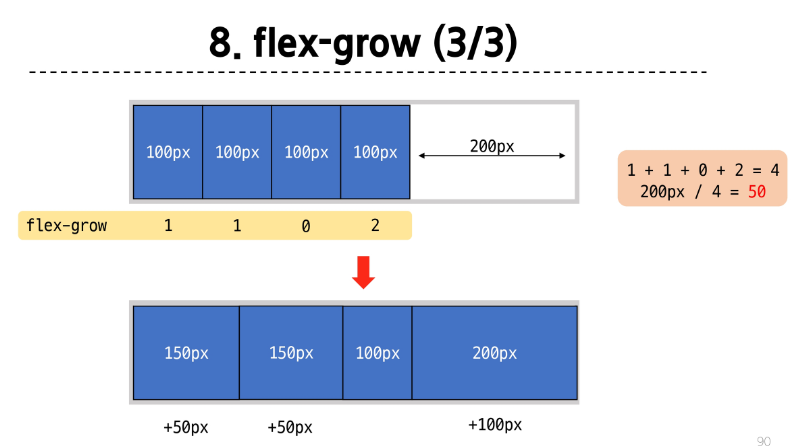

<!DOCTYPE html>
<html lang="en">

<head>
  <meta charset="UTF-8">
  <meta http-equiv="X-UA-Compatible" content="IE=edge">
  <meta name="viewport" content="width=device-width, initial-scale=1.0">
  <title>Document</title>
  <style>
    .container {
      width: 100%;
      display: flex;
    }

    .item {
      height: 100px;
      color: white;
      font-size: 3rem;
    }

    .item-1 {
      background-color: red;
      flex-basis: 200px;
    }

    .item-2 {
      background-color: green;
      flex-basis: 400px;
    }

    .item-3 {
      background-color: blue;
      flex-basis: 200px;
    }
  </style>
</head>

<body>
  <div class="container">
    <div class="item item-1">1</div>
    <div class="item item-2">2</div>
    <div class="item item-3">3</div>
  </div>
</body>

</html>
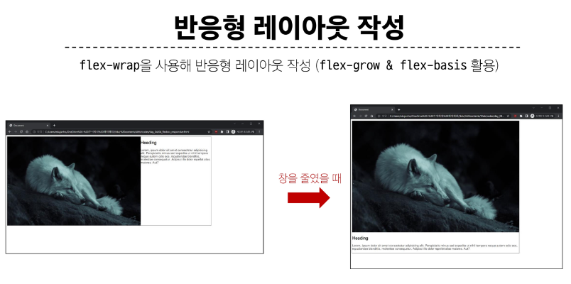
flex-wrap 응용
반응형 레이아웃
다양한 디바이스와 화면 크기에 자동으로 적응하여 콘텐츠를 최적으로 표시하는 웹 레이아웃 방식
<!DOCTYPE html>
<html lang="en">

<head>
  <meta charset="UTF-8">
  <meta http-equiv="X-UA-Compatible" content="IE=edge">
  <meta name="viewport" content="width=device-width, initial-scale=1.0">
  <title>Document</title>
  <style>
    .card {
      width: 80%;
      border: 1px solid black;
      display: flex;
      flex-wrap: wrap;
    }

    img {
      width: 100%;
    }

    .thumbnail {
      flex-basis: 700px;
      flex-grow: 1;
    }

    .content {
      flex-basis: 350px;
      flex-grow: 1;
    }
  </style>
</head>

<body>
  <div class="card">
    <img class="thumbnail" src="images/sample.jpg" alt="sample">
    <div class="content">
      <h2>Heading</h2>
      <p>Lorem, ipsum dolor sit amet consectetur adipisicing elit. Perspiciatis minus sed expedita ut nihil tempora
        neque autem odio eos, repudiandae blanditiis, molestiae consequatur. Adipisci illo dolor repellat alias
        maiores.
        Aut?</p>
    </div>
  </div>
</body>

</html>
정리