Syntax(구문)
-webkit-animation: name || duration || timing-function || delay || iteration- count || direction || fill-mode || play-state [,...];name : 애니메이션 이름
@-webkit-keyframes 속성에서 설정한 애니메이션의 이름이다. 이름을 설정해야 애니메이션을 재생할 수 있다.
duration : 애니메이션을 한 번 재생하는 데 걸리는 시간
- 0 : 애니메이션을 재생하지 않는다(기본값).
- 숫자와 단위 : 애니메이션을 한 번 재생하는 데 걸리는 시간이다. 초(s)와 밀리초(ms) 단위를 사용한다. 단위가 없거나 값이 음수면 애니메이션을 재생하지 않는다.
timing-function : 애니메이션의 단계별 재생 속도
- ease : 애니메이션이 시작해 서서히 빨라지다 중간부터 다시 서서히 느려져 종료된다(기본값).
- ease-in : 애니메이션이 시작해 점점 빨라진다.
- ease-out : 애니메이션이 빨리 시작되고 점점 느려진다.
- ease-in-out : 애니메이션이 서서히 시작하고 서서히 종료된다. 시작할 때의 속도는 ease-in 값을 적용했을 때와 같고, 종료할 때의 속도는 ease-out 값을 적용했을 때와 같다.
- linear : 애니메이션을 처음부터 끝까지 일정한 속도로 재생한다.
- cubic-bezier(x1,y1,x2,y2) : 큐빅 베지어cubic-bezier 곡선의 좌표 값을 직접 입력해 애니메이션의 단계별 재생 속도를 설정한다.
delay : 애니메이션 시작을 지연할 시간
- 0: 속성을 적용하자마자 애니메이션을 시작한다(기본값).
- now :속성을 적용하자마자 애니메이션을 시작한다. 0으로 설정한 것과 같다. iOS2.0부터 사용할 수 있다.
- 숫자와 단위: 설정한 시간이 지난 뒤에 애니메이션을 시작한다. 사용할 수 있는 단위는 초(s)와 밀리초 (ms)다. 값이 양수면 속성을 적용한 순간부터 시간을 계산해 애니메이션 재생을 지연한다. 값이 음수면 속성을 적용한 순간 바로 애니메이션을 실행하지만, 지정한 시간이 지난 뒤의 장면부터 애니메이션을 재 생한다. 예를 들어, 값이 ‘-1s’면 1초가 지난 뒤의 장면부터 애니메이션을 재생한다.
iteration-count : 애니메이션을 재생하는 횟수
- 숫자: 설정한 횟수만큼 애니메이션을 재생한다. 기본값은 1이다. 숫자가 소수면 애니메이션을 재생하는 도중에 첫 번째 프레임으로 돌아가 멈춘다. 숫자가 음수면 애니메이션을 재생하지 않는다.
- infinite : 애니메이션을 무한으로 반복한다.
direction : 애니메이션 재생 방향
-
@-webkit-keyframes 속성의 from에 설정한 스타일에서 to에 설정한 스타일로 재생하는 것이 순방향이고, to에 설정한 스타일에서 from에 설정한 스타일로 재생하는 것이역방향이다.
-
normal : 애니메이션을 순방향으로 재생한다(기본값). 재생이 한 번 끝나면 첫 번째 프레임부터 다시 시작한다.
-
alternate : 순방향으로 애니메이션을 시작해 역방향과 순방향으로 번갈아 애니메이션을 재생한다. 홀수 번째로 재생할 때는 순방향으로 재생하고, 짝수 번째로 재생할 때는 역방향으로 재생한다.
-
reverse : 애니메이션을 역방향으로 재생한다. 재생이 한 번 끝나면 마지막 프레임부터 다시 시작한다.
-
alternate-reverse : 역방향으로 애니메이션을 시작해 순방향과 역방향으로 번갈아 애니메이션을 재생한다. 홀수 번째로 재생할 때는 역방향으로 재생하고, 짝수 번째로 재생할 때는 순방향으로 재생한다.
fill-mode : 애니메이션 재생의 시작과 끝에 적용할 스타일
- none: 애니메이션을 재생하기 전이나 재생한 후에는 요소에 기본으로 설정한 스타일을 적용한다(기본값. 애니메이션 효과는 애니메이션에 정의된 시간동안만 적용된다.
- forwards : 애니메이션 재생이 끝난 뒤에 마지막 프레임에 설정한 스타일을 적용한다.
- backwards : -webkit-animation-delay 속성으로 애니메이션 재생을 지연하는 동안에도 첫 번째 프레임에 설정한 스타일을 적용한다.
- both : -webkit-animation-delay 속성으로 애니메이션 재생을 지연하는 동안에도 첫 번째 프레임에 설 정한 스타일을 적용하고, 애니메이션 재생이 끝난 뒤에는 마지막 프레임에 설정한 스타일을 적용한다.
play-state : 애니메이션 재생 여부
- running : 애니메이션을 재생한다(기본값).
- paused : 애니메이션을 정지한다.
Example.
1. 무한으로 회전하는 꽃 애니메이션 예제
<div class="flower">
  <img src="https://raw.githubusercontent.com/jaiyah77/Library77/gh-pages/flower.png"  width="100px" height="100px">
</div>

<style>
.flower{
  width:100px;
  height:100px;
  -webkit-animation:flower 3s linear infinite;
}
@-webkit-keyframes flower{
  0%{
    -webkit-transform:rotate(0deg);
    }
  100%{
    -webkit-transform:rotate(360deg);
    }
}

===>
-webkit-animation: flower 3s linear 0s infinite normal none running;
</style>
속성값을 애니메이션 이름(flower)과 재생 속도(linear), 시간(3s), 반복 횟수(infinite)만 적용 했지만 실제 브라우저는 지연 시간, 재생 방향, 스타일, 재생 여부를 다음과 같이 기본값으로 적용된다.
2. -webkit-animation-delay 예제 코드
다음 코드는 -webkit-animation-delay 속성을 적용한 예제다. 이 예제는 요소를 클릭하면 지정된 애니메이션을 재생하도록 스크립트가 적용되어 있다.
<div class="zero">0</div>
<div class="now">now</div>
<div class="s">2s</div>
<div class="minus">-1s</div>


<style>
  .zero{
  top:20px;
  animation-delay:0
}
.now{
  top:80px;
  animation-delay:now
}
.s{
  top:140px;
  animation-delay:2s
}
.minus{
  top:200px;
  animation-delay:-1s
}

@-webkit-keyframes boxDelay{
  from{
    left:100px;
  }
  to{
    left:300px;
  }
}


div{
  position:absolute;
  left:100px;
  width:100px;
  height:50px;
  background:#000;
  color:#fff;
  /* animation-name:boxDelay; */
  animation-timing-function:linear;
 animation-duration:2s
}
</style>


<script>
  $(function(){
  $('div').click(function(){
      $(this).css('-webkit-animation-name','boxDelay');
  });
});
</script>
-webkit-animation-delay 속성값을 0으로 설정하면 예제를 실행하고 사각형을 클릭했을 때 사각형이 화면 왼쪽에서 오른쪽으로 이동하는 애니메이션이 바로 재생된다.
now 로 설정한 예제는 사각형을 클릭하면 사각형이 화면 왼쪽에서 오른쪽으로 이동하는 애니메이션이 바로 재생된다.
속성값을 2s로 설정한 예제는 사각형을 클릭하면 2초 후 애니메이션이 재생된다.
-webkit-animation-delay 속성값을 음수인 -1s로 설정한 예제는 사각형을 클릭하면 사각형이 화면 가운데에서부터 오른쪽으로 이동하는 애니메이션이 재생된다.
값을 음수로 설정했기 때문에 1초가 지난 후인, 화면 가운데 위치의 장면부터 애니메이션이 재생된다.
3. -webkit-animation-direction 예제 코드
다음 코드는 -webkit-animation-direction 속성을 적용한 예제다.
이 예제는 요소를 클 릭하면 지정된 애니메이션을 재생하도록 스크립트가 적용되어 있다.
<div class="normal">normal</div>
<div class="alternate">alternate</div>
<div class="reverse">reverse</div>
<div class="a_reverse">alternate-reverse</div>

<style>
  .normal{
  top:20;
  animation-direction:normal;
}
.alternate{
  top:80px;
  animation-direction:alternate;
}
.reverse{
  top:140px;
  animation-direction:reverse;
}
.a_reverse{
  top:200px;
  animation-direction:alternate-reverse;
}

@-webkit-keyframes direction {
  from{
    left:40px;
  }
  to{
    left:300px;
  }
}

div{
  position:absolute;
  left:40px;
  width:150px;
  height:50px;
  background:#000;
  color:#fff;
  /* animation-name:direction; */
  animation-duration:2s;
  animation-iteration-count:3;
  animation-timing-function:ease-in;
}
  </style>
<script>
  $(function(){
  $('div').click(function(){
      $(this).css('animation-name','direction');
  });
});
  </script>
첫 번째 박스를 실행(사각형을 클릭)하면 사각형이 화면 왼쪽에서 오른쪽으로 이동하는 애니메이션이 세 번 재생된다.
-
-webkit-animation-direction 속성값을 normal로 설정했기 때문에 한 번 재생이 끝나 면 사각형이 다시 화면 왼쪽에서 오른쪽으로 이동한다.
-
alternate 속성값은 순방향으로 애니메이션 재생을 시작해 역방향과 순방향으로 방향을 바꿔 가며 애니메이션을 재생한다.
두 번째 사각형을 클릭하면 처음에는 사각형이 순방향인 화면 왼쪽에서 오른쪽으로 이동한다. 애니메이션이 두 번째로 재생될 때는 사각형이 역 방향인 오른쪽에서 왼쪽으로 이동한다.세 번째로 재생될 때는 다시순방향인 왼쪽에서 오른 쪽으로 이동한다. -
세 번째 박스는 -webkit-animation-direction 속성값을 reverse 로 설정했기 때문에 한 번 재생이 끝나면 사각형이 다시 화면 오른쪽에서 왼쪽으로 이동한다. 예제를 실행하고 사각형을 클릭하면 사각형이 화면 오른쪽에서 왼쪽으로 이동하는 애니메이션이 세 번 재생된다.
-
네 번째 박스의 alternate-reverse 속성값은 역방향으로 애니메이션 재생을 시작해 순방향과 역 방향으로 방향을 바꿔 가며 애니메이션을 재생한다.
예제를 실행하고 사각형을 클릭하면 처음 에는 사각형이 역방향인 화면 오른쪽에서 왼쪽으로 이동한다. 애니메이션이 두 번째로 재생될 때는 사각형이 순방향인 왼쪽에서 오른쪽으로 이동한다. 세 번째로 재생될 때는 다시 역방향인 오른쪽에서 왼쪽으로 이동한다.
애니메이션이 역방향으로 재생될 때는 -webkit-animation-timing-function속성과 관련된 효과도 반대로 적용된다.
예를 들어 서서히 시작했다 빠르게 종료하는 -webkit-animation-timing- function:ease-in을 적용한 애니메이션을 역방향으로 재생하면 빠르게 시작했다 서서히 종료하게 된다.
4. -webkit-animation-duration 속성을 적용한 예제
다음의 예제를 실행하고 사각형을 클릭하면 사각형이 화면 왼쪽에서 오른쪽으로 이동하도록 애니메이션을 설정했다.
<div class="zero">0</div>
<div class="minus">-2s</div>
<div class="s">2s</div>
<div class="ms">900ms</div>
<style>
  div{
  position:absolute;
  left:100px;
  width:100px;
  height:50px;
  margin-left:-50px;
  background-color:#000;
  border:solid 1px #000;
  color:#fff;
  /* animation-name:duration; */
}

.zero{
  top:20px;
  animation-duration:0
}
.minus{
  top:80px;
  animation-duration:-2s
}
.s {
  top:140px;
  animation-duration:2s
}
/* .s:hover {
  animation-name:duration;
} */
.ms{
  top:200px;
  animation-duration:900ms
}

@-webkit-keyframes duration{
  from{
    left:100px;
    background-color:#fff;
  }
  to{
    left:300px;
    background-color:#999;
  }
}

  </style>
<script>

$(function(){
  $('div').click(function(){
      $(this).css('-webkit-animation-name','duration');
  });
});


  </script>
-webkit- animation-duration 속성값을 0으로 설정했기 때문에 사각형을 클릭해도 애니메이션이 재생되지 않는다.
값을 음수(-2s)로 바꿔서 설정해도 애니메이션은 재생되지 않는다.
-webkit-animation-duration 속성의 값을 2s 로 설정하면 사각형이 2초 동안 화면 왼쪽에서 오른쪽으로 이동하는 애니메이션이 재생된다.
5. -webkit-animation-fill-mode 속성을 적용한 예제
-webkit-animation-fill-mode 속성은 애니메이션의 시작과 끝에 어떤 스타일을 적용할지를 설정한다. 애니메이션이 어떻게 나타나고 어떻게 사라질지 효과를 넣는 속성이다.
예를 들어 -webkit-animation-delay 속성으로 애니메이션 재생이 지연되고 있을 때에는, 지연되는 동안 애니메이션의 첫 프레임에 설정한 스타일을 볼 수 없다.
하지만 -webkit-animation-fill-mode 속성으로 backward 나 both 를 설정하면 지연 시간에 상관없이 애니메이션의 첫 프레임에 설정한 스타일을 볼 수가 있다.
-webkit-animation-fill-mode 속성을 적용한 이 예제는 요소를 클릭하면 지정된 애니메이션을 재생하도록 스크립트가 적용되어 있다.
<div class="none">none</div>
<div class="forwards">forwards</div>
<div class="backwards">backwards</div>
<div class="both">both</div>

<style>
  div{
  position:absolute;
  left:100px;
  width:100px;
  height:50px;
  margin-left:-50px;
  background-color:#000;
  border:solid 1px #000;
  color:#fff;
  /*-webkit-animation-name:fill-mode;*/
  -webkit-animation-timing-function:linear;
  -webkit-animation-duration:2s;
  -webkit-animation-delay:1s;
}

.none{
  top:20px;
  -webkit-animation-fill-mode:none;
}
.forwards{
  top:80px;
  -webkit-animation-fill-mode:forwards;
}
.backwards{
  top:140px;
  -webkit-animation-fill-mode:backwards;
}
.both{
  top:200px;
  -webkit-animation-fill-mode:both;
}

@-webkit-keyframes fill-mode{
  from{
    left:100px;
    background-color:#fff;
  }
  to{
    left:300px;
    background-color:#999;
  }
}

</style>
<script>
  $(function(){
  $('div').click(function(){
      $(this).css('-webkit-animation-name','fill-mode');
  });
});
</script>
사각형의 기본 스타일은 배경색이 검정색이지만 애니메이션 시작은 흰색으로, 애니메이션 종료는 회색으로 스타일을 적용했다. 애니메이션에 1초의 지연 시간을 적용한 상태다.
예제를 실행하고 검정색 사각형을 클릭하면 1초 후에 사각형이 화면 왼쪽에서 오른쪽으로 이동하며 배경색이 흰색에서 회색으로 바뀐다.
-
-webkit-animation-fill-mode 속성값을 none 으로 설정했기 때문에 애니메이 션이 지연되는 동안 흰색으로 변화되는 것은 보이지 않고 기본 스타일 색인 검정색으로 유지 되다 지연이 끝난 후배경색이 흰색에서 회색으로 바뀐다. 애니메이션이 끝난 후에는 다시 애니메이션을 설정하기 전 상태로 돌아온다.
-
forwards 로 설정한 예제는 애니메이션이 끝나면 마지막 프레임의 스타일이 사각형에 적용되어 사각형이 계속 화면 오른쪽에 위치하고 배경색도 계속 회색이 된다.
- 애니메이션 재생이 지연되는 동안에는 기본 스타일이 적용되어 사각형의 배경색은 검정색이다. 애니메이션 재생이 시작되면 배경색이 흰색이 되고 사각형이 화면 오른쪽으로 이동한다.
- 사각형이 이동하는 동안 배경색이 흰색에서 회색으로 바뀐다. 애니메이션 재생이 끝나면 마지막 프레임의 스타일이 적용되어 사각형은 화면 오른쪽에 위치하고 배경색은 회색이다.
-
backwards 로 설정한 예제의 사각형을 클릭하면 첫 번째 프레임의 스타일이 적용되어 배경색이 흰색인 상태로 애니메이션이 지연된다.
- 사각형을 클릭해 애니메이션 재생이 지연되면 첫 번째 프레임의 스타일이 적용되어 사각형의 배경색은 흰색이 된다.
- 애니메이션 재생이 시작되면 사각형이 화면 오른쪽으로 이동하면서 배경색이 회색으로 바뀐다. 애니메이션 재생이 끝나면 다시 기본 스타일이 적용되어 사각형은 화면 왼쪽에 위치하고 배경색은 검정색이 된다.
-
-webkit- animation-fill-mode 속성값을 both 로 설정하면 값을 forwards 로 설정한 효과와 backwards로 설정한 효과가 모두 적용된다.
- 예제를 실행하고 사각형을 클릭하면 첫 번째 프 레임의 스타일이 적용되어 배경색이 흰색인 상태로 애니메이션이 지연된다.애니메이션 재생 이 끝나면 마지막 프레임의 스타일이 적용되어 사각형은 화면 오른쪽에 위치하고 배경색은 회색이 된다.
- 즉, 사각형을 클릭해 애니메이션 재생이 지연되면 첫 번째 프레임의 스타일이 적용되어 사각형의 배경색은 흰색이 된다. 애니메이션 재생이 시작되면 사각형이 화면 오른쪽으로 이동하면서 배경색이 회색으로 바뀐다. 애니메이션 재생이 끝나면 마지막 프레임의 스타일이 적용되어 사각 형은 화면 오른쪽에 위치하고 배경색은 회색이 된다.
- 안드로이드 4.0.3에서 애니메이션이 실행될 때는 깜빡임 현상이 나타난다. left 나 top, width, height 등 CSS2 속성값을 변경하는 애니메이션이 끝나고 요소의 기본 속성으로 돌아가는 순간에 깜빡인다.
- 애니메이션이 적용되기 전 상태로 돌아가지 못하도록 -webkit-animation-fill-mode 속성에 forwards 나 backwards, both 중 아무 값이나 적용하면 문제가 해결된다.
6. -webkit-animation-iteration-count 속성을 적용한 예제
다음의 예제 역시 요소를 클릭하면 지정된 애니메이션을 재생하도록 스크립트가 적용되어 있다.
<div class="num">2</div>
<div class="num2">1.3</div>
<div class="infinite">infinite</div>

<style>
.num{
  top:20px;
  animation-iteration-count:2
}
.num2{
  top:80px;
  animation-iteration-count:1.3
}
.infinite{
  top:140px;
  animation-iteration-count:infinite
}

@-webkit-keyframes iteration-count{
  from{
    left:100px;
  }
  to{
    left:300px;
  }
}

div{
  position:absolute;
  left:100px;
  width:100px;
  height:50px;
  margin-left:-50px;
  background-color:#000;
  color:#fff;
  /*animation-name:iteration-count; */
  animation-timing-function:linear;
  animation-duration:2s;
}
</style>

<script>
  $(document).ready(function(){
  $('div').click(function(){
      $(this).css('-webkit-animation-name','iteration-count');
  });
});
</script>
첫 번째 예제를 실행하고 사각형을 클릭하면 사각형이 화면 왼쪽에서 오른쪽으로 이동한다.
-
-webkit-animation-iteration-count 속성값을 1로 설정했기 때문에 애니메이션은 한 번만 재생된다.
-
-webkit-animation-iteration-count 속성값을 소수인 1.3으로 설정하면 애니메이션이 한 번 재생된 다음 전체 프레임의 3/10에 해당하는 프레임까지 더 재생되고 애니메이션이 끝난다.
-
infinite로 설정하면 애니메이션이 무한으로 재생된다.
7. -webkit-animation-name 구문과 속성을 적용한 예제
-webkit-animation-name: <name> [,...];- name 은 애니메이션을 식별하는 문자열이다.
- none : 애니메이션을 재생하지 않는다. 값이 none 이면 none 이라는 이름의 @-webkit-keyframes 속성이 있어도 애니메이션을 재생하지 않는다.
- 문자열 : 재생할 애니메이션의 이름이다.
유효한 애니메이션 이름과 유효하지 않은 애니메이션 이름
다음 애니메이션 이름은 유효한 값이다.
유효한 애니메이션 이름과 유효하지 않은 애니메이션 이름
다음 애니메이션 이름은 유효한 값이다.
CSS
-webkit-animation-name: name; /* 문자열로 시작하는 이름 */
-webkit-animation-name: _name; /* 언더바(_)로 시작하는 이름 */
-webkit-animation-name: -name; /* 하이픈(-)으로 시작하는 이름 */
다음 애니메이션 이름은 유효하지 않은 값이다.
CSS
-webkit-animation-name: 1name; /* 숫자로 시작하는 이름 */
-webkit-animation-name: @name; /* 특수 문자로 시작하는 이름 */<div>box</div>
<style>
div{
position:absolute;
left:100px;
width:100px;
height:50px;
margin-left:-50px;
background-color:#000;
color:#fff;
/* 애니메이션 이름 */
animation-name: jaehee;
animation-duration:2s;
animation-duration: leaner;
animation-iteration-count:3;
animation-direction:alternate;
animation-fill-mode: forwards;
}
/* 키프레임 이름 = 애니메이션 이름 */
@-webkit-keyframes jaehee {
0% {
left:100px;
}
100% {
left:300px;
}
}
</style>@-webkit-keyframes 속 성에 설정한 이름인 ani-name 를 -webkit-animation-name 속성값으로 설정했다.
예제를 실행 하면 ani-name 이름을 갖는 @-webkit-keyframes 을 실행한다.
8. -webkit-animation-play-state 속성을 적용한 예제
예제를 실행하면 사 각형이 화면 왼쪽과 오른쪽을 무한으로 반복하며 이동한다. 멈춤 버튼과 재생 버튼에는 각각 -webkit-animation-play-state 속성을 자바스크립트로 적용한 상태다.
<button class="play">재생</button>
<button class="stop">멈춤  </button>
<div>box</div>

<style>
  @-webkit-keyframes play-state{
  from{
    left: 100px;
  }
  to{
    left: 300px;
  }
}

div{
  position:absolute;
  top: 70px;
  left:100px;
  width:100px;
  height:50px;
  margin-left:-90px;
  background-color:#000;
  color:#fff;
  animation: play-state 2s linear infinite alternate;
}
  </style>
<script>
  $(function(){
  $('.play').click(function(){
  // [재생] 버튼을 클릭하면 -webkit-animation-play-state: running 속성 적용
    $('div').css('animation-play-state','running');
  });
  $('.stop').click(function(){
  // [멈춤] 버튼을 클릭하면 -webkit-animation-play-state: paused 속성 적용
    $('div').css('animation-play-state','paused');
  });
});
</script>- 멈춤 버튼을 클릭하면 -webkit-animation-play-state:paused 를 적용해 애니메이션 재생을 정지한다.
- 재생 버튼을 클릭하면 -webkit-animation-play-state:running을 적용해 애니메이션을 재생한다.
9.-webkit-animation-timing-function 구문 및 속성 예제
애니메이션을 재생하는 동안 단계별 재생 속도를 설정한다. 애니메이션의 프레임 사이의 재생 속도를 조절하는 속성이며, 애니메이션의 시작 부분과 종료 부분에 적용된다.
예를 들어 -webkit-animation-timing-function:ease-in-out 속성은 시작 부분의 재생 속도를 점점 빠르게 하고, 마지막 부분의 재생 속도를 점점 느리게 한다.
-webkit-animation-timing-function: <function> [,...];function : 애니메이션의 단계별 재생 속도.
- ease : 애니메이션이 서서히 시작해 빨라지다 중간부터 다시 느려져 서서히 종료된다(기본값).
- ease-in : 애니메이션이 서서히 시작해 점점 빨라진다.
- ease-out :애니메이션이 빠르게 시작해 점점 느려진다.
- ease-in-out: 애니메이션이 서서히 시작하고 서서히 종료된다. 시작할 때의 속도는 ease-in 값을 적용했을 때와 같고, 종료할 때의 속도는 ease-out 값을 적용했을 때와 같다.
- linear : 처음부터 끝까지 애니메이션을 일정한 속도로 재생한다.
- cubic-bezier(x1,y1,x2,y2) : 큐빅 베지어cubic-bezier 곡선의 좌표 값을 직접 입력해 애니메이션의 단계별 재생 속도를 설정한다.
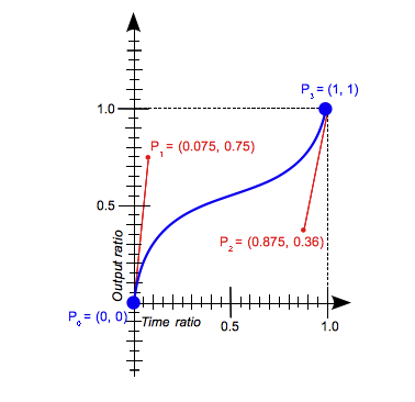
큐빅 베지어 곡선
-
큐빅 베지어 곡선은 네개의 점으로 정의되는 3차원곡선이다. 다음 아래의 그림에서 X축은 애니메이션 재생 시간을 의미하고, Y축은 진행 정도를 의미한다.
-
P0은 초기 시간과 초기 애니메이션 상태(가속도)를 의미하며, P3는 마지막 시간과 최종 애니메이션 상태(가 속도)를 의미한다. 이 점은 움직이지 않으며 고정이다.
-
P1과 P2는 큐빅 베지어 곡선을 조절하 는 점(핸들)이다.
-
P1은 초기 시간과 초기 애니메이션의 곡선을 만드는 점으로 x1과 y1에 설정 하는 좌표 값이다.
-
P2는 마지막 시간과 최종 애니메이션 상태 곡선을 만드는 점으로 x2와 y2에 설정하는 좌표 값이다.
큐빅 베지어 값은 보통 0 ~ 1 값이지만 음수나 1보다 큰 값도 유효하다.
다음 코드의 경우 유효한 값이다.
CSS
cubic-bezier(0.1, 0.75, 1.0, 0.1) /* 0과 1 범위내 소수점 */
cubic-bezier(0, 0, 1, 1) /* 정수 */
cubic-bezier(0.1, -0.6, 0.2, -1) /* y축의 음수 */
cubic-bezier(0.4, 1.5, 0.8, 5) /* y축의 1.0보다 큰 값 */
잘못된 큐빅 베지어 곡선 값을 설정하면 기본값인 ease가 적용된다. -webkit-animation 속성에[timing-function] 값을 잘못지정하면 -webkit-animation 속성자체 모두 무시하게 된다.
다음 코드의 경우 유효하지 않은 값이다.
cubic-bezier(0, blue, 1,black) /* 문자가 들어간 경우 */
cubic-bezier(0.3, 2.1) /* 두 개의 값. 네 개의 값이어야 한다. */
cubic-bezier(-1.4, 0.3, -0.5, 2.1) /* x축의 음수. x축은 0에서 1의 범위에 있어야 한다. */
cubic-bezier(2.45, 0.6, 4, 0.1) /* x축의 1.0보다 큰 값. x축은 0에서 1의 범위에 있어야 한다. */
function 함수 비교
<div class="ease">ease<br>(기본)</div>
<div class="ease_in">ease-in</div>
<div class="ease_out">ease-out</div>
<div class="ease_in_out">ease-in-out</div>
<div class="linear">linear</div>

<style>
  div{
  position:absolute;
  left:100px;
  width:100px;
  height:50px;
  margin-left:-50px;
  background-color:#000;
  color:#fff;
  /* -webkit-animation-name:timing-function; */
  -webkit-animation-duration:1s;
}
.ease_in{
  top:80px;
  -webkit-animation-timing-function:cubic-bezier(1,1.1,1.8,1)
    }
.ease_out{
  top:140px;
  -webkit-animation-timing-function:ease-out
}
.ease_in_out{
  top:200px;
  -webkit-animation-timing-function:ease-in-out
}
.linear{
  top:260px;
  -webkit-animation-timing-function:linear
    }

@-webkit-keyframes timing-function{
  from{
    left:100px;
  }
  to{
    left:300px;
  }
}

</style>

<script>
  $(function(){
  $('div').click(function(){
      $(this).css('-webkit-animation-name','timing-function');
  });
});

</script>
ease과 ease-in-out 비교
-webkit-animation-timing-function 속성값을 ease로 설정했을 때와 ease-in-out으로 설정했을 때 이동 속도를 비교할 수 있는 예제다.
ease로 설정했을 때가 ease-in-out 으로 설정했을 때보다 조금 더 빠르게 시작하고 중간 부분부터 느려지는 것을 확인할 수 있다.
<div class="ease">ease<br>(기본)</div>
<div class="ease_in_out">ease-in-out</div>

<style>
div{
  position:absolute;
  left:100px;
  width:100px;
  height:50px;
  margin-left:-100px;
  background-color:#000;
  color:#fff;
  animation: compare 2s infinite alternate;
}
.ease{
 animation-timing-function:ease;
}
.ease_in_out{
  top:100px;
  animation-timing-function:ease-in-out;
}


@-webkit-keyframes compare{
  from{
    left:100px;
  }
  to{
    left:300px;
  }
}
</style>
10. @-webkit-keyframes
스크립트 없이 애니메이션을 재생한다.
애니메이션을 재생할 각 프레임의 스타일을 설정한다. from 속성이나 0% 속성에 설정한 스타 일에서 출발해 to 속성이나 100% 속성에 설정한 스타일로 점차 바뀌면서 애니메이션이 재생된다.
@-webkit-keyframes <animation-name> {
	<keyframes-selector> { css-styles; }
}-
animation-name : 재생할 애니메이션 이름, 애니메이션을 적용할 요소의 -webkit-animation-name 속성값으로 설정한다.
-
keyframes-selector : 재생할 프레임별 시간 비율.
- 0% : 애니메이션의시작프레임이다.
- 100% : 애니메이션의마지막프레임이다.
- from : 애니메이션의시작프레임이다.0%와같다.
- to : 애니메이션의마지막프레임이다.100%와같다.
0%와 100% 사이에는 여러 개의 중간 값(%)을 설정해 프레임을 넣을 수 있다.
다음 코드는 중간 값 을 넣어 요소가 위에서 아래로 이동하게하는 예제다.
@-webkit-keyframes move {
	0% {top: 0px;}
	25%{top: 20px;}
	75%{top: 175px;}
	100%{top: 200px;}
}
다음의 예제를 실행하면 동그라미가 화면 위에서 아래로 이동한다.
 <div></div>
<style>
  div{
  position:relative;
  top:0;
  width:100px;
  height:100px;
  border-radius:50px;
  background:#000;
  -webkit-animation:move 1s;
}
@-webkit-keyframes move
{
  from{
    top:0px;
  }
  to{
    top:200px;
  }
}

  </style>
앞의 예제에 -webkit-animation 속성을 함께 적용해 공이 통통 튀는 애니메이션을 만들 어 보겠다.
다음 코드와 같이 -webkit-animation-iteration-count값과 -webkit-animation-timing-function값, -webkit-animation-direction값을 추가해 공이 통통 튀는 효과를 적용할 수 있다.
-webkit-border-radius 속성과 width, height 속성을 적절히 이용하면 공이 땅에서 튕길 때 찌그러지는 효과도 적용할 수 있다.
<div></div>

<style>
@keyframes ball {
  0% {
    top:0px;
  }
  95% {
    width: 100px;
  }
  to {
    top:300px;
    width:115px;
    height:90px
  }
}

div{
  position:relative;
  left: 100px;
  top:0;
  width:100px;
  height:100px;
  border-radius:50%;
  background:#000;
  animation:ball 1s ease-in Infinite Alternate;
}
  </style>
공이 튀는 효과 관련 속성은 다음과 같습니다.
-webkit-animation, -webkit-animation-iteration-count, -webkit-animation-timing-funtion, -webkit-animation-direction
11.-webkit-transition 속성과 -webkit-animation 속성의 차이
-webkit-transition 속성과 -webkit-animation 속성은 플래시의 기술이나 자바스크립트의 도움 없이 요소에 직접 애니메이션 효과를 적용하는 속성이다. -webkit-transition 속성은 요소의 상태가 변해야 애니메이션을 실행한다.
-webkit-animation 속성은 요소의 모양과 동작을 키프레임 단위로 변경할 수 있다. 키프레임 동작은 재생 횟수, 재생 방향등 여러 애니메이션 속성으로 제어할 수 있다.
-webkit-transition 속성과 -webkit-animation 속성의 가장 큰 차이는 -webkit- transition 속성은 요소의 상태가 바뀌어야 바뀌는 상태를 애니메이션으로 표현하지만, -webkit-animation 속성은 요소의 상태 변화와 상관 없이 애니메이션을 실행한 다. 또한 @-webkit-keyframes 속성으로 프레임을 추가할 수 있다.
두 속성의 차이에 관한 더 자세한 설명은 “Transitions & Animations” 문서를 참고 한다.